本文介绍多行输入框(textarea)。
| 属性名 | 类型 | 默认值 | 描述 | 最低版本 |
|---|---|---|---|---|
| name | String | - | 组件名字,用于表单提交获取数据 | - |
| value | String | - | 初始内容 | - |
| placeholder | String | - | 占位符 | - |
| placeholder-style | String | - | 指定 placeholder 的样式 | 1.6.0 |
| placeholder-class | String | - | 指定 placeholder 的样式类 | 1.6.0 |
| disabled | Boolean | false | 是否禁用 | - |
| maxlength | Number | 140 | 最大长度,当设置为 -1 时不限制最大长度 | - |
| focus | Boolean | false | 获取焦点(iOS 不支持) | - |
| auto-height | Boolean | false | 是否自动增高 | - |
| show-count | Boolean | true | 是否渲染字数统计功能 | 1.8.0 |
| controlled | Boolean | false | 是否为受控组件。为 true 时,value 内容会完全受 setData 控制 | 1.8.0 |
| onInput | EventHandle | - | 键盘输入时触发,可以直接 return 一个字符串以替换输入框的内容 | - |
| onFocus | EventHandle | - | 输入框聚焦时触发 | - |
| onBlur | EventHandle | - | 输入框失去焦点时触发 | - |
| onConfirm | EventHandle | - | 点击完成时触发 | - |
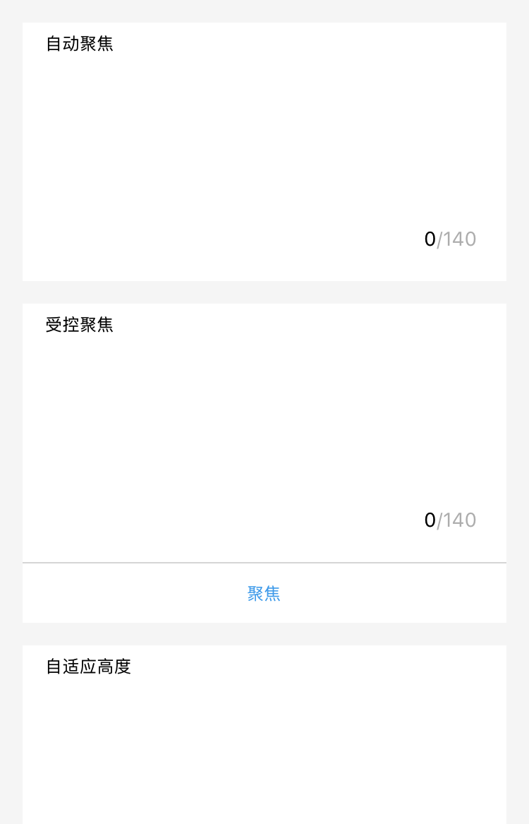
图示
代码示例
<view class="section"><textarea onBlur="bindTextAreaBlur" auto-height placeholder="自动变高" /></view><view class="section"><textarea placeholder="这个只有在按钮点击的时候才聚焦" focus="{{focus}}" /><view class="btn-area"><button onTap="bindButtonTap">使得输入框获取焦点</button></view></view><view class="section"><form onSubmit="bindFormSubmit"><textarea placeholder="form 中的 textarea" name="textarea"/><button form-type="submit"> 提交 </button></form></view>
Page({data: {focus: false,inputValue: ''},bindButtonTap() {this.setData({focus: true})},bindTextAreaBlur: function(e) {console.log(e.detail.value)},bindFormSubmit: function(e) {console.log(e.detail.value.textarea)}})
iOS 键盘与组件交互异常处理
对于需要启动键盘的组件,如 input、textarea 等,目前默认使用的是原生键盘。如果键盘和组件的交互存在异常,可在组件中添加 enableNative="{{false}}"属性(代码如下所示),即可恢复到使用 WKWebview 的键盘。同时,由于使用的是系统键盘,也就不能使用 mPaaS 提供的 Native 键盘相关功能。键盘与组件的交互目前不再专门适配,如有交互异常问题请使用该方式进行处理。
<textarea value="{{inputValue}}" enableNative="{{false}}" maxlength="500" onInput="onInput" />
该文章对您有帮助吗?