
当应用中需要比较明显的对用户当前的操作行为进行警示或提醒时,可以使用对话框。用户需要针对对话框进行操作后方可结束。
属性
属性 | 类型 | 必填 | 默认值 | 说明 |
|---|---|---|---|---|
title | string | 否 | - | 标题 |
content | string | 是 | - | 内容 |
image | string | 否 | - | 缩略图 |
imageSize | 'medium' | 'large' | 'x-large' | 否 | 'medium' | 缩略图尺寸 |
visible | boolean | 是 | false | 是否可见,受控模式 |
duration | number | 否 | - | 过渡动画时长,单位毫秒 |
mainButtonText | string | 否 | '主操作' | 主按钮 |
addonButtonText | string | 否 | '辅助操作' | 辅助按钮,第二个按钮 |
maskClosable | boolean | 否 | true | 点击蒙层关闭 |
disableScroll | boolean | 否 | true | 弹窗展示时,是否禁止页面滚动 |
animation | boolean | 否 | true | 是否开启过渡动画 |
zIndex | number | 否 | 998 | 弹窗层级 |
className | string | 否 | - | 类名 |
事件
事件名 | 说明 | 类型 |
|---|---|---|
onButtonTap | 点击 Modal 组件内部按钮,触发回调 |
|
onClose | 点击 close 图标触发回调 |
|
插槽
名称 | 说明 |
|---|---|
default | 弹窗内容 |
样式类
类名 | 说明 |
|---|---|
amd-modal | 整体样式 |
amd-modal-content | 弹窗主体内容样式 |
amd-modal-content-image | 弹窗图片样式 |
amd-modal-content-image-medium | 弹窗图片样式 |
amd-modal-content-image-large | 弹窗图片样式 |
amd-modal-content-title | 弹窗标题样式 |
amd-modal-content-content | 弹窗内容样式 |
amd-modal-buttons-container | 弹窗按钮区域整体样式 |
amd-modal-buttons-addon | 辅助按钮样式 |
amd-modal-close | close 图标样式 |
代码示例
基本使用
index.axml 的代码示例如下:
<view class="demo">
<modal
visible="{{isBaseModalShow}}"
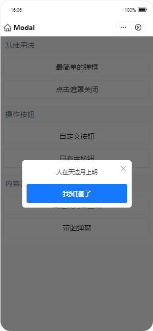
content="人在天边月上明"
mainButtonText="我知道了"
addonButtonText=""
maskClosable="{{false}}"
onClose="closeBaseModal"
onButtonTap="closeBaseModal">
</modal>
<modal
visible="{{isCloseableModalShow}}"
content="人在天边月上明"
mainButtonText="我知道了"
addonButtonText=""
maskClosable
onClose="closeCloseableModal"
onButtonTap="closeCloseableModal">
</modal>
<modal
visible="{{isCustomBtnModalShow}}"
content="人在天边月上明"
mainButtonText="在线阅读"
addonButtonText="下载文件"
maskClosable="{{false}}"
onClose="closeCustomBtnModal"
onButtonTap="handleButtonTap">
</modal>
<modal
visible="{{isMainBtnModalShow}}"
content="人在天边月上明"
mainButtonText="在线阅读"
addonButtonText=""
maskClosable="{{false}}"
onClose="closeMainBtnModal"
onButtonTap="handleButtonTap">
</modal>
<modal
title="温馨提示"
content="请选择范围"
visible="{{isCustomModalShow}}"
onClose="closeCustomModal"
mainButtonText="确定"
addonButtonText="取消"
maskClosable="{{true}}"
onButtonTap="closeCustomModal">
<slider value="5" step="5" />
</modal>
<modal
title="带图弹窗"
imageSize="x-large"
image="{{url}}"
visible="{{isLImgModalShow}}"
content="说明提示用户解决方案。"
mainButtonText="主按钮"
addonButtonText="辅助按钮"
onClose="closeLImgModal"
onButtonTap="closeLImgModal">
</modal>
<demo-block title="基础用法">
<view class="btn-list">
<button onTap="openBaseModal">最简单的弹框</button>
<button onTap="openCloseableModal">点击遮罩关闭</button>
</view>
</demo-block>
<demo-block title="操作按钮">
<view class="btn-list">
<button onTap="openCustomBtnModal">自定义按钮</button>
<button onTap="openMainBtnModal">只有主按钮</button>
</view>
</demo-block>
<demo-block title="内容区域">
<view class="btn-list">
<button onTap="openCustomModal">自定义内容区域</button>
<button onTap="openLImgModal">带图弹窗</button>
</view>
</demo-block>
</view>index.js 的代码示例如下:
Page({
  data: {
    isBaseModalShow: false,
    isCloseableModalShow: false,
    isCustomBtnModalShow: false,
    isMainBtnModalShow: false,
    isCustomModalShow: false,
    isLImgModalShow: false,
    url: 'https://gw.alipayobjects.com/zos/rmsportal/yFeFExbGpDxvDYnKHcrs.png',
  },
  openBaseModal() {
    this.commonShow('isBaseModalShow');
  },
  closeBaseModal() {
    this.commonHide('isBaseModalShow');
  },
  openCloseableModal() {
    this.commonShow('isCloseableModalShow');
  },
  closeCloseableModal() {
    this.commonHide('isCloseableModalShow');
  },
  openCustomBtnModal() {
    this.commonShow('isCustomBtnModalShow');
  },
  closeCustomBtnModal() {
    this.commonHide('isCustomBtnModalShow');
  },
  openMainBtnModal() {
    this.commonShow('isMainBtnModalShow');
  },
  closeMainBtnModal() {
    this.commonHide('isMainBtnModalShow');
  },
  openCustomModal() {
    this.commonShow('isCustomModalShow');
  },
  closeCustomModal() {
    this.commonHide('isCustomModalShow');
  },
  openLImgModal() {
    this.commonShow('isLImgModalShow');
  },
  closeLImgModal() {
    this.commonHide('isLImgModalShow');
  },
  handleButtonTap(type) {
    my.alert({
      title: `点击了${type === 'main' ? '主按钮' : '辅助按钮'}`,
    });
  },
  commonShow(prop) {
    this.setData({
      [prop]: true,
    });
  },
  commonHide(prop) {
    this.setData({
      [prop]: false,
    });
  },
});
index.acss 的代码示例如下:
.deleteBtn {
  color: #f93a4a;
  font-weight: bolder;
}
.cancelBtn {
  color: #ccc;
}
.buttonBold,
.modalButtonBold .am-modal-footer {
  font-weight: bold;
}
.space {
  margin-top: 10px;
}
index.json 的代码示例如下:
{
  "defaultTitle": "Modal",
  "usingComponents": {
    "modal": "antd-mini/es/Modal/index",
    "button": "antd-mini/es/Button/index",
    "demo-block": "../../components/DemoBlock/index"
  }
}