
从屏幕滑出或弹出一块自定义内容区,用于展示弹窗、信息提示、选择输入、切换等内容,支持多个弹出层叠加展示。maskClosable 为 false 时,不触发 onClose 函数。
属性
属性 | 类型 | 必填 | 默认值 | 说明 |
|---|---|---|---|---|
visible | boolean | 否 | false | 是否显示 |
maskClosable | boolean | 否 | false | 点击蒙层是否可以关闭 |
showCloseIcon | boolean | 否 | false | 是否展示关闭图标 |
disableScroll | boolean | 否 | true | 弹窗展示时,是否禁止页面滚动 |
animation | boolean | 否 | true | 是否开启过渡动画 |
duration | number | 否 | 300 | 过渡动画时长,单位毫秒 |
position | 'center' | 'top' | 'bottom' | 'left' | 'right' | 否 | 'center' | 弹窗布局 |
zIndex | number | 否 | 998 | 弹窗层级 |
className | string | 否 | - | 类名 |
事件
事件名 | 说明 | 类型 |
|---|---|---|
onClose | 弹窗关闭时,触发回调 |
|
样式类
类名 | 说明 |
|---|---|
amd-popup | 整体样式 |
amd-popup-mask | 遮罩层样式 |
amd-popup-disable-scroll | 禁用滚动样式 |
amd-popup-animation | 开启过渡动画样式 |
amd-popup-content | 内容样式 |
amd-popup-top | 内容样式 |
amd-popup-bottom | 内容样式 |
amd-popup-left | 内容样式 |
amd-popup-right | 内容样式 |
amd-popup-center | 内容样式 |
amd-popup-close-container | 关闭图标区域样式 |
amd-popup-close-container | 关闭图标样式 |
代码示例
基本使用
index.axml 的代码示例如下:
<view>
<popup visible="{{basicShow}}" maskClosable="{{maskClosable}}" position="{{position}}" animation="{{animation}}" onClose="handlePopupClose"
showCloseIcon="{{showCloseIcon}}">
</popup>
<popup visible="{{showCenterDisableScoll}}" maskClosable="{{maskClosable}}" position="center" animation="{{animation}}"
onClose="handlePopupClose" showCloseIcon="{{showCloseIcon}}">
<scroll-view scroll-y="{{true}}" class="box center" disable-lower-scroll="out-of-bounds" disable-upper-scroll="out-of-bounds">
<view class="centerContent"> 试一下滚动</view>
</scroll-view>
</popup>
<popup visible="{{showCenterScoll}}" maskClosable="{{maskClosable}}" position="center" animation="{{animation}}" onClose="handlePopupClose"
showCloseIcon="{{showCloseIcon}}" disableScroll="{{false}}">
<scroll-view scroll-y="{{true}}" class="box center">
<view class="centerContent"> 试一下滚动</view>
</scroll-view>
</popup>
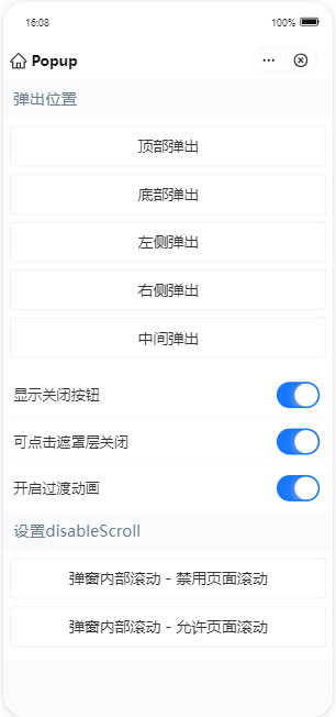
<demo-block title="弹出位置">
<view class="btn-list">
<button data-position="top" onTap="handleShowBasic">顶部弹出</button>
<button data-position="bottom" onTap="handleShowBasic">底部弹出</button>
<button data-position="left" onTap="handleShowBasic">左侧弹出</button>
<button data-position="right" onTap="handleShowBasic">右侧弹出</button>
<button data-position="center" onTap="handleShowBasic">中间弹出</button>
</view>
</demo-block>
<list>
<list-item>
显示关闭按钮
<switch slot="extra" checked="{{showCloseIcon}}" controlled onChange="handleChangeShowCloseIcon" />
</list-item>
<list-item>
可点击遮罩层关闭
<switch slot="extra" checked="{{maskClosable}}" controlled onChange="handleChangeMaskClosable" />
</list-item>
<list-item>
开启过渡动画
<switch slot="extra" checked="{{animation}}" controlled onChange="handleChangeAnimation" />
</list-item>
</list>
<demo-block title="设置disableScroll">
<view class="btn-list">
<button onTap="handleShowDisableScroll">弹窗内部滚动 - 禁用页面滚动</button>
<button onTap="handleShowScroll">弹窗内部滚动 - 允许页面滚动</button>
</view>
</demo-block>
</view>index.js 的代码示例如下:
Page({
  data: {
    position: '',
    basicShow: false,
    maskClosable: true,
    showCloseIcon: true,
    animation: true,
    showCenterScoll: false,
    showCenterDisableScoll: false,
  },
  handlePopupClose() {
    this.setData({
      basicShow: false,
      showCenterScoll: false,
      showCenterDisableScoll: false,
    });
  },
  handleShowBasic(e) {
    const { position } = e.target.dataset;
    this.setData({
      position,
      basicShow: true,
    });
  },
  handleShowDisableScroll() {
    this.setData({
      showCenterDisableScoll: true,
    });
  },
  handleShowScroll() {
    this.setData({
      showCenterScoll: true,
    });
  },
  handleChangeMaskClosable(checked) {
    const { showCloseIcon } = this.data;
    if (!showCloseIcon && !checked) {
      return my.alert({
        content: '同时隐藏关闭按钮和蒙层关闭事件将无法关闭弹出层',
      });
    }
    this.setData({ maskClosable: checked });
  },
  handleChangeShowCloseIcon(checked) {
    const { maskClosable } = this.data;
    if (!maskClosable && !checked) {
      return my.alert({
        content: '同时隐藏关闭按钮和蒙层关闭事件将无法关闭弹出层',
      });
    }
    this.setData({ showCloseIcon: checked });
  },
  handleChangeAnimation(checked) {
    this.setData({ animation: checked });
  },
});
index.acss 的代码示例如下:
.box {
  display: flex;
  justify-content: center;
  align-items: center;
}

.box.center {
  display: block;
  height: 200px;
}

.centerContent {
  width: 60%;
  height: 500px;
  margin: 24rpx auto;
  padding: 24rpx;
  background-color: #ccc;
  box-sizing: border-box;
}
index.json 的代码示例如下:
{
  "defaultTitle": "Popup",
  "usingComponents": {
    "popup": "antd-mini/es/Popup/index",
    "demo-block": "../../components/DemoBlock/index",
    "button": "antd-mini/es/Button/index",
    "list": "antd-mini/es/List/index",
    "list-item": "antd-mini/es/List/ListItem/index",
    "switch": "antd-mini/es/Switch/index"
  }
}