The visualization chart feature for SQL queries enables you to visualize and analyze query results quickly and conveniently. Supported chart types include line charts, column charts, bar charts, and pie charts. This topic describes the scenarios for different chart types to assist you in selecting the most suitable chart for data rendering and presentation.
Line chart
Line charts are ideal for displaying data trends over equal time intervals, such as analyzing product sales changes over time and forecasting future trends.
Sample chart | Data elements |
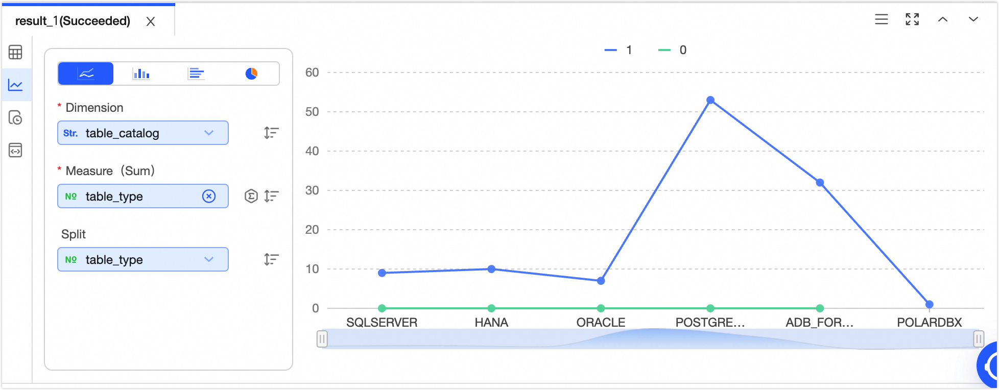
|
Note Click  icon to sort data elements in ascending order, descending order, or no sort. When both X-axis and Y-axis are configured with sorting, X-axis sorting takes precedence. icon to sort data elements in ascending order, descending order, or no sort. When both X-axis and Y-axis are configured with sorting, X-axis sorting takes precedence. Click  icon to select the data aggregation method. The default aggregation method for numeric fields is sum, and you can choose sum, average, or count. The default aggregation method for non-numeric fields is count, and only count can be selected. icon to select the data aggregation method. The default aggregation method for numeric fields is sum, and you can choose sum, average, or count. The default aggregation method for non-numeric fields is count, and only count can be selected.
|
Column chart
Column charts are effective for comparing differences across groups of data and can also illustrate changes over time.
Sample chart | Data elements |
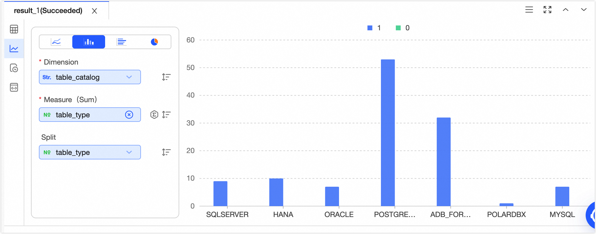
|
Note Click icon to sort data elements in ascending order, descending order, or no sort. When both X-axis and Y-axis are configured with sorting, X-axis sorting takes precedence. Click  icon to select the data aggregation method. The default aggregation method for numeric fields is sum, and you can choose sum, average, or count. The default aggregation method for non-numeric fields is count, and only count can be selected. icon to select the data aggregation method. The default aggregation method for numeric fields is sum, and you can choose sum, average, or count. The default aggregation method for non-numeric fields is count, and only count can be selected.
|
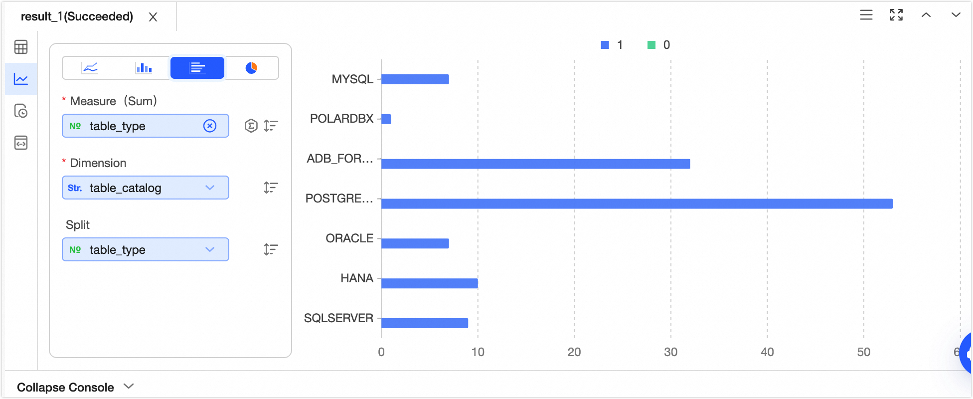
Bar chart
Bar charts, similar to column charts, are well-suited for comparing data magnitudes and the differences between items in a horizontal layout.
Sample chart | Data elements |
|
Note Click icon to sort data elements in ascending order, descending order, or no sort. When both X-axis and Y-axis are configured with sorting, Y-axis sorting takes precedence. Click icon to select the data aggregation method. The default aggregation method for numeric fields is sum, and you can choose sum, average, or count. The default aggregation method for non-numeric fields is count, and only count can be selected.
|
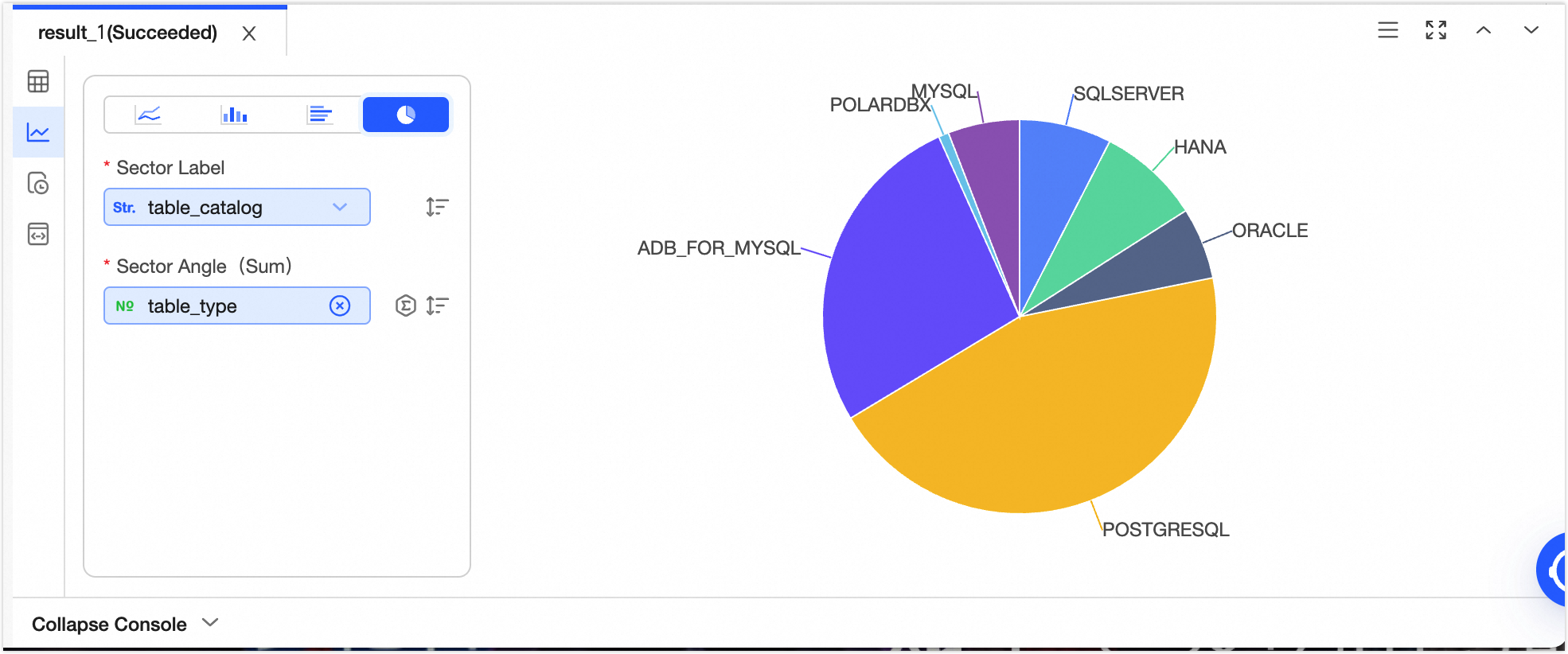
Pie chart
Pie charts effectively display the size of each data item and its proportion to the overall total.
Sample chart | Data elements |
| Sector tag Central angle (sum)
Note Click icon to sort data elements in ascending order, descending order, or no sort. When both sector tag and central angle are configured with sorting, sector tag sorting takes precedence. Click icon to select the data aggregation method. The default aggregation method for numeric fields is sum, and you can choose sum, average, or count. The default aggregation method for non-numeric fields is count, and only count can be selected.
|