Configure the appearance and behavior of the Full-Screen Switch widget, including icons, background styles, and blueprint editor interactions.
Chart style
The Full-Screen Switch widget supports icon and background style configuration. Customize background visibility to toggle between full-screen and windowed display.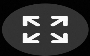
Configuration panel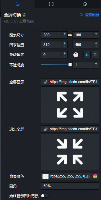
- Search for Configurations: In the right-side panel of Canvas Editor, click the Settings tab, and click Search for Configurations in the upper-right corner. Enter the required configuration item in the search box, and click the search icon to quickly locate the configuration item. Fuzzy match is supported. For more information, see Search for Configurations.
- Size: indicates the size of a widget, including its pixel width and height. You can click the
 icon to proportionally adjust the width and height of a widget. After you click this icon again, you can adjust the width and height as needed.
 - Position: the position of a widget, which is indicated by pixel X and Y coordinates. X-coordinate indicates the pixel distance between the upper-left corner of the widget and the left border of the canvas. Y-coordinate indicates the pixel distance between the upper-left corner of the widget and the upper border of the canvas.
- Rotation Angle: the angle of a rotation that uses the center point of a widget as the rotation point. The unit is degrees (°). You can use one of the following methods to control the rotation angle of a widget:
- Directly enter the degrees in the Rotation Angle spin box or click the plus sign (+) or minus sign (-) to increase or decrease the value in the Rotation Angle spin box.
- Drag the black dot in the
 icon.
icon. - Click the
 icon to horizontally flip a widget.
 - Click the
 icon to vertically flip a widget.
- Opacity: the opacity of a widget. Valid values: 0 and 1. If this parameter is set to 0, the widget is hidden. If this parameter is set to 1, the widget is completely displayed. Default value: 1.
-
Full Screen Display: Configures the full-screen display icon. Enter an image URL to use a remote image. Click Preview to view the image at full size, or click Change to replace it. Design asset details: Interface features.
-
Exit Full Screen: Configures the exit full-screen icon. Enter an image URL to use a remote image. Click Preview to view the image at full size, or click Change to replace it. Design asset details: Interface features.
-
Background Color: Sets the background fill color. Adjust colors using the Color picker instructions.
-
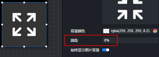
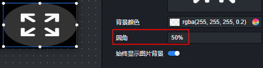
Border Radius: Sets the background shape. Default 50% produces a circle. 0% produces a square.
NoteIf the widget is not square, a border radius of 50% produces an ellipse.
-
Always show image background: When enabled, the image background is always visible. When disabled, it appears only on hover.
 icon to vertically flip a widget.
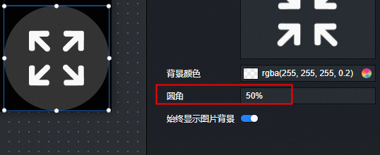
Configured styles are visible only on the preview or publish page.
Data panel
No data configuration required.
Interaction panel
No interaction event configuration required.
Blueprint editor interactions
- In Canvas Editor, right-click a widget in the Layer panel and select Add to Blueprint Editor.
- Click the icon in the upper-left corner of the page.
-
On the blueprint editor page, click the Full Screen Switch widget in the imported nodes pane. The widget parameters appear on the canvas.
-
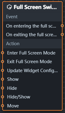
Events
Parameter
Description
When entering full screen
Triggered when entering full screen. No parameters required.
When exiting full screen
Triggered when exiting full screen. No parameters required.
-
Actions
Action
Description
Enter Full Screen
No parameters required.
Exit Full Screen
No parameters required.
Update Widget Configuration
Dynamically updates widget styles. On the Configuration panel, click Copy Configuration to Clipboard to get the configuration data, then modify the field values in the data processing node as needed.
Show
Shows the widget. Example reference data:
return {
  "animationType": "",
  "animationDuration": 1000,
  "animationEasing": "linear"
};
Hide
Hides the widget. Example reference data:
return {
  "animationType": "",
  "animationDuration": 1000,
  "animationEasing": "linear"
};
Toggle Visibility
Toggles widget visibility. Example reference data:
return {
  "animationIn": {
    "animationType": "",
    "animationDuration": 1000,
    "animationEasing": "linear"
  },
  "animationOut": {
    "animationType": "",
    "animationDuration": 1000,
    "animationEasing": "linear"
  }
};
Move
Moves the widget to a specified position. Example reference data:
return {
  // The moving mode. Absolute positioning: to. Relative positioning: by. Default value: to.
  "positionType": "to",
  // The specified position. x-coordinate, y-coordinate.
  "attr": {
    "x": 0,
    "y": 0
  },
  // The animation mode.
  "animation": {
    "enable": false,
    // The animation delay.
    "animationDuration": 1000,
    // The animation curve. Optional values: linear|easeInOutQuad|easeInOutExpo.
    "animationEasing": "linear"
  }
};
-
 icon in the upper-left corner of the page.