Describes the chart style and configuration options of the Graphic widget.
Chart Style
The Graphic widget is a media widget that adds custom decorative elements to your DataV application or its modules to enhance the visual appearance. 
Settings Panel
- Search for Configurations: In the right-side panel of Canvas Editor, click the Settings tab, and click Search for Configurations in the upper-right corner. Enter the required configuration item in the search box, and click the search icon to quickly locate the configuration item. Fuzzy match is supported. For more information, see Search for Configurations.
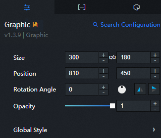
- Size: indicates the size of a widget, including its pixel width and height. You can click the
 icon to proportionally adjust the width and height of a widget. After you click this icon again, you can adjust the width and height as needed.
 - Position: the position of a widget, which is indicated by pixel X and Y coordinates. X-coordinate indicates the pixel distance between the upper-left corner of the widget and the left border of the canvas. Y-coordinate indicates the pixel distance between the upper-left corner of the widget and the upper border of the canvas.
- Rotation Angle: the angle of a rotation that uses the center point of a widget as the rotation point. The unit is degrees (°). You can use one of the following methods to control the rotation angle of a widget:
- Directly enter the degrees in the Rotation Angle spin box or click the plus sign (+) or minus sign (-) to increase or decrease the value in the Rotation Angle spin box.
- Drag the black dot in the
 icon.
icon. - Click the
 icon to horizontally flip a widget.
 - Click the
 icon to vertically flip a widget.
- Opacity: the opacity of a widget. Valid values: 0 and 1. If this parameter is set to 0, the widget is hidden. If this parameter is set to 1, the widget is completely displayed. Default value: 1.
-
Global level
Parameter
Description
Decorative elements
The decoration type. 55 built-in types are available, with thumbnails shown in the drop-down list.
Transparency
The transparency of the decoration.
 icon to vertically flip a widget.
Data Panel
This widget does not support data configuration.
Interaction Panel
This widget does not support interaction events.
Configure interactions in Blueprint Editor
- In Canvas Editor, right-click a widget in the Layer panel and select Add to Blueprint Editor.
- Click the icon in the upper-left corner of the page.
-
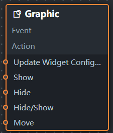
In Blueprint Editor, click Graphic in the Import Nodes pane to view the decoration parameters on the canvas.
-
Event: The Graphic widget does not support events.
-
Policy Action
Policy Action
Description
Update component configurations
Dynamically updates widget style configurations. To use this action, click the widget in Canvas Editor, click the Settings tab in the right-side panel, and click Copy Configurations to... to obtain the widget configurations. Then modify the style field in the data processing node in Blueprint Editor.
Display
Shows the widget. Sample reference data:
return {
  "animationType": "",
  "animationDuration": 1000,
  "animationEasing": "linear"
};
Hide
Hides the widget. Sample reference data:
return {
  "animationType": "",
  "animationDuration": 1000,
  "animationEasing": "linear"
};
Switch to the implicit state
Toggles widget visibility. Sample reference data:
return {
  "animationIn": {
    "animationType": "",
    "animationDuration": 1000,
    "animationEasing": "linear"
  },
  "animationOut": {
    "animationType": "",
    "animationDuration": 1000,
    "animationEasing": "linear"
  }
};
Move
Moves the widget to a specified position. Sample reference data:
return {
  // The positioning type. to indicates absolute positioning, whereas by indicates relative positioning. The default value is to.
  "positionType": "to",
  // The location, which is indicated by the x and y coordinates.
  "attr": {
    "x": 0,
    "y": 0
  },
  // The animation type.
  "animation": {
    "enable": false,
    // The duration in which animation is displayed.
    "animationDuration": 1000,
    // The animation curve, which can be set to linear|easeInOutQuad|easeInOutExpo.
    "animationEasing": "linear"
  }
};
-
 icon in the upper-left corner of the page.