Manage blocks
Blocks are advanced functional modules that encapsulate basic widgets. They function as black box tools that define internal and external data transmission. Internally, blocks encapsulate widget styles, layouts, default data (excluding dynamic data sources), and blueprint logic. Externally, they define business-related data interfaces. This topic describes how to create and manage blocks to help you design and use them efficiently.
Limits
The block feature is exclusive to the Professional Edition and higher. To use this feature, you must upgrade to the Professional or Premium Edition.
Access block management
Log on to the DataV console.
On the My Assets tab, in the left navigation pane, click My Blocks.
Create blocks
The platform supports creating blank blocks and template blocks. You can design a functional module from scratch or quickly build one from a preset template based on your requirements.
Create a blank block
On the My Blocks page, click New Block.
In the Select Block Template dialog box, click Create Directly in the lower-right corner.
In the New Block dialog box, enter the new block information.
Parameter
Description
English Name
(Required) Enter the English name for the block. The name can contain up to 20 English letters, digits, and hyphens (-). It cannot contain spaces and cannot be modified after creation. For example,
block-test-xz. The English name must be unique and cannot be the same as other blocks in the system.Display Name
(Required) Enter the display name for the block. The name can contain up to 20 characters and cannot contain special characters. You can modify it at any time. For example, Test Block. The display name can be the same as other blocks in the system.
Preset Size
Set the preset size of the block. The system provides multiple options:
Landscape (for PC) 480x260px
Landscape (for PC) 900x260px
Portrait layout (for large screens) 260x940px
Portrait layout (for large screens) 380x940px
Portrait layout (for large screens) 480x940px
After you enter the block information, click OK. A blank block is created, and you are automatically redirected to the block editor. For more information about the block editor, see Block editor overview.
The new block automatically appears on the My Blocks page.
Create a block from a template
On the My Blocks page, click New Block at the top.
In the Select Block Template dialog box, point to a template block and click New Block.
In the Create Block dialog box, enter the block information.
Parameter
Description
English Name
(Required) Enter the English name for the template block. The name can contain up to 20 English letters, digits, and hyphens (-). It cannot contain spaces and cannot be modified after creation. For example,
block-test-xz. The English name must be unique and cannot be the same as other blocks in the system.Display Name
(Required) Enter the display name for the template block. The name can contain up to 20 characters and can be modified at any time. For example, Test Block. The display name can be the same as other blocks in the system.
After you enter the block information, click OK. A block is created from the template and you are automatically redirected to the block editor. For more information about the block editor, see Block editor overview.
The new block is automatically listed on the My Blocks page.
Add a block
- On the My Visualizations page, click Edit above the project that you created.
In the canvas editor, click Blocks in the All Assets list to expand the section.
In the block list, find the desired block and click it to add it to the canvas editor.
NoteAfter you add a block to the canvas, you can move it or resize it by dragging the dots on its edges. To restore the block's original size, click Restore to Default Size in the upper-right corner of its configuration pane.
You can select a block on the canvas to view its Configuration, Data, and Interaction tabs in the pane on the right. The block is configured using the widget configuration method.
Edit a block
You can edit a block to configure its settings and behavior. For more information, see editing the block.
Block operations
Block management supports operations such as copying, deleting, and granting permissions, which allow you to manage and adjust blocks flexibly. These operations improve the efficiency of and collaboration on dashboard design.
Delete a block
On the My Blocks page, click the
 icon to the right of the block to delete and select Delete.
Click OK in the lower-right corner of the dialog box to delete the block. To cancel, click Cancel.
After a block is deleted, existing instances of the block in a visualization application can still be used. However, you can no longer add the block from the asset list.
Copy a block
On the My Blocks page, click the
icon to the right of the block you want to copy and select Copy.In the Copy dialog box, enter the English Name and Display Name for the block. Clicking OK copies the block to the current workspace and redirects you to the block editor.
Rename a block
On the My Blocks page, click the  icon to the left of a block name. In the input box that appears, enter a new name. Then, click a blank area or press the Enter key to save the new name.
Block authorization and copying
The block feature integrates permission management and sharing capabilities. This provides a secure and controllable solution for collaborating on blocks.
Authorization block
You can flexibly configure block access permissions to achieve fine-grained data security management and control.
On the My Blocks page, click the
icon to the right of the desired block name and select Grant.In the Block Authorization dialog box, enter the transfer ID of the target user, set an Expiration Time for the block, and then click the Grant button in the lower-right corner. This grants the target user permission to use the block.
NoteOn the console home page, click the drop-down list next to your account in the upper-right corner to view your transfer ID.
The default permission level for block authorization is Subscriber. Subscribers can only view and use published blocks in the block list on the edit page.
After you grant the permission, you can click Grant next to the block name to open the Block Authorization dialog box and view the authorization record. To revoke the permission, click Revoke in the Actions column. In the confirmation dialog box, click OK.
Copy block
Blocks can be copied to other users. This provides a flexible block management method and an efficient team collaboration experience.
On the My Blocks page, click the
icon to the right of the block that you want to copy and select Copy.In the dialog box that appears, enter the target transfer ID and click Confirm to copy the current block to the target account.
On the console home page, click the drop-down list next to your account in the upper-right corner to view your transfer ID.
If the user to whom the block is copied lacks permissions for the widgets within the block, the copy operation fails.
Publish and preview a block
The publish and preview features allow you to preview a block before its official release to ensure that its content and style meet your expectations. By previewing the block, you can view its real-time effect and make necessary adjustments and optimizations. This process improves the quality and consistency of the block.
Preview a block
On the My Blocks page, click a target block to open the block editor. To preview the block, click the
 icon in the upper-right corner.
On the preview page, you can view the overall appearance of the block and configure features such as Style, Data, Events, and Actions in the right-side panel. The following table provides examples:
Name
Operation
Style
On the Style tab, configure different styles. For more information about the configurations, see Widget Guide.
As shown in the following figure, on the Style tab, set the Background Color for the Table Header of the List Carousel widget to red.
Data
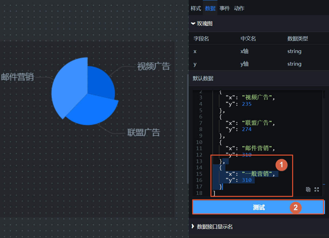
On the Data tab, enter different data content and check whether the data configuration and corresponding style of the internal widgets meet your expectations.
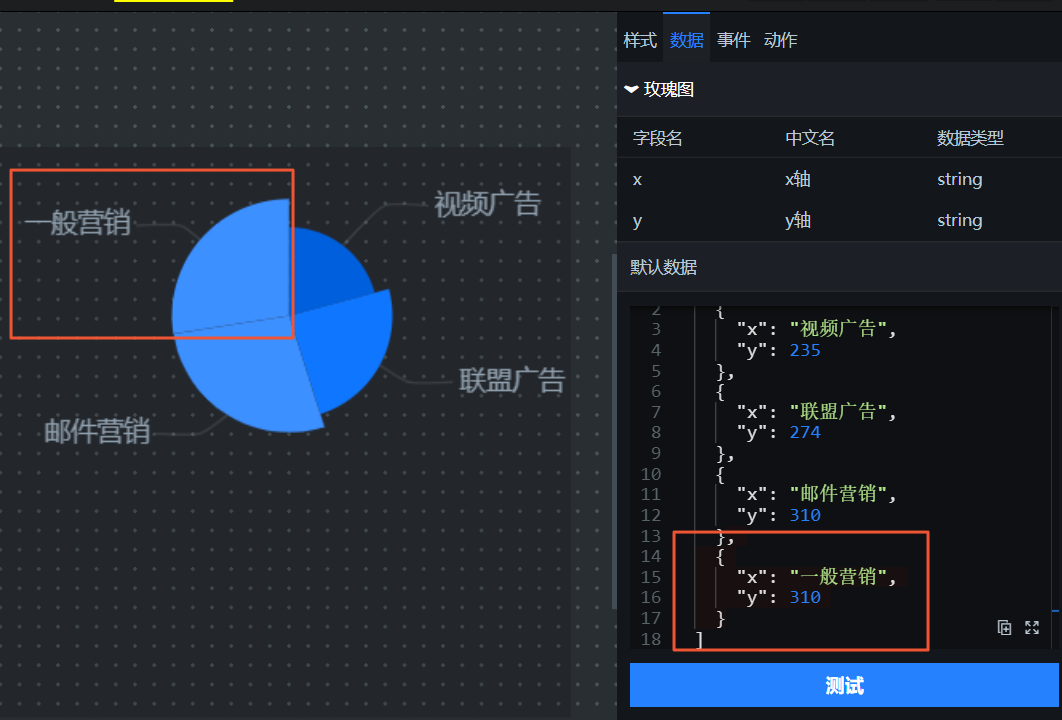
As shown in the following figures, you can enter additional data on the Data tab on the right. Click the Test button below to view the changes in the data displayed in the corresponding widget.
Enter different data
Test the result of the new data
Event
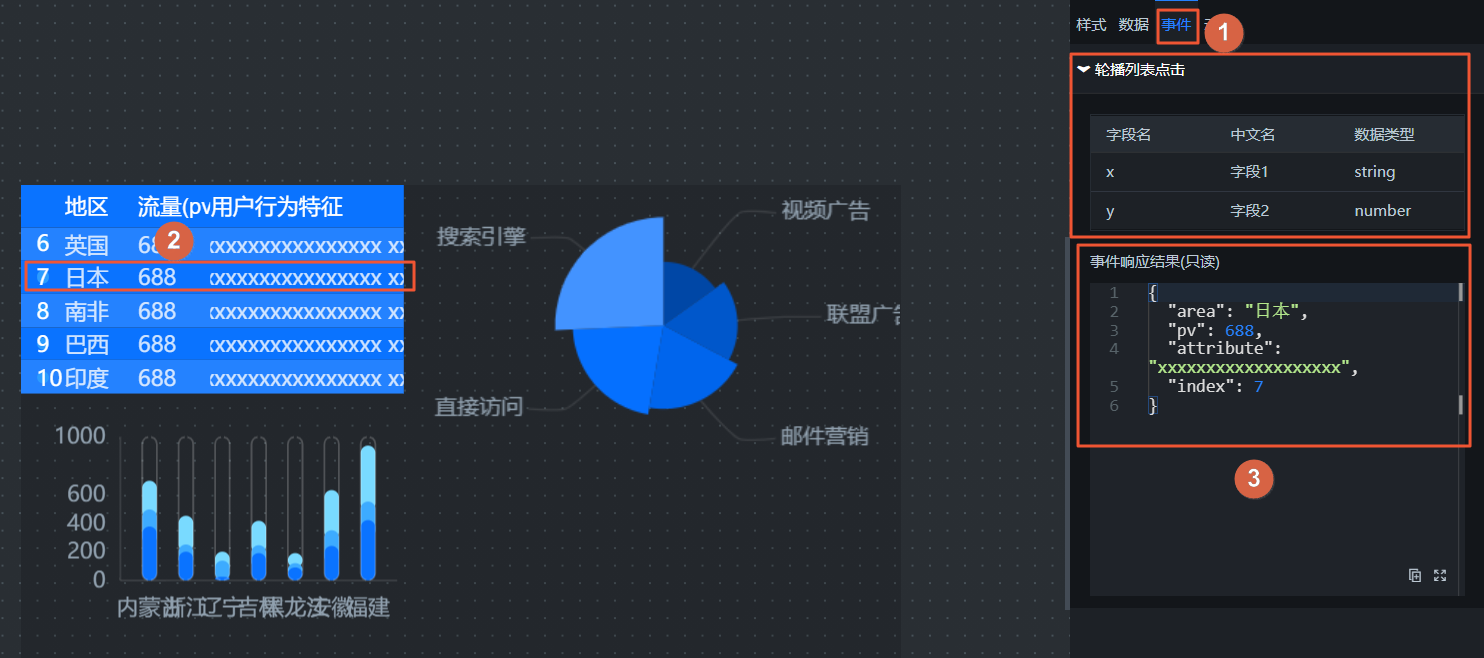
On the Events tab, click a component in the block that corresponds to an event. Check whether the data thrown by the component is correct on the Events tab.
As shown in the following figure, click a row in the List Carousel widget. In the Event Response section of the List Carousel Click event tab on the right, you can listen for the data thrown when the List Carousel widget is clicked.
Action
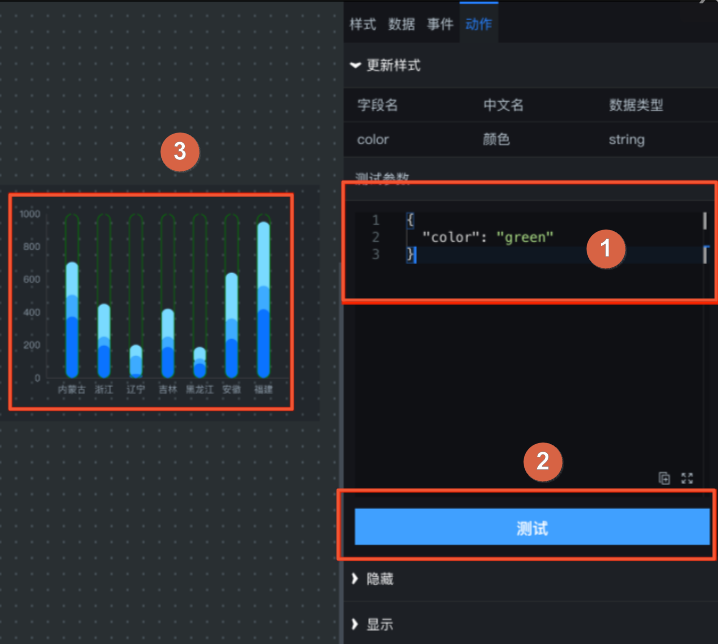
On the Actions tab, enter different parameters for an action. Check whether the behavior of the internal component corresponding to the action meets your expectations.
As shown in the following figure, you can enter a color parameter in the Test Parameters input box under Update Style on the Actions tab on the right. This changes the border color of the bars in the Vertical Capsule Column Chart to green.
Click the
icon in the upper-right corner of the preview page to return to the block editor and continue editing the block.If the preview looks correct and the block's features work as expected after testing, you can publish the block to the online environment. Other users can then add and use it directly in their visualization applications.
 icon in the upper-right corner.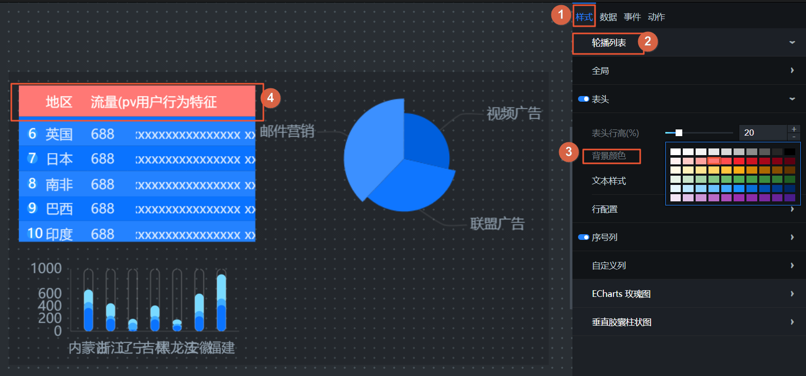
 icon in the upper-right corner of the preview page to return to the block editor and continue editing the block.
Publish a block
On the My Blocks page, click a block to open the block editor. Then, click the
icon in the upper-right corner to publish the block.In the Publish Block dialog box, enter notes for this release and click Confirm.
NoteIf this is not the first time you are publishing the block, you can view the version number and publication time of the previous release.
After a block is published, you can go to the My Blocks page on the My Assets tab in the DataV console. Click View History for a block to view its version history.
 icon in the upper-right corner to publish the block.
Block version and asset management
Manage block version history
The version history feature for a block is available only after the block is published. Each time you publish a block, a snapshot of its current content is created and assigned a new version number. Version history is not generated for unpublished blocks.
On the My Blocks page, click View History for a block.
In the Historical Versions pane on the right, you can view all versions of the current block. This includes information such as the Version Number, Publication Time, Description, Status, and Actions.
Block version information parameter
Description
Version Number
Each block supports multiple versions. The latest version number is the highest version number that has been published. To update, click Upgrade to Latest Version in the canvas editor.
Publication Time
The detailed publication time for each version of the block.
Description
The custom description for the version that was set when the block was published.
Status
The online or offline status of the block version.
Actions
For blocks from historical versions in different states, you can Publish or Unpublish them.
Publish: Click the
icon to the right of a block in the Not Published state. In the Publish Version dialog box that appears, click OK to publish the content of this block version.Unpublish: Click the
icon on the right side of a block that is in the Published state. In the Unpublish Version dialog box that appears, click OK to unpublish the block version.
NoteBy default, after a block is published, its status is Published. You can then click the Upgrade button in the visualization application canvas editor to update the block to its latest version.
 icon to the right of a block in the Not Published state. In the Publish Version dialog box that appears, click OK to publish the content of this block version.
 icon on the right side of a block that is in the Published state. In the Unpublish Version dialog box that appears, click OK to unpublish the block version.
Upgrade a favorite asset to a block
On the My Assets tab, in the navigation pane on the left, click Favorite Widgets.
Hover over a favorite asset and click the
icon within the asset.In the Upgrade to Block dialog box, enter the English Name and Display Name for the block.
ImportantYou can only upgrade favorite assets that are configured with static data or an API data source. The internal data transmission logic must also be configured.
After you enter the required information, click the OK button in the lower-right corner to upgrade the asset to a block.
The upgraded block automatically appears on the My Blocks page.
 icon within the asset.
References
Perform operations in the block editor.