Explains each configuration item available when you select Full for the ApsaraVideo Player component.
Chart style
ApsaraVideo Player is a media component that supports custom video URLs, enabling video playback within visual applications. 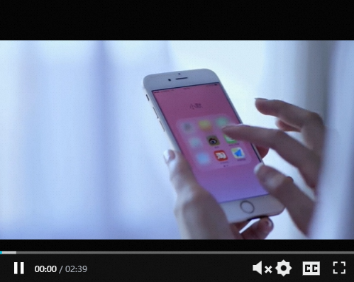
Style Panel 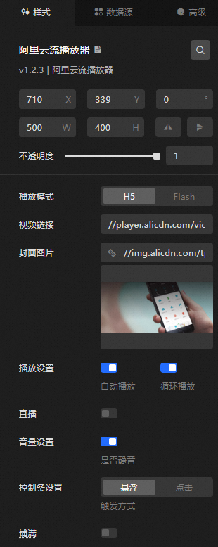
-
Search Configuration: Click the Search configuration items icon
 in the upper-right corner of the Style panel. In the Search Configuration panel, enter the name of the configuration items that you want to search for and locate the configuration items. Fuzzy match is supported. For more information, see Search configuration items.
 -
Size: the width and height of the widget. Unit: pixels.
-
Positioning: the x-axis and y-axis of the component. Unit: pixels. X-coordinate indicates the pixel distance between the upper-left corner of the widget and the left border of the canvas. Y-coordinate indicates the pixel distance between the upper-left corner of the widget and the upper border of the canvas.
-
Rotate: The widget is rotated around the center of the widget. Unit: degrees.
-
Directly enter the degrees in the Rotation Angle spin box or click the plus sign (+) or minus sign (-) to increase or decrease the value in the Rotation Angle spin box.
-
Click the
 icon to flip the widget style.
 -
Click the
 icon to flip the widget style.
-
-
Opacity: Valid values: 0 to 1. If this parameter is set to 0, the widget is hidden. If this parameter is set to 1, the widget is completely displayed. Default value: 1.
-
-
Playback Mode: the playback mode of the video stream. You can select H5 or Flash.
ImportantFlash mode in Chrome has stopped receiving updates.
-
Video Link: the URL of the video track. You can also configure the URL on the Data Source tab. The URL in the Data Source panel is optional.
NoteMP4, FLV, M3U8, and RTMP are supported.
-
Cover Image: the content of the video cover image. To use an image on a remote server, enter the URL of the image in the upper-right corner. Click Preview in the image box to preview the image format. Click Change in the dashed box below the image box. For more information about how to change the image design asset, see Use the interface.
-
Playback Settings: Turn on the switch to configure automatic playback and loop playback for the video.
-
Live Streaming: If you turn on the switch, you can use a live stream to play the live stream. This feature is available only when you set Playback Mode to H5.
-
Volume Settings: If you turn on the switch, you can mute the video playback. If you turn off the switch, you can set the volume in %. Configurable only when H5 is selected for playback mode.
-
Control Bar Settings: Set the trigger mode and dwell time of the control bar. You can select Hover and Tap. You can configure this parameter only when you select H5 for Play Mode.
-
Flatness: If you turn on the switch, if the aspect ratio of the video does not match the size of the content frame, the video is stretched to fit the size of the content frame.
Data Sources panel 
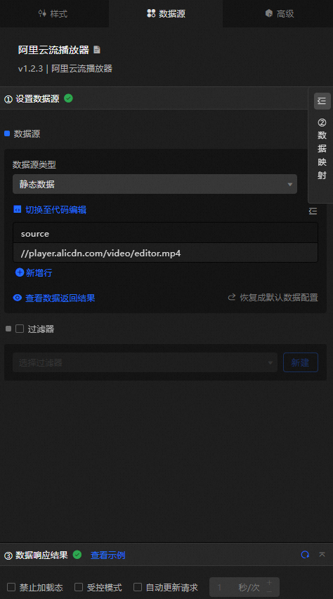
source: the URL of the video stream, identical to the video link setting in the Style panel. If both are configured, the Data Source panel value takes precedence.
|
Configure data items |
Description |
|
Data sources |
Use the code editor or visual editor to view widget data fields. Modify the data type to configure component data flexibly. |
|
Data Mapping |
Set field mapping rules in the Data Mapping module to map custom fields to widget fields without modifying the data source. Click the |
|
Configure a filter |
Turn on Filter, select an existing data filter or create a data filter, and configure a data filter script to filter data. For more information, see Manage data filters. |
|
Data Response Result |
Displays widget data in real time. When the data source changes, this section shows the latest data. Click the |
|
Forbid Loading |
When selected, loaded content is hidden during component initialization when you update or preview the data dashboard. Deselected by default. |
|
Controlled Mode |
When selected, the component does not request data on initialization and only responds to global variables or methods configured in Blueprint Editor. When cleared, the component uses automatic data updates. Deselected by default. |
|
Auto Data Request |
Select to set a polling interval for dynamic data refresh. When cleared, the page does not update automatically — manually refresh it or use Blueprint Editor and global variable events to trigger data updates. |
 icon to configure the field style.
  icon to view the data response result, or click the
  icon to fetch the latest data. Click View Example to view a sample response.
 Advanced Panel
This widget does not support interaction events.
Blueprint Interaction
-
Click the
icon in the upper-left corner to go to the Blueprint page. -
On the Layer Nodes tab, add the widget to the main canvas.
-
View blueprint configuration parameters.
-
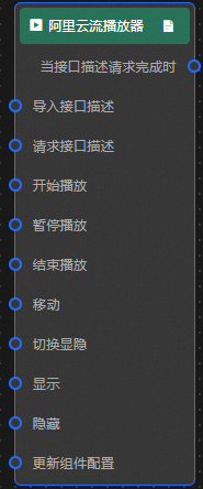
Event
Event
Description
When the interface description request is completed
Triggered with the processed JSON data after a data interface request is returned and processed by a filter. For specific data examples, see the Data Response Result section of the Data Source tab in the right-side configuration panel of the canvas editor.
-
Action
Action
Description
Request API Description
Requests server data again, using data from an upstream processing node or layer node as a parameter. For example, if the API data source is
https://api.testand the data passed to the Request API Description action is{ id: '1'}, the final request URL ishttps://api.test?id=1.Import Interface Description
Imports pre-processed data directly for widget redrawing without requesting server data again. For specific data examples, see the Data Response Result section of the Data Source tab in the right-side configuration panel of the canvas editor.
Start the playback
Starts video playback. No parameters required.
Pause playback
Pauses video playback. No parameters required.
End playback
Stops video playback. No parameters required.
Move
Move a widget to a specified location. For more information, see the data example.
    {
      // The positioning type. to indicates absolute positioning, whereas by indicates relative positioning. The default value is to.
        "positionType": "to",
      // The location, which is indicated by the x and y coordinates.
      "attr": {
        "x": 0,
        "y": 0
      },
      // The animation type.
      "animation": {
        "enable": false,
        // The duration in which animation is displayed.
        "animationDuration": 1000,
        // The animation curve, which can be set to linear|easeInOutQuad|easeInOutExpo.
        "animationEasing": "linear"
      }
    }
Switch Display /Hide
Toggles widget visibility. No parameters required.
Display
Display the widget. For more information, see Data example.
{
  "animationType": "",// The animation method. Valid value: fade. If you do not specify this parameter, no animation is generated.
  "animationDuration": 1000,// The animation delay. Unit: ms.
  "animationEasing": ""// animation curve
}
Hide
Hide the component. For more information, see Data example.
{
  "animationType": "",// The animation method. Valid value: fade. If you do not specify this parameter, no animation is generated.
  "animationDuration": 1000,// The animation delay. Unit: ms.
  "animationEasing": ""// animation curve
}
Update component configurations
Dynamically updates widget style configurations. In the Style panel, click Copy Configuration to Clipboard to obtain the configuration data, then modify the style field for the data processing node in Blueprint Editor.
-
 icon in the upper-left corner to go to the Blueprint page.