Display query results on a bubble chart
Learn about all configuration items available for the bubble chart.
Chart style
A bubble chart uses bubbles to display data, with customizable sizes to highlight differences between discrete data points across multiple time periods. 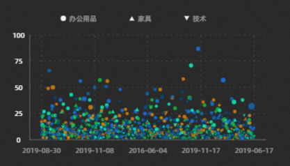
Style Panel 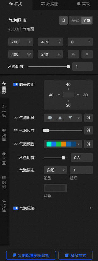
-
Search Configuration: Click the Search configuration items icon
 in the upper-right corner of the Style panel. In the Search Configuration panel, enter a configuration item name to locate it. Fuzzy match is supported. For more information, see Search configuration items.
 -
Size: the width and height of the widget, in pixels.
-
Positioning: the x-axis and y-axis of the component. Unit: pixels. X-coordinate is the pixel distance from the upper-left corner of the widget to the left border of the canvas. Y-coordinate is the pixel distance from the upper-left corner of the widget to the upper border of the canvas.
-
Rotate: Rotates the widget around its center, in degrees.
-
Enter the degrees in the Rotation Angle spin box, or click the plus (+) or minus (-) sign to adjust the value.
-
Click the
 icon to flip the widget style.
 -
Click the
 icon to flip the widget style.
-
-
Opacity: Valid values: 0 to 1. A value of 0 hides the widget. A value of 1 makes the widget fully visible. Default value: 1.
-
-
Graphics
Metric
description
Chart Margins
Click the
 icon to toggle chart margins. When enabled, you can configure the distance between the bubble chart area and each widget boundary. Unit: px.
Bubble shape
For more information about the bubble shape, see Use the shape mapper.
Bubble Size
For more information about the bubble size, see Use the size mapper.
Bubble Color
For more information about the color of bubbles, see Color mapper instructions.
Opacity
The opacity of bubbles. Valid values: 0 to 1. A larger value indicates higher opacity.
Bubble Stroke
The bubble stroke style, including type, thickness, and color.
NoteWhen the line type is selected as dotted line or dotted line, the value of the break length of the line and the distance between each break line can also be configured.
Bubble Label
The bubble label style. Click the
icon to show or hide label settings.-
Label Field: The label field content must match the field in the data panel. By default, the y field value is used.
-
Value Format: The value format of the label. Valid values: Default, 11 (integer), 11.1 (floating point), 11.11 (floating point), 11%(percentage), 11.1%(percentage), 1,111 (thousands separator), and 1,111.1 (thousands separator). For more data display formats, see Data display format description. This parameter is displayed only when y is selected for the Label field.
-
Pre-Suffix: the prefix and suffix of the label.
-
Relative Offset: the relative offset of the bubble label in the horizontal and vertical directions, in pixels.
-
Text Style: the text style of the bubble label, including font style, weight, size, and color.
-
Text Stroke: the text stroke style of the bubble label, including thickness and color.
-
Empty Data: When enabled, null data is hidden if the bubble radius and value are both 0. When disabled, null data remains visible.
-
-
Coordinates: the x-axis and Y axes settings of the widget.
-
X-axis
-
x-axis Display: Toggle the visibility of the x-axis in the widget.
-
Data Type: the x-axis data type. Valid values: Number, Category, and Time.
-
Display Range: the minimum and maximum display range of the x-axis data. Available only when Data Type is set to Numerical.
Metric
description
Minimum Runtime Duration
The minimum value of the x-axis. You can select Minimum Value to use the minimum value from the data.
Maximum Runtime Duration
The maximum value of the x-axis. You can enter a custom value or select Data Max to use the maximum value from the data.
-
Axis: the x-axis line style, including shape, thickness, and line style. Click the
icon to toggle the x-axis line display.NoteWhen the line type is selected as dotted line or dotted line, the value of the break length of the line and the distance between each break line can also be configured.
-
Axis Title: the x-axis title style. Click the
icon to toggle the x-axis title display.Metric
description
Title Display
The text content of the x-axis title.
Title Display
The display mode of the x-axis title, including angle and offset values.
Text Style
The font style, weight, size, and color of the x-axis title text.
-
Axis Label: the x-axis label style. Click the
icon to toggle the x-axis label display.Metric
description
Display Format
The display format of the x-axis label value. Valid values: Default, 11 (integer), 11.1 (floating point), 11.11 (floating point), 11%(percentage), 11.1%(percentage), 1,111 (thousands separator), and 1,111.1 (thousands separator). For more information about data display formats, see Data display formats. This parameter is available only when you set the x-axis Data Type parameter to Numeric.
End Spacing
The distance between the x-axis label and the two ends of the axis, in %.
Label Display
The label display style, including the number of labels on the x-axis, prefix, suffix, angle, offset, and alignment.
Text Style
The font style, weight, size, and color of the x-axis label text.
-
Tick mark: the x-axis tick mark style, including length, thickness, and color. Click the
icon to toggle the tick mark display. -
Gridlines: the x-axis gridline style, including line style, thickness, color, length, and spacing. Click the
icon to toggle the gridline display.
-
-
Y-axis
-
Y-Axis Display: Toggle the visibility of the Y-axis in the widget.
-
Data Type: the Y-axis data type. Valid values: Number, Category, and Time.
-
Display Range: the minimum and maximum display range of the Y-axis. Available only when Data Type is set to Numerical.
Metric
description
Minimum Runtime Duration
The minimum value of the Y-axis. You can enter a custom value or select Minimum Value to use the minimum value from the data.
Maximum Runtime Duration
The maximum value of the Y-axis. You can enter a custom value or select Maximum Data Value to use the maximum value from the data.
-
Axis: the Y-axis line style, including shape, thickness, and style. Click the
icon to toggle the Y-axis line display. -
Axis Title: the Y-axis title style. Click the
icon to toggle the Y-axis title display.Metric
description
Title Display
The text content of the Y-axis title.
Title Display
The display mode of the Y-axis title, including angle and offset values.
Text Style
The font style, weight, size, and color of the Y-axis title text.
-
Axis Label: the Y-axis label style. Click the
icon to toggle the Y-axis label display.Metric
description
Display Format
The display format of the Y-axis label. Valid values: Default, 11 (integer), 11.1 (floating-point), 11.11 (floating-point), 11%(percentage), 11.1%(percentage), 1,111 (thousands separator), and 1,111.1 (thousands separator). For more information about data display formats, see Data display formats. This parameter is available only when you set the Data Type parameter to Numeric.
End Spacing
The distance between the two ends of the Y-axis label from the axis, in %.
Label Display
The label display style, including the number of Y-axis labels, prefix, suffix, angle, offset, and alignment.
Text Style
The font style, weight, size, and color of the Y-axis label text.
-
Tick Line: the Y-axis tick line style, including length, thickness, and color. Click the
icon to toggle the tick line display. -
Gridlines: the Y-axis gridline style, including line style, weight, color, length, and spacing. Click the
icon to toggle the gridline display.
-
-
-
Animation: the animation effects of the bubble chart.
Metric
description
Animation Switch
Turn on the switch to enable animation effects for the bubble chart.
Animation
The animation type. Options include Fading, Zooming, and Flowing. Available only after you turn on Animation.
Animation Duration
The duration of the animation effect, in milliseconds. Available only after you turn on Animation.
-
Interactive: the interaction settings of the bubble chart widget.
-
dialog box: the dialog box style that appears when you hover over or click a bubble on the preview or publish page. Click the
icon to toggle the dialog box.Metric
description
Mode
The dialog box mode. Valid values: concise and universal.
Trigger
The trigger method for the dialog box. Valid values: Hover and Click.
Display Position
The position of the dialog box. Valid values: top, bottom, left, and right.
Title Spacing
The spacing between titles in the dialog box, in px.
Title Text
The title text style in the dialog box, including font style, weight, size, and color.
Content Display
Click the
or icon on the right to add or delete a dialog box content series. Click the or icon to configure the arrangement style of multiple dialog box content display series. Click the icon to copy the current dialog box content display series configuration and add a dialog box content display series with the same configuration. -
Field Name: the name of the field in the dialog box. The name must match the field in the data panel.
-
Display Name: the display name of the dialog box content.
-
Suffix: the suffix of the dialog box content.
Content Spacing
The spacing between content text in the dialog box, in px.
Content Text
The content text style in the dialog box, including font style, weight, size, and color.
Frame Background
The background style of the dialog box.
-
Background Margin: the horizontal and vertical margins of the dialog box background.
-
Background Color: The background color of the dialog box.
-
Border Style: the border style of the dialog box, including border line type, rounded corner size, line width, and border color.
Axis indicator
The axis indicator line style, including line type, thickness, and color. Click the
icon to toggle the axis indicator display.NoteWhen the line type is selected as dotted line or dotted line, the value of the break length of the line and the distance between each break line can also be configured.
-
-
Selected: the selected state of bubbles. Click the
icon to enable or disable the selected state.Metric
description
Trigger
The trigger mode of the bubble. Valid values: Hover and Click.
Select Method
The bubble selection method. Valid values: Single and Multiple.
Bubble Color
The color of the selected bubble.
Bubble Stroke
The selected bubble stroke style, including type, thickness, and color.
NoteWhen the line type is selected as dotted line or dotted line, the value of the break length of the line and the distance between each break line can also be configured.
-
-
Legend: the legend style of the bubble chart.
Metric
description
Legend Switch
Turn on the switch to enable legend style configuration.
Legend Position
The legend position relative to the widget. Valid values: Top Left, Top Center, Top Right, Bottom Left, Bottom Center, Bottom Right, Left Top, Left Center, Left Bottom, Right Top, Right Center, and Right Bottom.
Text Style
The font style, weight, size, and color of the legend text.
Maximum Width (Height)%
The maximum width of the legend, in pixels.
Allow Page Turning
Turn on the switch to enable legend pagination. You can configure the page number style and arrow style when there are too many legends. When disabled, all legends are displayed on one page.
-
Maximum Rows: the maximum number of rows for pagination.
-
Page Style: the page number style, including font, weight, size, and color.
-
Arrow Style: the arrow size, default color, and disabled color for pagination.
Color Legend
Click the
icon to toggle the color legend.-
Slide Style: includes the type of slide, the length and height of the slide, and the background color of the slide.
-
Slider Style: the minimum value, maximum value, size, and color of the slider.
-
Dimension Style: includes the alignment and spacing of the slider.
Shape Legend
The legend style based on the bubble shape mapping type, including the size and color of legend markers, the distance between legends in different shape mappings, and the size of the row height value. You can click the
icon to enable or disable the legend style. Dimension Legend
The legend style based on the bubble size mapping type. You can click the
icon to enable or disable the size legend style. -
Rail Style
-
Type: the type of the sliding track in the legend, including Rectangle and Triangle.
-
Length: the length of the legend slide.
-
Height: the height of the sliding track in the legend.
-
Selected Color: the color of the selected track.
-
Background Color: the background color of the legend track.
-
-
Slider Style: the style of the slider on the slide track in the legend.
-
Minimum Value: the minimum value of the slider. You can specify a custom value. You can also select Auto to obtain the minimum value.
-
Maximum Value: the maximum value of the slider. You can specify a custom value. You can also select Automatic to obtain the maximum value.
-
Size: the size of the slider.
-
Color: the color of the slider.
-
-
Dimension Style: the style of text dimensions on the legend.
-
Alignment: the alignment of legend text dimensions relative to the slide track, including Top Alignment, Center Alignment, and Bottom Alignment.
-
Spacing: the distance between the legend text dimension and the slide.
-
-
-
Dimension: the description of dimension styles.
-
Auxiliary Line: Click the
or icon on the right to add or delete an auxiliary line series. Click the or icon to configure the arrangement style of multiple guide line series. Click the icon to copy the currently selected auxiliary line series configuration and add an auxiliary line series with the same configuration. -
Type: the type of the auxiliary line. Valid values: horizontal line, vertical line, and slash line.
-
Data Value: the data values of auxiliary lines, including the average line, median line, maximum line, and minimum line.
-
Linetype Style: the linetype style of the auxiliary line, including the linetype, thickness, length, spacing, and color of the auxiliary line.
-
Text: specifies the content style of the guide line, including the text, data display switch, rotation angle, horizontal and vertical offset, and alignment position.
-
Text Background: specifies the background of the guide line, including the color of the background and the radius of the rounded corner.
-
Text Style: the text style of the guide line.
-
-
Auxiliary Frame: Click the
or icon to add or delete an auxiliary frame series. Click the or icon to configure the arrangement style of multiple auxiliary frame series. Click the icon to copy the auxiliary frame series configuration and add an auxiliary frame series with the same configuration. -
End Point Position: Set the start time horizontal /y-axis of the auxiliary frame and the horizontal /y-axis of the end point.
-
Background Fill: Set the background color of the auxiliary frame.
-
Line Style: the line style of the auxiliary frame, including the line type, weight, length, spacing, and color of the auxiliary frame.
-
Text: Set the content style of the auxiliary frame, including the text, horizontal and vertical offset, rotation angle, and display position.
-
Text Background: Set the background of the auxiliary frame, including the color of the background and the radius of the rounded corners.
-
Text Style: the text style of the auxiliary frame.
-
-
Conditional Style: Click the
or icon to add or remove a conditional style. Click the or icon to configure the arrangement style of multiple conditional styles. Click the icon to copy the selected data series and add a conditional style. For more information, see Condition tree usage. -
Bubble Shape: If you turn on the switch, you cannot configure the bubble shape in this series. If you turn off the switch, you cannot configure the bubble shape in this series.
-
Bubble Radius: If you turn on the switch, you cannot configure the bubble radius in the condition style. If you turn off the switch, you cannot configure the bubble radius in the condition style.
-
Bubble Color: If you turn on the switch, you cannot configure the bubble color in the condition style. If you turn off the switch, you cannot configure the bubble color in the condition style.
-
Text Markup: the text markup style of the bubble.
-
Text Content: specifies the text annotation content.
-
Offset: the horizontal and vertical offsets of the text annotation. Unit: pixels.
-
Orientation: the orientation of the text annotation relative to the text annotation point, including top, right, bottom, and left.
-
Text Background: specifies the background of the text annotation, including the color of the background and the radius of the rounded corners.
-
Text Style: the text style of the text content.
-
Text Line: specifies the line style of the text annotation, including the line type, color, weight, and length.
-
-
-
 icon to toggle chart margins. When enabled, you can configure the distance between the bubble chart area and each widget boundary. Unit: px.
 or
or  icon on the right to add or delete a dialog box content series. Click the
  or
or  icon to configure the arrangement style of multiple dialog box content display series. Click the
  icon to copy the current dialog box content display series configuration and add a dialog box content display series with the same configuration.
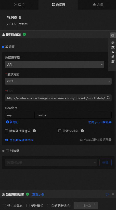
 Data Sources panel
|
Column |
Description |
|
|
The category of each bubble, which maps to the x-axis value. The field type and format must match the data type and format configured for the x-axis. |
|
|
The value of each bubble, which maps to the y-axis. |
|
|
Optional. The size mapping field that maps bubble sizes to data values. |
|
|
Optional. The color mapping field that maps bubble colors to data values. |
|
|
Optional. The shape mapping field that maps bubble shapes to data values. |
|
Configure data items |
Description |
|
Data sources |
You can use the code editor or visual editor to view the data fields contained in the widget. You can also modify the data type to flexibly configure the component data. |
|
Data Mapping |
If you need to customize chart field configurations, set different field mappings in the Data Mapping module to map them to the corresponding widget fields. This lets you match data without modifying the data source fields. Click the |
|
Configure a filter |
Turn on Filter, select an existing data filter or create a data filter, and configure a data filter script to filter data. For more information, see Manage data filters. |
|
Data Response Result |
Displays widget data in real time. When the data source changes, this section shows the latest data. Click the |
|
Forbid Loading |
Select this check box to prevent the widget from displaying loading content during initialization when you update and preview the data dashboard. Cleared by default. |
|
Controlled Mode |
Select this check box to prevent the widget from requesting data during initialization. Data can only be requested through global variables or methods configured in Blueprint Editor. When cleared, automatic data updates are enabled. Cleared by default. |
|
Auto Data Request |
Select this check box to set a polling interval for dynamic data updates. When cleared, you must manually refresh the page or use Blueprint Editor and global variable events to trigger data updates. |
 icon to configure the field style.
  icon to view the data response result, or click the
  icon to fetch the latest data. You can also click View Example to see a sample response.
Advanced Panel
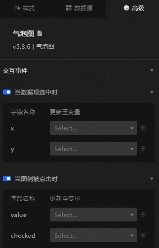
|
Interaction |
Description |
|
When a data item is selected |
Turn on the switch to enable widget interactions. When you click a data item, a temporary variable is thrown. By default, the |
|
When the legend is clicked |
Turn on the switch to enable widget interactions. A temporary variable is thrown when a legend is clicked. By default, the |
Blueprint Interaction
-
Click the
icon in the upper-left corner to go to the Blueprint page. -
On the Layer Nodes tab, add the widget to the main canvas.
-
View blueprint configuration parameters.
-
Event
Event
Description
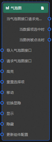
When the bubble chart interface request is completed
Triggered after a data interface request is processed by a filter, returning the processed JSON data. For more information about specific data examples, see the Data Response Result section of the Data Source tab in the right-side configuration panel of the canvas editor.
When a data item is selected
Triggered when a bubble is clicked. The event throws the data item corresponding to the bubble.
When the legend is clicked
Triggered when a legend is clicked. The event throws the corresponding data item.
-
Action
Action
Description
Import a bubble chart
Imports pre-processed data into the widget for redrawing without requesting server data again. For more information about specific data examples, see the Data Response Result section of the Data Source tab in the right-side configuration panel of the canvas editor.
Request bubble chart interface
Requests server data again, using data from an upstream node as parameters. For example, if the API data source is
https://api.testand the data passed to the request bubble chart interface is{ id: '1'}, the final request interface ishttps://api.test?id=1.Highlight
data: the data item to be highlighted.
-
Single highlight
{ x: 'West Lake', y: 8 } -
Bulk Highlight
[
  {
    x: 'West Lake',
    y: 8
  },
  {
    x: 'River',
    y: 3
  }
]
style: Select a style. such as fillStyle, stroke, and opacity. If you do not specify the highlight style, the default style is used.
Reference data example
{
  "data": {},
  "style": {}
}
Reset selections
Clears the selected items. No parameters are required.
Move
Moves the widget to a specified location. See the data example below.
    {
      // The positioning type. to indicates absolute positioning, whereas by indicates relative positioning. The default value is to.
        "positionType": "to",
      // The location, which is indicated by the x and y coordinates.
      "attr": {
        "x": 0,
        "y": 0
      },
      // The animation type.
      "animation": {
        "enable": false,
        // The animation delay. Unit: milliseconds.
        "animationDuration": 1000,
        // The animation curve, which can be set to linear|easeInOutQuad|easeInOutExpo.
        "animationEasing": "linear"
      }
    }
Switch Display /Display
Toggles the visibility of the widget. No parameters are required.
Display
Shows the widget. See the data example below.
{
  "animationType": "",// The animation method. Valid value: fade. If you do not specify this parameter, no animation is generated.
  "animationDuration": 1000,// The animation delay. Unit: ms.
  "animationEasing": ""// animation curve
}
Hide
Hides the widget. See the data example below.
{
  "animationType": "",// The animation method. Valid value: fade. If you do not specify this parameter, no animation is generated.
  "animationDuration": 1000,// The animation delay. Unit: ms.
  "animationEasing": ""// animation curve
}
Update component configurations
Dynamically updates widget style configurations. In the Style panel, click Copy Configuration to Clipboard to get the configuration data, then modify the style field for the data processing node in Blueprint Editor.
-
-
 icon in the upper-left corner to go to the Blueprint page.