Use the Custom Path widget to show an object's path between two points. This topic describes how to add and configure the Custom Path widget.
Chart style
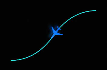
The Custom Path widget lets you set the style and path of a moving object. This provides a clear visualization of the object's entire movement.
Prerequisites
A data dashboard must be created. You can create a dashboard using a template, using a blank canvas, or using AI generation.
Add a custom path component
Access the DataV console.
On the page, click the target dashboard to open the canvas editor.
In the navigation pane on the left, add the Custom Path widget to the canvas as shown in the figure.
You can also add the widget by using global search.
Configure a custom path component
Click the Custom Path widget. In the pane on the right, you can configure the basic styles, advanced configurations such as global variables and interaction occurrences, and blueprint interactions.
Style configuration
The configuration items are described below.
Configuration Item |
Description |
Illustration |
Basic configuration |
Set the widget's position, transparency, and click-through behavior on the data dashboard.
|
|
Global configuration |
Set the movement path and its style. Styles include solid or dashed lines, line thickness, and color. Define the path in one of the following ways:
Note
Scalable Vector Graphics ( |
|
Image configuration |
Set the style of the moving object. You can use a circle, a rectangle, or a custom image. Hover over the image and click Change to upload official design resources or your own local files. You can also set the style of the image or shape, such as its width, height, color, and border thickness.
Note
The style settings vary based on the moving object. Refer to the user interface (UI) for the actual options. |
|
Animation configuration |
Set the animation effects for the path. This includes the direction, duration, path range, and speed.
|
Advanced Configuration
The configuration items are described below.
Configuration Item |
Description |
Diagram |
Interaction occurrence |
Define interaction behaviors with other widgets to enable filter interactions. For example, you can use this widget to display flight information. When the Custom Path widget starts moving, a List Carousel widget can display the current flight's location. Click the |
|
Associate global variables |
Associate global parameters with the widget to pass parameters between widgets for interaction. Click the |
 icon to define interaction occurrences and actions.
 icon to enable an instruction and associate the required
 Blueprint interaction
You can use the Blueprint Editor to define interaction relationships and logic between widgets using visual connections. Follow these steps:
On the canvas editor page, click the
 icon on the left of the top menu bar to open the Blueprint Editor.
In the layer node list, hover over the Custom Path widget and click the
 icon to add the widget to the main canvas.
Use connections to configure the blueprint interaction effects for the widgets as needed.
The following figure shows an example.