Download, install, and log on to the desktop developer tool to manage workspaces and develop, configure, and publish components.
Download and install desktop development tools
-
Log on to the DataV console.
-
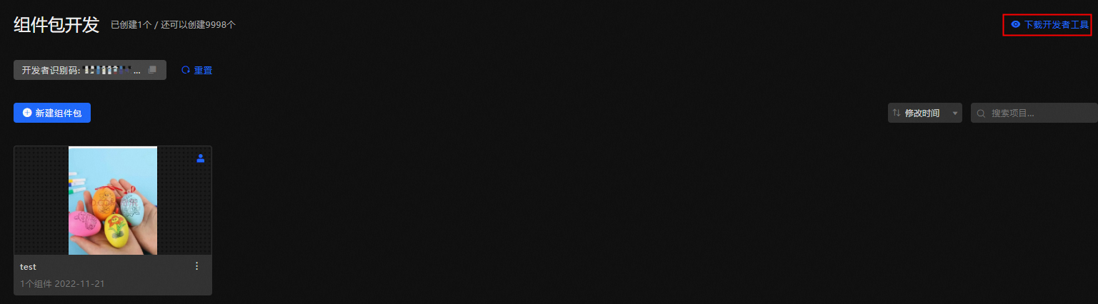
In the Component Development section, click Component Package.
-
Click Download Developer Tools.
-
In the Select Version to Download dialog box, select a version and click Download.
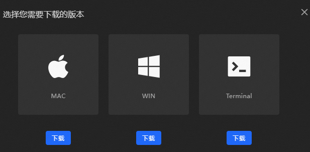
Three versions are available: MAC, WIN, and Terminal:
-
MAC: For macOS.
-
WIN: For Windows.
-
Terminal: For Linux. After you click Download, you are redirected to the Quick Start for Component Development section of the Developer Guide. For more information, see Install the development tool kit.
-
-
(MAC and WIN versions) After the download is complete, double-click the application to install it.
Log on to the desktop development tool
-
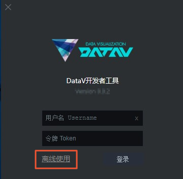
After the installation is complete, double-click the tool to open it. Enter your logon credentials, or choose offline development without logging on.
 Important
The publish feature cannot be used for offline development. Use it with caution.
Parameter
Description
Username
The Alibaba Cloud account used to log on to DataV.
Token
The developer identifier. On the My Widgets tab of the DataV console, click My Widgets, copy the Developer ID, and paste it into the input box.
-
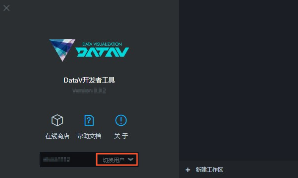
After you log on, click Switch User to return to the logon page.
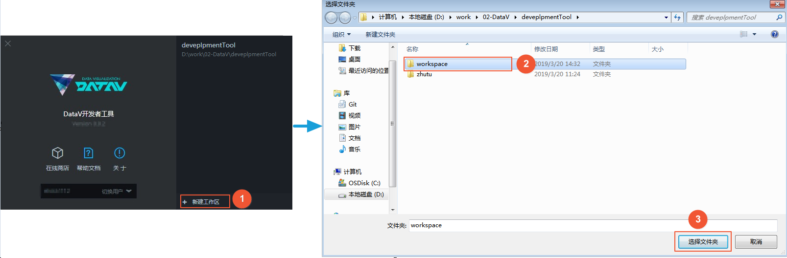
Create Workspace
-
On the Developer Tools page, click + Create Workspace in the lower-right corner.
-
Select a local folder as the package management folder.
-
Click Select Folder to create a workspace.
 Note
Note-
A workspace is a folder that contains multiple components. It can share the same name as an online component package.
-
If a folder that already contains components exists, you can open it directly. The tool automatically identifies DataV components in the folder.
-
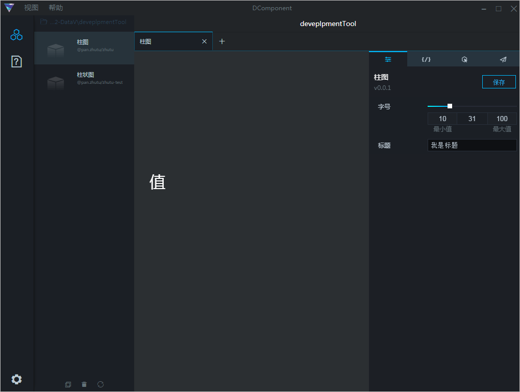
Workspace overview
After the workspace is created, it appears on the right side of the page. Click the workspace name to open it. The workspace page contains four sections: 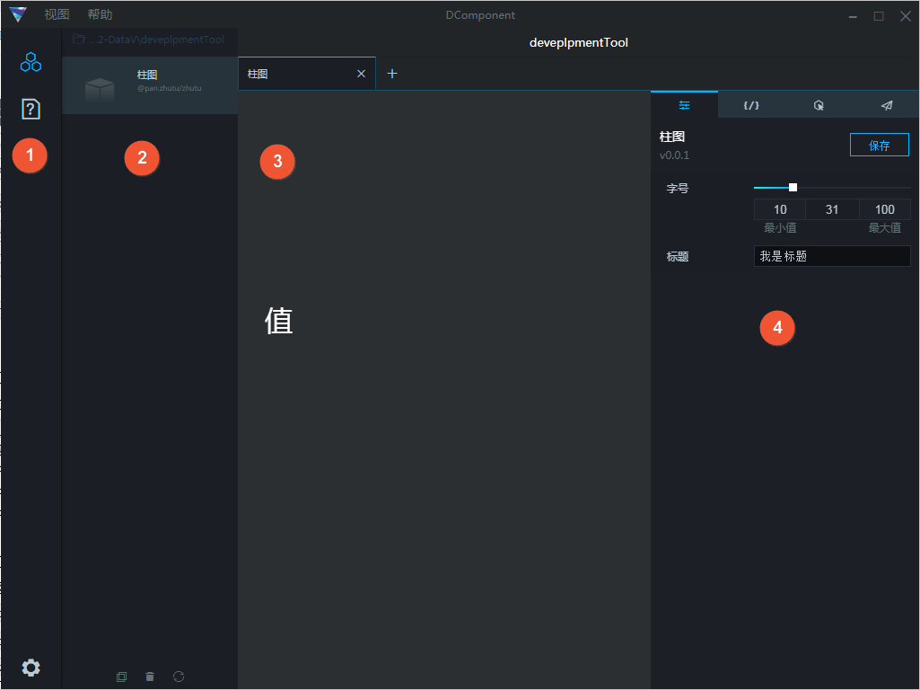
|
No. |
Component |
Description |
|
1 |
Sidebar |
Provides options to hide the component bar, view help documents, and log out. |
|
2 |
Component Bar |
Lists and manages widgets.
|
|
3 |
Canvas |
|
|
4 |
Component configuration bar |
Includes four panels: Configuration, Data, Interaction, and Publish.
|
Delete a workspace
In the workspace list, move the pointer over a workspace and click the X in the upper-right corner to delete the workspace. 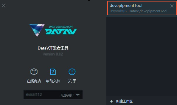
Create a component
-
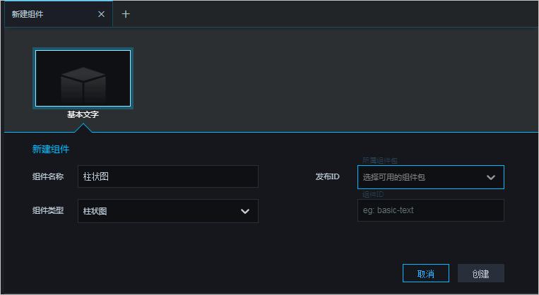
Click + Create Component on the right side of the workspace page, or use the Ctrl + N shortcut key to create a component.
After the widget is created, it appears on the Create Widget page as a basic text widget.
-
Click the Basic Text component and configure the component as described in the following table.

Parameter
Description
Component Name
Enter a name for the component.
Component Type
Select a component type from the drop-down list.
Publish ID
Select an available widget package from the drop-down list. If no widget package is available, click Custom to open the DataV console and create one. For more information, see Manage widget packages.
Component ID
Enter the component ID, for example, basic-text.
-
Click Create to create the widget.
After the widget is created, you can view it in the center canvas and configure it in the right-side configuration pane.
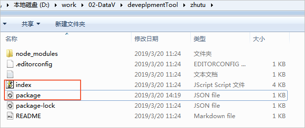
After the component is created, the index.js and package.json files are generated in the local component package folder. You can customize the component configuration items by editing these two files. For more information, see Component Development Package File Overview.
Preview a widget
After you create a widget, click it in the widget list on the left side to preview its style in the center canvas area.
Copy /Delete /Rename /View Component Details
Right-click a component and choose Make Copy, Delete, Rename, or Show Properties to copy, delete, rename, or view the details of the component.
You can also select a component and click the Copy Component or Delete Component icon in the lower part of the component bar to copy or delete the component. 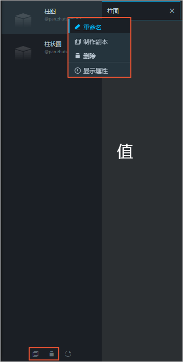
Refresh Workspace
Click the Refresh Workspace icon ( ) to refresh the workspace. After you modify component configuration items, use this feature to display the latest settings.