A ticker board displays values, counts, or time. It can interact with other widgets to show real-time data changes. This topic explains how to use the ticker board widget.
Widget overview
Scenarios
Ticker boards are used for clocks, timers, and counters. In finance, they display monetary amounts. Businesses use them to show key metrics. For example, you can display a business metric to quickly identify operational issues by observing its changes.
Demonstration
A ticker board usually consists of a title, a prefix or suffix, and the ticker content. The following example uses a ticker board to show the daily sales amount for a region.

Limits
The ticker board content only supports the Number type. If your data is not a Number type, the platform treats the content as an abnormal character and automatically replaces it with specified content. For more information, see Abnormal character processing.
Prerequisites
Create a data dashboard. You can use a template, use a blank canvas, or use AI to generate one.
Your business data is prepared. For more information, see Data Source.
Add a ticker board
Log on to the DataV console.
On the Workbench page, in the Data Dashboards area, hover over the target dashboard and click Edit. The canvas editor opens.
In the navigation pane on the left, under , click the Ticker Board widget to add it to the canvas.
You can also add the widget using the global search feature.
Connect to business data
After you add the widget, connect your business data to it. Click the ticker board. On the Data Source tab on the right, select the data for the widget.
The following table describes the data fields that the ticker board accepts.
Field
Description
name(Optional) The title of the ticker board. If not empty, this value overwrites the configuration in the Style tab. If empty, the content in the field is used.
valueThe specific numeric value for the ticker board.
prefix(Optional) The prefix for the ticker board. If not empty, this value overwrites the configuration in the Style tab. If empty, the content in the field is used.
suffix(Optional) The suffix for the ticker board. If not empty, this value overwrites the configuration in the Style tab. If empty, the content in the field is used.
The following code shows an example data structure and the resulting ticker board.
[
 {
 "name": "This is the title",
 "value": 232425
 }
]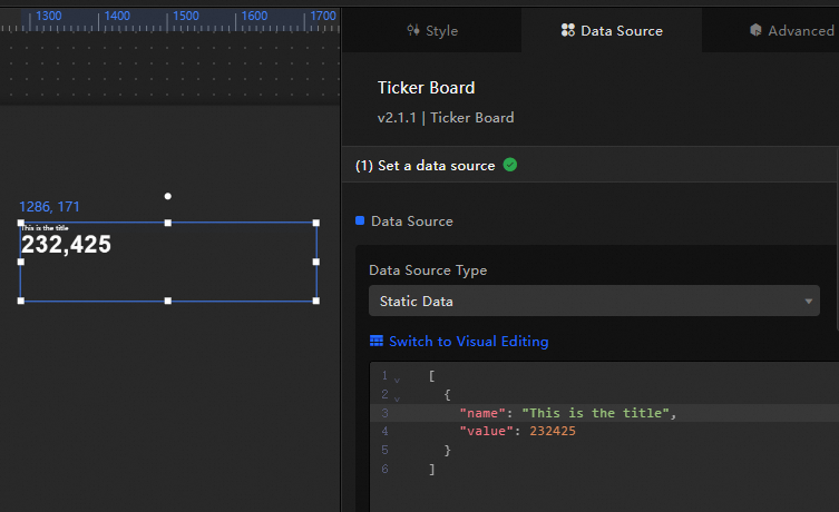
This section describes the core configuration items for the data source.
Configuration
Description
Select Data Source
Supports various data types, such as CSV files, APIs, and different databases. For more information, see Supported data source types. Edit data fields in a visual table or in code.
Configure Filter (Optional)
Customize filter code to transform, filter, display, and perform simple calculations on data. For more information, see Manage data filters.
Configure Data Mapping
Map fields from the selected data source to the widget's fields. This enables real-time data matching. Click the
 icon to configure field styles.
View Response Result
Displays the data connected to the widget in real time. When the widget's data source changes, this section shows the latest data.
Click the data response result to view the data field code.
Click View Example to see the array type and sample code that the data source accepts. You can write your fields based on the example.
Other data request configurations:
Disable Loading State: If you check this box, the widget's initial loading content does not appear when the widget updates or when you preview the data dashboard.
Controlled Mode: If you check this box, the widget does not request data when it initializes. Data requests can only be started by the blueprint editor or by global variable events.
Auto Update Request: If you check this box, the platform polls for data updates at the interval you set. If you do not check this box, you must refresh the page manually or use the blueprint editor or global variable events to trigger data updates.
Configure the ticker board
Style configuration
You can configure the ticker board's style in two modes: basic and full. You can switch between modes at the top of the Style tab. Basic mode includes only color and text settings. Full mode offers more comprehensive options. This topic describes the full configuration settings.
You can also click the
 icon and search for keywords to quickly find a configuration. The search supports fuzzy matching. For more information, see Search for configuration items.
The title, prefix, and suffix can also be set in the data source. The platform prioritizes the data source settings. If the data source fields are empty, the style settings are used.
The following describes the relevant configuration items.
Configuration | Description | Illustration |
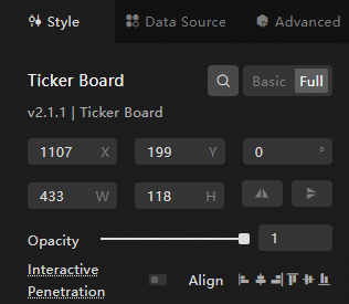
Global Configuration | Defines the widget's position, transparency, and interaction passthrough in the data dashboard.
|
|
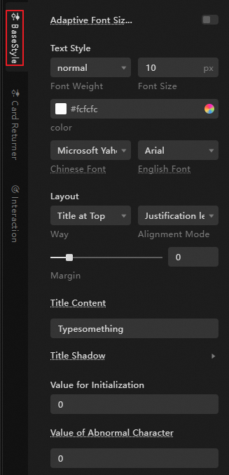
Basic Style Configuration | Defines the size, color, and shadow effect of the title text, the relative position and spacing between the title and the ticker board, and the automatic font size adjustment for the ticker board. It also supports customizing the display content during initialization and when abnormal characters appear.
|
|
Ticker Board Configuration | Defines the overall layout of the ticker board content (including numbers, prefixes, and suffixes), the style and layout of the numbers, and the font style and shadow effects of the prefixes and suffixes. Number configuration details:
|
|
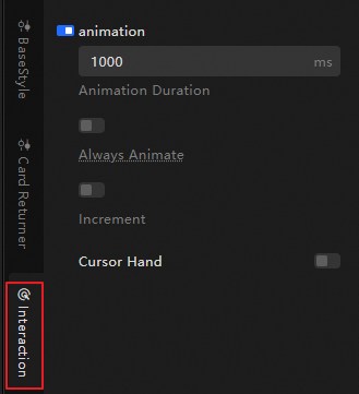
Interaction Configuration | Sets the animation effects, such as animation duration and data jitter correction, and the cursor style for the ticker board.
|
|

Advanced configuration
You can define interactions and data transfer between the ticker board and other widgets. The following table describes the configurations.
Configuration | Description | Legend |
Interaction Event | Define interaction behaviors with other widgets to enable widget filter interaction. For example, you can use a ticker board to connect to a sales data table for multiple stores in the current region. When the store sales data changes, the ticker board displays the total daily sales amount for the current region in real time. Click the |
|
Associate Global Variable | Associate global parameters with the widget to pass data between widgets. Click the |
 icon to define relevant interaction occurrences and actions.
 icon to enable an instruction and associate a
 Blueprint interaction
You can use the blueprint editor to visually define interactions and logic between widgets by connecting nodes.
Procedure
In the canvas editor, click the
 icon on the left side of the top menu bar to open the blueprint editor.
In the layer node list, hover over the ticker board widget and click the
icon to add the widget to the main canvas.You can use connections to configure the blueprint interaction effects for the relevant widgets as needed.
The following figure shows an example.
 icon on the left side of the top menu bar to open the blueprint editor.
 icon to add the widget to the main canvas.
Configuration description
Demo
For an example of how to use the ticker board, see Implement dynamic data summation.