ECharts gauge
Configure the style, data source, and blueprint interaction settings for the ECharts gauge widget.
Chart style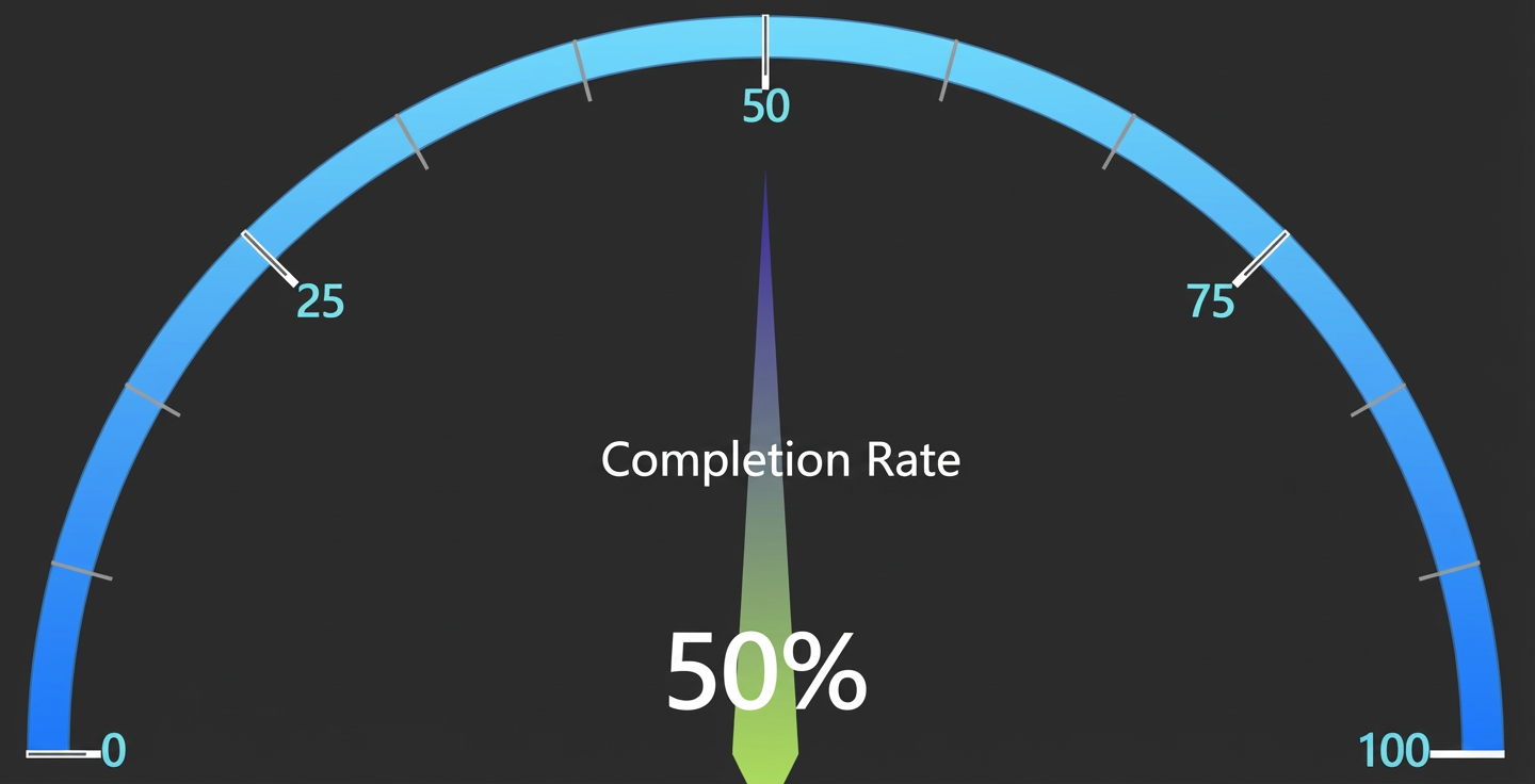
Style panel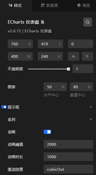
-
Search Configuration: Click the Style icon
 in the upper right corner of the panel to enter the name of the configuration item you wish to locate in the search field. The system supports fuzzy matching. For more information, see Search configuration item.
 -
Size: The width and height of the component in pixels (px).
Position: The component's x-coordinate and y-coordinate in pixels (px). The x-coordinate is the horizontal distance from the page's left edge to the component's top-left corner. The y-coordinate is the vertical distance from the page's top edge to the component's top-left corner.
Rotation: The rotation of the component around its center point, in degrees (°).
Enter an angle value to control the component's rotation.
Click the
 icon to flip the component horizontally.
Click the
 icon to flip the component vertically.
Opacity: The value ranges from 0 to 1. A value of 0 is completely transparent, while a value of 1 is fully opaque. The default is 1.
Interaction passthrough: When enabled, mouse interactions pass through this component, preventing it from blocking interactions with other components layered underneath it on a dashboard.
Alignment: The alignment of the component within the editor.
-
Chart: Click + or -, or enter a percentage value to adjust the Horizontal Center and Vertical Center of the gauge.
-
Tooltip: Click the eye icon to toggle the tooltip.
-
Trigger condition: Trigger type. Options: Trigger on mouse move, Trigger on mouse click, and Trigger on mouse move and click.
-
Background color: Select the tooltip background color from the Color picker.
-
Border color: Select the tooltip border color from the Color picker.
-
Border width: You can set the border width of the background box by clicking + or -, or by entering a value.
-
Padding: Background box padding in pixels. Default: 5 for all sides. Adjust using + or -, or enter a value.
-
Text style
-
Color: Select the tooltip text color from the Color picker.
-
Font style: The font style of the tooltip text.
-
Font weight: The font weight of the tooltip text.
-
Font: The font family of the tooltip text.
-
Font size: The font size of the tooltip text.
-
-
-
Series
-
Name: The name of the gauge.
-
Radius: Gauge radius as a percentage of the smaller container dimension.
-
Start angle: Gauge start angle. Adjust using + or -, or enter a value.
-
End angle: Gauge end angle. Adjust using + or -, or enter a value.
-
Clockwise: When enabled, gauge values increase clockwise.
-
Minimum: Gauge minimum value. Adjust using + or -, or enter a value.
-
Maximum: Gauge maximum value. Adjust using + or -, or enter a value.
-
Segments: Number of gauge segments. Adjust using + or -, or enter a value.
-
Static: When enabled, the gauge is static and non-interactive.
-
Axis line
-
Axis line style
-
Axis line segments: You can click the
 or icon to add or delete a segment style. You can click the or icon to arrange multiple segment styles. You can click the icon to copy the selected segment style and add a new one with the same configuration.
-
Position: Click + or -, slide the bar, or enter a value to adjust the position of the gauge segment.
-
Color: Select the segment color from the Color picker.
-
-
Width: Click + or -, or enter a value to set the segment width.
-
Opacity: Click + or - to adjust the opacity of the segment, or enter a value between 0 and 1.
-
-
-
Line separator: Click the eye icon to toggle the line separator.
-
Length: Click + or -, or enter a value to set the line separator length.
-
Line style
-
Color: Select the line separator color from the Color picker.
-
Width: Click + or -, or enter a value to set the line separator width.
-
Type: The type of the line separator, which can be Solid line or Dashed line.
-
Opacity: Click + or - to adjust the opacity of the line separator, or enter a value from 0 to 1.
-
-
-
Tick: Click the eye icon to toggle tick visibility.
-
Segments: Display interval of axis ticks for category axes. Adjust using + or -, or enter a value.
-
Length: Axis tick length. Adjust using + or -, or enter a value.
-
Line style
-
Color: Select the tick line color from the Color picker.
-
Width: Enter a value or click + or - to set the width of the tick lines.
-
Type: The type of the tick lines, which can be Solid line or Dashed line.
-
Opacity: Click + or -, or enter a value to adjust the opacity of the tick lines. The value can range from 0 to 1.
-
-
-
Tick label: Click the eye icon to toggle tick labels.
-
Distance: Distance between tick labels and the axis line.
-
Text style
-
Color: Select the tick label color from the Color picker.
-
Font style: The font style of the tick label text.
-
Font weight: The font weight of the tick label text.
-
Font: The font family of the tick label text.
-
Font size: The font size of the tick label text.
-
-
-
Gauge pointer: Click the eye icon to toggle the pointer.
-
Length: Sets the length of the gauge pointer.
-
Width: Sets the width of the gauge pointer.
-
-
Item Style
-
Normal
-
Color: Select the default item color from the color picker.
-
Border color: Select the pointer border color (normal state) from the Color picker.
-
Border width: Click + or -, or enter a value to set the border width for a normal item.
-
Border style: The style of the border outline. Options include Solid line and Dashed line.
-
Opacity: Click + or -, or enter a value from 0 to 1 to change the opacity of the normal item.
-
-
Key Items
-
Color: Select the highlighted element background color from the color picker.
-
Border Color: Select the key item border color from the color picker.
-
Border width: Click + or -, or enter a value to change the border width of the emphasized item.
-
Border style: Specifies the style of the border. Options include Solid line and Dashed line.
-
Opacity: Click + or -, or enter a value from 0 to 1 to adjust the opacity of the item.
-
-
-
Title: Click the eye icon to toggle the title.
-
Horizontal offset: Horizontal offset of the title. Range: -200 to 200. Adjust using + or -, or enter a value.
-
Vertical offset: Vertical offset for the title. Range: -200 to 200. Adjust using + or -, or enter a value.
-
Text style
-
Color: Select the title text color from the Color picker.
-
Font style: The font style of the title text.
-
Font weight: The font weight of the title text.
-
Font: The font family of the title text.
-
Font size: The font size of the title text.
-
-
-
Detail: Click the eye icon to toggle the detail display.
-
Unit: Sets the unit for the detail text.
-
Width: Click + or -, or enter a value to adjust the detail's width.
-
Height: Click + or -, or enter a value to adjust the height.
-
Horizontal offset: Click + or -, or enter a value to set the horizontal offset. The value can range from -200 to 200.
-
Vertical offset: Click + or -, or enter a value to adjust the vertical offset. The value must be between -200 and 200.
-
Background color: Detail text area background color. Default: transparent. Select a color from the Color picker.
-
Border width: Click + or -, or enter a value to adjust the border width.
-
Border color: Detail text area border color. Default: transparent. Select a color from the Color picker.
-
Text style
-
Color: Select the detail text color from the Color picker.
-
Font style: The font style of the detail text.
-
Font weight: The font weight of the detail text.
-
Font: The font family of the detail text.
-
Font size: The font size of the detail text.
-
-
-
-
Animation: When enabled, animation effects play.
-
Animation threshold: Animation threshold in milliseconds. If the graphic count in a single series exceeds this value, animation is disabled to prevent crashes. Adjust using + or -, or enter a value.
-
Animation duration: Initial animation duration in milliseconds. Adjust using + or -, or enter a value.
-
Easing effect: Easing effect for data update animation. Default: cubicOut.
 or
or  icon to add or delete a segment style. You can click the
  or
or  icon to arrange multiple segment styles. You can click the
  icon to copy the selected segment style and add a new one with the same configuration.
Data source panel
|
Field |
Description |
|
|
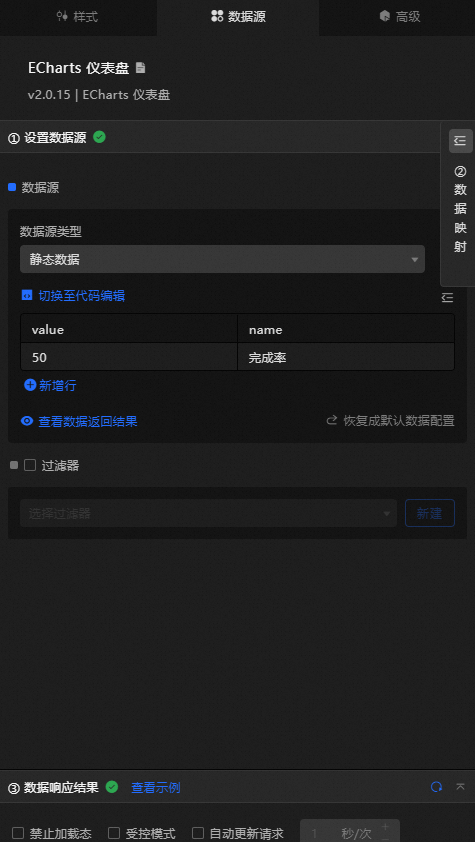
Configures the name of each gauge part. |
|
|
Configures the value of each gauge part. |
|
Data Item Configuration |
Description |
|
Data Source |
The component's data source displays the data fields contained within the component using code editing or visual editor. You can also modify the data type to flexibly configure the component's data. |
|
Data Mapping |
When you need to customize chart field configurations, you can set different field mappings in the Data Mapping module to map these fields to the corresponding fields of the component. This allows for real-time data matching without altering the data source fields. Additionally, click the |
|
Filter |
Open the Filter to select an existing data filter or create a new one, and configure the data filter script to achieve data filtering capabilities. For more information, see manage data filters. |
|
Data Response Result |
This feature displays the component's data in real-time. When the component's data source changes, the data response result will display the latest data accordingly. In case of a delayed system response, you can click the |
|
Disable Loading State |
Check the check box to hide the loading content during component updates and data dashboard previews. Unchecking will display the loading content. The default setting is unchecked. |
|
Controlled Mode |
Check the check box to prevent data requests upon the component's initialization. Data requests will only be initiated through global variables or methods configured in the blueprint editor. Unchecking allows for automatic update requests. The default setting is unchecked. |
|
Automatic Update Request |
Check the check box to manually set the polling frequency for dynamic polling. Clearing this option disables automatic updates, requiring manual page refreshes or data request triggers through the blueprint editor and global variable events for updates. |
 icon to configure field styles individually.
 icon on the right to check the current data response result, or click the
  icon on the right to obtain the most recent data for the component. You can also click to view examples to see sample response results for the current component.
Advanced panel
This widget does not have any interaction events.
Blueprint interaction
-
Click the
icon in the upper-left corner to open the Blueprint page. -
On the Layer Node tab, you can add the current widget to the main canvas.
-
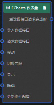
View the Blueprint configuration parameters.
-
Events
Event
Description
When data API request is complete
An event thrown after the data API request returns and is processed by the filter. Outputs the processed data in JSON format. For a data example, check the Data response area on the Data Source tab of the widget configuration panel.
-
Actions
Action
Description
Request data API
Re-requests data from the server. Data from input data processing nodes or layer nodes is used as parameters. For example, if a gauge's API data source is
https://api.testand the data passed to the Request data API action is{ id: '1'}, the final request URL ishttps://api.test?id=1.Import data API
Imports data in the widget's drawing format to redraw it without re-requesting data from the server. For a data example, check the Data response area on the Data Source tab of the widget configuration panel.
Move
Moves the widget to a specified position. See the data example.
 {
      // Movement type. Absolute positioning: to, relative positioning: by. Default: to.
        "positionType": "to",
      // Specified position. x-coordinate, y-coordinate.
      "attr": {
        "x": 0,
        "y": 0
      },
      // Animation method.
      "animation": {
        "enable": false,
        // Animation delay.
        "animationDuration": 1000,
        // Animation curve. Optional values: linear|easeInOutQuad|easeInOutExpo.
        "animationEasing": "linear"
      }
    }
Toggle visibility
Toggles the widget's visibility. No parameters are needed.
Show
Shows the widget. See the data example.
{
  "animationType": "",// Animation type, optional value: fade. If left blank, there is no animation.
  "animationDuration": 1000,// Animation delay, in ms.
  "animationEasing": ""// Animation curve
}
Hide
Hides the widget. See the data example.
{
  "animationType": "",// Animation type, optional value: fade. If left blank, there is no animation.
  "animationDuration": 1000,// Animation delay, in ms.
  "animationEasing": ""// Animation curve
}
Update widget configuration
Dynamically updates the widget style configuration. On the widget's Style panel, click Copy configuration to clipboard to get the configuration data, then modify the field values in the Blueprint editor's data processing node.
-
 icon in the upper-left corner to open the Blueprint page.