AMAP basemap layer (v4.x)
Configure the AMAP basemap layer, including style templates, display content, and filters.
Chart style
The AMAP basemap layer is a sub-widget of Basic Flat Map 4.0 that supports independent style and interaction settings, including basemap templates, display content, and filters. You can use the latest AMAP online map as a basemap and customize its style.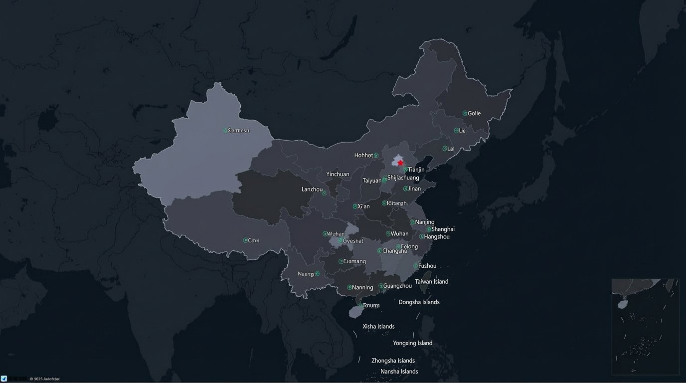
Style panel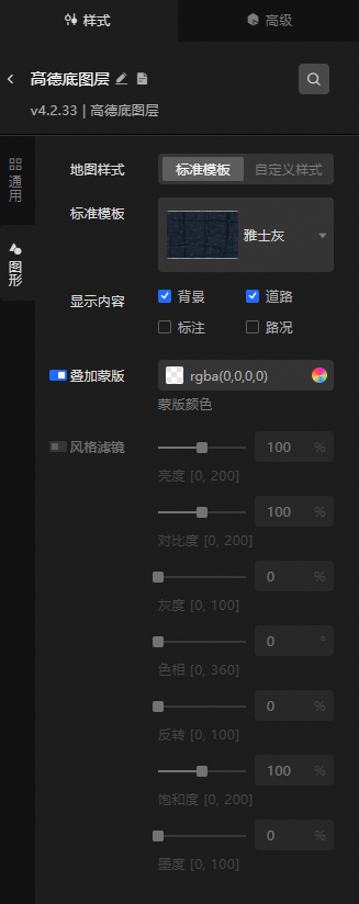
-
Search Configuration: Click the
 icon in the upper-right corner of the Style panel to search for configuration items by name. Fuzzy matching is supported. Search for a configuration item.
 -
General: General parameters of the AMAP basemap layer.
Parameter
Description
Visibility Level
The visibility level of the AMAP basemap layer. Valid values: 0 to 20. The basemap layer is visible only within the specified level range.
Opacity
The opacity of the AMAP basemap layer. Valid values: 0 to 100%. A higher value makes the map more opaque.
-
Graphic: Graphic style parameters of the AMAP basemap layer.
Parameter
Description
Map Style
The map style. Valid values: Standard Template and Custom Style.
Standard Template
The predefined map style template. Valid values: Standard, Phantom Black, Indigo Blue, Midnight Blue, Elegant Gray, Moonlight Silver, Grass Green, Graffiti, Distant Mountain, Macaron, and Wine. This is configurable only when you set Map Style to Standard Template.
AMAP Key/AMAP Secret Key
The AMAP Key that you requested. This parameter is configurable only when Map Style is set to Custom Style.
NoteYou must request an AMAP key first. Follow these steps.
-
Register an AMAP account: Go to the AMAP Open Platform and register as an AMAP developer.
-
Obtain an AMAP Key:
-
Log on to the AMAP Open Platform console. Click Application Management > My Applications > Create New Application. Enter an Application Name, select an Application Type, and then click Create.
-
Click Add Key on the right side of the application list. In the dialog box that appears, enter a Key Name, select a Service Platform, select the checkbox to agree to the terms of service at the bottom of the page, and then click Submit.
-
After you submit the request, the AMAP Open Platform automatically generates a Key. You can view the Key on the My Applications page. Copy and save the Key.
-
Return to the DataV console. Paste the AMAP Key into the AMAP Key text box. The AMAP online map then becomes the basemap of the Basic Flat Map.
-
ImportantIf a screen contains multiple AMAP online basemap layers, they must have the same AMAP Key and AMAP Secret Key.
Map Style ID
The custom map style ID. This parameter is configurable only when Map Style is set to Custom Style.
NoteYou must create a custom map on the AMAP Open Platform and obtain a map style ID. Follow these steps.
-
Log on to the AMAP Open Platform console. Click GeoHUB Custom Map > Custom Map > Create Map from Template. Select a template and click Use This Template.
-
After the template is created, you can customize its configuration.
-
After you complete the configuration, click the
 icon (Save) in the upper-right corner. After the map is saved, click the
  icon (Publish).
 -
After the map is published, the Published dialog box appears. Click Back to Console to return to the custom map page.
-
On the custom map page, click Use and Share below the map style that you published.
-
On the Use and Share page, click Copy next to the style ID.
-
Paste the copied style ID into the Amap Basemap Layer > Style > Graphic > Map Style ID text box in DataV. Click an empty area in the configuration panel, and the basemap layer style takes effect.
Display Content
The content to display on the map. Valid values: Background, Roads, Labels, and Traffic.
Overlay Mask
The color of the overlay mask applied to the AMAP basemap layer.
Style Filter
Click the
 icon on the left to enable style filters. After you enable this feature, you can adjust the Brightness, Contrast, Grayscale, Hue, Invert, Saturation, and Sepia of the basemap layer.
To use a default style, set the Map Style ID parameter to a Style ID from the following table.
Style Name
Style ID
Standard
normal
Phantom Black
dark
Indigo Blue
blue
Midnight Blue
darkblue
Elegant Gray
grey
Moonlight Silver
light
Grass Green
fresh
Graffiti
graffiti
Distant Mountain
whitesmoke
Macaron
macaron
Wine
wine
-
 icon on the left to enable style filters. After you enable this feature, you can adjust the Brightness, Contrast, Grayscale, Hue, Invert, Saturation, and Sepia of the basemap layer.
Advanced panel
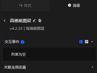
Configure interaction events or associate global variables for filter interactions between widgets. Configure widget interactions.
Interactive map floor mode is available only when the Standard Template style is selected.
Blueprint interaction
-
Click the
icon in the upper-left corner of the page to open the Blueprint page. -
On the Layer Node tab, add the current widget to the main canvas.
-
View the Blueprint configuration parameters.
NoteClick the
icon in the anchor point area on the right to view event and action parameter tooltips.-
Events
Event
Description
Widget loaded
Triggered after the data API request is complete and the data is processed by the filter. The event passes the processed data in JSON format. For an example, see the Data Response Result area on the Data Source tab in the widget's configuration panel.
-
Actions
Action
Description
Toggle Visibility
The Toggle Visibility, Show, and Hide actions do not require parameters by default. You can add animation configurations as needed. See the data example.
{
  // Animation type. Optional values: appear|fade|slideToUp. The default is fade. If left blank, there is no animation.
  "animationType": "fade",
  // Animation duration. The default is 1000 ms.
  "animationDuration": 1000,
  // Animation curve. Optional values: linear|easeInOutQuad|easeInOutExpo. The default is linear.
  "animationEasing": "linear"
}
Show
Hide
Update Widget Configuration
Dynamically updates the widget style. In the widget's Style panel, click Copy Configuration to Clipboard to obtain the configuration data. Then, modify the style field values in a data processing node in the Blueprint editor as needed.
-
 icon in the upper-left corner of the page to open the Blueprint page.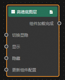
 icon in the anchor point area on the right to view event and action parameter tooltips.