Configure all available settings for the horizontal capsule histogram widget, including chart style, data sources, and interaction options.
Chart style
A horizontal capsule histogram is a type of bar chart that displays multi-dimensional data differences in a compact dashboard space. It supports custom x-axis intervals, multi-series data configuration, and stacked data display. 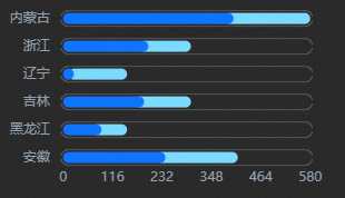
Style Panel 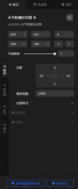
-
Search Configuration: Click the Search configuration items icon
 in the upper-right corner of the Style panel to search for a configuration item by name. Fuzzy match is supported. For more information, see Search configuration items.
 -
Size: the width and height of the widget, in pixels.
-
Positioning: the x-axis and y-axis coordinates of the widget, in pixels. X-coordinate is the pixel distance between the upper-left corner of the widget and the left border of the canvas. Y-coordinate is the pixel distance between the upper-left corner of the widget and the upper border of the canvas.
-
Rotate: the rotation angle of the widget in degrees.
-
Enter the rotation angle directly in the spin box, or click the plus sign (+) or minus sign (-) to adjust the value.
-
Click the
 icon to flip the widget horizontally.
 -
Click the
 icon to flip the widget vertically.
-
-
Opacity: Valid values: 0 to 1. A value of 0 hides the widget. A value of 1 displays the widget at full opacity. Default value: 1.
-
Chart name
-
Margin: the distance between the chart area and the widget boundaries. Unit: px.
-
Maximum Load: the maximum number of data records to load. The system loads up to this number of records for layout, drawing, and computing to ensure visual performance.
-
column chart Style: the style of each column in the chart.
Parameter
Description
Column spacing
The distance between the column and the capsule shell. Valid values: 0 to 10. Unit: px.
The color of the font outline. For more information, see Color setting parameters.
The color of the capsule column stroke. For more information, see color picker instructions.
Frame Color
The color of the capsule outer border. Modify it by using the color picker instructions.
Frame thickness
The thickness of the outer border of the capsule.
-
Value Label: the style of the value label on each column. Click the
 icon to show or hide value labels.
 Parameter
Description
Text
The font style, text weight, font size, and color of the value label text.
Location
The position of the value label text. Valid values: Left, Middle, Right, and Right Outside.
Null data
When enabled, value labels are displayed even when column data is null. When disabled, value labels are hidden for null data.
-
Legend: the legend style of the chart. Click
the icon to show or hide the legend. Parameter
Description
Text
The font style, text weight, font size, and color of the legend text.
Layout
The layout of multiple legends relative to each other.
-
Spacing
-
Left and Right Spacing: the horizontal distance between adjacent legends. This setting only takes effect when multiple series exist.
-
Distance: the vertical distance between the legend and the widget or chart boundaries.
-
-
Position: the position of the legend relative to the start coordinates of the widget. Valid values: Top Left, Top Center, Top Right, Bottom Left, Bottom Center, and Bottom Right.
-
-
-
Axis: You can select x-axis or y-axis.
-
X Axis
-
X Axis Visible: toggle the visibility of the x-axis in the widget.
-
Range: the range of the maximum value on the x-axis.
Maximum Value: the maximum value on the x-axis. You can enter a custom value or select from available options.
-
Maximum Data Value: the maximum value in the data.
-
Automatic Rounding: automatically calculates the maximum value, minimum value, and the number of metric points from the data.
-
-
Axis Label: the label style of the x-axis. Click the
icon to show or hide axis labels. Parameter
Description
Display Format
The display format of the x-axis labels. Valid values: Default, 11 (integer), 11.1 (floating-point), 11.11 (floating-point), 11%, 11.1%, and 11.11%. For more information about data display formats, see Data display formats.
Text
The font style, weight, font size, and color of the x-axis label text.
Axis Label Display
The number and units of the x-axis labels.
-
Axis: the style of the x-axis line. Click
the icon to show or hide the x-axis. Color: the color of the x-axis.
-
Gridlines: the style of x-axis gridlines. Click the
icon to show or hide gridlines. Color: the color of the x-axis grid lines.
-
-
Y-axis
-
Y Axis Visible: toggle the visibility of the y-axis in the widget.
-
White Space: the distance between the upper and lower sides of the y-axis. Valid values: 0 to 1.
-
interval: the spacing between columns on the y-axis. A larger value produces thinner columns with wider gaps. Valid values: 0 to 0.95.
-
Axis Label: the label style of the y-axis. Click the
icon to show or hide axis labels. Parameter
Description
Text
The font style, text weight, font size, and color of the y-axis label text.
Axis Label Display
The angle of the y-axis label. Valid values: Horizontal, Tilt, and Vertical. The number and units of the y-axis labels.
-
Axis: the style of the y-axis line. Click
the icon to show or hide the y-axis. Color: the color of the y-axis.
-
Gridlines: the style of y-axis gridlines. Click the
icon to show or hide gridlines. Color: the color of the grid lines on the y-axis.
-
-
-
Edition
data series: Click the
or icon on the right to add or delete a data series. Click the or icon to configure the arrangement style of multiple data series. Click the icon to copy the selected data series configurations and add a data series with the same configurations. Parameter
Description
Series Name
The name of the data series. You can enter a custom name. If left empty, the value of the s field in the component data is used as the series name. If a custom name is specified, ensure the data is returned in the correct order.
Color
The column colors for this series.
-
Remarks
-
Easement Animation: the animation effect of the chart. Click the
icon to enable or disable the animation effect. Parameter
Description
Animation Settings
-
Easement Effect: the easing effect of the animation. Multiple common easing effects are available.
-
Sequential animation of each series: When enabled, each series plays the animation in sequence. When disabled, all columns play the animation simultaneously.
Admission Animation
The duration of the initial rendering animation. Unit: ms.
Update Animation
-
Update Animation Duration: the duration of the animation when the widget data is updated. Unit: ms.
-
Start From Previous Position: When enabled, the animation starts from the previous position when data updates. When disabled, the animation starts from the initial position.
-
-
dialog box: the style of the tooltip that appears when you hover over or click a column on the preview or publish page. Click
the icon to enable or disable the tooltip. Parameter
Description
Disappearing Delay Time
The delay before the tooltip disappears after the trigger condition is no longer met. Unit: ms.
Trigger
-
Trigger Type: the target type that triggers the tooltip. Valid values: Data Item and Axis.
-
Trigger Action: the action that triggers the tooltip. Valid values: Hover and Click.
Text Style
The text style of the tooltip, including font style, weight, font size, and color.
Background Box Style
The background style of the tooltip.
-
Background Color: the background color of the tooltip.
-
Custom: the width and height of the tooltip, in pixels. Click the
icon to enable or disable custom sizing. -
Pin: the inner margin of the tooltip, in pixels.
-
Offset
-
Horizontal Offset: the horizontal offset of the tooltip relative to the cursor. Unit: px.
-
Vertical Offset: the vertical offset of the tooltip relative to the cursor. Unit: px.
-
-
Borders
-
Border: the border thickness of the tooltip, in pixels.
-
Border Color: the border color of the tooltip.
-
-
-
 icon to show or hide value labels.
  or
or  icon on the right to add or delete a data series. Click the
  or
or  icon to configure the arrangement style of multiple data series. Click the
  icon to copy the selected data series configurations and add a data series with the same configurations.
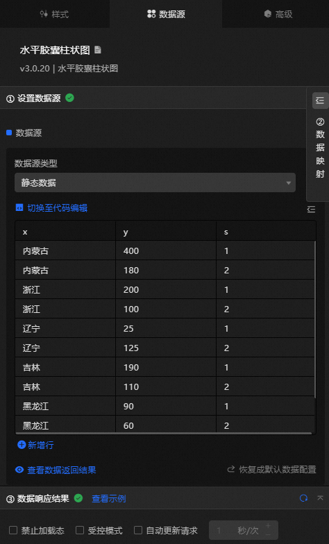
 Data Sources panel
|
Field |
Description |
|
|
The category of each column in the column chart. |
|
|
The value of each column in the column chart. |
|
|
Optional. The data of the corresponding series. |
|
Configure data items |
Description |
|
DataSource |
You can use the code editor or visual editor to view the data fields of the widget. You can also change the Data Type to configure the component data source. |
|
Data Mapping |
To customize chart field configurations, set field mappings in the Data Mapping module to map data to the corresponding widget fields without modifying the data source. Click the |
|
Configure a filter |
Turn on Filter, select an existing data filter or create a data filter, and configure a data filter script to filter data. For more information, see Manage data filters. |
|
Data Response Result |
Displays the widget data in real time. When the data source changes, this section shows the latest data. If the response is delayed, click the |
|
Forbid Loading |
When selected, loading indicators are hidden during component initialization and data preview updates. When cleared, loading indicators are displayed. This check box is cleared by default. |
|
Controlled Mode |
When selected, the widget does not request data during initialization and only requests data through global variables or methods configured in Blueprint Editor. When cleared, data is requested automatically. This check box is cleared by default. |
|
Auto Data Request |
Select this check box and enter a polling interval to enable automatic data refresh. When cleared, the page does not auto-update. You must manually refresh the page or use Blueprint Editor and global variable events to trigger data updates. |
 icon to configure the field style.
  icon to view the data response result, or click the
  icon to refresh the data. You can also click View Example to view a sample response.
 Advanced Panel
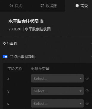
When you click a data item: Enable this switch to activate widget interaction. When a column is clicked, a data request is triggered and a temporary variable is emitted to dynamically load data for different columns. By default, the x, y, and s values from the data are emitted. For more information, see Component interaction configuration.
Blueprint Interaction
-
Click the
icon in the upper-left corner to go to the Blueprint page. -
On the Layer Nodes tab, add the widget to the main canvas.
-
View blueprint configuration parameters.
-
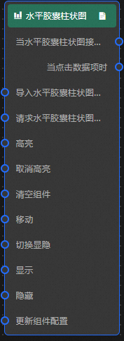
Event
Event
Description
When the horizontal capsule histogram request is completed
This event is triggered with the processed JSON data after a data interface request is completed and processed by a filter. For specific data examples, see the Data Response Result section on the Data Source tab in the right-side configuration panel of the canvas editor.
When a data item is clicked
The event raised when a column is clicked, along with the data item corresponding to that column.
-
Action
Action
Description
Import a horizontal capsule histogram
Imports pre-processed data in the widget's drawing format for redrawing without making a new server request. For specific data examples, see the Data Response Result section on the Data Source tab in the right-side configuration panel of the canvas editor.
Request a horizontal capsule histogram
Requests server data again, using data from an upstream data processing node or layer node as parameters. For example, if the API data source is
https://api.testand the data passed to the Request Horizontal Capsule Histogram action is{ id: '1'}, the final request becomeshttps://api.test?id=1.Highlight
data: the data item to be highlighted.
{
  x: 'Inner mongolic'
}
Reference data example
{
  "data": {},
  "options": {}
}
Unhighlight
data: the data item that needs to be unhighlighted. If the
datafield is not specified, all highlighted data is unhighlighted.{ x: 'Inner mongolic' }Reference data example
{
  "data": {},
  "options": {}
}
Clear components
Clear the widget data. No parameters are required.
Move
Move the widget to a specified location. See the following data example.
    {
      // The positioning type. to indicates absolute positioning, whereas by indicates relative positioning. The default value is to.
        "positionType": "to",
      // The location, which is indicated by the x and y coordinates.
      "attr": {
        "x": 0,
        "y": 0
      },
      // The animation type.
      "animation": {
        "enable": false,
        // The animation delay. Unit: milliseconds.
        "animationDuration": 1000,
        // The animation curve, which can be set to linear|easeInOutQuad|easeInOutExpo.
        "animationEasing": "linear"
      }
    }
Toggle Display
Toggles the widget between displayed and hidden states. No parameters are required.
Display
Display the widget. See the following data example.
{
  "animationType": "",// The animation method. Valid value: fade. If you do not set this parameter, no animation is available.
  "animationDuration": 1000,// The animation delay. Unit: ms.
  "animationEasing": ""// animation curve
}
Hide
Hide the widget. See the following data example.
{
  "animationType": "",// The animation method. Valid value: fade. If you do not set this parameter, no animation is available.
  "animationDuration": 1000,// The animation delay. Unit: ms.
  "animationEasing": ""// animation curve
}
Update component configurations
Dynamically update widget style configurations. In the Style panel, click Copy Configuration to Clipboard to obtain the widget configuration data. Then modify the style field in the data processing node in Blueprint Editor.
-
 icon in the upper-left corner to go to the Blueprint page.