The input box widget lets users enter content and submit it for backend processing via a button click.
Component overview
An input box is a control widget consisting of a content input area and a submission button. You can enter content in the input area and click the button to submit it for backend processing. 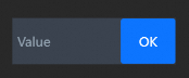
Scenarios
Input boxes are commonly used in visualization applications as input forms for quick and accurate data entry or retrieval, such as registration and login verification or product search interfaces.
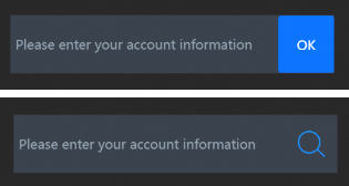
Effect display
Prerequisites
-
Create a data dashboard. You can use a template, use a blank canvas, or use AI to generate one.
-
Your business data is prepared. For more information, see Data Source.
Add input box
-
Access the DataV console.
-
On the Workbench page, in the Data Dashboards area, hover over the target dashboard and click Edit. The canvas editor opens.
-
In the left-side navigation pane, under the list, click the Input Box widget to add it to the canvas.
You can also use global search to add related widgets.
Integrate business data
After adding the widget, integrate your business data for display. Click the input box and select the data to render on the right-side Data Source tab. 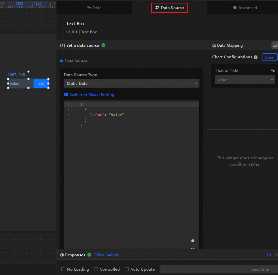
-
The input box accepts the following data fields.
Field
Description
valueThe content that is displayed by default in the content input area of the input box. If not empty, it will overwrite the configuration in the style. If empty, it will use the content in the configuration item.
The following example shows the data structure and effect of a sample input box.
[
  {
    "value": "Please enter your content..."
  }
]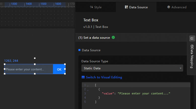
-
This section describes the core configuration items for the data source.
Configuration
Description
Select Data Source
Supports various data types, such as CSV files, APIs, and different databases. For more information, see Supported data source types. Edit data fields in a visual table or in code.
Configure Filter (Optional)
Customize filter code to transform, filter, display, and perform simple calculations on data. For more information, see Manage data filters.
Configure Data Mapping
Map fields from the selected data source to the widget's fields. This enables real-time data matching. Click the
 icon to configure field styles.
View Response Result
Displays the data connected to the widget in real time. When the widget's data source changes, this section shows the latest data.
-
Click the data response result to view the data field code.
-
Click View Example to see the array type and sample code that the data source accepts. You can write your fields based on the example.
Other data request configurations:
-
Disable Loading State: If you check this box, the widget's initial loading content does not appear when the widget updates or when you preview the data dashboard.
-
Controlled Mode: If you check this box, the widget does not request data when it initializes. Data requests can only be started by the blueprint editor or by global variable events.
-
Auto Update Request: If you check this box, the platform polls for data updates at the interval you set. If you do not check this box, you must refresh the page manually or use the blueprint editor or global variable events to trigger data updates.
-
Configure input box
Click the input box widget to access configuration options on the right-side panel, including basic style, global variables, interaction occurrences, advanced settings, and blueprint interaction.
Style configuration
On the Style panel, configure the background color, placeholder text, border, and other styles of the input box.
You can also click the  icon to quickly find configuration items by keyword search, which supports fuzzy match. For more information, see Search Configuration Items.
The following table describes the configuration items.
|
Configuration item |
Description |
Illustration |
|
Global configuration |
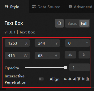
Defines the widget's position, transparency, and interaction passthrough in the data dashboard.
|
|
|
Input box configuration |
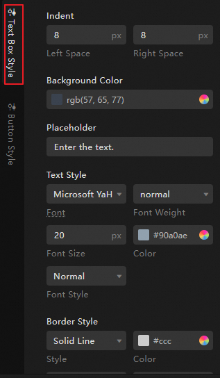
Configures the background color, border style, text content, margin between text and border, and text style of the input box.
|
|
|
Button configuration |
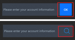
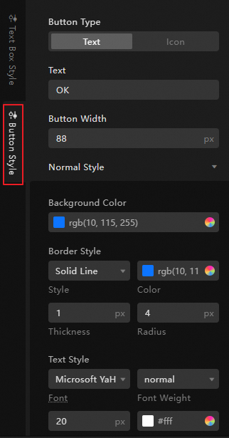
Defines the button type of the widget as text or icon, and the display style of the button in different states.
|
|
Advanced configuration
Configure how the input box interacts with other widgets.
|
Configuration item |
Description |
Illustration |
|
Interaction occurrences |
Defines the interaction behavior with other widgets to achieve widget linkage. Click the |
|
|
Associate global variables |
You can associate global parameters in the widget to achieve parameter transmission between widgets and perform widget interaction. Click the By changing the text content of the input box or clicking the widget button, trigger a data request, and throw the |
 icon to define related interaction occurrences and interaction actions.
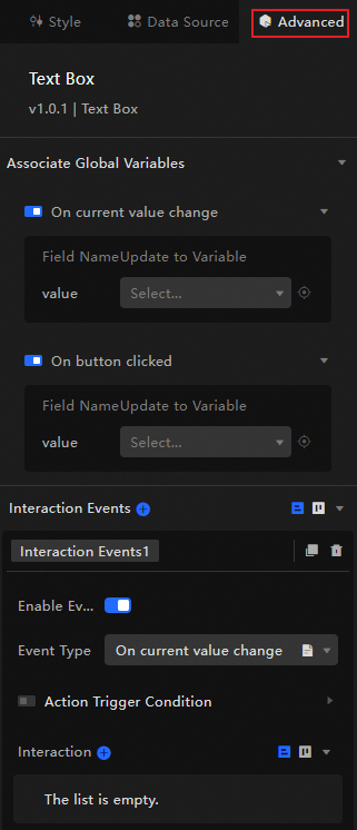
 icon to enable the corresponding instruction and associate the required
 Blueprint interaction
Use the Blueprint Editor to visually define the interaction relationships and behavior logic between widgets.
Procedure
-
On the canvas editing page, click the
 icon at the top left of the menu bar to enter the Blueprint Editor.
 -
In the layer node list, hover over the input box widget and click the
icon to add the widget to the main canvas. -
Configure the blueprint interaction effects for related widgets as needed using the connection method.
Here is an example.
 icon at the top left of the menu bar to enter the Blueprint Editor.
 icon to add the widget to the main canvas.
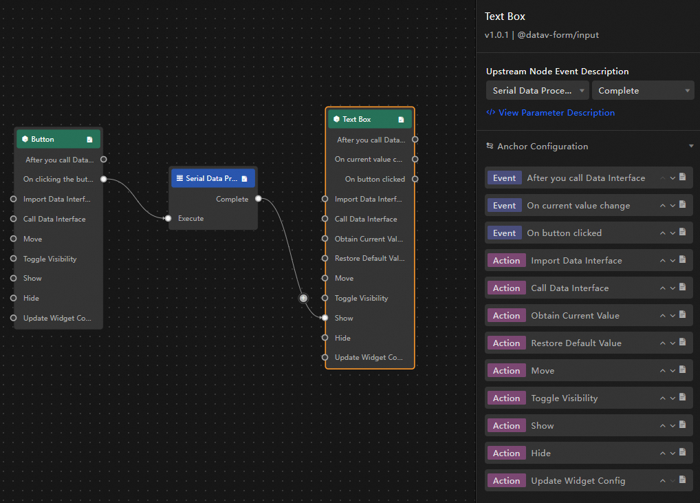
Configuration item introduction
The following table describes the available interaction occurrences and actions.
Click the  icon next to the occurrence or action in the blueprint configuration interface for a detailed description of the related parameters.
|
Category |
Subcategory |
Description |
|
Event |
When Data Is Updated |
This occurrence is thrown when the widget data is updated. |
|
When Request Status Changes |
This occurrence is thrown when the data request status changes. The status values include Void, Loading, Success, Error. |
|
|
When Current Value Changes |
This occurrence is thrown when the current value changes, and the data item corresponding to the value is also thrown. The data example is as follows. |
|
|
When Button Is Clicked |
This occurrence is thrown when the button is clicked, and the data item corresponding to the value is also thrown. The data example is as follows. |
|
|
Action |
Import Data |
After processing the data according to the widget rendering format, import it into the widget and re-render it. There is no need to request server data again. The data example is as follows. |
|
Request Data |
Request server data again. The data thrown by the input data processing node or layer node will be used as a parameter. For example, if the API data source configured for the input box is |
|
|
Obtain Current Input Box Value |
Obtain the current value of the input box. |
|
|
Revert Component To Default Value |
Revert to the default value of the widget. |
|
|
Shift |
Moves the widget to a specified position. The following code shows a data example. |
|
|
Switch Visibility |
Toggles the widget's visibility between shown and hidden. The following code shows a data example.
|
|
|
Show |
||
|
Hide |
||
|
Update Widget Configuration |
Dynamically updates the widget's style configuration.
|