Configuration items for the Koi Flip widget when all options are selected.
Chart style
The Koi Flip widget simulates a lottery draw to reveal a winner.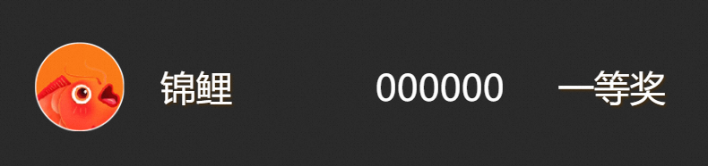
Style Panel 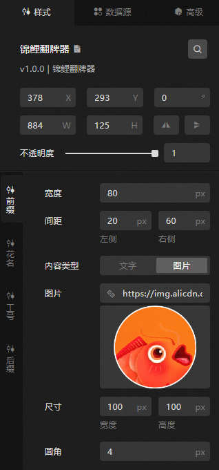
-
Search Configuration: Click the
 icon in the upper-right corner of the Style panel to search for configuration items by name. Fuzzy match is supported. For more information, see Search configuration items.
-
Size: the width and height of the widget. Unit: pixels.
-
Positioning: the x-axis and y-axis coordinates of the widget. Unit: pixels. X-coordinate is the pixel distance from the upper-left corner of the widget to the left edge of the canvas. Y-coordinate is the pixel distance from the upper-left corner of the widget to the top edge of the canvas.
-
Rotate: Rotates the widget around its center. Unit: degrees.
-
Enter a value in the Rotation Angle spin box, or click the plus sign (+) or minus sign (-) to adjust the angle.
-
Click the
 icon to flip the widget style.
 -
Click the
 icon to flip the widget style.
-
-
Opacity: Valid values: 0 to 1. A value of 0 hides the widget. A value of 1 makes the widget fully visible. Default value: 1.
-
-
Prefix: the prefix of the koi card.
Metric
description
Width
The width of the prefix. Unit: px.
Spacing
The horizontal spacing between the prefix and adjacent content. Unit: px.
Content Type
The content type of the prefix. Valid values: Text and Image.
Text Content
The custom text content for the prefix. Available only when Content Type is set to Text.
Text Settings
The font settings for prefix text, including font style, weight, size, and color. Available only when Content Type is set to Text.
Shadow
The text shadow settings, including horizontal and vertical offset, blur radius, and shadow color. Available only when Content Type is set to Text.
Image
The image for the prefix. To use a remote image, enter the URL in the top navigation bar. Click Preview to preview the image. Click Change in the dashed box below to replace the design asset. For more information, see Overview. Available only when Content Type is set to Image.
Dimensions
The width and height of the image. Unit: px.
Fillet
The border radius of the image. Unit: pixels. A value of 0 produces square corners. Larger values produce more rounded corners.
-
Flower Name: the flower name of the Koi Brand Flip widget.
Metric
description
Width
The overall width of the flower name area. Unit: px.
Spacing
The horizontal spacing between the flower name and adjacent content. Unit: px.
Pre-award copywriting
The flower name text displayed before the draw result is revealed.
Text Settings
The font settings for the flower name text, including font style, weight, size, and color.
Shadow
The text shadow settings for the flower name, including horizontal and vertical offset, blur radius, and shadow color.
-
Labor ID: the type of the labor ID of the Koi Fender component.
Metric
description
Number of bits
The number of digits for the labor ID.
Allow Scrolling Numbers
Specifies the numbers that can scroll, separated by commas. Click the
 or icon to add or remove a number series. Click the or icon to reorder multiple number series. Click the icon to duplicate a number series configuration.
 Time Interval
The minimum and maximum scroll interval for the labor ID. Unit: ms.
Text Settings
The font settings for the labor ID, including font style, weight, size, and color.
-
Suffix: the suffix content of the Koi Flip widget.
Metric
description
Width
The width of the suffix. Unit: px.
Spacing
The horizontal spacing between the suffix and adjacent content. Unit: px.
Content Type
The content type of the suffix. Valid values: Text or Image.
Text Content
The custom text content for the suffix. Available only when Text is selected for Content Type.
Text Settings
The font settings for the suffix text, including font style, weight, size, and color. Available only when Content Type is set to Text.
Shadow
The text shadow settings, including horizontal and vertical offset, blur radius, and shadow color. Available only when Content Type is set to Text.
Image
The image for the suffix. To use a remote image, enter the URL in the top navigation bar. Click Preview to preview the image. Click Change in the dashed box below to replace the design asset. For more information, see Use. Available only when Content Type is set to Image.
Dimensions
The width and height of the image. Unit: px.
Fillet
The border radius of the image. Unit: pixels. A value of 0 produces square corners. Larger values produce more rounded corners.
 or
or  icon to add or remove a number series. Click the
  or
or  icon to reorder multiple number series. Click the
  icon to duplicate a number series configuration.
 Data Sources panel
|
Column |
Description |
|
|
The ID of the tag. |
|
|
The label key. |
|
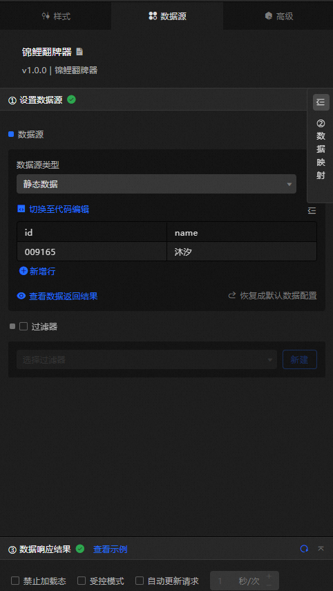
Configure data items |
Description |
|
Data sources |
Use the code editor or visual editor to view the data fields in the widget. You can modify the data type to configure the component data. |
|
Data Mapping |
To customize field configurations, set field mappings in the Data Mapping module to map data to the corresponding widget fields without modifying the data source. You can also click the |
|
Configure a filter |
Turn on Filter, select an existing data filter or create a data filter, and configure a data filter script to filter data. For more information, see Manage data filters. |
|
Data Response Result |
Displays widget data in real time. When the data source changes, the latest data is shown automatically. Click the |
|
Forbid Loading |
If selected, loading indicators are hidden during component initialization when you update and preview the data dashboard. By default, this check box is cleared. |
|
Controlled Mode |
If selected, the widget does not request data on initialization and only requests data through global variables or methods configured in Blueprint Editor. If cleared, data is requested automatically. By default, this check box is cleared. |
|
Auto Data Request |
Select to enable dynamic polling and set the polling interval. If cleared, the page does not update automatically. You must manually refresh the page or use Blueprint Editor and global variable events to trigger data updates. |
 icon to configure the field style.
  icon to refresh the response result, or click the
  icon to fetch the latest data. You can also click View Example to see a sample response.
 Advanced Panel
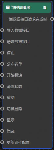
This component has no event configuration.
Blueprint Interaction
-
Click the
icon in the upper-left corner to go to the Blueprint page. -
On the Layer Nodes tab, add the widget to the main canvas.
-
View blueprint configuration parameters.
-
Event
Event
Description
When the data interface request is completed
Triggered with the processed JSON data after a data interface request is returned and filtered. For data examples, see the Data Response Result section of the Data Source tab in the right-side configuration panel.
-
Action
Action
Description
Import data
Imports pre-processed data that matches the widget drawing format, redrawing the widget without requesting server data again. See the data example.
[
  {
    "name": "Koi",
    "id": "000000"
  }
]
Request Data Interface
Requests server data again, using data from an upstream processing node or layer node as a parameter. For example, if the Koi Flip API data source is
https://api.testand the data passed to request data interface is{ id: '1'}, the final request URL ishttps://api.test?id=1.Stop a password change task
Stops scrolling at a specified digit position. See the data example.
{
  "index": 1 // The index number of digits, starting from the highest digit. 0 is the starting number.
}
Publish List
Publishes the list. No parameters are required.
Start tumbling
Starts the tumbling animation. No parameters are required.
Clear Status
Clears all states. No parameters are required.
Move
Moves the widget to a specified location. See the data example.
    {
      // The positioning type. to indicates absolute positioning, whereas by indicates relative positioning. The default value is to.
        "positionType": "to",
      // The location, which is indicated by the x and y coordinates.
      "attr": {
        "x": 0,
        "y": 0
      },
      // The animation type.
      "animation": {
        "enable": false,
        // The animation delay. Unit: milliseconds.
        "animationDuration": 1000,
        // The animation curve, which can be set to linear|easeInOutQuad|easeInOutExpo.
        "animationEasing": "linear"
      }
    }
Toggle Display
Toggles the visibility of the widget. No parameters are required.
Display
Shows the widget. See the data example.
{
  "animationType": "",// The animation method. Valid value: fade. If you do not specify this parameter, no animation is generated.
  "animationDuration": 1000,// The animation delay. Unit: ms.
  "animationEasing": ""// animation curve
}
Hide
Hides the widget. See the data example.
{
  "animationType": "",// The animation method. Valid value: fade. If you do not specify this parameter, no animation is generated.
  "animationDuration": 1000,// The animation delay. Unit: ms.
  "animationEasing": ""// animation curve
}
Update component configurations
Dynamically updates widget style configurations. In the Style panel, click Copy Configuration to Clipboard to obtain the widget configuration data. Then modify the style field in the data processing node in Blueprint Editor.
-
 icon in the upper-left corner to go to the Blueprint page.