liquid-fill-charts
Each configuration item of the liquid fill chart when all options are selected.
Chart style
A liquid fill chart uses animated waves to display the percentage or progress of a dataset. 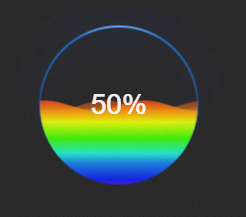
Style Panel 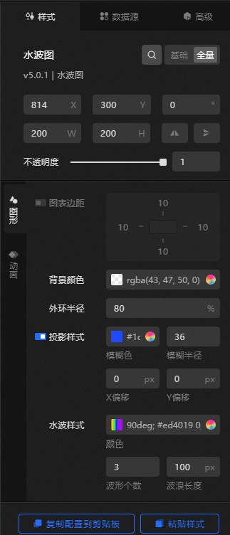
-
Search Configuration: Click the
 icon in the upper-right corner of the Style panel to search for a configuration item by name. Fuzzy match is supported. For more information, see Search configuration items.
-
Size: the width and height of the widget, in pixels.
-
Positioning: the x-axis and y-axis coordinates of the widget, in pixels. X-coordinate is the pixel distance between the upper-left corner of the widget and the left edge of the canvas. Y-coordinate is the pixel distance between the upper-left corner of the widget and the top edge of the canvas.
-
Rotate: the rotation angle of the widget around its center, in degrees.
-
Enter a value in the Rotation Angle spin box, or click the plus sign (+) or minus sign (-) to adjust the value.
-
Click the
 icon to flip the widget horizontally.
 -
Click the
 icon to flip the widget vertically.
-
-
Opacity: a value from 0 to 1. A value of 0 hides the widget, and 1 makes it fully visible. Default value: 1.
-
-
Graphics
Metric
description
Chart Margins
Click the
 icon to toggle chart margins. When enabled, you can set the distance between the chart area and each edge of the widget. Unit: px.
Background Color
Set the background color of the liquid fill chart widget. For more information, see color picker description.
Outer ring radius
The radius of the outer ring relative to the widget border. Valid values: 0 to 100. Unit: %.
Projection Style
The projection style of the outer ring, including the ring color, blur radius, and the x-axis and y-axis offsets of the ring center relative to the widget center.
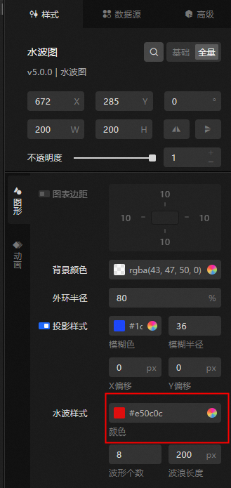
Water Wave Style
Set the color, number of waves, and wavelength of the liquid fill chart.
NoteIf you turn on the Map switch, gradient colors are not supported for the wave color.
OUTER FRAME
The border style of the liquid fill chart.
-
Frame Shape: the shape of the frame. Options: circle, diamond, triangle, pin, and rectangle.
-
Frame Stroke: the stroke style of the frame, including thickness, spacing, and color.
-
Dashed Line Stroke: the dashed stroke style of the border, including dash length and gap.
Tag the data
Set the title style and data content style of the liquid fill chart.
-
title
-
Content: the text content of the label.
-
Text Style: the font style of the title.
-
Position: the X offset, Y offset, and rotation angle of the label relative to the widget.
-
-
Data Content
-
Content: the text content of the data label.
-
Text Style: the font style of the data label.
-
Position: the X offset, Y offset, and rotation angle of the data label relative to the widget.
-
Map
The texture map style of the liquid fill chart.
-
Type: the texture type. Options: Point, Linear, and Square.
-
Fill Color: the fill color of the texture. Available only when Point or Square is selected.
-
Stroke Style: the stroke style of the texture. Available only when the type is Point or Square.
-
Fill Style: the fill style of the texture, including color and width. Available only when Type is set to Linear.
-
Extra Style: the line spacing and rotation angle of the texture. When Type is set to Dot or Square, you can also configure the graphic size, graphic spacing, rotation angle, and stagger option.
-
-
Animation
Metric
description
Animation Switch
Turn on the switch to configure the animation effect of the liquid fill chart.
Animation
The animation effect type. Configurable only after you turn on the Animation Switch.
Animation Duration
The duration of the animation effect, in milliseconds. Configurable only after you turn on the Animation Switch.
 icon to toggle chart margins. When enabled, you can set the distance between the chart area and each edge of the widget. Unit: px.
Data Sources panel
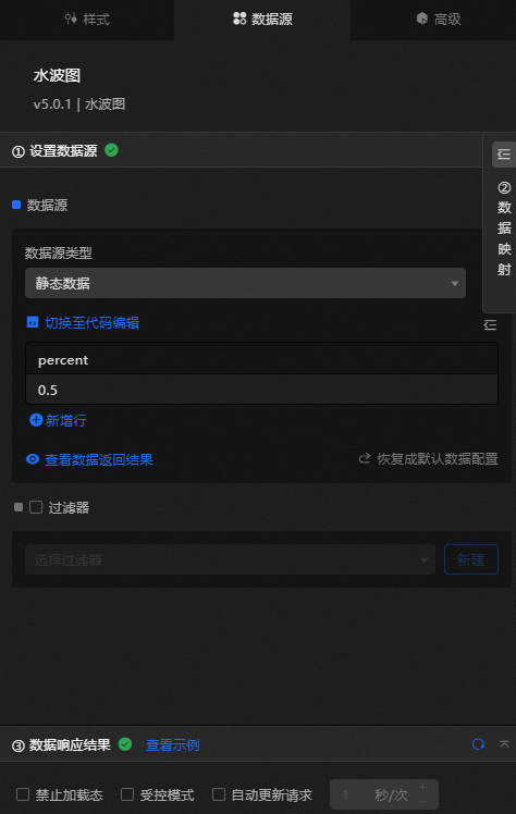
percent: the percentage of the liquid fill displayed as a decimal value. A value of 1 indicates 100%.
|
Configure data items |
Description |
|
Data sources |
Use the code editor or visual editor to view the data fields of the widget. You can also change the data type to configure the component data flexibly. |
|
Data Mapping |
To customize chart field configurations, set the field mapping content in the Data Mapping module to map fields to the corresponding widget fields. This allows you to match data without modifying fields in the data source. You can also click the |
|
Configure a filter |
Turn on Filter, select an existing data filter or create a data filter, and configure a data filter script to filter data. For more information, see Manage data filters. |
|
Data Response Result |
Displays the widget data in real time. When the data source changes, this section shows the latest data. If the response is delayed, click the |
|
Forbid Loading |
Select this check box to hide the loading indicator during widget initialization when you preview the data dashboard. By default, this check box is cleared. |
|
Controlled Mode |
Select this check box to prevent the widget from requesting data during initialization. Data is requested only through global variables or methods configured in Blueprint Editor. Clear this check box to allow automatic data requests. By default, this check box is cleared. |
|
Auto Data Request |
Select this check box and specify a polling interval to enable automatic data refresh. If cleared, you must manually refresh the page or use Blueprint Editor and global variable events to trigger data updates. |
 icon to configure the field style.
 icon to view the data response result, or click the
  icon to refresh the data. You can also click View Example to view a sample response.
Advanced panel
This widget does not support interaction events.
Blueprint Interaction
-
Click the
icon in the upper-left corner to go to the Blueprint page. -
On the Layer Nodes tab, add the widget to the main canvas.
-
View blueprint configuration parameters.
-
Event
Event
Description
When the data interface request is completed
Triggered with the processed JSON data after a data interface request is responded to and processed by a filter. For specific data examples, see the Data Response Results section on the Data Source tab of the right-side configuration panel in the Canvas Editor.
-
Action
Action
Description
Import data
After the widget data is processed into the required format, it is imported for redrawing without requesting server data again. For specific data examples, see the Data Response Result section of the Data Source tab in the right-side configuration panel of the canvas editor.
Request Data Interface
Requests server data again, using data from an upstream data processing node or layer node as parameters. For example, if the API data source is
https://api.testand the data passed to the request data interface is{ id: '1'}, the final request URL ishttps://api.test?id=1.Move
Move a widget to a specified location. See the following data example.
{
      // The positioning type. to indicates absolute positioning, whereas by indicates relative positioning. The default value is to.
        "positionType": "to",
      // The location, which is indicated by the x and y coordinates.
      "attr": {
        "x": 0,
        "y": 0
      },
      // The animation type.
      "animation": {
        "enable": false,
        // The animation delay. Unit: milliseconds.
        "animationDuration": 1000,
        // The animation curve, which can be set to linear|easeInOutQuad|easeInOutExpo.
        "animationEasing": "linear"
      }
    }
Toggle Display
Toggles the visibility of a widget. No parameters are required.
Display
Display the widget. See the following data example.
{
  "animationType": "",// The animation method. Valid value: fade. If you do not specify this parameter, no animation is generated.
  "animationDuration": 1000,// The animation delay. Unit: ms.
  "animationEasing": ""// animation curve
}
Hide
Hide the widget. See the following data example.
{
  "animationType": "",// The animation method. Valid value: fade. If you do not specify this parameter, no animation is generated.
  "animationDuration": 1000,// The animation delay. Unit: ms.
  "animationEasing": ""// animation curve
}
Update component configurations
Dynamically updates widget style configurations. In the Style panel, click Copy Configuration to Clipboard to obtain the configuration data. Then modify the style field in the data processing node in Blueprint Editor.
-
 icon in the upper-left corner to go to the Blueprint page.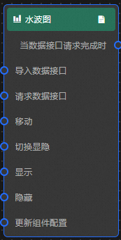
Case demonstration
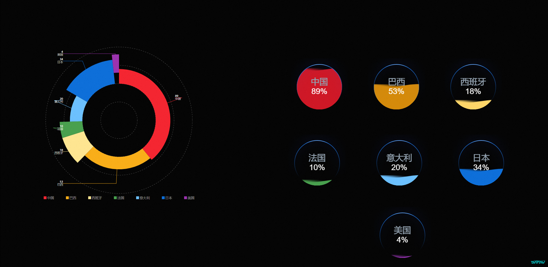
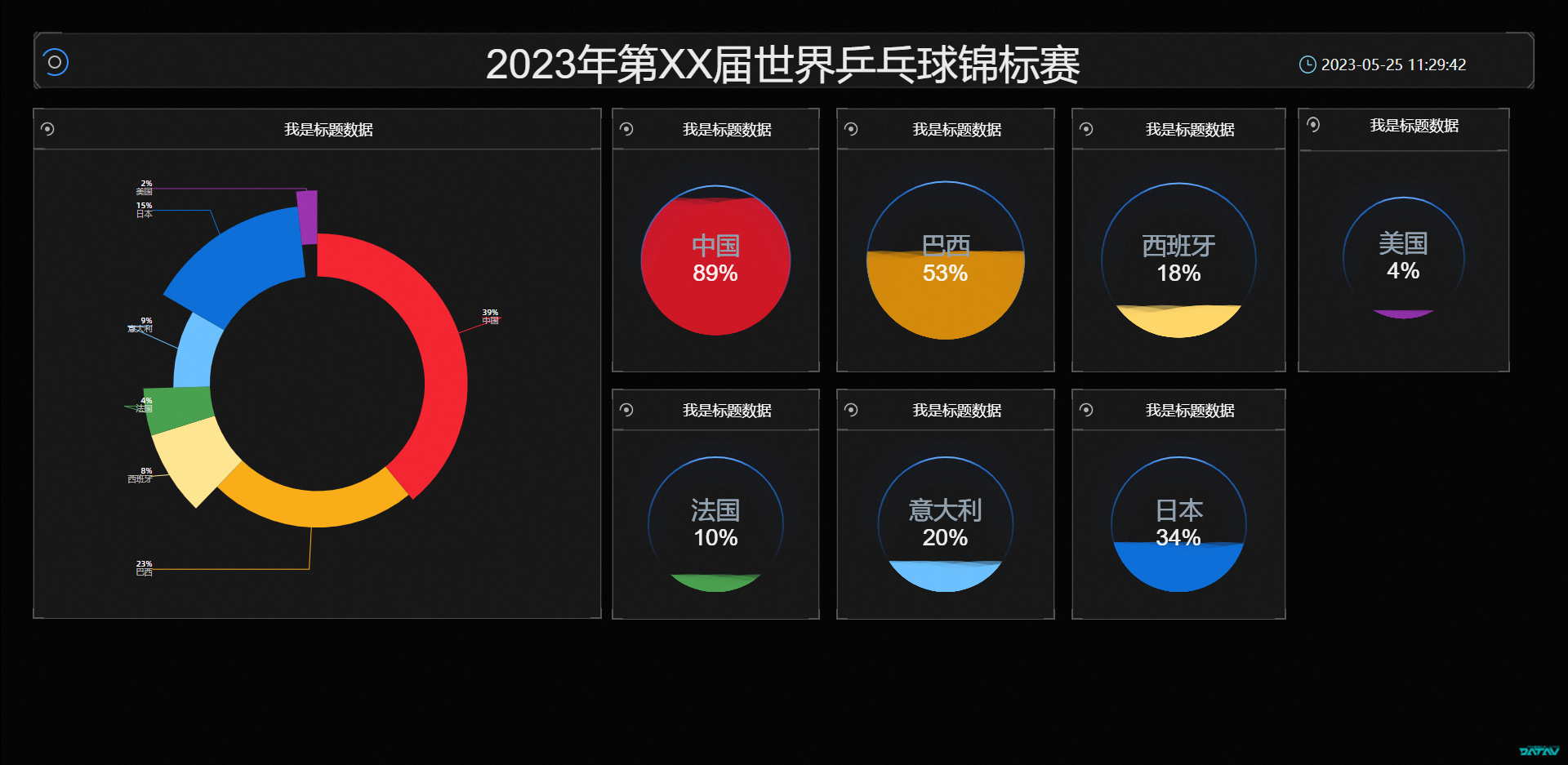
This example shows how to use multiple liquid fill chart widgets to visualize the level of attention from various countries to the World Table Tennis Championships.
-
Log on to the DataV console.
-
On the console page, select a dashboard and click Edit.
-
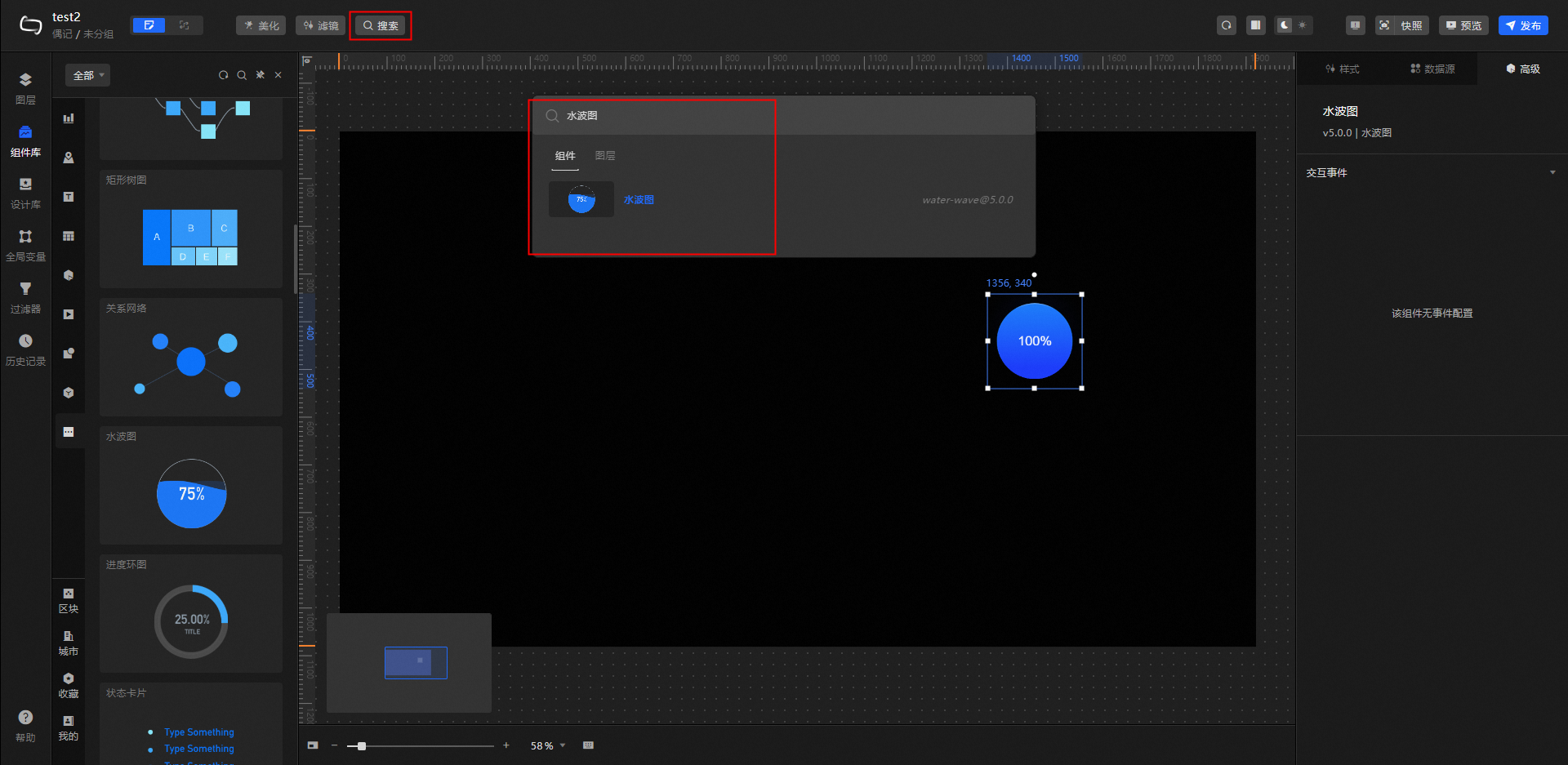
In the top toolbar, click Search, enter a water wave chart, and then click Add to Canvas.
-
Repeat the preceding operations to add six water pattern widgets and one donut chart widget.
-
Click the donut chart component. On the Data Source tab, modify the static data.
[ { "x": "China", "y": "89%" }, { "x": "Brazil", "y": "53%" }, { "x": "Spain", "y": "18%" }, { "x": "France", "y": "10%" }, { "x": "Italy", "y": "20%" }, { "x": "Japan", "y": "34%" }, { "x": "United States", "y": "4%" } ] -
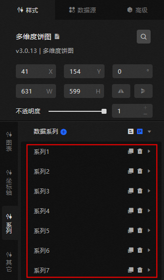
Click the Style tab and add a data series.
-
Modify the color value and name of the water wave pattern of each of the seven water wave widows to ensure that the color and name are different.
-
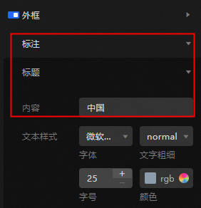
Modify the title content under Style> Labeling> Title of each of the seven water wave diagrams to be consistent with the
xparameter fields in the donut chart data source. For example: Water Wave Figure 1: China. -
Click the
icon to switch to the Bluechart. -
On the Layer Nodes tab, drag all widgets to the main canvas.
-
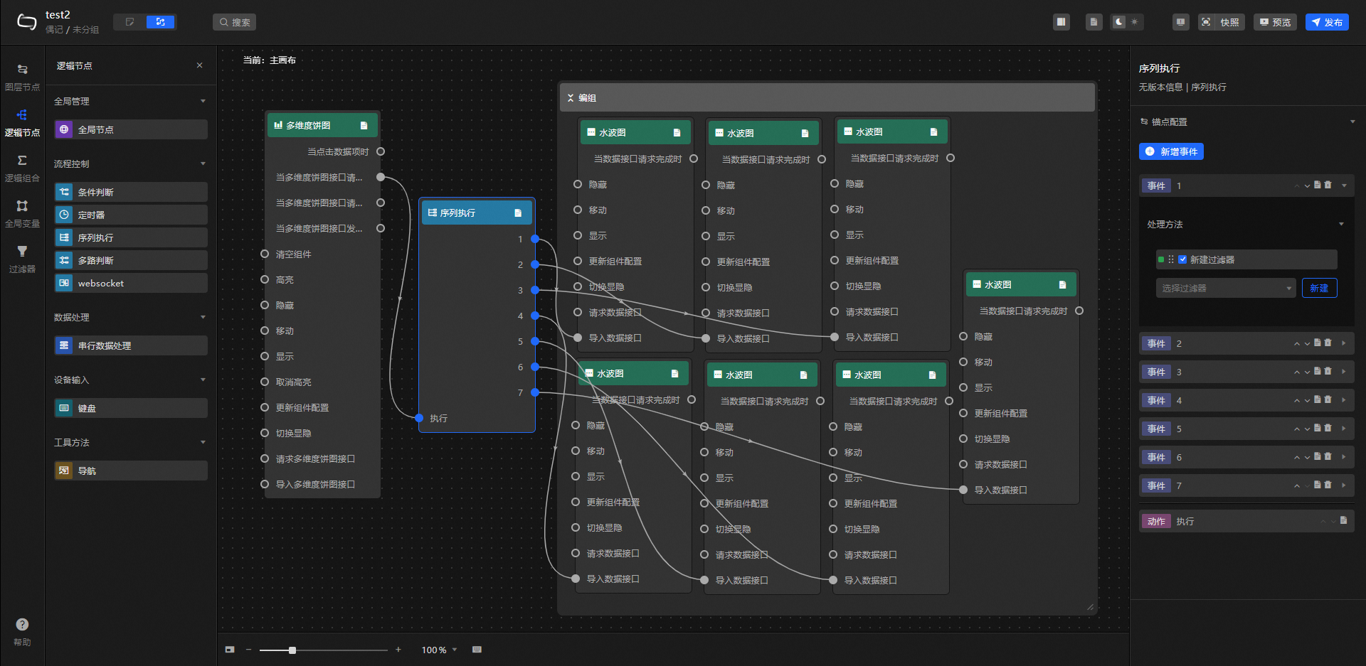
Click the Logical Nodes tab, add a sequence execution node to the main canvas, and connect the component.
-
Configure the sequence execution node processing method.
// Water wave map -1 return [{ "percent": (data[0].y) / 100 }] // Water wave map -2 return [{ "percent": (data[1].y) / 100 }] // Water wave map -3 return [{ "percent": (data[2].y) / 100 }] // Water wave map -4 return [{ "percent": (data[3].y) / 100 }] // Water wave diagram -5 return [{ "percent": (data[4].y) / 100 }] // Water wave diagram -6 return [{ "percent": (data[5].y) / 100 }] // Water wave diagram -7 return [{ "percent": (data[6].y) / 100 }] -
Click Preview in the upper-right corner. View the display results.
-
(Optional) Add other components such as the Timer and General Title to make the digital screen fuller.
 icon to switch to the Bluechart.