Map container (v4.x)
The map container holds the basic flat map and its sub-widgets (choropleth layers, point heatmap layers, and others). You can configure map position, color, and mouse interaction events to render real-time geographic data from multiple angles and formats.
Camera settings
-
Click the
 button in the upper-right corner of the Basic Flat Map 4.0 widget on the canvas to open the Camera Settings panel.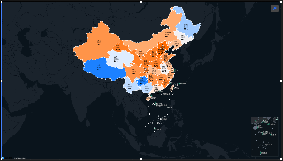
-
On the Camera Settings page, adjust the camera view. Save when finished.
Mouse controls:
-
Click and hold the left mouse button to drag and pan the map.
-
Scroll the mouse wheel up or down to zoom in or out of the map.
-
If you add a Custom Area Drill-down Layer sub-widget, double-click a province, municipality, or city to drill down and center that area.
-
-
Click Save and Exit Settings to save the view and close the settings page.
NoteYou can reopen Camera Settings at any time. Save any changes before exiting.
Sub-widget management
-
Add a sub-widget
-
On the canvas, click the Basic Flat Map 4.0 widget to open the Style panel on the right.
-
Click the
 icon to expand the sub-widgets.
 -
In the sub-layer panel on the left, click to add sub-widgets. Added sub-widgets appear in the Sub-widget Management list.
-
Click an added sub-widget to configure its parameters.
-
Click the
 icon to return to the Style panel and configure other sub-widgets.
-
-
To copy, delete, or rename a sub-widget, hover over the sub-widget. Right-click and select Copy or Delete. To rename it, double-click the sub-widget.
NoteFor details on sub-widget operations, see Manage map sub-widgets.
Style panel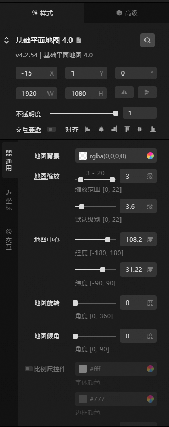
-
Search Configuration: Click the
 icon in the upper-right corner of the Style panel to search for configuration items by name. Fuzzy matching is supported. Search for a configuration item.
 icon in the upper-right corner of the Style panel to search for configuration items by name. Fuzzy matching is supported.
 -
Basic configurations:
Size: The width and height of the component in pixels (px).
Position: The component's x-coordinate and y-coordinate in pixels (px). The x-coordinate is the horizontal distance from the page's left edge to the component's top-left corner. The y-coordinate is the vertical distance from the page's top edge to the component's top-left corner.
Rotation: The rotation of the component around its center point, in degrees (°).
Enter an angle value to control the component's rotation.
Click the
icon to flip the component horizontally.Click the
icon to flip the component vertically.
Opacity: The value ranges from 0 to 1. A value of 0 is completely transparent, while a value of 1 is fully opaque. The default is 1.
Interaction passthrough: When enabled, mouse interactions pass through this component, preventing it from blocking interactions with other components layered underneath it on a dashboard.
Alignment: The alignment of the component within the editor.
-
General: General configurations for the map container.
Parameter
Description
Map Background
The background color of the map. For more information, see Color picker.
Map Zoom
Controls the zoom range and default zoom level of the map container.
-
Zoom Range: Sets the minimum and maximum zoom levels. Valid values: 0 to 22.
-
Default Level: The initial zoom level. Must fall within the specified zoom range. Valid values: 0 to 22.
NoteFractional zoom levels are supported. The default level must fall within the zoom range.
Map Center
Configure the longitude and latitude to control the center position of the map.
Map Rotation
The rotation angle of the map.
Map Pitch
Adjusts the map from a top-down vertical view to a tilted angle.
Scale Ruler
Click the
icon next to Scale Ruler to show the scale ruler on the map. When enabled, you can adjust font color, border color, and offset values. -
-
Coordinate: The coordinate system type for the map. You can select General Coordinate or Custom.
Parameter
Description
General Coordinate
Options: EPSG:3857, EPSG:3395, EPSG:4326, and BD09. The default is EPSG:3857. If you switch coordinate systems, reset the tile URL for the Raster Tile Layer.
Custom
Configure EPSG, proj parameters, origin longitude, origin latitude, and resolution. Maps with custom coordinate systems.
NoteResolution: Comma-separated resolution values for each tile level in the current coordinate system.
-
Interaction: Map interaction settings.
Parameter
Description
Map Interaction
Enable to allow clicking areas on the preview or publish page to focus and view data configuration.
Drag Interaction
Enable to allow dragging the map on the preview or publish page.
Zoom Interaction
Enable to allow scrolling the mouse wheel to zoom on the preview or publish page.
Rotate/Pitch
Enable to allow rotating or tilting the map on the preview or publish page.
Keyboard Interaction
Enable to allow using arrow keys to control the map view on the preview or publish page.
 icon to flip the component horizontally.
 icon to flip the component vertically.
 icon next to Scale Ruler to show the scale ruler on the map. When enabled, you can adjust font color, border color, and offset values.
Advanced panel
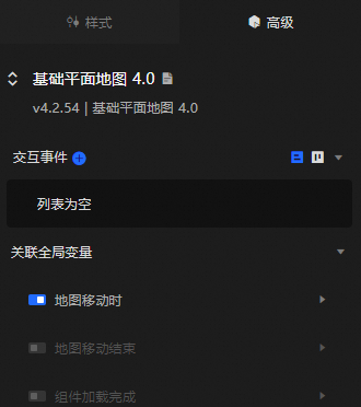
Configure interaction events or associate global variables for filter interactions between widgets. Configure widget interactions.
Blueprint interaction
-
Click the
icon in the upper-left corner of the page to go to the Blueprint page. -
On the Layer Node tab, add the current widget to the main canvas.
-
View the Blueprint configuration parameters.
NoteClick the
icon in the anchor point area on the right to view event and action parameter tooltips.-
Events
Event
Description
When the map moves
Triggers an event and outputs data when the map's center point moves.
When map movement ends
Triggers an event and outputs data when the map's center point stops moving.
Component Loaded
Triggered after the data API returns and filter processing completes. Outputs the processed data in JSON format. See the Data Response area on the Data Source tab in the widget's configuration panel.
-
Actions
Action
Description
Set View
Sets the parameters for the map view. See the data example.
{
  // The zoom level, which must be within the configured zoom range.
  "zoom": 4.5,
  // Longitude range: [-180, 180]
  "lng": 108,
  // Latitude range: [-90, 90]
  "lat": 38,
  // Rotation angle range: [0, 360]
  "rotate": 0,
  // Pitch angle range: [0, 90]
  "pitch": 0
}
Set Zoom Level
Sets the zoom level of the map. See the data example.
{
  // The zoom level, which must be within the configured zoom range.
  "zoom":4.5
}
Set Zoom Range
Sets the zoom range of the map. See the data example.
{
  // Zoom level range: [minimum level, maximum level].
  "range":[3,18]
}
Set Maximum View Extent
Sets the coordinate range for the maximum view extent of the map. See the data example.
{
// Coordinate range: [[min latitude, min longitude], [max latitude, max longitude]]
  "bounds":
  [
    [0, 72],
    [53, 138]
  ]
 }
Fly to a Specific Location
Sets the longitude, latitude, zoom level, rotation angle, and duration for flying to a specific point. See the data example.
{
  // The zoom level, which must be within the configured zoom range.
  "zoom": 4.5,
  // Longitude range: [-180, 180]
  "lng": 108,
  // Latitude range: [-90, 90]
  "lat": 38,
  // Rotation angle range: [0, 360]
  "rotate": 0,
  // Pitch angle range: [0, 90]
  "pitch": 0,
  // Duration in seconds.
  "duration": 100
 }
Fly to a Specific Extent
Sets the coordinate range and flight duration for flying to a specific extent. See the data example.
{
  // Coordinate range: [[min latitude, min longitude], [max latitude, max longitude]]
  "bounds":
  [
    [0,72],
    [53,138]
  ],
  // Duration in seconds.
  "duration": 0.25
 }
Move
Moves the widget to a specified position. See the data example.
    {
      // Movement type. Absolute positioning: to. Relative positioning: by. Default value: to.
        "positionType": "to",
      // Specified position. x-coordinate, y-coordinate.
      "attr": {
        "x": 0,
        "y": 0
      },
      // Animation method.
      "animation": {
        "enable": false,
        // Animation duration in milliseconds (ms).
        "animationDuration": 1000,
        // Animation curve. Optional values: linear|easeInOutQuad|easeInOutExpo.
        "animationEasing": "linear"
      }
    }
Toggle Visibility
The Toggle Visibility, Show, and Hide actions do not require parameters by default. You can add animation configurations as needed. See the data example.
{
  // Animation type. Optional values: appear|fade|slideToUp. The default is fade. If left blank, there is no animation.
  "animationType": "fade",
  // Animation duration. The default is 1000 ms.
  "animationDuration": 1000,
  // Animation curve. Optional values: linear|easeInOutQuad|easeInOutExpo. The default is linear.
  "animationEasing": "linear"
}
Show
Hide
Update Widget Configuration
Dynamically updates widget styles. On the widget's Style panel, click Copy Configuration to Clipboard to get the configuration data. Then modify the field values in the data processing node on the Blueprint editor.
-
 icon in the upper-left corner of the page to go to the Blueprint page.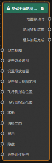
 icon in the anchor point area on the right to view event and action parameter tooltips.