The marquee widget dynamically scrolls overflow text from right to left in your visualization applications.
Overview of the component
A text widget that dynamically scrolls overflow text from right to left in visualization applications.
If the text length is shorter than the widget, the content will remain static and not scroll.
Scenarios
Commonly used to highlight important text in visualization applications, such as reminder notifications or live comments.
Effect display
-
Single-line text

-
Multi-line text

Prerequisites
-
Create a data dashboard. You can use a template, use a blank canvas, or use AI to generate one.
-
Your business data is prepared. For more information, see Data Source.
Add a marquee
-
Access the DataV console.
-
On the Workbench page, in the Data Dashboards area, hover over the target dashboard and click Edit. The canvas editor opens.
-
In the left-side navigation pane, under the list, click the Marquee widget to add it to the canvas.
You can also use global search to find and add related widgets.
Integrate business data
Once the widget is added, bind your business data for display. Click the marquee, and in the right-side Data Source tab, select the data for the widget to render. 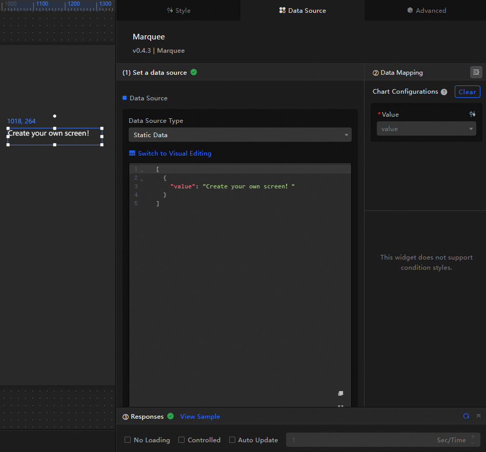
-
The marquee accepts the following data fields.
Field
Description
valueThe dynamic text content displayed by the widget.
-
Only the first value is read if multiple values exist.
-
Supports the <br> tag for line breaks.
The following example shows the data structure and display of a marquee.
[
  {
    "value": "DataV-Board is a professional data dashboard building tool. <br>You can use DataV-Board to create your own large screen!"
  }
]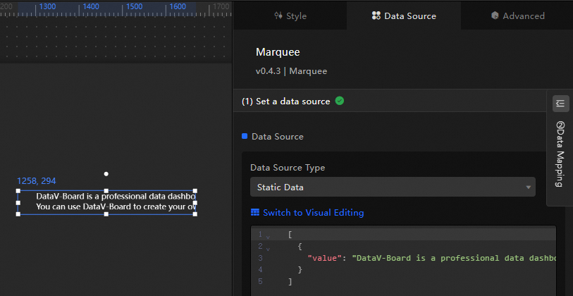
-
-
This section describes the core configuration items for the data source.
Configuration
Description
Select Data Source
Supports various data types, such as CSV files, APIs, and different databases. For more information, see Supported data source types. Edit data fields in a visual table or in code.
Configure Filter (Optional)
Customize filter code to transform, filter, display, and perform simple calculations on data. For more information, see Manage data filters.
Configure Data Mapping
Map fields from the selected data source to the widget's fields. This enables real-time data matching. Click the
 icon to configure field styles.
View Response Result
Displays the data connected to the widget in real time. When the widget's data source changes, this section shows the latest data.
-
Click the data response result to view the data field code.
-
Click View Example to see the array type and sample code that the data source accepts. You can write your fields based on the example.
Other data request configurations:
-
Disable Loading State: If you check this box, the widget's initial loading content does not appear when the widget updates or when you preview the data dashboard.
-
Controlled Mode: If you check this box, the widget does not request data when it initializes. Data requests can only be started by the blueprint editor or by global variable events.
-
Auto Update Request: If you check this box, the platform polls for data updates at the interval you set. If you do not check this box, you must refresh the page manually or use the blueprint editor or global variable events to trigger data updates.
-
Configure the marquee
Click the marquee widget and use the right-side panel to configure its basic style, interaction occurrences, and blueprint interactions.
Style configuration
In the Style panel, adjust the text size, layout, animation duration, and other style properties. The configuration items are described below.
Use the  icon to search for specific configuration items by keyword. The search feature supports fuzzy matching. For more information, see Search configuration items.
The configuration items are described below.
|
Configuration Item |
Description |
Illustration |
|
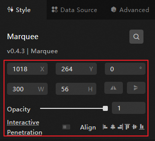
Global configuration |
Defines the widget's position, transparency, and interaction passthrough in the data dashboard.
|
|
|
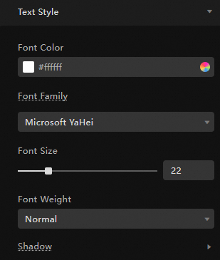
Basic style configuration |
Sets the text size, font, color, and text shadow of the widget. Note
Text shadows can be stacked but cannot exceed 3 layers. Excessive use may degrade platform performance. |
|
|
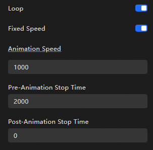
Animation configuration |
Specifies whether the widget uses carousel mode. When enabled, the content scrolls with animation. The playback rate and duration settings are as follows:
|
|
Advanced configuration
Configure interactions between the marquee and other widgets. The configuration items are described below.
|
Configuration Item |
Description |
Illustration |
|
Interaction occurrences |
Configures the interaction behavior with other widgets for filter-based interaction. Click the |
|
 icon to define the interaction occurrences and actions.
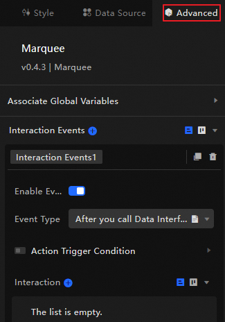
Blueprint interaction
Use the Blueprint Editor to visually define interaction logic between widgets.
Procedure
-
On the canvas editing page, click the
 icon at the top left of the menu bar to access the Blueprint Editor.
 -
Hover over the marquee widget in the layer node list and click the
to add it to the main canvas. -
Connect related widgets to configure blueprint interactions as needed.
The following example illustrates a blueprint interaction.
 icon at the top left of the menu bar to access the Blueprint Editor.
 to add it to the main canvas.
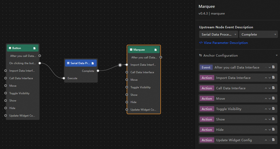
Introduction to configuration items
The available interaction occurrences and actions are described below.
Click the  icon next to an occurrence or action in the blueprint editor for parameter details.
|
Category |
Subcategory |
Description |
|
Event |
When Data Is Updated |
Triggered when the widget data is updated. |
|
When The Data Request Status Changes |
Triggered when the data request status changes. Status values include Void, Loading, Success, and Error. |
|
|
Action |
Import Data |
Imports pre-processed data into the widget for re-rendering without re-requesting server-side data. A data example is as follows. |
|
Request Data |
Re-requests server-side data. Data from the input data processing node or layer node is used as a parameter. For example, if the API data source configured for the marquee is |
|
|
Shift |
Moves the widget to a specified position. The following code shows a data example. |
|
|
Switch Visibility |
Toggles the widget's visibility between shown and hidden. The following code shows a data example.
|
|
|
Show |
||
|
Hide |
||
|
Update Widget Configuration |
Dynamically updates the widget's style configuration.
|