one-click-beautification
The one-click beautification feature lets you quickly adjust the layout of a dashboard and apply built-in styles to enrich its content, helping you resolve overall styling difficulties during dashboard design.
Procedure
-
Log on to the DataV console.
-
On the console page, use the template to create a PC dashboard or click Edit for an existing dashboard.
-
Go to the Canvas Editor page and click the Beautify icon
 at the top of the editor page.
 -
Click the
 icon before One-click beautification to enable the beautification feature. Note
If Disenabled is displayed on the One-click Beautification page, you can click the
 icon or click Quick Enable to enable the feature.
 -
On the One-click beautification page, configure the overall style and layout of the dashboard. For more information, see Configure modules.
-
Preview the one-click beautification effect on the canvas. After you are satisfied, click Confirm Application in the lower-right corner.
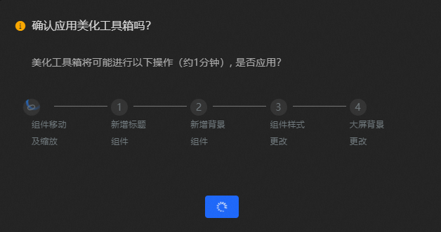 Important
Applying the beautification overwrites the original dashboard configuration and may change its internal components. Confirm before you proceed.
-
After you configure the one-click beautification feature, you can preview and publish the dashboard to show the beautification effect of the dashboard online.
Parameters
On the One-click beautification tab, the One-click Beautify page provides the following settings.
-
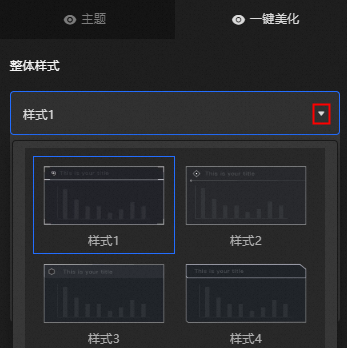
Overall Style: Click the
 icon in the style list, select a style for the dashboard, and then click the blank area to apply it.Note
-
Up to 20 styles are available.
-
Changing the overall style overwrites the previous style.

-
Headline: The banner style for visual groups in the dashboard. Click the
icon to toggle the banner style.Parameter
Description
Subtitle
Specifies whether to display the subtitle in a heading.
Text alignment
The text alignment in a heading. Valid values: Align Default, Align Left, Align Center, and Align Right.
-
Level -2 Title: The level-2 title style for visual groups in the dashboard. Click the
icon to toggle the level-2 title style.Parameter
Description
Subtitle
Specifies whether to display the subtitle in a title.
Text alignment
The text alignment in the title. Valid values: Align Default, Align Left, Align Center, and Align Right.
Exclusion type
The widget types to exclude from the level-2 title style. You can select the Map and Tender Flip widgets. If no widget type is selected, the level-2 title style applies to all widgets on the dashboard.
NoteOnly the Map and Ticker Board options are provided for this parameter. For other widgets, you must specify whether to apply the title style.
-
Level -2 Background: The level-2 background style for visual groups in the dashboard. Click the
icon to toggle the level-2 background style.Exclude Type: The widget types to exclude from the level-2 background style. You can select Map and Tick Board. If no widget type is selected, the level-2 background style applies to all widgets in the dashboard.
NoteOnly the Map and Ticker Board options are provided for this parameter. For other widgets, you must specify whether to apply the background style.
-
-
Layout Settings: Configure the overall layout of visual groups in the dashboard.
-
Margins: The margin settings for visual groups in the dashboard.
Parameter
Description
Screen padding
The margin between visual groups and the edge of the canvas.
Group margin
The spacing between visual groups in the dashboard.
Group padding
The padding between widgets and the borders of their visual groups.
-
Alignment threshold: Thresholds for optimizing page layout. Adjust these values to improve the alignment between widgets.
Parameter
Description
Guideline thresholds X and Y
The thresholds for merging visual guides along the X and Y axes.
NoteUse this parameter when large gaps appear between components due to two independent visual guides in the dashboard.
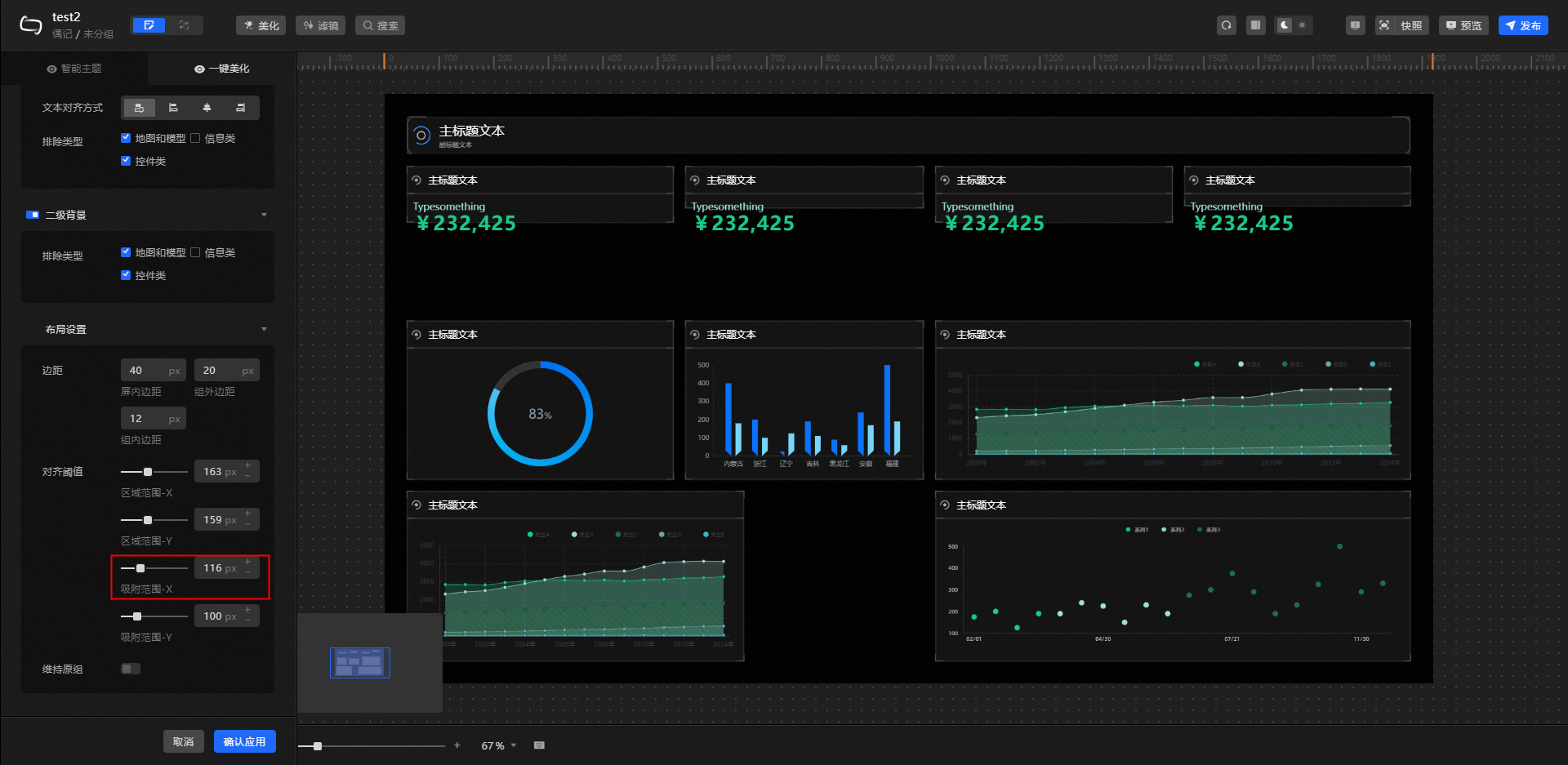
Snap thresholds X and Y
The thresholds for snapping widgets to visual guides along the X and Y axes.
NoteAdjust these thresholds if visual guides are present but widgets are not properly aligned.
-
Maintain the original group: By default, existing group structures are not considered during one-click layout optimization. Turn on this switch to preserve grouped widgets as independent visual groups. To form a new visual group from ungrouped widgets, manually group them with a Title widget (if needed) and enable this switch.
-
 icon to toggle the banner style.
 icon to toggle the level-2 title style.
 icon to toggle the level-2 background style.
Examples
Before one-click beautification: 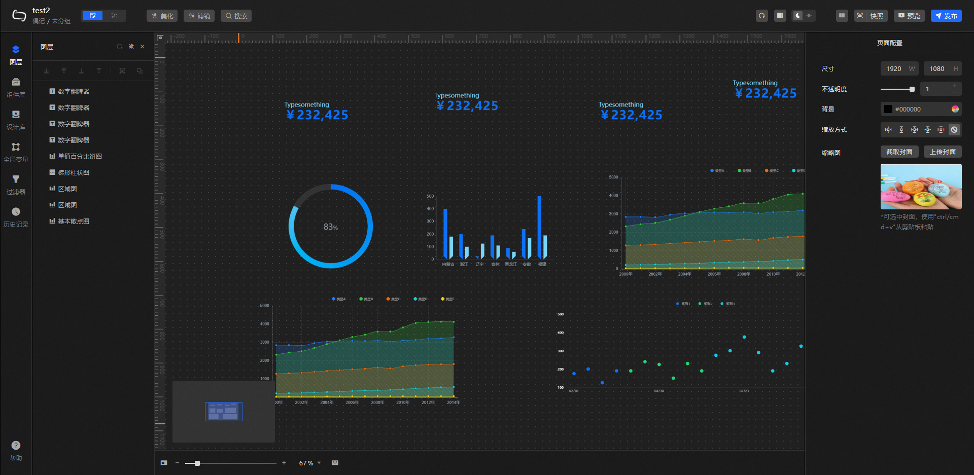 After applying the overall style (default state):
  After adjusting Guideline threshold X from 100 px to 163 px:
 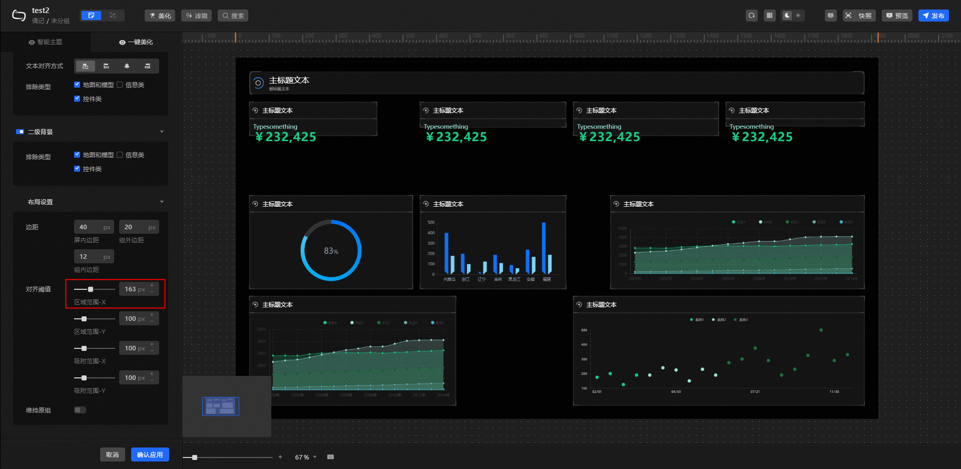 After adjusting Guideline threshold Y from 100 px to 159 px:
  After adjusting Snap threshold X from 100 px to 116 px:
  After adjusting Snap threshold Y from 100 px to 229 px: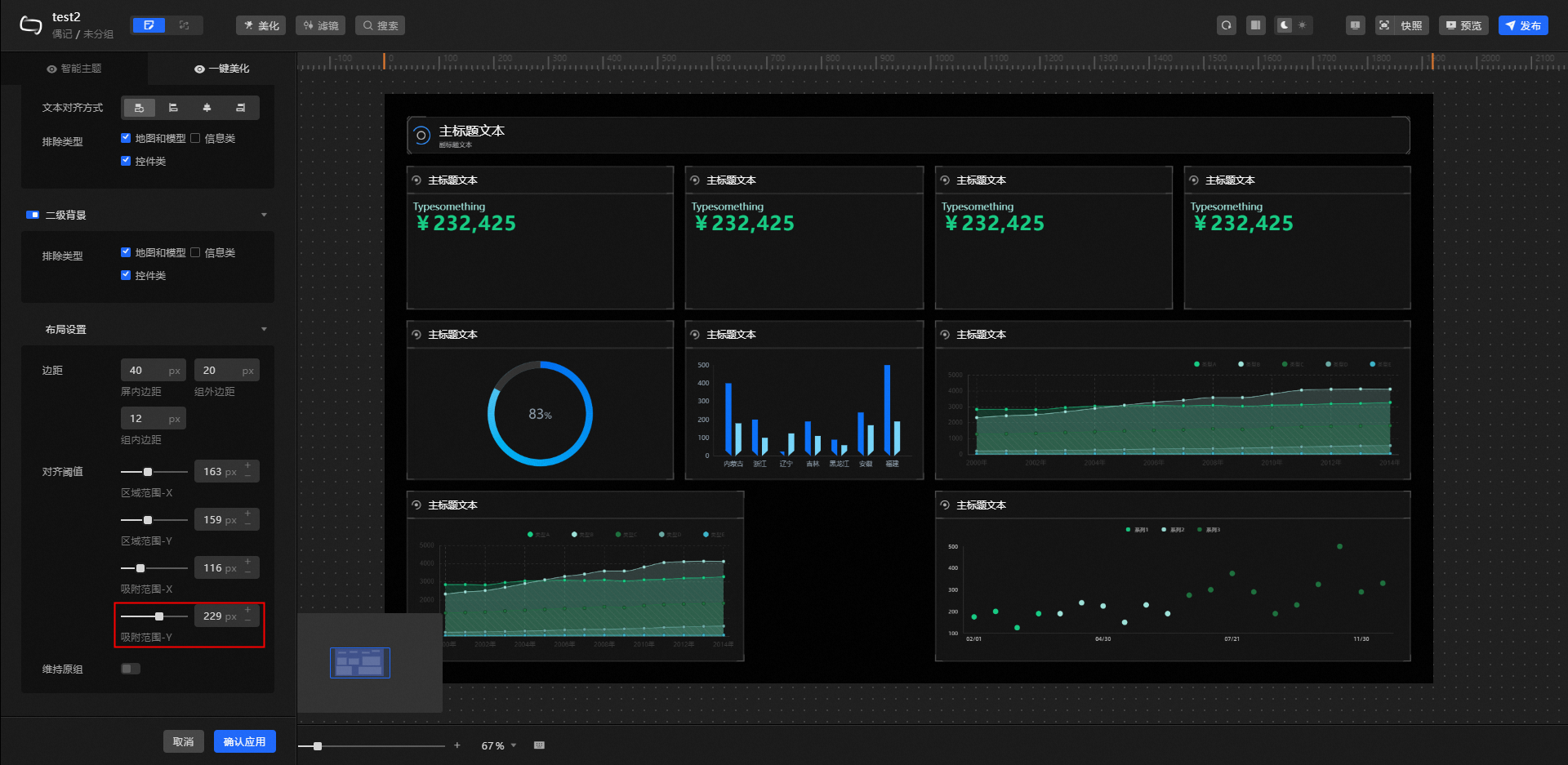
Set the optimal thresholds based on your design preferences and specific layout. The preceding values are examples only.