percentage-pie-chart
Describes each configuration item available for the percentage pie chart widget when all options are selected.
Chart style
A percentage pie chart is a type of pie chart that displays both the actual value and the percentage of data simultaneously. It is suitable for comparing two metrics and supports only two data series. 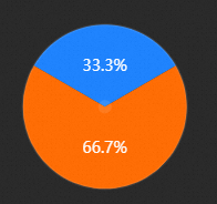
Style Panel 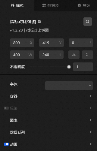
-
Search Configuration: Click the Search configuration items icon
 in the upper-right corner of the Style panel to search for a configuration item by name. Fuzzy match is supported. For more information, see Search configuration items.
 -
Size: the width and height of the widget, in pixels.
-
Positioning: the x-axis and y-axis of the component, in pixels. X-coordinate is the pixel distance between the upper-left corner of the widget and the left border of the canvas. Y-coordinate is the pixel distance between the upper-left corner of the widget and the upper border of the canvas.
-
Rotate: the rotation angle of the widget, in degrees.
-
Enter the degrees in the Rotation Angle spin box, or click the plus sign (+) or minus sign (-) to adjust the value.
-
Click the
 icon to flip the widget style.
 -
Click the
 icon to flip the widget style.
-
-
Opacity: valid values: 0 to 1. A value of 0 hides the widget, and a value of 1 fully displays the widget. Default value: 1.
-
-
Font: the font of all text in the widget. Default value: Microsoft Yahei.
-
Container
Pin: the distance between the pie chart and the left, upper, and lower borders of the widget, in pixels. If the value is too large, the pie chart may extend beyond the chart boundary.
-
Label: the label style of the pie chart. Click the
 icon to show or hide the label.
 Parameter
Description
Color
Color of the upper and lower labels. For details, see color picker.
Font size
The font size of the label. Valid values: 12 to 100.
Font weight
The font weight of the label.
-
Chart name
Parameter
Description
Radius
The radius of the pie chart.
Color
The color of the percentage in the pie chart.
Decoration Color
The color of the outer border and center point of the pie chart.
Background color
The background color of the pie chart.
Font size
The size of the text in the pie chart. Valid values: 12 to 100.
Font weight
The font weight of the text in the pie chart.
Margin
The distance between the pie chart and the four sides, including:
-
Top Margin: the distance between the top label and the top label of the pie chart.
-
Bottom Margin: the distance between the bottom label and the bottom label of the pie chart.
-
Left Margin: the distance between the pie chart and the left side of the icon.
-
Right Margin: the distance between the pie chart and the right side of the icon.
Start Angle Offset
The starting offset angle of the sector in the pie chart. Valid values: 0 to 360.
-
-
data series: the data series of the pie chart. Two series are supported. You cannot add or delete series.
-
Series 1
Color: the color of the sector in the pie chart.
-
Series 2
Color: the color of the sector in the pie chart.
-
-
Animation: the animation effect style of the pie chart. Click the
icon to enable or disable the animation effect. -
Initial Animation Duration: the duration of the initial animation rendered by the component, in milliseconds.
-
Eating Effect: the easing effect of the animation. Multiple common easing effects are available.
-
Update Animation Duration: the animation duration when widget data is updated, in milliseconds.
-
 icon to show or hide the label.
  icon to enable or disable the animation effect.
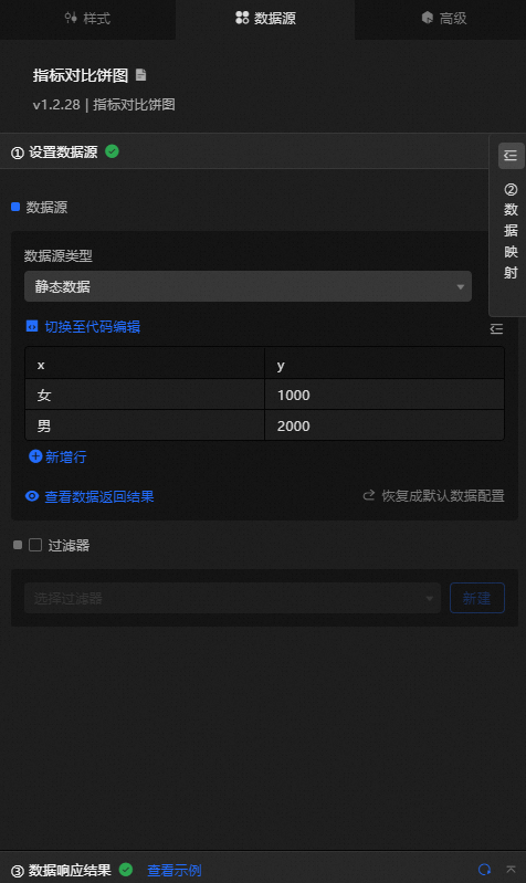
 Data Sources panel
|
Column |
Description |
|
|
The category of the series label. |
|
|
The value of the series label. |
|
Configure data items |
Description |
|
DataSource |
Use the code editor or visual editor to view the data fields in the widget. You can also change the Data Type parameter to configure the component data. |
|
Data Mapping |
To customize chart field configurations, set different field mappings in the Data Mapping module to map them to the corresponding widget fields. This allows you to match data without modifying the data source fields. You can also click the |
|
Configure a filter |
Turn on Filter, select an existing data filter or create a data filter, and configure a data filter script to filter data. For more information, see Manage data filters. |
|
Data Response Result |
The Data Response Result section displays widget data in real time. If the data source changes, this section displays the latest data. If the system response is delayed, click the |
|
Forbid Loading |
If you select this check box, loading content is not displayed during component initialization when you update the component and preview the data dashboard. By default, the check box is cleared. |
|
Controlled Mode |
If you select this check box, the component does not request data during initialization and only requests data through global variables or methods configured in Blueprint Editor. If you clear the check box, automatic data requests are used. By default, the check box is cleared. |
|
Auto Data Request |
Select this check box and enter a polling interval to enable dynamic polling. If you clear the check box, the page does not automatically update. You must manually refresh the page or use Blueprint Editor and global variable events to trigger a data update. |
 icon to configure the field style.
  icon on the right to view the data response result. You can also click the
  icon on the right to obtain the latest data. You can also click View Example to view a sample response result.
 Advanced Panel
This widget does not support interaction events.
Blueprint Interaction
-
Click the
icon in the upper-left corner to go to the Blueprint page. -
On the Layer Nodes tab, add the widget to the main canvas.
-
View blueprint configuration parameters.
-
Event
Event
Description
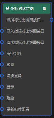
When the percentage pie chart interface request is completed
The event is triggered with the processed JSON data after a data interface request is responded to and processed by a filter. For specific data examples, see the Data Response Result section of the Data Source tab in the right-side configuration panel of the canvas editor.
-
Action
Action
Description
Import percentage pie chart Interface
After widget data is processed in its drawing format, the data is imported for redrawing without requesting server data again. For specific data examples, see the Data Response Result section of the Data Source tab in the right-side configuration panel of the canvas editor.
Request percentage pie chart Interface
This action requests server data again. The data sent by an upstream data processing node or layer node is used as a parameter. For example, if the percentage pie chart API data source is configured as
https://api.testand the data transferred to the request percentage pie chart interface is{ id: '1'}, the final request interface ishttps://api.test?id=1.Clear components
Clear component data. No parameters are required.
Move
Move a widget to a specified location. See the following data example.
    {
      // The positioning type. to indicates absolute positioning, whereas by indicates relative positioning. The default value is to.
        "positionType": "to",
      // The location, which is indicated by the x and y coordinates.
      "attr": {
        "x": 0,
        "y": 0
      },
      // The animation type.
      "animation": {
        "enable": false,
        // The animation delay. Unit: milliseconds.
        "animationDuration": 1000,
        // The animation curve, which can be set to linear|easeInOutQuad|easeInOutExpo.
        "animationEasing": "linear"
      }
    }
Toggle Show /Show
Toggles whether the widget is displayed or hidden. No parameters are required.
Display
Display the widget. See the following data example.
{
  "animationType": "",// The animation method. Valid value: fade. If you do not set this parameter, no animation is available.
  "animationDuration": 1000,// The animation delay. Unit: ms.
  "animationEasing": ""// animation curve
}
Hide
Hide the component. See the following data example.
{
  "animationType": "",// The animation method. Valid value: fade. If you do not set this parameter, no animation is available.
  "animationDuration": 1000,// The animation delay. Unit: ms.
  "animationEasing": ""// animation curve
}
Update component configurations
Dynamically update the style configurations of the widget. In the Style panel, click Copy Configuration to Clipboard to obtain the configuration data. Then, modify the style field in the data processing node in Blueprint Editor.
-
 icon in the upper-left corner to go to the Blueprint page.