Learn about all configuration items available for the progress bar widget.
Chart style
Customize the color, value, border, tooltip text, and position of the progress bar to visualize task progress. 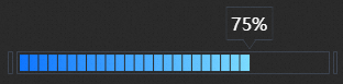
Style Panel 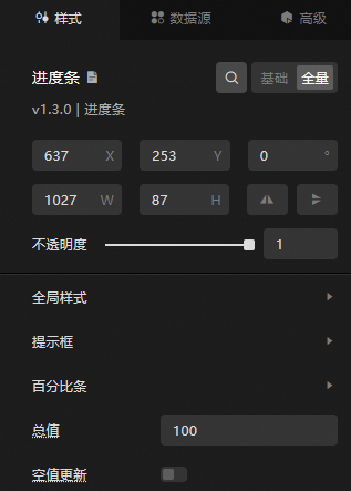
-
Search Configuration: Click the
 icon in the upper-right corner of the Style panel to search for a configuration item by name. Fuzzy match is supported. For more information, see Search configuration items.
 -
Size: the width and height of the widget. Unit: pixels.
-
Positioning: the x-axis and y-axis of the component. Unit: pixels. X-coordinate indicates the pixel distance between the upper-left corner of the widget and the left border of the canvas. Y-coordinate indicates the pixel distance between the upper-left corner of the widget and the upper border of the canvas.
-
Rotate: The widget is rotated around the center of the widget. Unit: degrees.
-
Directly enter the degrees in the Rotation Angle spin box or click the plus sign (+) or minus sign (-) to increase or decrease the value in the Rotation Angle spin box.
-
Click the
 icon to flip the widget style.
 -
Click the
 icon to flip the widget style.
-
-
Opacity: Valid values: 0 to 1. If this parameter is set to 0, the widget is hidden. If this parameter is set to 1, the widget is completely displayed. Default value: 1.
-
-
Global Style
Parameter
Description
Font
The font used for all text in the widget. Default value: Microsoft Yahei.
Spacing between two sides
The distance between the progress bar and the left and right sides of the component. Unit: pixels. Valid values: 0 to 100.
dialog box bottom spacing
The spacing between the tooltip bottom and the progress bar. Unit: pixels. Valid values: 0 to 50.
-
dialog box
Parameter
Description
Font size
The size of the dialog box percent text. Valid values: 10 to 100.
Color
dialog box the color of the percentage text, see the color picker instructions to modify.
Font weight
dialog box the font weight of the text.
Show real values
When enabled, the tooltip displays the actual value. When disabled, the tooltip displays the percentage value.
Value Unit
The unit appended to the displayed value. This parameter is available only after Display Real Value is enabled.
Border Style
The border color of the tooltip. Click the
 icon to enable or disable the border style.
 decimal point
The decimal point option is available only when display of true values is turned off.
-
Decimal: When enabled, the tooltip displays the percentage value with decimal places.
-
Retained Decimal Places: The number of decimal places to retain. Valid values: 1 to 4. Available only after Decimal is enabled.
-
-
Percentage bar
Parameter
Description
Gradient Range
The gradient type of the percentage bar. Valent values: Global Gradient and Local Gradient.
Start Color
The color of the starting position of the percentage bar.
End Color
The color of the percentage bar when it reaches the proportion of the data.
Density
The total number of small cells displayed when the percentage bar is full. Valid values: 1 to 50.
Border Style
The border color of the percentage bar. You can click the
icon to enable or disable the border style. -
Total Value: the actual value when the progress reaches the 100%.
ImportantThe percentage value is (value / sum or total value). The value of value is obtained from the Data panel. The sum value has a higher priority than the total value in the configuration bar.
-
Empty Value Update: If you turn on the switch, the widget progress is displayed as 0 when the data is empty or abnormal. If you turn off the switch, the widget progress is not updated when the data is empty or abnormal.
 icon to enable or disable the border style.
 Data Source Template
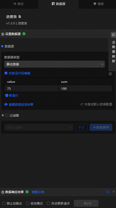
|
Field |
Notes |
|
|
The specific value of the progress bar. The percentage value in the figure is the value/sum value. |
|
|
The total value of the progress bar. The sum value in the Data Sources panel takes precedence over the total value in the Style panel. |
|
Configure data items |
Notes |
|
DataSource |
Use the code editor or visual editor to view the widget data fields. Modify the Data Type parameter to configure the component data. |
|
Data Mapping |
Set field mappings in the Data Mapping module to map custom fields to widget fields without modifying the data source. Click the |
|
Configure a filter |
Turn on Filter, select an existing data filter or create a data filter, and configure a data filter script to filter data. For more information, see Manage data filters. |
|
Data Response Result |
Displays widget data in real time. Click the |
|
Forbid Loading |
When selected, the loading animation is hidden during component initialization and data preview. Deselected by default. |
|
Controlled Mode |
When selected, the component does not request data on initialization. Data is requested only through global variables or methods configured in Blueprint Editor. Deselected by default. |
|
Auto Data Request |
When selected, enter a polling interval to enable automatic data refresh. When deselected, you must manually refresh the page or use Blueprint Editor events to update data. |
 icon to configure the field style.
  icon to view the data response result, or click the
  icon to refresh to the latest data. You can also click View Example to view a sample response.
 Advanced Panel
No event configuration is available for this component.
Blueprint Interaction
-
Click the
icon in the upper-left corner to go to the Blueprint page. -
On the Layer Nodes tab, add the widget to the main canvas.
-
View blueprint configuration parameters.
-
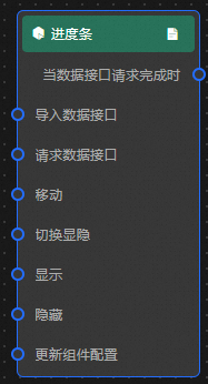
Event
Event
Notes
When the data interface request is completed
Triggered with the processed JSON data after a data interface request is responded to and processed by a filter. For data examples, see the Data Response Result section of the Data Source tab in the canvas editor configuration panel.
-
Action
Action
Notes
Import data
Imports pre-processed data for widget redrawing without requesting server data again. See the data example below.
[
  {
    "value": 15,
    "sum": 100
  }
]
Request Data Interface
Requests server data again, using data from an upstream node as query parameters. For example, if the API data source is
https://api.testand the input data is{ id: '1'}, the final request URL ishttps://api.test?id=1.Move
Move a widget to a specified location. For more information, see the data example.
    {
      // The positioning type. to indicates absolute positioning, whereas by indicates relative positioning. The default value is to.
        "positionType": "to",
      // The location, which is indicated by the x and y coordinates.
      "attr": {
        "x": 0,
        "y": 0
      },
      // The animation type.
      "animation": {
        "enable": false,
        // The duration in which animation is displayed.
        "animationDuration": 1000,
        // The animation curve, which can be set to linear|easeInOutQuad|easeInOutExpo.
        "animationEasing": "linear"
      }
    }
Switch Display /Display
Toggles whether the widget is displayed or hidden. No parameters are required.
Display
Display the widget. For more information, see Data example.
{
  "animationType": "",// The animation method. Valid value: fade. If you do not set this parameter, no animation is available.
  "animationDuration": 1000,// The animation delay. Unit: ms.
  "animationEasing": ""// animation curve
}
Hide
Hide the component. For more information, see Data example.
{
  "animationType": "",// The animation method. Valid value: fade. If you do not set this parameter, no animation is available.
  "animationDuration": 1000,// The animation delay. Unit: ms.
  "animationEasing": ""// animation curve
}
Update component configurations
Dynamically updates widget style configurations. In the Style panel, click Copy Configuration to Clipboard to obtain the configuration data, then modify the style field in Blueprint Editor.
-
 icon in the upper-left corner to go to the Blueprint page.