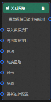
relationship-network
Learn about all configuration options available when the relationship network widget is fully selected, including chart style, data sources, and blueprint interactions.
Chart style
The relationship network widget displays relationships between objects as dots and lines. It supports custom styles for points, lines, and labels, multi-series node configurations, and complex network visualization on dashboards. 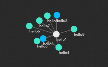
Style Panel 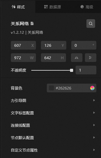
-
Search Configuration: Click the Search configuration items icon
 in the upper-right corner of the Style panel. In the Search Configuration panel, enter the name of the configuration items that you want to search for and locate the configuration items. Fuzzy match is supported. For more information, see Search configuration items.
 -
Size: the width and height of the widget. Unit: pixels.
-
Positioning: the x-axis and y-axis of the component. Unit: pixels. X-coordinate indicates the pixel distance between the upper-left corner of the widget and the left border of the canvas. Y-coordinate indicates the pixel distance between the upper-left corner of the widget and the upper border of the canvas.
-
Rotate: Rotate the widget by degrees.
-
Directly enter the degrees in the Rotation Angle spin box or click the plus sign (+) or minus sign (-) to increase or decrease the value in the Rotation Angle spin box.
-
Click the
 icon to flip the widget style.
 -
Click the
 icon to flip the widget style.
-
-
Opacity: Valid values: 0 to 1. If this parameter is set to 0, the widget is hidden. If this parameter is set to 1, the widget is completely displayed. Default value: 1.
-
-
Background Color: the background color of the widget. For more information, see color picker description.
-
force-directed map
Parameter
Description
Margin
The distance between the force-directed map and each edge of the widget. Unit: pixels.
Charge strength, attraction /repulsion
The attraction or repulsion between the charges, the larger the value, the more dense the charge.
charge distance
The distance between the charges.
Gravity
The gravity of each charge. The greater the gravity, the denser the charge.
friction factor
The friction factor between the charges ranges from 0 to 1.
-
Text Label Configuration
Parameter
Description
The color of the font. For more information, see Color setting parameters.
The color of the text label.
Font size
The font size of the text label.
Font weight
The font weight of the text label.
Centered Font
Turn on the switch and the text label is centered relative to the charge node.
-
Connection line configuration
Parameter
Description
Connection line color
The color of the connector.
Connection line thickness
The thickness of the connector.
Connection Line Length
The length of the connection line.
Minimum Connection Line
The minimum value of the connection line.
Connection Line Maximum Value
The maximum value of the connection line.
-
Default Node Configuration
Parameter
Description
Label Category Name
The name of the label category.
Node Radius
The default radius size of the node.
Node Fill Color
The default fill color of the node.
Node Stroke Color
The default outline color of the node.
Node Stroke Size
The default stroke weight of the node.
-
Custom Node Attributes: Click the
 or icon to add or remove a node. Click the or icon to configure the arrangement styles of multiple custom node series. Click the icon to copy the configurations of the selected node series and add a node series with the same configurations.
 Parameter
Description
Label Category Name
You can manually enter a tag name. If the value of the type field does not contain this tag name, the default configuration of the node is used.
Node Radius
The radius size of the nodes under this category.
Fill Color
The fill color of nodes under this category.
Stroke Color
The outline color of the nodes under this category.
Stroke weight
The stroke weight of the nodes under this category.
 or
or  icon to add or remove a node. Click the
  or
or  icon to configure the arrangement styles of multiple custom node series. Click the
  icon to copy the configurations of the selected node series and add a node series with the same configurations.
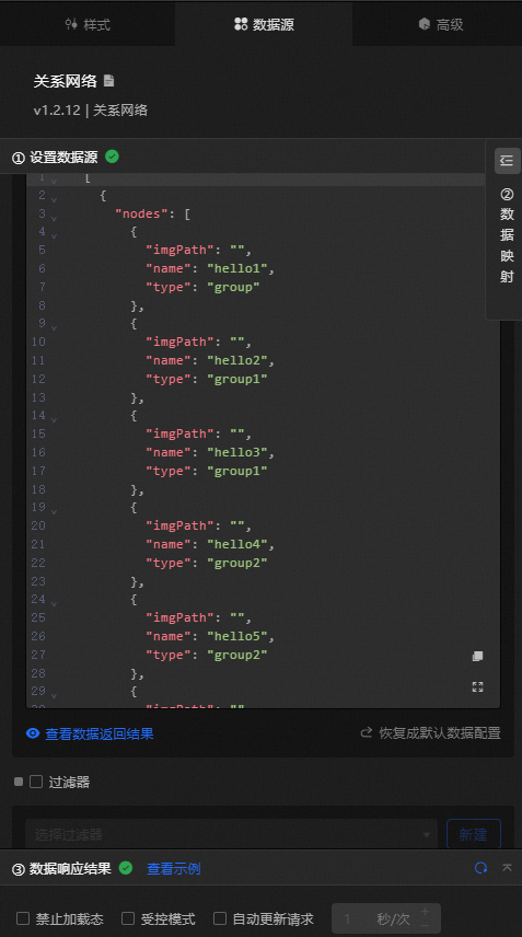
 Data Sources panel
|
Column |
Description |
|
|
Set up nodes. Valid values:
|
|
|
Set the connection line, which contains the following fields:
|
|
Configure data items |
Description |
|
DataSource |
You can use the code editor or visual editor to view the data fields contained in the widget. You can also modify the Data Type parameter to flexibly configure the component data. |
|
Data Mapping |
If you need to customize chart field configurations, you can set different field mapping content in the Data Mapping module and field mapping these content to the corresponding fields of the widget. This allows you to match data without modifying the fields in the data source. You can also click the |
|
Configure a filter |
Turn on Filter, select an existing data filter or create a data filter, and configure a data filter script to filter data. For more information, see Manage data filters. |
|
Data Response Result |
The Data Response Result section displays widget data in real time. If the data source of the widget changes, this section displays the latest data. If the system response is delayed, you can click the |
|
Forbid Loading |
If you select the check box, you will not see the loaded content during component initialization when you update the component and preview the data kanban. If you select the check box, the opposite is true. By default, the status is deselected. |
|
Controlled Mode |
If you select the check box, the component does not request data in the initialized state, and only requests data by using global variables or the method configured in Blueprint Editor. If you clear the check box, you can use automatic update to request data. By default, the status is deselected. |
|
Auto Data Request |
Select the check box to manually enter the time frequency of polling to set dynamic polling. If you clear the page, the page is not automatically updated. You need to manually refresh the page or use Blueprint Editor and global variable events to trigger a request to update data. |
 icon to configure the field style.
  icon on the right to view the data response result. You can also click the
  icon on the right to obtain the latest data of the widget. You can also click View Example to view an example of the response result of the current component.
 Advanced Panel
This widget does not support interaction events.
Blueprint Interaction
-
Click the
icon in the upper-left corner to go to the Blueprint page. -
On the Layer Nodes tab, add the widget to the main canvas.
-
View blueprint configuration parameters.
-
Event
Event
Description
When the data interface request is completed
The event is triggered with the processed JSON data after a data interface request is responded and processed by a filter. For more information about specific data examples, see the Data Response Result section of the Data Source tab in the right-side configuration panel of the canvas editor.
-
Action
Action
Description
Request Data Interface
This action is performed to request the server data again. The data sent by an upstream data processing node or layer node is used as a parameter. For example, relationship network the API data source is
https://api.testand the data transferred to the request data interface is{ id: '1'}, the final request interface ishttps://api.test?id=1.Import data
After data of a widget is processed in accordance with its drawing format, the widget is imported for redrawing. You do not need to request server data again. For more information about specific data examples, see the Data Response Result section of the Data Source tab in the right-side configuration panel of the canvas editor.
Move
Move a widget to a specified location. For more information, see the data example.
    {
      // The positioning type. to indicates absolute positioning, whereas by indicates relative positioning. The default value is to.
        "positionType": "to",
      // The location, which is indicated by the x and y coordinates.
      "attr": {
        "x": 0,
        "y": 0
      },
      // The animation type.
      "animation": {
        "enable": false,
        // The animation delay. Unit: milliseconds.
        "animationDuration": 1000,
        // The animation curve, which can be set to linear|easeInOutQuad|easeInOutExpo.
        "animationEasing": "linear"
      }
    }
Toggle Show /Show
Toggles whether the widget is displayed or hidden. No parameters are required.
Display
Display the widget. For more information, see Data example.
{
  "animationType": "",// The animation method. Valid value: fade. If you do not set this parameter, no animation is available.
  "animationDuration": 1000,// The animation delay. Unit: ms.
  "animationEasing": ""// animation curve
}
Hide
Hide the component. For more information, see Data example.
{
  "animationType": "",// The animation method. Valid value: fade. If you do not set this parameter, no animation is available.
  "animationDuration": 1000,// The animation delay. Unit: ms.
  "animationEasing": ""// animation curve
}
Update component configurations
Style configurations of widgets are dynamically updated. In the Style panel, click Copy Configuration to Clipboard to obtain the configuration data of the widget. After that, change the style field for the data processing node in Blueprint Editor.
-
 icon in the upper-left corner to go to the Blueprint page.