Use the tab list widget to group related information into switchable tabs on a data dashboard.
Widget overview
A tab list consists of multiple tabs that you can configure to interact with other widgets, grouping related information and enabling quick switching between views or functional areas.
Scenarios
The tab list is commonly used for information organization, content categorization, and data display. Examples:
-
Information organization: Group related content using tabs, such as "Personal Information" and "Account Settings".
-
Content categorization: Use tabs to distinguish between content categories, such as "Electronics" and "Home Goods" on an e-commerce platform.
-
Data display: Show different data views using tabs, such as "Elementary School Distribution in a Region" and "High School Distribution in a Region".
Demonstration
-
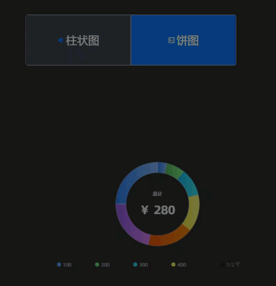
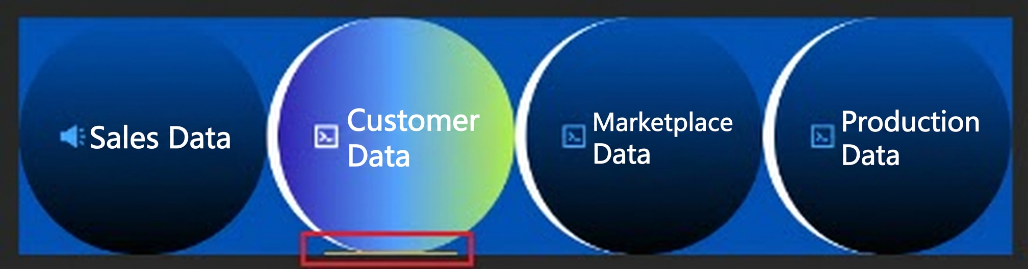
Different tabs in a tab list display different charts.
-
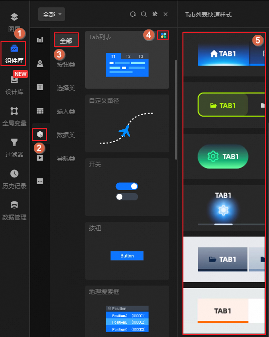
The tab list widget provides multiple built-in quick styles.
Prerequisites
-
Create a data dashboard. You can use a template, use a blank canvas, or use AI to generate one.
-
Your business data is prepared. For more information, see Data Source.
Add a tab list
-
Access the DataV console.
-
On the Workbench page, in the Data Dashboards area, hover over the target dashboard and click Edit. The canvas editor opens.
-
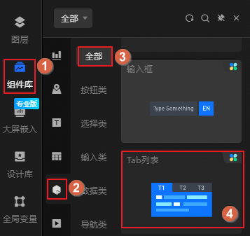
In the navigation pane on the left, follow the steps in the figure to add the Tab list widget to the canvas.
 Note
NoteThe platform provides multiple built-in tab list styles, also known as quick styles, that you can use directly. To select a style, hover over the
 icon on the widget. If the quick styles do not meet your requirements, you can customize the widget style after you add it. For more information, see Style configuration.
You can also use the global search feature to add the widget.
Connect to business data
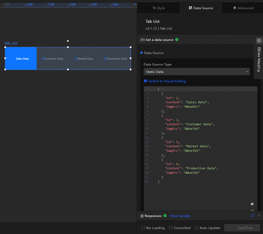
After you add the widget, connect it to your business data. Click the tab list, and then on the Data Source tab on the right, select the data for the widget.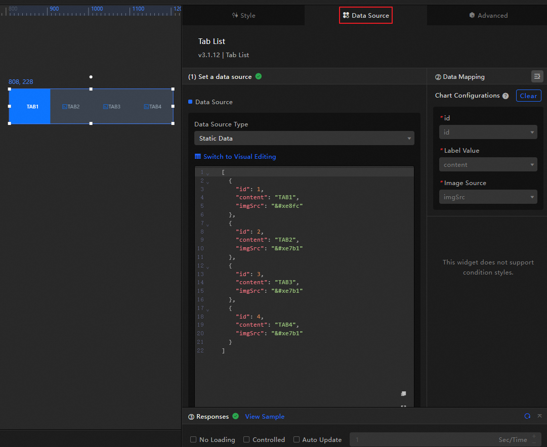
-
The tab list widget accepts the following data fields.
Field
Description
idThe ID of a tab. The setting in the Style panel uses this value to define which tab is selected at initialization.
contentThe name of a tab.
imgSrcThe URL of the icon for a tab. After you configure an icon, you can modify its size, position, and other properties under in the Style panel.
[ { "id": 1, "content": "Sales Data", "imgSrc": "" }, { "id": 2, "content": "Customer Data", "imgSrc": "" }, { "id": 3, "content": "Market Data", "imgSrc": "" }, { "id": 4, "content": "Production Data", "imgSrc": "" } ]
-
Core data source configuration items:
Configuration Item
Description
Select Data Source
The tab list widget supports various data source types, such as CSV files, APIs, and different databases. For more information, see Supported data source types. You can edit data fields using a visual table or code.
Configure Filter (Optional)
Defines custom filter code for data transformation, filtering, display, and simple calculations. For more information, see Manage data filters.
Configure Data Mapping
Maps fields from the data source to the widget fields for real-time matching. Click the
icon to configure field styles.View Response Result
Displays the data connected to the widget in real time. When the widget's data source changes, the latest data is shown here.
-
Click the data response result to view the data field code.
-
Click View Example to see the array type and sample code that the data source accepts. You can use the example as a reference to write your fields.
Other data request configurations:
-
Disable Loading State: If selected, the widget's loading indicator is hidden during updates and dashboard previews.
-
Controlled Mode: If selected, the widget does not request data at initialization. Data requests can only be triggered through the Blueprint editor or global variable events.
-
Automatic Update Requests: If selected, the platform polls for data updates at the interval you set. Otherwise, manually refresh the page or trigger updates through the Blueprint editor or global variable events.
-
 icon to configure field styles.
Configuration: Tab List
Click the tab list widget to configure styles, advanced settings such as global variables and interaction events, and Blueprint interactions in the right panel.
Style configuration
On the Style panel, configure styles for the tab list, such as text size, background, and animation effects.
You can also click the  icon to quickly find a configuration item by searching for keywords. The search supports fuzzy matching. For more information, see Search for configuration items.
|
Configuration Item |
Description |
Figure |
|
Global Configuration |
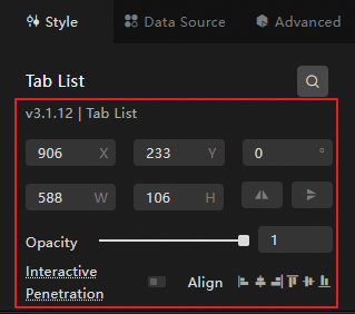
Defines the widget's position, transparency, and interaction penetration on the data dashboard.
|
|
|
General Configurations |
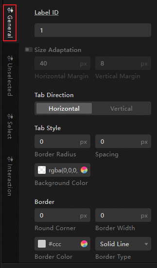
Defines the overall display style of the tab list, including the background and border of the tab container, and the size and arrangement of the tabs.
|
|
|
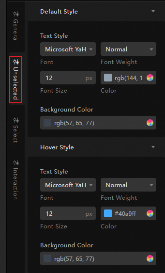
Unselected Configuration |
Defines the display style for unselected tabs.
Note
You can upload a local image to use as the background. |
|
|
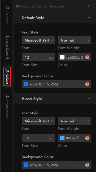
Selected Configuration |
Defines the display style for the selected tab.
Note
You can upload a local image to use as the background. |
|
|
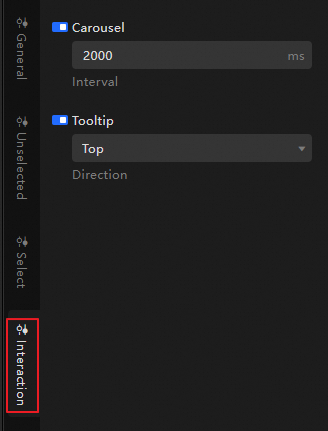
Interaction Configuration |
Sets the carousel interval for the tab list and the position of the tooltip relative to each tab. |
|
Advanced Configuration
On this tab, define interactions and data transfer relationships between the tab list and other widgets.
|
Configuration Item |
Description |
Figure |
|
Interaction Event |
Defines interaction behaviors with other widgets to enable widget linkage. For example, you can use a tab list and a line chart to show a company's business performance. By clicking different tabs, you can display fluctuations in sales data, customer data, market data, and production data. Click the |
|
|
Associate Global Variables |
You can associate global parameters in the widget to pass parameters between widgets for interaction. For an introduction to global variables, see Global Variables. Click the |
 icon to define the interaction events and actions.
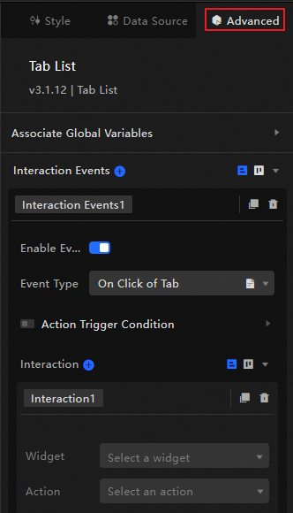
 icon to enable the corresponding instruction. When you click a tab, a data request is triggered, a temporary variable is thrown, and the tab content is dynamically loaded. By default, the
 Blueprint interaction
Use the Blueprint editor to define interaction logic between widgets in a visual, node-based way.
Procedure
-
On the canvas editor page, click the
icon on the left side of the top menu bar to open the Blueprint editor. -
In the layer node list, hover over the tab list widget and click the
icon to add the widget to the main canvas. -
Connect the nodes to configure the desired Blueprint interaction effects for the widgets.
The following figure shows an example.
 icon on the left side of the top menu bar to open the Blueprint editor.
 icon to add the widget to the main canvas.
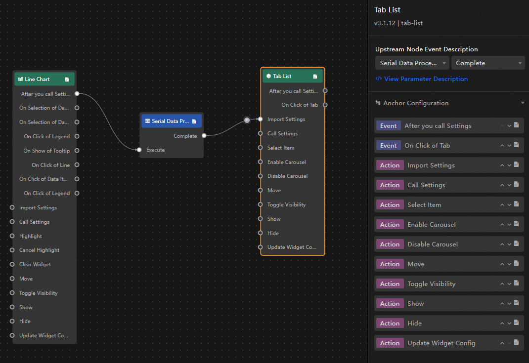
Configuration item descriptions
The following table describes interaction events and actions.
You can also click the  icon next to an event or action on the right side of the Blueprint configuration interface to view detailed parameter descriptions.
|
Category |
Subcategory |
Description |
|
Event |
When data is updated |
Triggers when the component data is updated. |
|
When data request status changes |
Triggers when the data request status changes. The status can be Loading, Success, or Error. |
|
|
When a tab is clicked |
Triggers when a tab is clicked. The event passes the data item of the corresponding tab. Example: |
|
|
Action |
Import data |
Processes and imports data to redraw the component without re-requesting from the server. Example: |
|
Request data |
Re-requests data from the server-side. Data from upstream converters or layer nodes is used as parameters. For example, if the API data source for the tab list is set to |
|
|
Set selected item |
Selects one or more tab options. The data can be an array or a single object. Example: |
|
|
Enable carousel |
Enables automatic carousel for the tab list. Example: |
|
|
Disable carousel |
Disables the carousel for the tab list. No parameters are required. |
|
|
Move |
Moves the component to a specified position. Example: |
|
|
Toggle visibility |
Toggles the component between visible and hidden. Example:
|
|
|
Show |
||
|
Hide |
||
|
Update component configuration |
Dynamically updates the style configuration of the component.
|
Demo
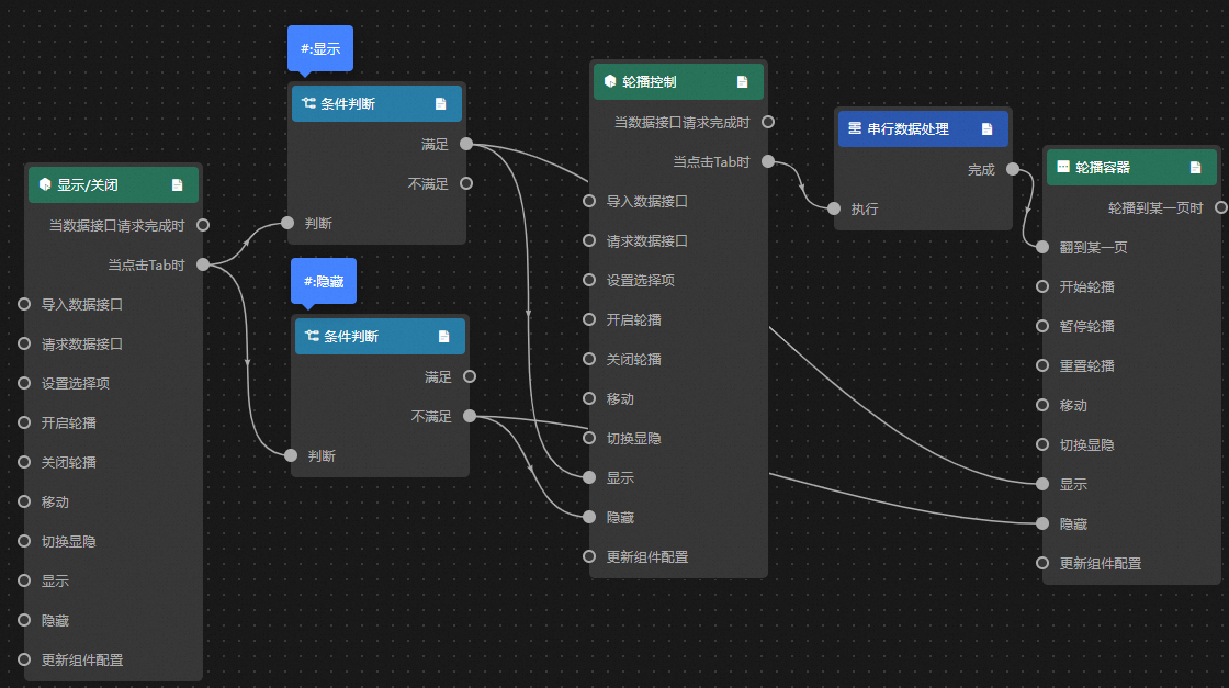
Use a tab list to control a group's carousel and visibility, creating a dynamic display effect.
Access the DataV console.
-
Select any data dashboard and click Edit to open the canvas editor.
-
Add a column chart, a line chart, a doughnut chart, and two Tab list widgets to the canvas.
-
Group the column chart, line chart, and doughnut chart. Set the trigger method for the carousel container to Event Trigger.
-
Click one of the tab list widgets. On the data source panel, modify the static data and change the widget's name to Show/Hide.
[ { "id": 1, "content": "Show" }, { "id": 2, "content": "Hide" } ] -
Click the other tab list widget and change its name to Carousel Control.
-
Click the
icon in the upper-left corner of the page to open the Blueprint page. -
On the Layer Node tab, add the carousel container, the Show/Hide widget, and the Carousel Control widget to the main canvas.
-
On the Logic Node tab, add one serial data processing node and two conditional nodes to the main canvas.
-
Connect the widgets.
-
Configure the processing methods.
-
Show
return data.id == 1; -
Hide
return data.id == 2; -
Serial Data Processing
return {
  index: data.id - 1
};
-
-
Click Preview in the upper-right corner of the page to preview the result.
 icon in the upper-left corner of the page to open the Blueprint page.