Configure the time range selector widget by customizing its basic settings, input box style, and drop-down box style.
The time range selector does not support mobile devices. Check the DataV website for updates.
Chart style
The time range selector is an advanced widget that supports custom basic settings, input box styles, and drop-down box styles.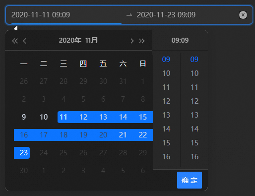
Style Panel 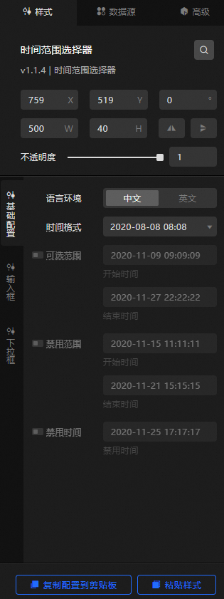
-
Search Configuration: Click the Search configuration items icon
 in the upper-right corner of the Style panel. In the Search Configuration panel, enter a configuration item name to locate it. Fuzzy match is supported. For more information, see Search configuration items.
 -
Size: the width and height of the widget. Unit: pixels.
-
Positioning: the x-axis and y-axis position of the widget. Unit: pixels. X-coordinate is the pixel distance from the upper-left corner of the widget to the left edge of the canvas. Y-coordinate is the pixel distance from the upper-left corner of the widget to the top edge of the canvas.
-
Rotate: Rotates the widget around its center. Unit: degrees.
-
Enter degrees in the Rotation Angle spin box, or click the plus (+) or minus (-) sign to adjust the value.
-
Click the
 icon to flip the widget style.
 -
Click the
 icon to flip the widget style.
-
-
Opacity: Valid values: 0 to 1. A value of 0 hides the widget. A value of 1 fully displays the widget. Default value: 1.
-
-
Basic Settings step
Metric
description
Language
The locale of the time range selector. Valid values: Chinese and English.
Time format
Select a time format from the drop-down list or enter a custom format, such as YYYY/MM/DD HH:mm:ss.
Optional scope
The selectable time range, including the start time and end time. Click the
 icon to show or hide the time range. The selectRange field in the Data panel takes precedence over the one in the Configurations panel. Values must use the specified time format.
Disable Range
The start time and end time of the disabled range. Click the
icon to show or hide the disabled range. The disabledRange field in the Data panel takes precedence over the one in the Configuration panel. Values must use the specified time format.Disable Time
A specific disabled time point. Click the
icon to show or hide the disabled time. The disabled field in the Data panel takes precedence over the one in the Configuration panel. Values must use the specified time format. -
Input box
Metric
description
Background Color
The background color of the input box.
Border Style
The border style of the input box, including the border line type, corner radius, line width, and color.
Text Style
The text style of the input box, including the color, font style, weight, and font size of the text.
Hover Style
The hover style of the input box, including the border color and font color.
Connection icon
The style of the connector icon in the input box, including icon size and color.
Clear icon
The style of the clear icon in the input box, including icon size, graphic color, default background color, and hover background color.
Underline
The underline style in the input box, including thickness, corner radius, and color.
-
drop-down box
Metric
description
drop-down box container
The container style of the drop-down box, including the top offset, corner radius, width, and height.
Disable Style
The disabled style in the drop-down box, including font size, background color, and font color for disabled calendar and time items.
Calendar Style
The calendar style in the time range selector drop-down box.
-
Column Width: The column width between calendar cells. Minimum value: 26 px.
-
Sub-item Fill: The fill color of each calendar sub-item, including the default color, hover color, and selected color.
-
Sub-item Text: The font style, weight, font size, default color, hover color, and selected color of calendar sub-item text.
-
Dotted Range: the color of the dotted line in the calendar range.
-
Content Background: the background color of the calendar.
-
Top Style: The top style of the calendar, including background color, text style, button colors in various states, and line separator width and color.
-
Week Style: The week row style in the calendar, including background color, border style, and text style.
NoteIf the border line width, corner radius, and color match the background color, the corner radius may be partially clipped.
Time Style
The time style in the time range selector drop-down box.
-
Column Width: The column width between time columns. Minimum value: 24 px.
-
Overall Background: the overall background color of the time style.
-
Top Style: The top style of the time section, including background color, text font size, and font color.
-
Split Style: The line separators in the time section, including the left line weight and color, top line weight and color, and per-column line weight and color.
-
Content Background: The background color of the time section content.
-
Sub-item Fill: The fill color of each time sub-item, including the default color, hover color, and selected color.
-
Sub-item Border: The border style of each time sub-item, including line type, corner radius, line width, default color, hover color, and selected color.
-
Sub-item Text: The font style, weight, font size, default color, hover color, and selected color of each time sub-item text.
Bottom Style
The style at the bottom of the Time Range Selector drop-down box.
-
Background Color: the background color at the bottom of the drop-down list.
-
Split Style: the style of the line separator at the bottom of the drop-down box, including the bottom line weight value and color.
-
Confirm Button: The confirm button style at the bottom of the drop-down box, including background color, border style, and text style.
-
 icon to show or hide the time range. The selectRange field in the Data panel takes precedence over the one in the Configurations panel. Values must use the specified time format.
Data Sources panel
|
Column |
Description |
|
|
The start time of the time range selector. |
|
|
The end time of the time range selector. |
|
|
You can specify a time range. If you do not specify this field in the Data panel, the default value ['1000-01-01 00:00:00', '5999-12-31 23:59:59'] is used. |
|
|
Set the time range to disable. If this field is not configured in the data panel, ['1000-01-01 00:00:00', '5999-12-31 23:59:59'] is used by default. |
|
|
Set to disable a time node separately. If the content is incomplete, use '5999-12-31 23:59:59'. |
|
Configure data items |
Description |
|
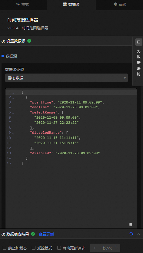
Data sources |
Use the code editor or visual editor to view and edit the data fields of the widget. You can also change the data type to configure component data. |
|
Data Mapping |
Set field mappings in the Data Mapping module to map data to the corresponding widget fields without modifying the data source. You can also click the |
|
Configure a filter |
Turn on Filter, select an existing data filter or create a data filter, and configure a data filter script to filter data. For more information, see Manage data filters. |
|
Data Response Result |
Displays widget data in real time. When the data source changes, the latest data is shown. Click the |
|
Forbid Loading |
When selected, the loading state is hidden during component initialization when updating or previewing the dashboard. Deselected by default. |
|
Controlled Mode |
When selected, the component does not request data during initialization and only responds to requests from global variables or Blueprint Editor. When cleared, the component supports automatic data updates. Deselected by default. |
|
Auto Data Request |
When selected, you can set a polling interval for dynamic data updates. When cleared, the page does not update automatically and requires a manual refresh or a trigger from Blueprint Editor or global variable events. |
 icon to configure the field style.
 icon to view the response result, or click the
  icon to refresh the data. You can also click View Example to view a sample response.
Advanced Panel
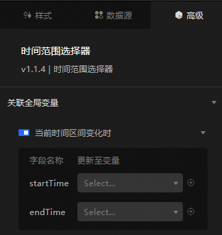
Enable the switch to associate the widget with global variables. When the time range changes, a data request is triggered and temporary variables are passed to other components. By default, the startTime and endTime values from the Data Source panel are used. For more information, see Component interaction configuration.
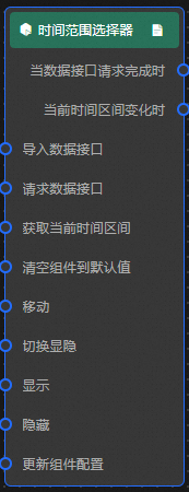
Blueprint Interaction
-
Click the
icon in the upper-left corner to go to the Blueprint page. -
On the Layer Nodes tab, add the widget to the main canvas.
-
View blueprint configuration parameters.
-
Event
Event
Description
When the data interface request is completed
Triggered after a data interface request is completed and processed by a filter, returning the processed JSON data. For data examples, see the Data Response Result section on the Data Source tab in the canvas editor configuration panel.
When the current time range changes
Triggered when the current time range changes. The event returns the corresponding data item. See the data example.
{ "startTime": "2020-12-12 09:09:09", "endTime": "2021-11-11 15:28:49" } -
Action
Action
Description
Import data
Imports pre-processed data for redrawing the widget without re-requesting server data. See the data example.
[
  {
    "startTime": "2020-11-11 09:09:09",
    "endTime": "2020-11-23 09:09:09",
    "selectRange": [
      "2020-11-09 09:09:09",
      "2020-11-27 22:22:22"
    ],
    "disabledRange": [
      "2020-11-15 11:11:11",
      "2020-11-21 15:15:15"
    ],
    "disabled": "2020-11-23 09:09:09"
  }
]
Request Data Interface
Requests server data again, using data from an upstream data processing node or layer node as parameters. For example, if the time range selector is configured with the API data source as
https://api.testand the data transferred to the request data interface as{ id: '1'}, the final request interface ishttps://api.test?id=1.Obtain the current time interval
Gets the current time range value. No parameters required.
Clear a component to its default value
Resets the component data to the default value. No parameters required.
Move
Moves the widget to a specified location. See the data example.
    {
      // The positioning type. to indicates absolute positioning, whereas by indicates relative positioning. The default value is to.
        "positionType": "to",
      // The location, which is indicated by the x and y coordinates.
      "attr": {
        "x": 0,
        "y": 0
      },
      // The animation type.
      "animation": {
        "enable": false,
        // The duration in which animation is displayed.
        "animationDuration": 1000,
        // The animation curve, which can be set to linear|easeInOutQuad|easeInOutExpo.
        "animationEasing": "linear"
      }
    }
Switch Display /Display
Toggles the widget between visible and hidden states. No parameters required.
Display
Shows the widget. See the data example.
{
  "animationType": "",// The animation method. Valid value: fade. If you do not specify this parameter, no animation is generated.
  "animationDuration": 1000,// The animation delay. Unit: ms.
  "animationEasing": ""// animation curve
}
Hide
Hides the widget. See the data example.
{
  "animationType": "",// The animation method. Valid value: fade. If you do not specify this parameter, no animation is generated.
  "animationDuration": 1000,// The animation delay. Unit: ms.
  "animationEasing": ""// animation curve
}
Update component configurations
Dynamically updates widget style configurations. In the Style panel, click Copy Configuration to Clipboard to obtain the configuration data, then modify the style field in the Blueprint Editor data processing node.
-
 icon in the upper-left corner to go to the Blueprint page.