DataV replaces the original component panel with the widget library panel to better organize the growing variety of widgets. The widget library lets you browse, search, and manage widget packages from official, custom, and third-party sources.
Component library source
The Widgets drop-down list displays all widget packages available in your account, which fall into three categories. 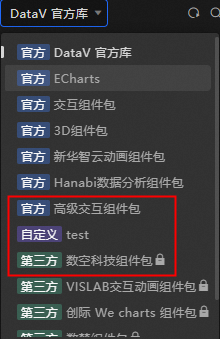
-
Official: Widget packages provided by DataV.
-
Custom: Widget packages that you created or that others authorized you to write to. A
 icon appears in the lower-left corner.
-
Third-party: Widget packages provided or authorized by third-party companies or individuals. A
 icon appears in the lower-left corner.
Component package switchover
In the Widget Library section, you can switch between widget packages by using the drop-down list. 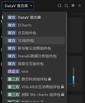
Search and classify widget display area
In the Component Library list, click the drop-down menu above the list to view all available widget packages. Widgets are organized by category so you can quickly find what you need. You can browse by category or click the  icon above the widget list to search. For more information, see Component classification.
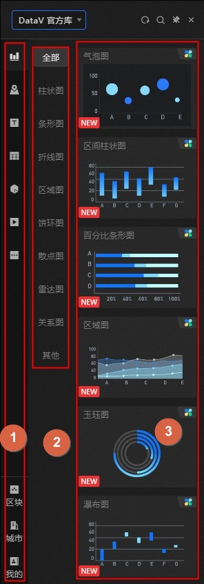
|
No. |
Description |
|
1 |
The Component Library Classification panel groups widgets by type, such as Chart, Map, Info, Table, Control, Media, and Others. Additional categories include Block, City, and My. |
|
2 |
The component library partition panel further divides certain categories into smaller groups. Categories with subcategories include Charts and Controls. |
|
3 |
The widget details panel. You can click or drag the widget to the canvas. For more information, see Canvas Editor. |
Panel function
The upper part of the Component Library panel provides the following options:
-
Click the
 icon to refresh the Component Library page. All components are updated to the latest version.
 -
Click the
icon to open the Shortcut Search panel and enter the widget that you want to query. -
Click the
icon to pin the Component Library panel to the Canvas Editor. When pinned, the panel stays open even if you open another panel. -
Click the
icon to close the Component Library panel.
 icon to refresh the Component Library page. All components are updated to the latest version.
  icon to open the Shortcut Search panel and enter the widget that you want to query.
  icon to pin the Component Library panel to the Canvas Editor. When pinned, the panel stays open even if you open another panel.
  icon to close the Component Library panel.