Data visualization
The DataAnalysis module in DataWorks provides a data visualization tool to display processed data in charts, allowing for quick analysis. This topic demonstrates how to visualize user profile data.
Prerequisites
Before you begin, ensure you have completed the steps in Process data to generate the basic user profile data.
Visualization scenarios
This example uses DataAnalysis to visualize and analyze user profile data, covering the following scenarios:
Scenario | Chart example |
City registration leaderboard |
|
Visit count distribution by age for registered members |
|
Visit count distribution by gender for registered members |
|
Analysis of visit counts by gender and zodiac sign |
|


Go to the SQL Query page
The operations in this example are performed in the DataAnalysis's SQL Query feature.
Log on to the DataWorks console. In the target region, click in the left-side navigation pane. Click Go to DataAnalysis to open the Data Analysis page. In the left-side navigation pane, click SQL Query.
Configure SQL Query data source
-
Authorize the Data Source.
To use a data source in DataAnalysis, you must first authorize it. Go to . Find the data source that you want to query, click Authorization in the Operation column, and grant permissions to your account. For more information, see Security Center.
-
Create a Temporary File.
-
Method 1: If this is your first time on the SQL Query page or no SQL file is open in the current window, click Create SQL Query to create a Temporary File.
-
Method 2: If an SQL file is already open, click the
 icon to create a Temporary File.
NoteFor more information about creating an SQL query, see SQL Query (Legacy).
-
-
Select a Data Source.
On the temporary file edit page, click the
 icon in the upper-right corner. Select the workspace, engine type, and data source for your query. This example uses a MaxCompute data source.
 icon in the upper-right corner. Select the workspace, engine type, and data source for your query. This example uses a MaxCompute data source.
Write an SQL query
In the temporary file editor, enter the following SQL statement and click the  button to query data in the ads_user_info_1d_emr table. In this example, the partition is
 dt='<your_date>'.
-- If the target partition is not found, you can run `show partitions <table_name>` to confirm the available partitions.
select * from ads_user_info_1d_emr where dt='<your_date>';
View query results and modify charts
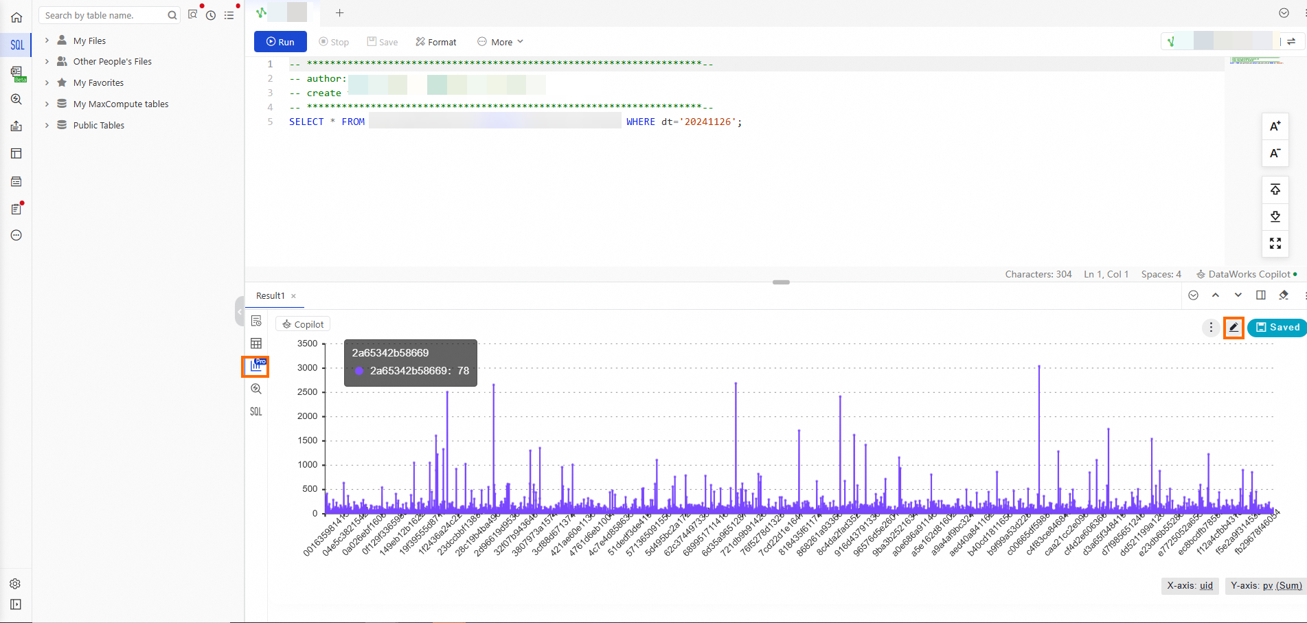
After the query returns results, click the  icon in the left-side panel to create a visualization. You can also click the
  icon in the upper-right corner of the chart to open the chart editor and modify the chart.
User ranking by city
-
Double-click the default chart title and enter a new title.
-
Configure the style.
In the right-side panel, go to .
-
Configure the data.
In the left-side panel, click Data Settings. Configure the X Axis to show a Distinct count and the Y Axis to show the Region.
-
Drag the UID field to the X Axiswell. From the X Axis drop-down list, select .
-
Drag the Region field to the Y Axis well.
-
-
Modify the axis titles.
In the right-side panel, click Style Settings. Under , click Details and select the Chart Style tab.
-
Click the axis title of the X Axis. In the Title Display section, change the X Axis field from UID to Number of Registered Members.
-
Click the axis title on the Y Axis, and in the Title Display section, change the Y Axis field from Region to Province.
-
Click Save in the upper-right corner to save the chart.
-
-
Review the final chart.


Age distribution
-
Double-click the default chart title and enter a new title.
-
Configure the style.
In the right-side panel, go to .
-
Configure the data.
In the left-side panel, click Data Settings. Set the category field to age_range and the value field to pv.
-
Drag the age_range field to the Category well.
-
Drag the pv field to the Value well. From the Value drop-down list, select .
-
Click Save in the upper-right corner to save the chart.
-
-
Review the final chart.


Gender distribution
-
Double-click the default chart title and enter a new title.
-
Configure the style.
In the right-side panel, go to .
-
Configure the data.
In the left-side panel, click Data Settings. Set the category field to gender, and the Value field to pv.
-
Drag the gender field to the Category well.
-
Drag the pv field to the Value well. From the Value drop-down list, select .
-
Click Save in the upper-right corner to save the chart.
-
-
Review the final chart.


Gender and zodiac analysis
-
Double-click the default title and enter a new title.
-
Configure the style.
In the right-side panel, go to .
-
Configure the data.
In the left-side panel, click Data Settings and configure the fields:
-
Drag the gender field to the X Axis well.
-
Drag the pv field to the Y Axis well. From the Y Axis drop-down list, select .
-
Drag the zodiac field to the Split well.
-
-
Modify the axis titles.
In the right-side panel, click Style Settings. Under , click Details and select the Chart Style tab.
-
Click the axis title on the X Axis, and in the Title Display section, you can set the field information for the X Axis by changing gender to Gender.
-
Click the axis title on the Y Axis. In the Title Display section, you can set the field information for the Y Axis by changing pv to Number of visits.
-
Click Save in the upper-right corner to save the chart.
-
-
Review the final chart.


Next steps
-
After editing a chart, click the Save button in the upper-right corner to save and share it. To create another visualization of the same data with a different style, click the Save As button.
-
To view your saved charts, go to the DataAnalysis page and click the
icon in the sidebar.

 icon in the sidebar.