Designer structure
To build a website quickly, you should first understand the structure and features of the designer. This topic describes the layout of the designer, its sections, and their functions.
The designer is divided into four sections: the top toolbar, the resource area on the left, the design area in the center, and the AI assistant on the right. The following figure shows the location of these sections.
To avoid naming conflicts with the top bar of the management console, the top section of the designer is referred to as the top toolbar.
Top toolbar
This section describes the features of the top toolbar from left to right.
Return: Click the Return icon on the far left to return to the website console.
Switch pages: Click the current page name to switch to another page.
In the center of the toolbar, you can switch between PC and mobile design modes. To the right of this option, you can switch the design language.
Click ... to access the Help Center, Rulers, and Operation History.
NoteRulers: The rulers change color based on the page style to avoid distracting from your design.
Operation History: You can view your operation history in the designer. You can also use the keyboard shortcut Shift+H to open it.
Undo, Redo, and Save: In addition to the buttons in the toolbar, you can use the following keyboard shortcuts:
Windows shortcuts: Undo: Ctrl+Z. Redo: Ctrl+Y. Save: Ctrl+S.
Mac shortcuts: Undo: ⌘+Z. Redo: Shift+⌘+Z. Save: ⌘+S.
Preview: Preview your website before publishing.
Layers: You can check the layers to find flaws in your design.
Publish: Click Publish to publish the website.
Backup: Click the grid icon to back up the current website design. This feature requires automatic backup to be enabled.
Resource area on the left
Content: Includes components for text, images, and image-text combinations. It also includes components that are primarily based on text and images, such as articles, products, and files.
Features: Includes components for features such as Alibaba Cloud Video, Map, Categories, Search, Message Board, Comments, Share, Music, and Member E-commerce.
Design:
Navigation: Includes various navigation components.
Layout: Includes buttons, lines, various layout components, such as containers and tabs, and pop-up windows.
Advanced: Includes components for HTML/CSS/JS code, Aifanfan configuration, CNZZ configuration, and third-party video configuration.
Form: Specifies the settings for the form.
Design area in the center
After you select a template, you can design the central design area, which consists of two sections: the page content, and the header and footer.
The header and footer sections can be left empty. You can use the same header and footer across multiple pages for a consistent design.
You can create multiple headers and footers.
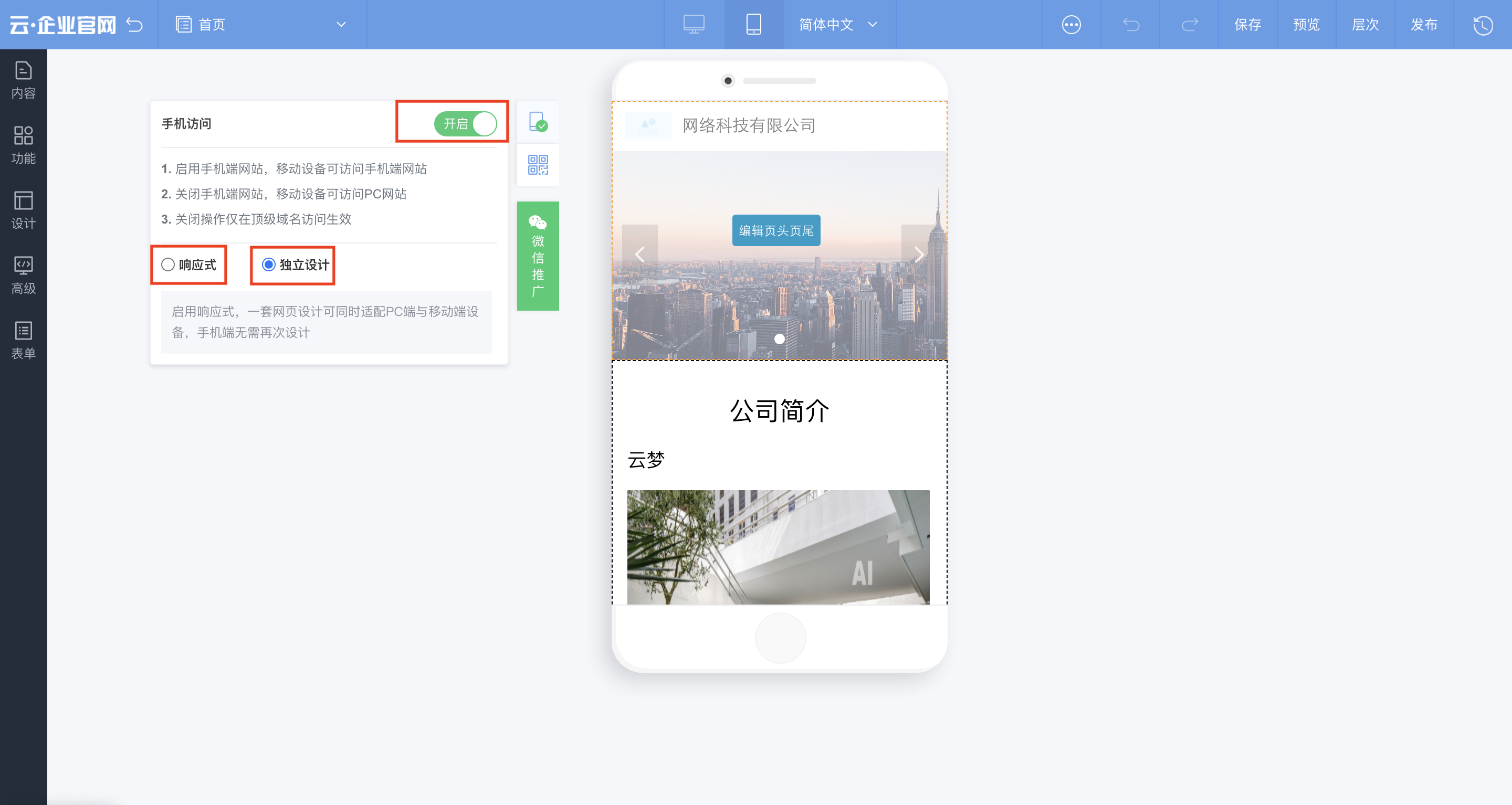
When you switch to the mobile view, you can use the pane on the left to configure how the website is displayed on different devices.
Responsive button: If you select this option, mobile devices access the PC website by default. The website layout automatically adapts to the device screen.
Separate design button: If you select this option, mobile devices access the separately designed mobile website by default.
Mobile access off: If you turn off mobile access, the responsive button, the separate design button, and the text below them are not displayed.
Quick settings panel
Right-click menu: You can right-click a component to open a context menu, as shown in the following figure. From this menu, you can click Align to set the alignment or click Layer to adjust the layer. If you select multiple components, you can also click Distribute to set their distribution.
 Note
NoteTo select multiple components, hold down the Ctrl or Command key and click each component.
Quick settings panel: When you click a component, its settings panel opens. This panel contains menu buttons for different features. You can switch between the menu buttons to quickly adjust settings such as arrangement, animation, content, and style.

Style: Adjust styles, such as shadows and formats. The interface is similar to PowerPoint.
Edit: Add or change data. You can also set data links and specify how they open.
Interaction: Design animations within the component.
Animation: Set the animation for the entire component.
Arrangement: Set the size and position.