Performance monitoring metrics
Performance monitoring metrics are quantitative indicators that measure system and application behavior under real conditions, enabling you to detect issues early and act before users are affected.
Performance monitoring metrics quantify how a system or application behaves under real conditions. They help developers and system administrators detect performance issues early and take action before users are affected. Core metrics include CPU usage, memory usage, disk I/O, network bandwidth, response time, concurrent connections, error rate, log records, resource utilization, and transaction throughput.
Latency
Latency is one of the three golden signals and the most direct indicator of application interface performance. The most common way to measure it is by average: add up all request latencies and divide by the total number of requests. This gives a single number reflecting the system's current response speed.
However, average latency has a critical flaw—outliers can skew it significantly. If 99 out of 100 requests take 10 ms but one abnormal request takes 1 minute, the average becomes (60,000 + 10 × 99) / 100 = 609.9 ms. This does not reflect real-world performance. For a more accurate picture, use latency quantiles and latency histograms alongside average values.
Latency quantiles
A quantile (also called a percentile) divides a dataset into groups based on rank. The median, or P50, splits data in half: 50% of values fall below it and 50% above. Compared to the average, the median filters out random outliers and gives a more stable baseline.
In IT, quantiles applied to latency reveal how interface services perform across the full distribution of requests:
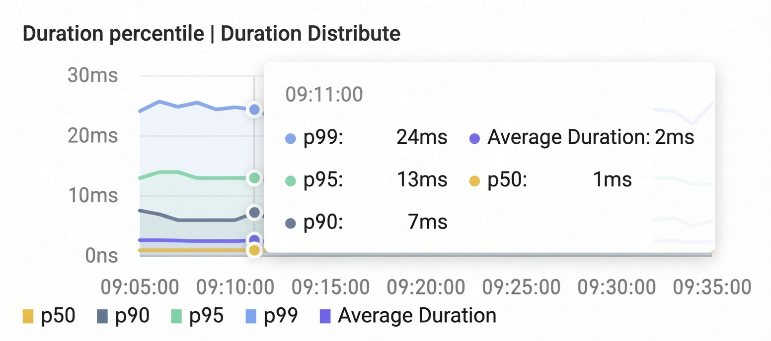
P50: Typical performance—what the average user experiences
P95: Performance under load—what most users experience during traffic spikes
P99: Worst-case performance—the slowest 1% of requests, often the threshold for unacceptable response times (for example, 30 seconds)
Compared to average latency, the P99 quantile provides three additional insights:
1% of service requests may be experiencing extremely long response times, but the proportion of affected users is much higher than 1%. A single end-user request can trigger multiple backend service calls—if any one is slow, the overall experience degrades. A user performing multiple operations is also affected if even one is slow.
The P99 quantile is an early warning for application performance bottlenecks. When P99 exceeds your availability threshold, the system's service capacity is approaching its limit. Addressing the slowest 1% of requests now prevents 5%, 10%, or more requests from slowing down as traffic grows.
"Power users" who handle large data volumes and complex queries are more likely to trigger slow requests. These users often have an outsized impact on revenue and reputation, so their issues require priority attention.
Beyond P99, commonly used quantiles include P99.9, P95, P90, and P50. Select the quantiles for monitoring and alerting based on the importance of each interface and its Service-Level Agreement (SLA). When you plot quantile values over time, they form a quantile line that lets you track latency trends and spot anomalies, as shown in the following figure:
Latency histogram
Latency quantiles condense response speed into a few key numbers—ideal for monitoring and alerting. To understand the full distribution of requests, a latency histogram is more suitable.
In a histogram, the horizontal axis represents latency ranges and the vertical axis represents request count. Both axes are often non-uniform because latency and request volume distributions are typically uneven. A non-uniform axis makes it easier to observe infrequent but important slow requests that a uniform scale would compress into insignificance. The following figure shows a sample distribution: over 10,000 requests have a latency of around 100 ms, nearly 1,000 fall in the 5–10 s range, and close to 10 take longer than 30 s.
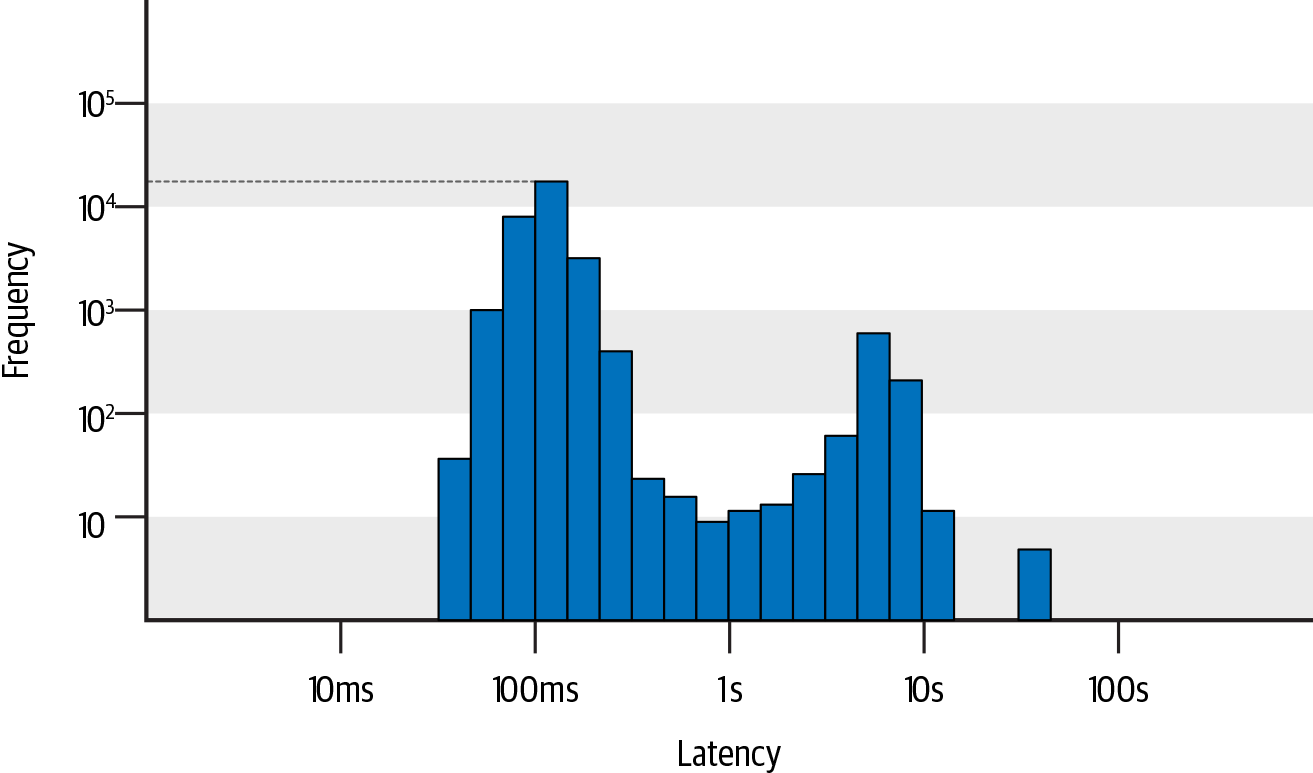
Histograms work well in combination with quantiles. Each latency quantile maps to a specific bucket on the histogram, so you can not only identify that the P99 threshold is 3 s, but also see how those slow requests are distributed—whether they concentrate in the 3–5 s range or extend beyond 10 s. For the same P99 value, these two distributions indicate very different severity levels and root causes.
When you notice an unusual distribution—such as an unexpected spike in a high-latency bucket—investigate by examining the specific transactions that occurred during that time window. This turns the histogram from an observation tool into a diagnostic tool, shortening the path from detecting a problem to finding its cause.
Use histograms to compare distributions across time periods:
For end-user-facing services where every long-tail request represents a poor experience, focus on changes in the highest-latency buckets, such as the bucket containing the P99 quantile.
For systems that prioritize throughput over tail latency—such as image processing pipelines—focus on distribution changes in the P90 or P50 buckets.
Cache hit ratio
A cache speeds up responses for frequent, repetitive requests. For example, an Order Hub can store product details in a Redis cache and query the database only on a cache miss. In a production environment, the cache hit ratio is a key metric for measuring system performance.
At the start of a promotional event, an Order Hub might experience a traffic surge followed by a drop and slow recovery—often accompanied by significant latency jitter. The request volumes for the cache and database fluctuate accordingly, as shown in the following figure.
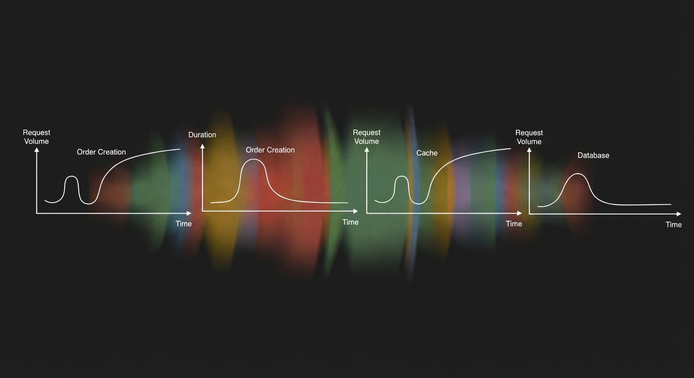
Cache request volume roughly tracks the create order interface traffic, while database request volume shows a much larger increase. This suggests that cache misses at the start of the promotion caused abnormal latency in the create order interface—because a database query is far more expensive than a cache lookup. Cache misses typically have two root causes: a drop in hit ratio from querying large volumes of cold data, or a traffic surge that exhausts cache connections. You can distinguish between these two causes by examining the cache hit ratio, as shown in the following figure.
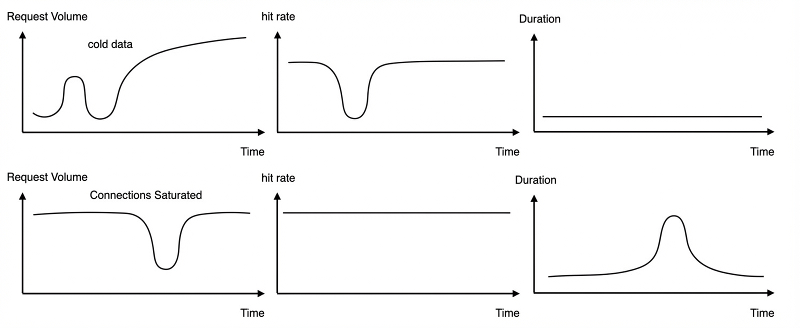
To reduce the impact of cold data during a promotion, prefetch the cache in advance to raise the hit ratio. For connection exhaustion, increase the maximum connections limit on the client-side or server-side cache connection pool, or scale out in advance. A severe drop in the cache hit ratio can lead to cache penetration, where a large number of requests bypass the cache and hit the database directly—potentially making the entire service unavailable. Set alerts on the cache hit ratio in production to detect these threats early.
CPU usage and load average
CPU usage
CPU usage is the percentage of time the CPU spends in a non-idle state. The formula is: CPU Usage = (1 − Idle Time / Total Time) × 100%.
For example, a single-core CPU that is non-idle for 0.8 s out of 1 s has 80% CPU usage. A dual-core CPU with non-idle times of 0.4 s and 0.6 s across its two cores has (0.4 + 0.6) / (1 × 2) = 50% usage.
In Linux, use the top command to view CPU usage:
Cpu(s): 0.2%us, 0.1%sy, 0.0%ni, 77.5%id, 2.1%wa, 0.0%hi, 0.0%si, 20.0%stThe output contains multiple fields, each measuring a different CPU state:
us(user): CPU time in user mode. High values indicate a busy application—typical user-mode programs include databases and web servers.sy(sys): CPU time in kernel mode, excluding interrupts. High values may indicate system bottlenecks.ni(nice): CPU time for user-mode processes with adjusted scheduling priority vianice. If a process's priority is changed, its CPU overhead is tracked separately.id(idle): CPU idle time. During this period, the CPU executes the System Idle Process.wa(iowait): CPU time waiting for I/O to complete. Keep this value as low as possible—high values indicate an I/O bottleneck. Investigate further withiostat.hi(hardirq): CPU time handling hardware interrupts from peripherals such as keyboard controllers. Hardware interrupts require an interrupt controller and complete quickly.si(softirq): CPU time handling software interrupts from programs such as network packet processors or timed schedulers. Software interrupts execute with a slight delay.st(steal): CPU time stolen by other virtual machines. This field appears only in multi-VM environments. High values may indicate abnormal behavior on the host or other VMs.
As a rule of thumb, keep total CPU usage in a production system below 70%.
Load average
Load average is the average number of processes in a runnable or uninterruptible state over a period of time—in other words, the average number of active processes.
Runnable processes are those currently using the CPU or waiting for it. Uninterruptible processes are in a critical kernel-mode flow that cannot be safely interrupted—for example, a process writing data to disk that, if interrupted, would cause data inconsistency between the disk and the process. This state is essentially a protection mechanism for processes and hardware devices.
In Linux, use the top command to view load average:
load average: 1.09, 1.12, 1.52These three numbers are the system's load average over the last 1, 5, and 15 minutes, respectively. A lower value means less workload; a higher value means the system is more loaded.
Ideally, each CPU core is fully utilized with no waiting processes—in this state, load average equals the number of logical CPU cores. In practice, running at full capacity is not recommended. A general rule of thumb: Load Average = 0.7 × Number of Logical CPU Cores.
If load average consistently exceeds 0.7 × logical CPU cores, investigate the cause before the system degrades.
If load average consistently exceeds 1.0 × logical CPU cores, take action to reduce the load.
If load average consistently exceeds 5.0 × logical CPU cores, the system is in a critical state and may be unresponsive or close to crashing.
In addition to absolute values, monitor the trend across the three intervals:
If the 1-minute, 5-minute, and 15-minute averages are close, the load is stable in the short term. Compare against the same time yesterday or last week to check for significant increases.
If the 1-minute average is much lower than the 5-minute or 15-minute averages, the load has been decreasing recently but was high over the past 5–15 minutes.
If the 1-minute average is much higher than the 5-minute or 15-minute averages, the load is rising sharply. If this is a sustained increase rather than a brief spike, investigate—especially if the 5-minute average has already exceeded 0.7 × logical CPU cores.
Relationship between CPU usage and load average
CPU usage measures how busy the CPU is. Load average is broader—it includes processes waiting for I/O, not just those using or waiting for the CPU. The two metrics are not equivalent:
For CPU-intensive applications, many processes wait for or use the CPU—so CPU usage and load average are positively correlated.
For I/O-intensive applications, many processes wait for I/O. Load average rises, but CPU usage stays low.