Displays a horizontal progress bar with customizable color, thickness, and animation.
Attributes
|
Attribute |
Type |
Default value |
Description |
Minimum version |
|
percent |
Float |
- |
Percentage (0~100) |
- |
|
show-info |
Boolean |
false |
Displays the percentage value on the right |
- |
|
stroke-width |
Number |
6 |
Line thickness in px |
- |
|
activeColor |
Color |
#09BB07 |
Color of the filled portion |
- |
|
backgroundColor |
Color |
- |
Color of the unfilled portion |
- |
|
active |
Boolean |
false |
Enables a left-to-right loading animation |
- |
Legend
Code example
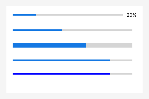
<progress percent="20" show-info/>
<progress percent="40" active/>
<progress percent="60" stroke-width="10"/>
<progress percent="80" active/>
<progress percent="80" color="#10AEFF"/>该文章对您有帮助吗?