Renders a vector icon with a configurable type, size, and color.
API
|
Attribute |
Type |
Default value |
Description |
Minimum version |
|
type |
String |
- |
The icon type. Valid values: |
|
|
size |
Number |
23 |
The icon size, in pixels. |
- |
|
color |
Color |
- |
The icon color. Accepts standard CSS color values. |
- |
Legend
Code example
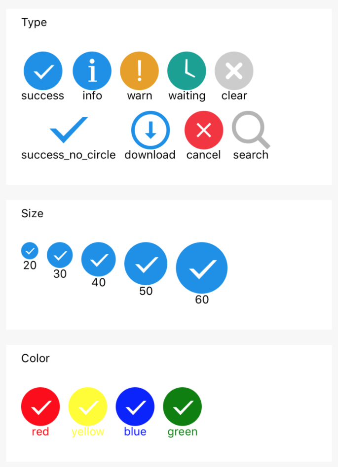
The following example iterates over icon types, sizes, and colors to render a grid of icons.
<block a:for="{{iconType}}">
  <view class="item">
    <icon type="{{item}}" aria-label="{{item}}" size="45"/>
    <text>{{item}}</text>
  </view>
</block>

<block a:for="{{iconSize}}">
  <view class="item">
    <icon type="success" size="{{item}}"/>
    <text>{{item}}</text>
  </view>
</block>

<block a:for="{{iconColor}}">
  <view class="item">
    <icon type="success" size="45" color="{{item}}"/>
    <text style="color:{{item}}">{{item}}</text>
  </view>
</block>
Page({
data: {
iconSize: [20, 30, 40, 50, 60],
iconColor: [
'red', 'yellow', 'blue', 'green'
],
iconType: [
'success',
'info',
'warn',
'waiting',
'clear',
'success_no_circle',
'download',
'cancel',
'search',
]
}
})该文章对您有帮助吗?