Bar chart
The bar chart component displays trends across multiple data series, simplifying data analysis and comparison.
Example
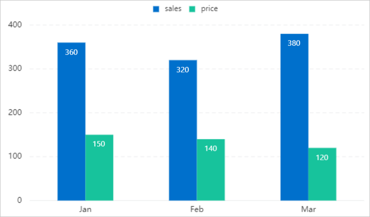
This example uses a bar chart to display a company's unit price (price) and sales volume (sales) for an item from January to March.
Step 1: Add the component
-
Create a web application. For more information, see Create a web application.
In the Web application editor, click the component icon
 on the left.
-
In the search box above the component list on the left of the canvas, enter Bar Chart, find the component, then drag it onto the canvas.
For more information about adding components, see Add a component.
Step 2: Configure a data source
-
In the web editor, select the component. In the Style pane on the right, click Configure data source.
-
On the Data source configuration page, select a data source type and complete the configuration.
Available data source types include API, data table resource, static data, and application push.
-
Click OK.
On the Data display tab, the Data source section on the left shows the name of the configured data source. The Dimension and Measure sections list the attribute fields automatically parsed from the data source.
NoteData source attribute fields are matched based on the following rules:
-
Dimension: boolean, string, and time fields.
-
Measure: numeric fields.
-
-
Optional: Click Data table in the upper-left corner to view all data from the configured data source.
Step 3: Configure data display
On the Data Display tab, configure the data and style for the bar chart.
-
Depending on your needs, drag a Dimension field and multiple Measure fields to the Horizontal Axis and Vertical Axis, respectively.
NoteThe system automatically assigns a color to the bar chart for each added measure field. You can change this color in the Color section under the Properties tab on the right side of the page. You cannot add or delete measure fields in this section.
-
Optional:Click the triangle icon next to a field in the X-axis or Y-axis well to perform the following operations.
Actions
Description
Aggregation method
Options: Sum (default), Average, Maximum, Minimum, and Count.
This feature is available only for measure fields. The configured aggregation method appears before the field name.
After setting an aggregation method for a measure field, you can configure filter conditions to display specific data.
NoteThis feature is available only when the component's data source type is Data Table Resource.
Filter
Add a field to the Filter section to use it as a filter item. You can then configure conditions based on this field to filter the displayed data. A maximum of 10 filters is supported.
Alternatively, from the Dimension or Measure section on the left, you can click the triangle icon next to a field to add it to the Filter section.
NoteThis feature is available only when the component's data source is a data table resource. For more information, see Configure filters.
Set display name
Edit the display name of the field.
-
On the right side of the Data Display tab, click Style and configure the display style of the component.
Parameter
Description
Chart type
Sets the bar chart type.
Based on the X-axis, there are two types: a bar chart, where data from each series is displayed in parallel, and a stacked bar chart, where data from each series is stacked sequentially.
Global style
Sets the global font for the component.
Title
Show or hide the title or legend. If visible, you can customize their appearance.
Legend
X-axis
Show or hide tick labels on the X-axis or Y-axis. If visible, you can customize their appearance.
NoteThe number of Y-axis ticks is based on the range of values and the specified interval. For example, if the minimum value is 0, the maximum value is 500, and the interval is 50, the number of ticks is 11.
Y-axis
Label
These settings control the visibility and appearance of data point labels, grid lines, background color, and borders.
Horizontal grid line
Background
Border
No data message
Configure the message that appears when the component has no data.
-
Click Complete Configuration to return to the web application editor and view the configured component data.
-
Adjust the component's position on the page. For more information about general component style settings, see Configure styles.
Step 4: Configure interactions
-
In the Interaction panel on the right side of the web application editor, click Add Interaction, and then set an event and an action.
This component supports the Mouse In event. For example, you can set the Mouse In event to trigger a Show/Hide action that reveals a hidden component with additional information.
For more information, see Interaction configuration.
-
Click Preview in the upper-right corner of the page to view and debug the component's data and style.