Edit a component
This topic describes how to edit the icon, basic information, and documentation for a component in the IoT Studio component development workbench.
Prerequisites
Upload the component package and screenshotsStep 1: Edit the component icon
The component icon appears in the component list for Web visual development, providing a quick preview of the component.
- On the IoT Studio component development page, click the component icon in the upper-left corner and follow the on-screen instructions to upload an icon.
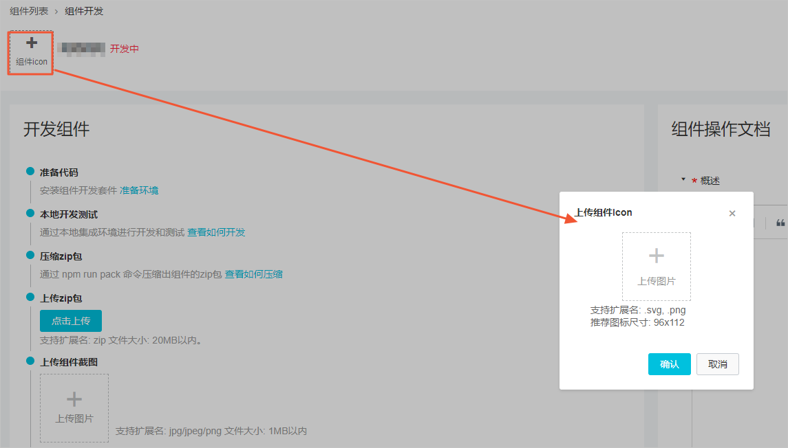
- Click OK.After you upload the icon, it appears in the upper-left corner of the page. To change the icon, hover over it and click Edit.
Step 2: Edit basic information
Before you publish a component, you can modify its name and description.
- On the IoT Studio component development page, click Edit Information in the upper-right corner and follow the prompts to modify the component information.
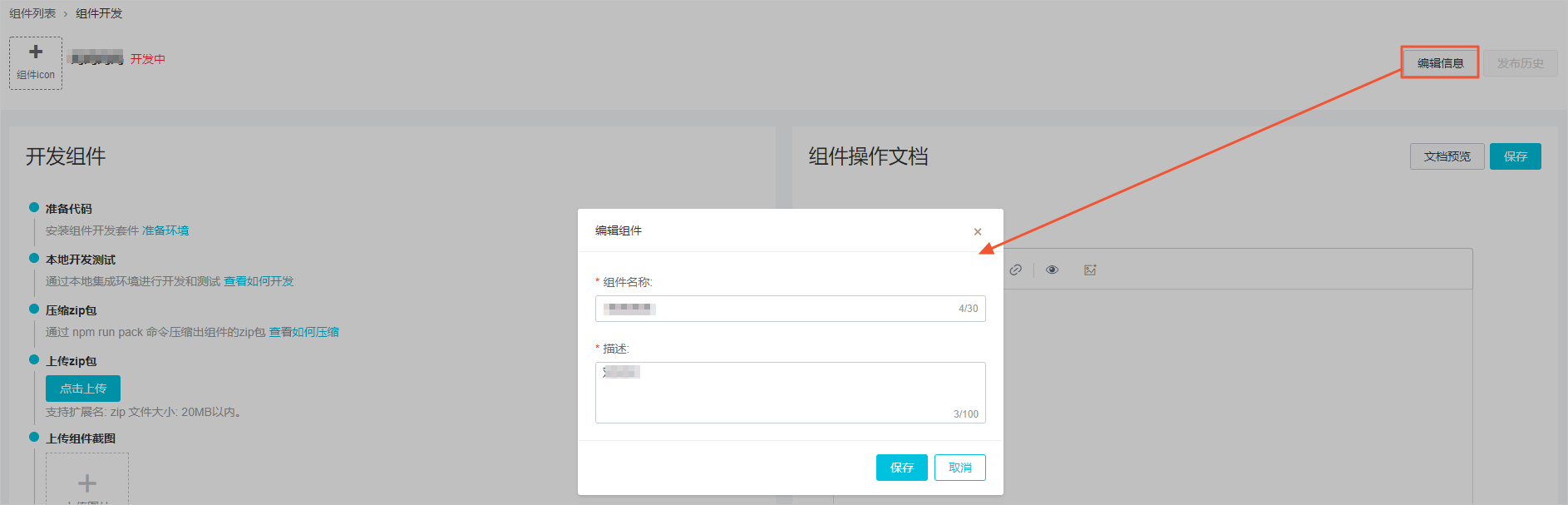
- Click Save.
Step 3: Edit component documentation
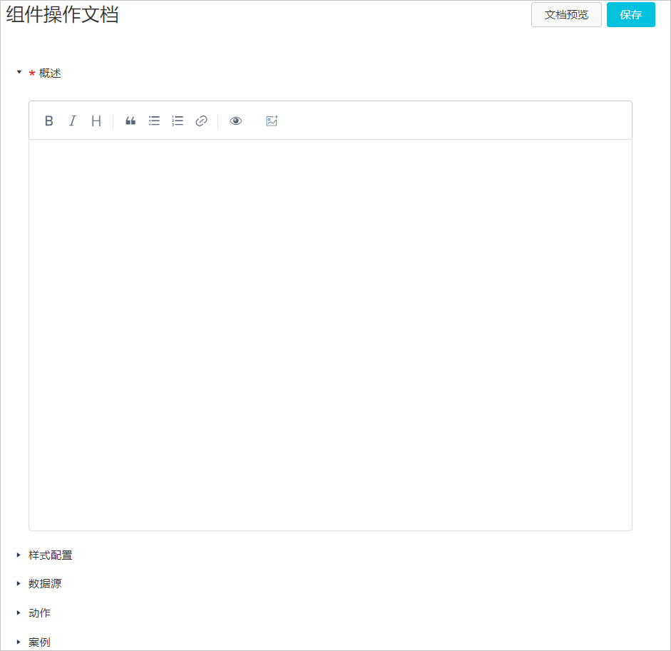
The component documentation helps other developers understand and correctly use your published component. The documentation consists of the following five sections:
- Component Overview: Describes the basic information about the component. This section is required.
- Style Settings: Describes the component's style settings.
- Data Source: Describes the component's data simulation and binding.
- Action: Describes the component's action settings.
- Example: Provides use cases for the component as a reference for other developers and users.
You must complete and save the required Component Overview section. You can also edit the component documentation during or after the development process.
After you edit and save the content, click Preview Documentation to see a real-time preview. When you import the component into Web visual development, a link to this documentation appears below the properties panel on the right.