Flicker Alarm
The flicker alarm component simulates a rippling effect to indicate the urgency of an alarm based on its diffusion speed and diffusion range. This article explains how to configure the flicker alarm component.
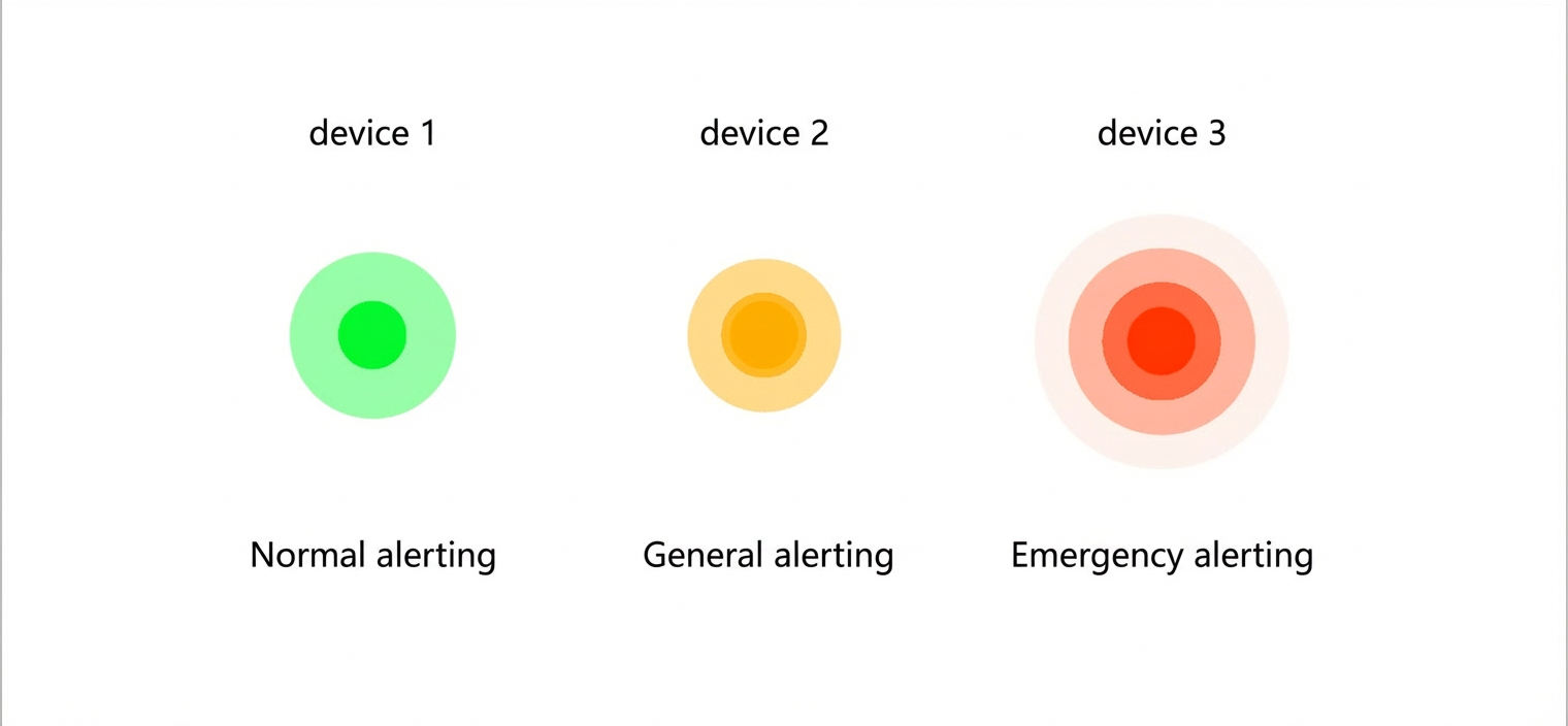
Example
The flicker alarm component displays the urgency of a device alarm.
Step 1: Add the component
-
Create a web application. For more information, see Create a web application.
-
In the web application editor, click the component icon
 on the far left.
 - In the search box above the component list, enter flicker alarm, find the component, and drag it to the canvas.
For more information about adding components, see Add a component.
Step 2: Configure the style
- In the Style panel, configure the display style for the flicker alarm component, including its diffusion speed, diffusion range, and background color.
Many style options support configuration with a data source. You can select device, API, or application push. The background color option only supports API and application push data sources.
Each parameter requires a specific data format. The data returned by your data source must match the required format.
Parameter Format background color JSON format for an RGB color. { "r": 255, "g": 255, "b": 255 }Or:
{
  "r": 255,
  "g": 255,
  "b": 255,
  "a":0
}
Note The a parameter represents opacity, with a value ranging from 0 to 1. -
Adjust the component's position on the page. For more information about general component style settings, see Configure styles.
Step 3: Configure interactions
- InteractionAdd InteractionEventActionOn the tab, click to configure an and a corresponding .
For example, you can click a component and perform the Open Link action to configure how the link opens and display the link's content.
For details, see Interaction configuration.
-
Click Preview in the upper-right corner of the page to view and debug the component's data and style.