Indicator
The indicator component displays information such as device status and alerts. This topic describes how to configure the component.
Use cases
-
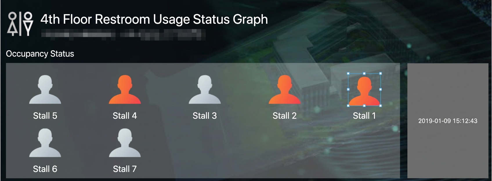
On a monitoring dashboard, indicators show the occupancy status of restrooms.
-
You can use multiple indicators to represent different states. For example, you can use a blue indicator for low water temperature, green for normal, and red for high.
Step 1: Add the component
-
Create a web application. For more information, see Create a web application.
-
In the web application editor, click the component icon
 on the far left.
 -
Above the component list on the left of the canvas, enter Indicator to find the component and drag it to the center canvas.
For more information about adding components, see Add a component.
In the search box of the component panel on the left, enter Indicator. From the Basic Components category, select the Indicator component and drag it to the center canvas. After you add the component, you can configure its properties, such as position, size, name, visibility, and opacity in the properties panel on the right. You can also bind a data source by clicking the Configure Data Source button.
Step 2: Configure the data source
-
In the Style panel on the right side of the web application editor, click Configure Data Source next to Display Data.
-
On the Data Source Configuration page, select a data source type and configure it.
The available data source types are device, API, static data, and App Push.
Note-
Both device and API data sources support boolean and numeric types (integer, single-precision number, and double-precision number). Additionally, a device data source supports the enum type.
-
Boolean: The indicator's on/off state corresponds to
trueandfalsevalues. The device's TSL properties or the API's return value configuration determines this mapping. -
Enum: Different enum values correspond to different states and colors. You can configure the corresponding colors based on the enum properties in the product's TSL.
-
Integer: Convert integer data returned by the device to a boolean or enum type.
-
Single-precision number and double-precision number: Convert single-precision or double-precision numbers returned by the device to an enum type.
-
Numeric: Use a data filtering script to convert numeric data returned by an API to a boolean or enum type.
-
-
When using this component in a Repeat List, to configure its display for when the device is offline, you must associate its data source with a device. The configuration is as follows:
If the data source is Device:
If the data source of the Repeat List is a device, this component's data source can be set to parent component data source or device.
If the data source of the Repeat List is a non-device type, this component's data source must be device.
The component parses the value of the bound property to determine the current state and displays the corresponding configuration options in the Style panel.
-
-
Click OK.
Step 3: Configure styles
-
In the Style panel on the right, select Display Style to configure the indicator's style.
-
Component Visibility:
If the data source is a device, you can only select a property from the thing model. Supported data formats are
float,double,integer,boolean, andenum. In this case, you can configure whether the component is visible when the device is offline. If the data source returns a numerical data type, you must use Convert Integer to Boolean or Convert Number to Enum to configure the visibility.NoteIn a Repeat List, to configure component visibility based on a thing model property (including the offline state), the component's data source must be a device. The configuration is as follows:
If the data source of the Repeat List is a device, the data source for component visibility can be set to parent component data source or device.
If the data source of the Repeat List is a non-device type, the data source for component visibility must be device.
Component Visibility supports dynamic data sources. Available options are device, API, and App Push.
-
Display Data:
-
Color: By default, the indicator's color corresponds to the data source's state value. You can modify this color.
-
Image: After you upload an image, the indicator displays an image corresponding to the data source's state.
In Color mode, the default color for the Off state is
#3B81FF, and the default for the On state is#FFBF00. In Image mode, you can click Upload Image for the Off and On states to set an image for each state. -
-
-
Adjust the component's position on the page. For more information about general component style settings, see Configure styles.
Step 4: Configure interactions
-
In the Interaction panel on the right side of the web application editor, click Add Interaction, and then set an event and an action.
This component supports the Mouse In event. For example, you can set the Mouse In event to trigger a Show/Hide action that reveals a hidden component with additional information.
For more information, see Interaction configuration.
-
Click Preview in the upper-right corner of the page to view and debug the component's data and style.