Mini line chart
The Mini Line Chart component displays the trend of a single data series as a line or curve, without X or Y axes, for quick data viewing and analysis. This article describes how to configure the Mini Line Chart component.
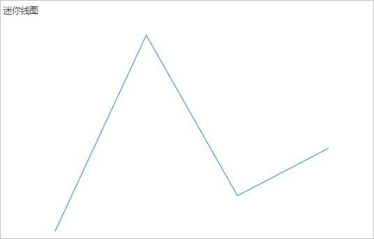
Example
The following figure shows a Mini Line Chart displaying the temperature trend over time.
Step 1: Add the component
-
Create a web application. For more information, see Create a web application.
-
In the web application editor, click the component icon
 on the far left.
 -
Above the component list on the left side of the canvas, enter Mini Line Chart in the search box to find the component, then drag it onto the canvas.
For more information about adding components, see Add a component.
In the component panel on the left, search for and add the Mini Line Chart component to the canvas. You can then adjust the component's style, such as its position, size, and opacity, in the panel on the right. Click Configure Data Source to configure the data for the component.
Step 2: Configure a data source
-
In the web editor, select the component. In the Style pane on the right, click Configure data source.
-
On the Data source configuration page, select a data source type and complete the configuration.
Available data source types include API, data table resource, static data, and application push.
-
Click OK.
On the Data display tab, the Data source section on the left shows the name of the configured data source. The Dimension and Measure sections list the attribute fields automatically parsed from the data source.
NoteData source attribute fields are matched based on the following rules:
-
Dimension: boolean, string, and time fields.
-
Measure: numeric fields.
-
-
Optional: Click Data table in the upper-left corner to view all data from the configured data source.
Step 3: Configure data display
On the Data Display tab, configure the data and style for the Mini Line Chart.
-
Drag a dimension field to the Category box and a measure field to the Value box.
NoteTo change the default colors, go to the Properties or Style tab on the right side of the Data tab.
-
In the Category and Value boxes, click the triangle icon next to a field to access the following options.
Actions
Description
Aggregation method
Options: Sum (default), Average, Maximum, Minimum, and Count.
This feature is available only for measure fields. The configured aggregation method appears before the field name.
After setting an aggregation method for a measure field, you can configure filter conditions to display specific data.
NoteThis feature is available only when the component's data source type is Data Table Resource.
Filter
Add a field to the Filter section to use it as a filter item. You can then configure conditions based on this field to filter the displayed data. A maximum of 10 filters is supported.
Alternatively, from the Dimension or Measure section on the left, you can click the triangle icon next to a field to add it to the Filter section.
NoteThis feature is available only when the component's data source is a data table resource. For more information, see Configure filters.
Set display name
Edit the display name of the field.
-
On the right side of the Data Display tab, click Style to configure the component's display style.
Parameter
Description
Mini Line Chart style
Configure the line's appearance, such as enabling a smooth curve, showing a filled area, setting min/max values, and adjusting the line weight.
NoteThe valid range for line weight is 0 to 10.
Title
Show or hide the item. If shown, you can configure its display style.
Background
Border
No Data Message
Step 4: Configure interactions
-
In the Interaction panel on the right side of the web application editor, click Add Interaction, and then set an event and an action.
This component supports the Mouse In event. For example, you can set the Mouse In event to trigger a Show/Hide action that reveals a hidden component with additional information.
For more information, see Interaction configuration.
-
Click Preview in the upper-right corner of the page to view and debug the component's data and style.