Radar chart
This component displays data in a spiderweb or circular layout. It uses angular axes to represent specific categories and a polar axis for values, showing the values or ratios from an analysis. This helps you visualize trends and compare data across multiple dimensions. This topic describes how to configure the radar chart component.
Example
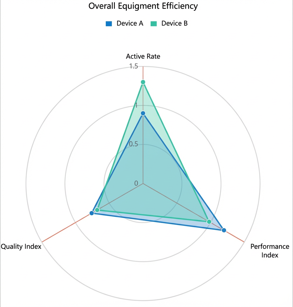
The following figure shows a radar chart comparing the overall equipment effectiveness (the ratio of a device's actual production capacity to its theoretical capacity) of Equipment A and Equipment B in a factory. The equipment is compared across three dimensions: availability, performance, and quality. The chart shows that Equipment A has better overall equipment effectiveness.
Step 1: Add the component
-
Create a web application. For more information, see Create a web application.
In the Web application editor, click the component icon
 on the left.
-
Above the component list on the left side of the canvas, enter radar chart to find the component. Then, drag the component onto the canvas.
For more information about adding components, see Add a component.
Step 2: Configure a data source
-
In the web editor, select the component. In the Style pane on the right, click Configure data source.
-
On the Data source configuration page, select a data source type and complete the configuration.
Available data source types include API, data table resource, static data, and application push.
-
Click OK.
On the Data display tab, the Data source section on the left shows the name of the configured data source. The Dimension and Measure sections list the attribute fields automatically parsed from the data source.
NoteData source attribute fields are matched based on the following rules:
-
Dimension: boolean, string, and time fields.
-
Measure: numeric fields.
-
-
Optional: Click Data table in the upper-left corner to view all data from the configured data source.
Step 3: Configure data display
On the Data display tab, configure the data and style for the radar chart.
-
Based on your requirements, drag a dimension field to the category well, another dimension field to the series well, and a measure field to the value well.
NoteThe system automatically assigns a color to each added category. You can change the color in the Color section of the Properties tab on the right.
-
Optional: In the category, series, and value wells, click the triangle icon next to a field to perform the following operations.
Actions
Description
Aggregation method
Options: Sum (default), Average, Maximum, Minimum, and Count.
This feature is available only for measure fields. The configured aggregation method appears before the field name.
After setting an aggregation method for a measure field, you can configure filter conditions to display specific data.
NoteThis feature is available only when the component's data source type is Data Table Resource.
Filter
Add a field to the Filter section to use it as a filter item. You can then configure conditions based on this field to filter the displayed data. A maximum of 10 filters is supported.
Alternatively, from the Dimension or Measure section on the left, you can click the triangle icon next to a field to add it to the Filter section.
NoteThis feature is available only when the component's data source is a data table resource. For more information, see Configure filters.
Set display name
Edit the display name of the field.
-
On the Data display tab, click style on the right to configure the component's appearance.
Parameter
Description
Radar style
Configure the shape of the radar chart, specify whether to fill the area, and set minimum or maximum values.
Title
Controls the visibility of the corresponding element. If visible, you can customize its style.
Legend
Label
Grid line
Angle line
Background
Border
No data message
-
Click Complete Configuration to return to the web application editor and view the configured component data.
-
Adjust the component's position on the page. For more information about general component style settings, see Configure styles.
Step 4: Configure interactions
-
In the Interaction panel on the right side of the web application editor, click Add Interaction, and then set an event and an action.
This component supports the Mouse In event. For example, you can set the Mouse In event to trigger a Show/Hide action that reveals a hidden component with additional information.
For more information, see Interaction configuration.
-
Click Preview in the upper-right corner of the page to view and debug the component's data and style.