Dual Y-axis bar and line chart
A dual Y-axis bar and line chart combines a bar chart and a line chart to visualize complex data. This topic explains how to configure this component.
Example
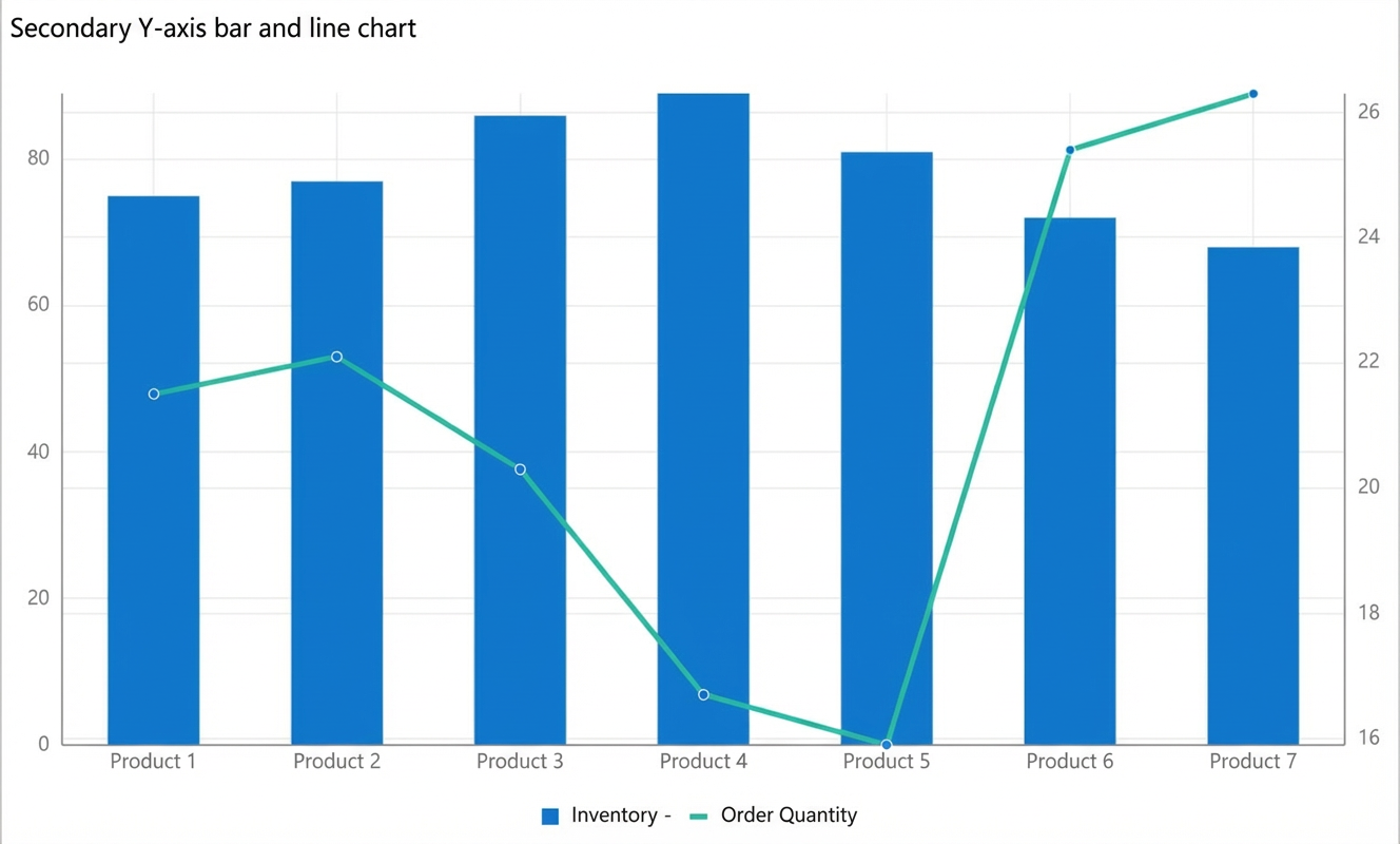
For example, you can use a dual Y-axis bar and line chart to visualize product inventory and order quantities, as shown in the following figure.
Step 1: Add the component
Create a web application. For more information, see Create a web application.
In the Web application editor, click the component icon
 on the left.
-
In the search box above the component list, enter dual Y-axis bar and line chart to find the component. Then, drag the component to the canvas.
For more information about adding components, see Add a component.
Step 2: Configure the data source
In the web application editor, select the component. On the Style tab on the right, click Configure Data Source.
On the Data Source Configuration page, select a data source type and complete the configuration.
The available data types are API, Data Table Resource, Static Data, and Application Push.
Click OK.
On the Data tab, the name of the configured data source is displayed in the Data Source section on the left. The Dimensions and Measures sections display the property fields that are automatically parsed from the data source.
NoteData source property field matching rules:
Dimensions: Boolean, character, and time fields.
Measures: Numeric fields.
Optional: In the upper-left corner, click Data Table to view all data from the configured data source.
Step 3: Configure data display
On the Data Display tab, configure the data and style settings for the dual Y-axis bar and line chart.
-
Drag a field from the Dimension section to the X-axis container, and fields from the Measure section to the left Y-axis (bar) and right Y-axis (line) containers.
NoteYou can change the default system colors on the Property or Style tab on the right side of the Data page.
-
In the X-axis, left Y-axis (bar), and right Y-axis (line) containers, click the triangle icon next to a field to perform the following operations.
Operation
Description
Aggregation Method
Options: Sum (default), Average, Maximum, Minimum, and Count.
This feature is available only for measure fields. The selected aggregation method is displayed before the field name.
After you set an aggregation method for a measure field, you can configure filter conditions to display specific data.
NoteThis feature is available only when the component's data source is a Data Table Resource.
Filter
Add a field to the Filter section. You can then configure conditions for this field to filter the displayed data. You can add up to 10 filters.
You can also click the triangle icon for a field in the Dimensions or Measures section on the left to add the field to the Filter section.
NoteThis feature is available only when the data source type for the component is Data Table Resource. For more information, see Configure a filter.
Set Display Name
Edit the display name of the field.
-
On the right side of the Data Display tab, click Style to configure the component's style settings.
Parameter
Description
Bar and line chart style
Set whether to use a smooth line, display an area fill, and specify the line thickness.
NoteYou can set the line thickness to a value from 0 to 10.
Title
Show or hide the item. If you show the item, you can configure its display style.
Legend
X-axis
Left Y-axis
Right Y-axis
Background
Border
No data prompt
-
In the upper-right corner of the page, click Finish Configuration to return to the web application editor and view the configured component data.
Adjust the position of the component on the page. For more information about common component style configurations, see Style configuration.
Step 4: Configure interactive actions
On the Interaction tab in the right-side pane of the web application editor, click Add Interaction to configure the Event and Action.
This component supports the Mouseover event. For example, you can execute the Show/Hide action on mouseover to display a hidden component that provides more information about the data.
For more information, see Interaction configuration.
Click Preview in the upper-right corner of the page to preview and test the component's data and style.