Time status chart
The time status chart is a segmented bar chart that shows the proportion of subcategories within a larger category, allowing you to visualize data across multiple dimensions. This topic describes how to configure this component.
Example
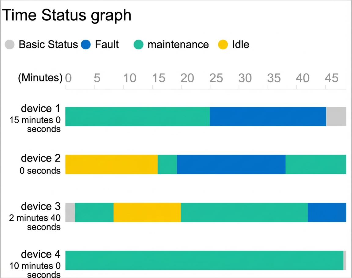
The following figure shows an example of factory equipment status over time.
Step 1: Add the component
Create a mobile application. For more information, see Create a mobile application.
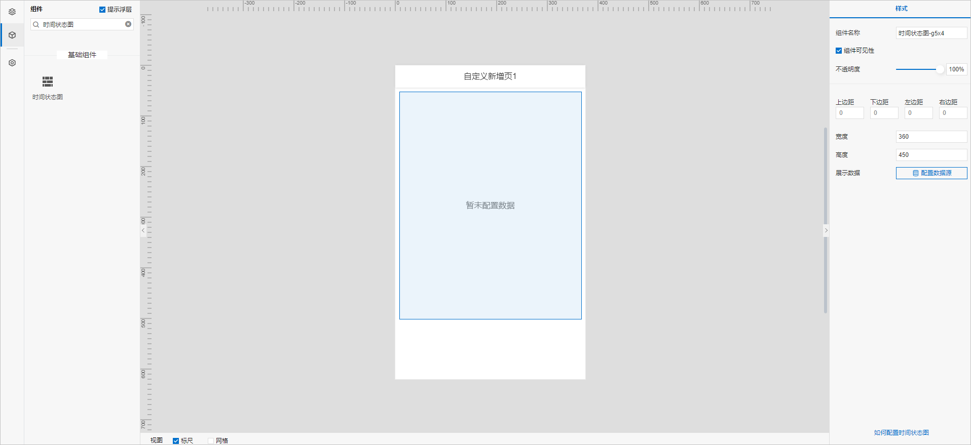
In the mobile application editor, click the Components icon
 on the far left.
(Optional) Add a column component to set the page layout. For more information, see Horizontal columns and vertical columns.
Above the component list on the left side of the canvas, enter Time Status Chart in the search box. After you find the component, drag it onto the canvas.
For more information about adding components, see Add a component.
Step 2: Configure the data source
In the Style panel on the right of the mobile application editor, click Configure Data Source next to Display Data.
On the Data Source Configuration page, select a data source type and complete the configuration.
The available data source types are API, data table resource, static data, and application push.
Click OK.
On the Data Display tab, the name of your configured data source appears under Data Source. The system automatically parses fields from your data source and lists them under dimension and measure.
NoteData source attribute matching rules:
-
dimension: Boolean, string, and time fields.
-
measure: Numeric fields.
-
(Optional) Click Data Table in the upper-left corner to view all data from the configured data source.
Step 3: Configure data display
On the Data Display tab, configure the data and style for the time status chart.
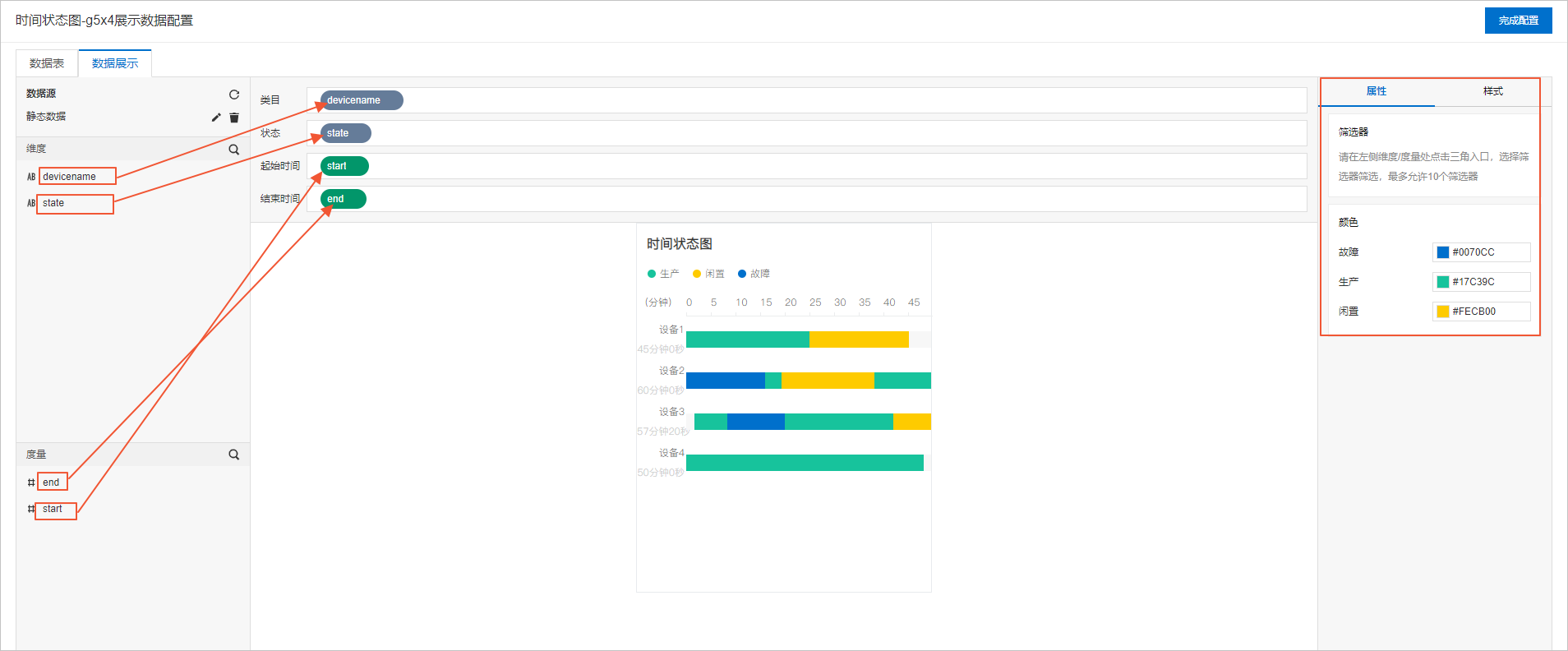
Drag fields from the left panel to the configuration wells: drag a dimension field to Category, a dimension field to Status, a dimension or measure field to Start Time, and a dimension or measure field to End Time.
NoteYou can change the default system colors on the Properties or Style tab.
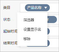
(Optional) In the Category, Status, Start Time, and End Time wells, click the triangle icon next to a field to perform the following actions.
Actions
Description
Aggregation method
Options: Sum (default), Average, Maximum, Minimum, and Count.
This feature is available only for measure fields. The configured aggregation method appears before the field name.
After you set an aggregation method for a measure field, you can configure filter conditions again to display specific data.
NoteThis feature is available only when the component's data source type is data table resource.
Filter
Add a field to the Filter section and configure conditions based on the field to filter the displayed data. You can add up to 10 filters. You can also click the drop-down arrow next to a field in the Dimension or Measure section to add the field to the Filter section.
NoteThis feature is available only when the component's data source type is data table resource. For more information, see Filter Configuration.
Set display name
Edit the display name of the field.
On the right side of the Data Display tab, click Style to configure the component's appearance.
Parameter
Description
Global Settings
Configure the time range type, basic status color, basic status name, width per second, and font.
Title
Show or hide the title. If shown, you can configure its appearance.
Legend
Configure the font size, color, and weight.
Time axis
Configure the font size, color, weight, axis color, and style.
Category axis
Configure the font size, color, and weight.
Total Duration of Basic Status
Show or hide the item. If visible, you can configure its appearance.
Background
Border
Click Done to return to the mobile application editor and view the configured component data.
Step 4: Configure the style
Adjust the component's dimensions and position on the page. For more information, see General styles.
Preview and debug the component's data display and style. For more information, see Preview and debug.