Flex layout
In addition to grid layout, Mobi supports flex layout, which offers more precise visual control and better adaptability.
Grid layout vs. flex layout
Grid layout is an efficient and flexible way to build pages. It lets you quickly construct a page structure by dragging components and positioning them with coordinates. However, grid layout has some limitations in certain scenarios.
1. It can create unwanted gaps: When a component is placed below a text block of variable height, a gap can appear if the text becomes shorter. In this scenario, the component below should remain directly under the text component without any gap.
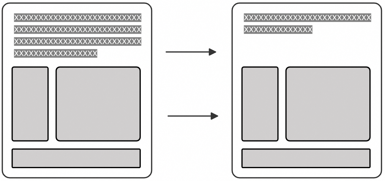
2. Certain layouts are impossible to create: The columns of a grid are calculated dynamically based on the width of the outer container. This makes it impossible to create layouts that contain text of variable width or square containers.
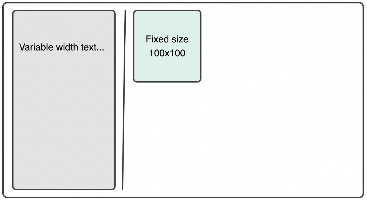
The element on the left has a variable width. The element on the right is positioned accordingly.
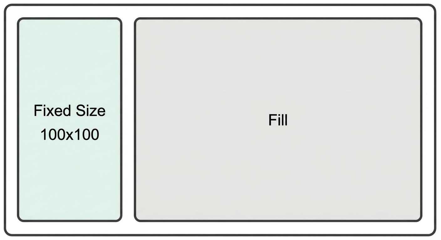
A 100 × 100 pixel square is on the left. The element on the right fills the remaining space.
Flex container configurations
You can solve these problems using flex layout.
You can switch the layout mode of any container from Grid to Flex. The following configurations are available for flex containers:
1. Flex container: Direction
You can set the direction in which child elements are arranged within a flex container. The options are top to bottom, left to right, bottom to top, and right to left. Wrapping is also supported.
Arranged from top to bottom
Arranged from top to bottom, wrapping to the right
Arranged from top to bottom, wrapping to the left
Arranged from left to right
Arranged from left to right, wrapping downwards
Arranged from left to right, wrapping upwards
2. Flex container: Horizontal or vertical item alignment
For a parent container with a vertical arrangement, you can set the horizontal alignment of its child components.
Align left
Align center
Align right
For a container with a horizontal arrangement, you can set the vertical alignment of its child components.
Align top
Align center
Align bottom
3. Flex container: Vertical and horizontal content alignment
For a parent container with a vertical arrangement, you can set how its child components are aligned along the vertical axis.
Align top
Align center
Align bottom
Justify
Equal pitch
For a parent container with a horizontal arrangement, you can set how its child components are aligned along the horizontal axis.
Align left
Align center
Align right
Justify
Space evenly
4. Flex container: Gap between child elements
You can set the vertical or horizontal gap between child elements in a flex container.
Vertical gap
Horizontal gap
5. Flex container: Row or column alignment (active when wrapping is enabled)
For a parent container with a vertical arrangement and wrapping enabled, you can set the column alignment for child components.
Align left
Align center
Align right
Justify
Equal pitch
Stretch
For a parent container with a horizontal arrangement and wrapping enabled, you can set the row alignment for child components.
Align top
Align center
Align bottom
Justify
Space evenly
Stretch
Flex item sizing configurations
Child components within a flex container have five sizing configurations: Width, Height, Align self (vertical or horizontal), Shrink, and Overflow. These configurations are described below.
1. Width and height configuration
The options for width and height include Auto, Fixed pixels, Percentage, and Custom CSS. If the parent container has a horizontal arrangement, the width can be set proportionally. If the parent container has a vertical arrangement, the height can be set proportionally.
For example, if you set the width of child1 to a proportion of "1" and the width of child2 and child3 to 30 px, child1 fills the remaining space.
If you set the width of child2 to a proportion of "2", the width ratio of child1 to child2 becomes 1:2.
"Auto" width and height
When set to Auto, an element renders with the minimum width and height it needs.
Rendering priority: 1. Auto, 2. Fixed pixels, Percentage, or Custom CSS, 3. Proportional
The parent container first renders child components with automatic or fixed-pixel dimensions and then uses the remaining space for proportional rendering.
2. Align self (vertical or horizontal)
A child component can have its own alignment, which overrides the alignment set on the parent container. The alignment axis depends on the parent's arrangement direction.
3. Shrink configuration
Child components shrink by default when their total size exceeds the parent container's size.
Example: Set the height to 999 px.
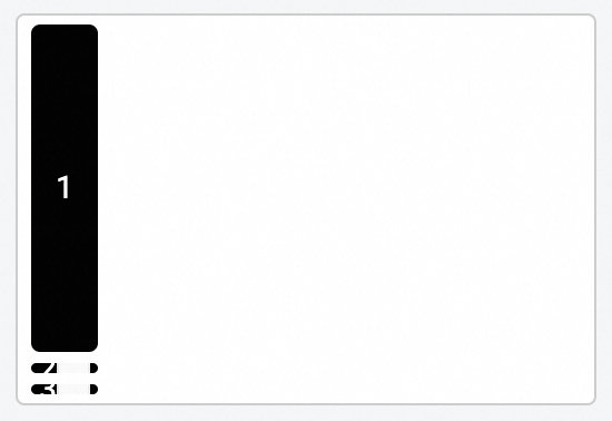
In this scenario, the height of child1 is set to 999 px. The combined height of the three components exceeds the height of the parent container. Because child components shrink by default, they are compressed during rendering.
If all three child components are set to "Do not shrink", a scrollbar appears on the parent container.
4. Overflow
In a flex container, this property controls how a child element is displayed when its allocated space is insufficient for rendering. The following example uses a container to demonstrate item overflow, but the principle applies to any component.
Overflow scroll
Overflow visible
Overflow hidden
Summary
Using flex layout helps you create more adaptive page layouts. In mobile scenarios, flex layout also helps you create pages that adapt to a wider range of device models.