This topic describes how to make pages responsive on different display devices.
Screen responsiveness
Screen responsiveness allows a webpage or application to dynamically adjust its layout and content based on the user's screen size and resolution. The goal is to provide a consistent and comfortable viewing experience on any device, from small mobile screens to large PC monitors.
On PCs, screen responsiveness is especially important because monitor resolutions can vary widely. For example, a standard laptop might have a 1440x900 resolution, while an ultrawide monitor could be 1920x1080 or higher. Setting a suitable maximum width provides a better viewing experience.
How to make pages responsive on different displays
To make pages responsive on different displays, you can configure the following features:
Minimum width: Prevents content from being compressed on small screens.
When the browser viewport is narrower than the minimum width set for the application, a scroll bar appears to ensure that all content is fully displayed.
Maximum width: Prevents content from being stretched on large screens.
You can set a maximum width for the page to inherit or overwrite the application's maximum width setting. When the browser viewport is wider than the application's maximum width, the content is centered with empty space on both sides.
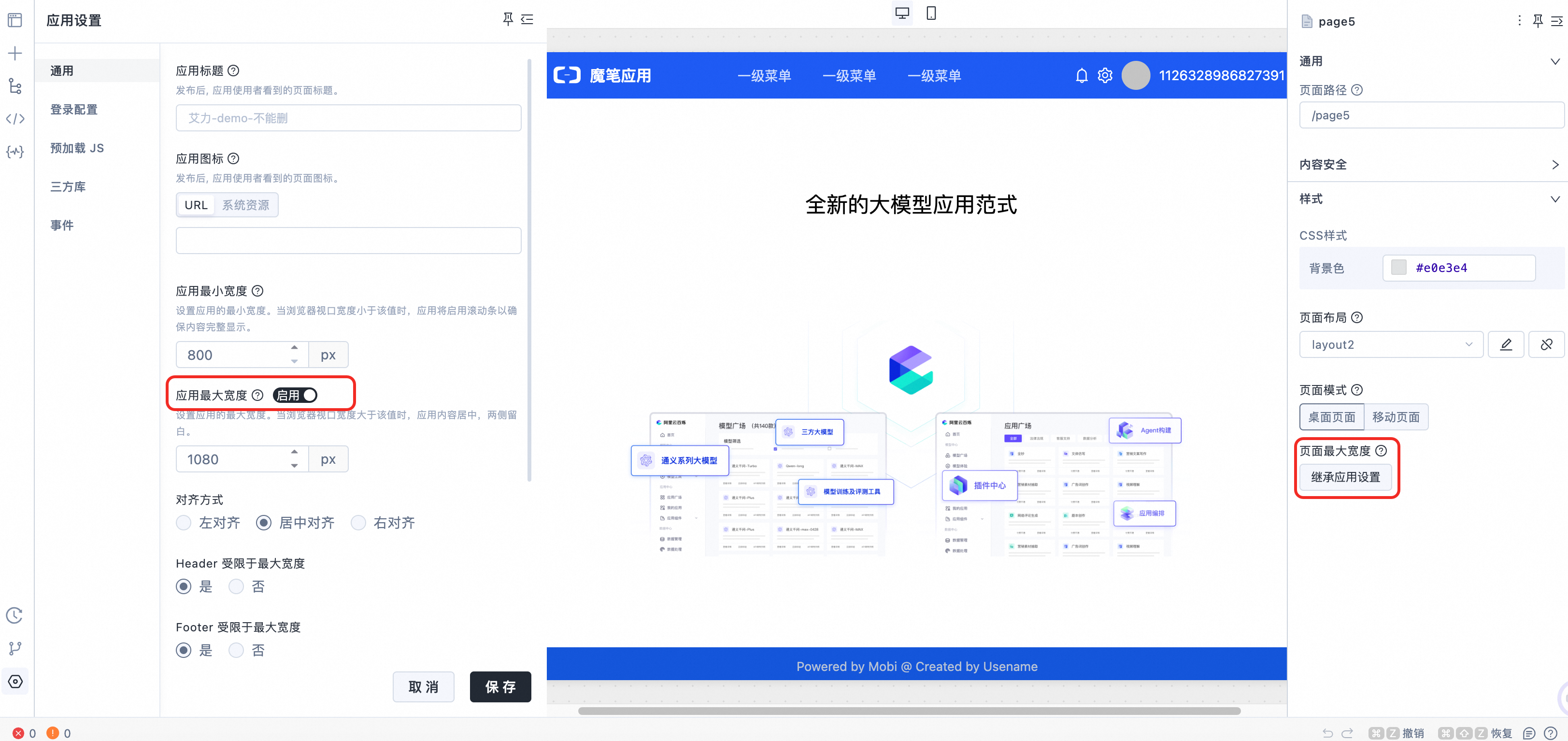
Horizontal alignment: You can configure the horizontal alignment of the content (left, center, or right) to maintain a consistent layout style across different resolutions.
Header and Footer configuration: You can set whether the maximum width constrains the header and footer. Constraining the header and footer to the same maximum width as the content area ensures a coordinated layout. Allowing them to stretch freely makes full use of the space on large screens.
Steps
In the navigation pane on the left, go to Application Settings > General configuration.
Minimum width: Defaults to 800 px.
Application maximum width: Disabled by default.
Minimum width
Pixel range: [800, 1920]
When the application's minimum width is set to 800 px and the browser viewport is narrower, a scroll bar appears to ensure that all content is displayed.
Maximum width
Enable application maximum width: Defaults to 1440 px.
Alignment: Defaults to center.
Header constrained by maximum width: Defaults to No.
Footer constrained by maximum width: Defaults to No.
Demonstration
Maximum width: Default (1440 px)
Center alignment
Header constrained by maximum width: No
Footer constrained by maximum width: No
Maximum width: 1080 px
Alignment: Left
Alignment: Right
Header and footer constrained by maximum width: Yes