You can add labels to specific parts of a chart using icons, background colors, and highlighted dimension values.
Prerequisites
You have created a dashboard. For more information, see Overview and Create a dashboard.
Limitations
Labels are available for the following chart types:
Trend charts: line chart, area chart, stacked area chart, 100% stacked area chart, and combination chart
Comparison charts: vertical bar chart, stacked vertical bar chart, 100% stacked vertical bar chart, horizontal bar chart, stacked horizontal bar chart, 100% stacked horizontal bar chart, and leaderboard
Relationship charts: scatter chart and bubble chart
Spatial charts: colored map and bubble map
Distribution charts: treemap and word cloud
Example
Add a label
Log on to the Quick BI console.
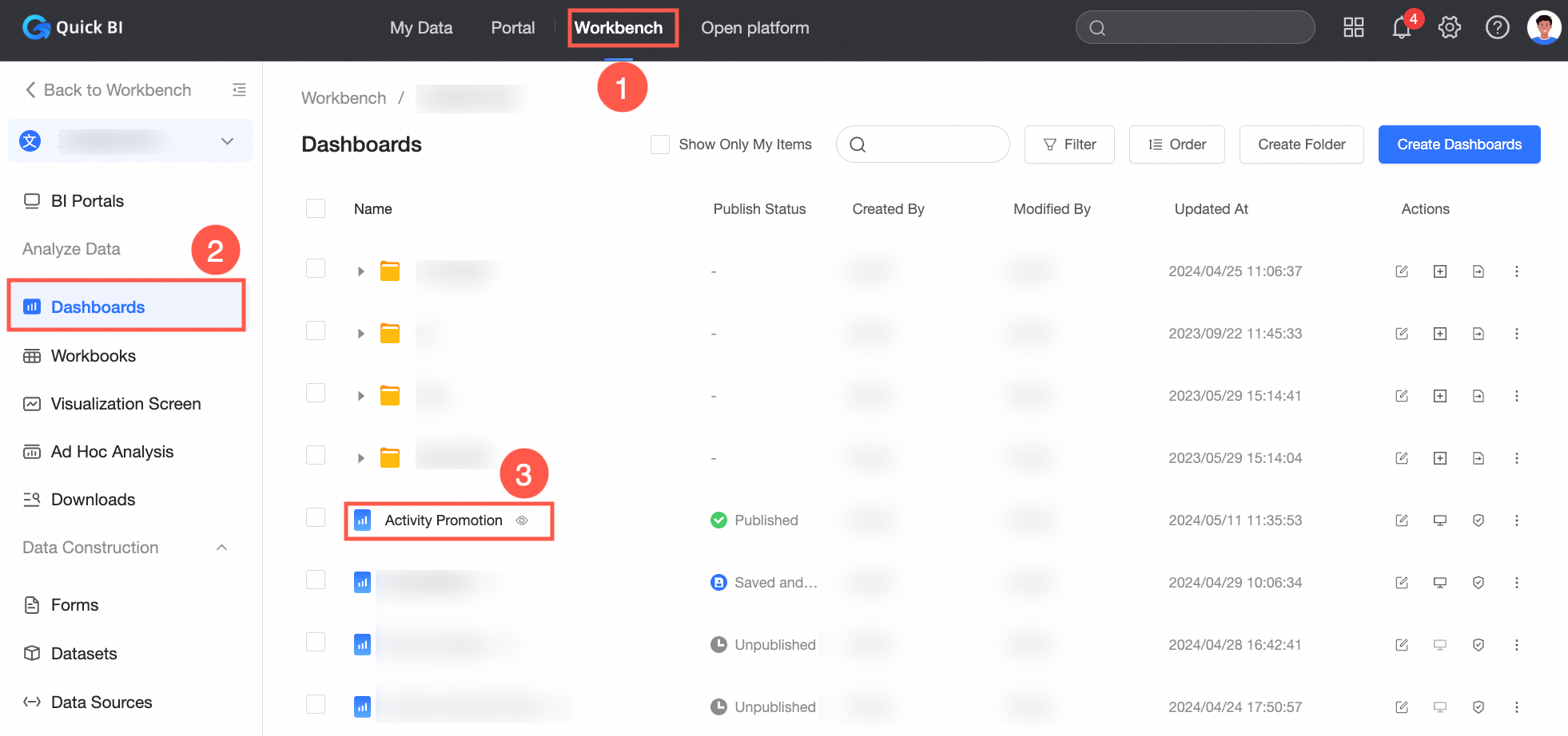
Follow the steps in the figure to open the dashboard edit page.
On the dashboard edit page, you can add a label in one of the following ways:
To add an inflection point label, a measure threshold, quadrant labeling, or manual labeling, use the options on the Advanced tab. For more information, see Add a label from the Advanced tab.
To add only manual labeling, add the label directly on the chart. For more information, see Add a label on a chart.
Add a label from the Advanced tab
On the dashboard edit page, select a chart.
Click the Advanced tab.
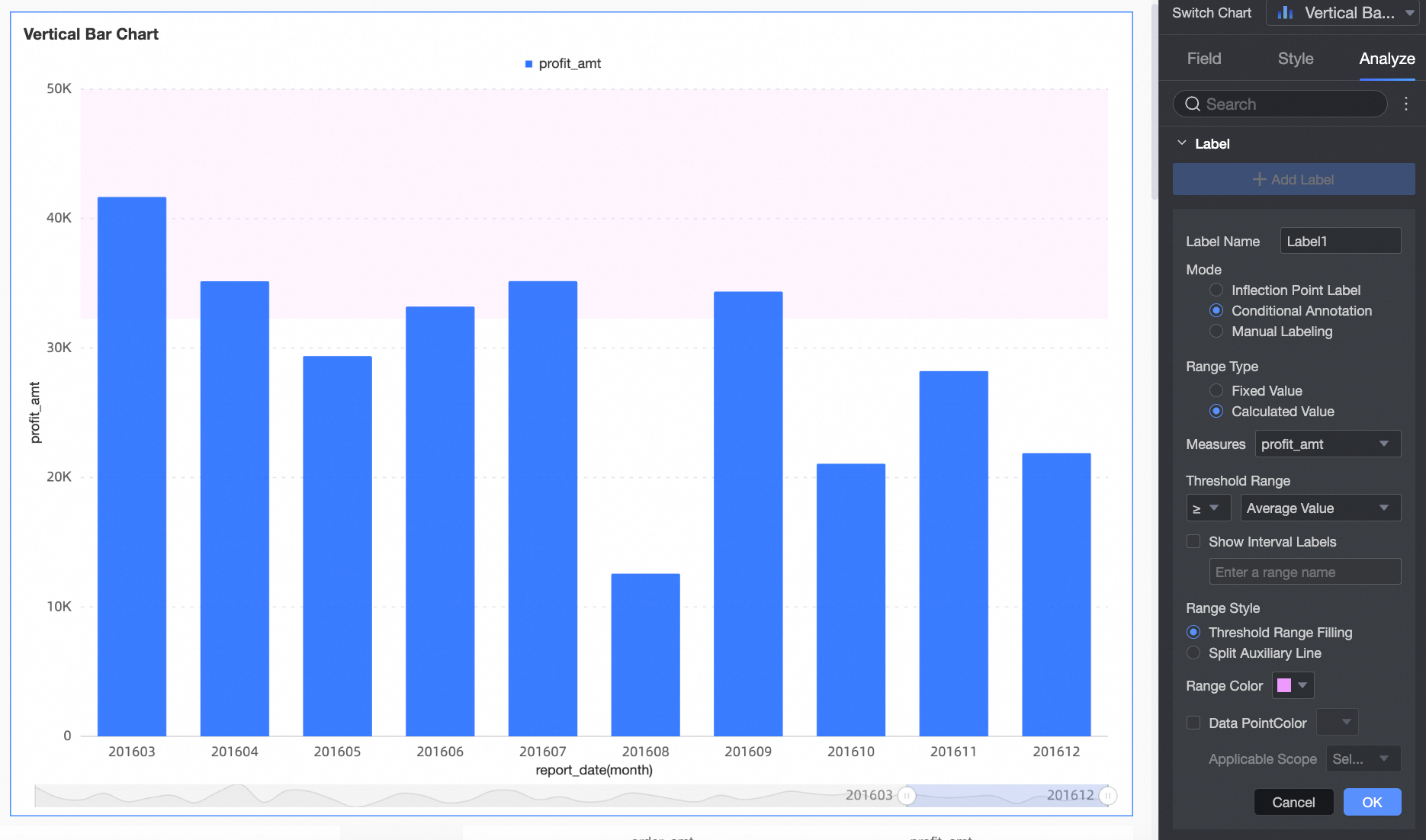
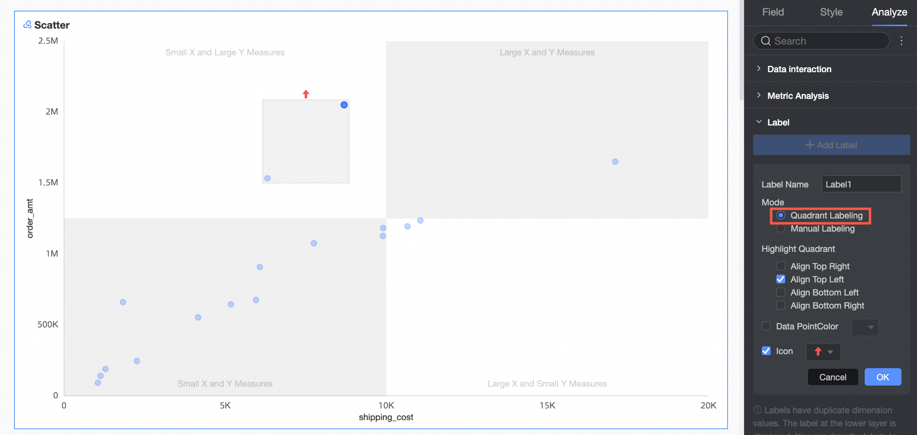
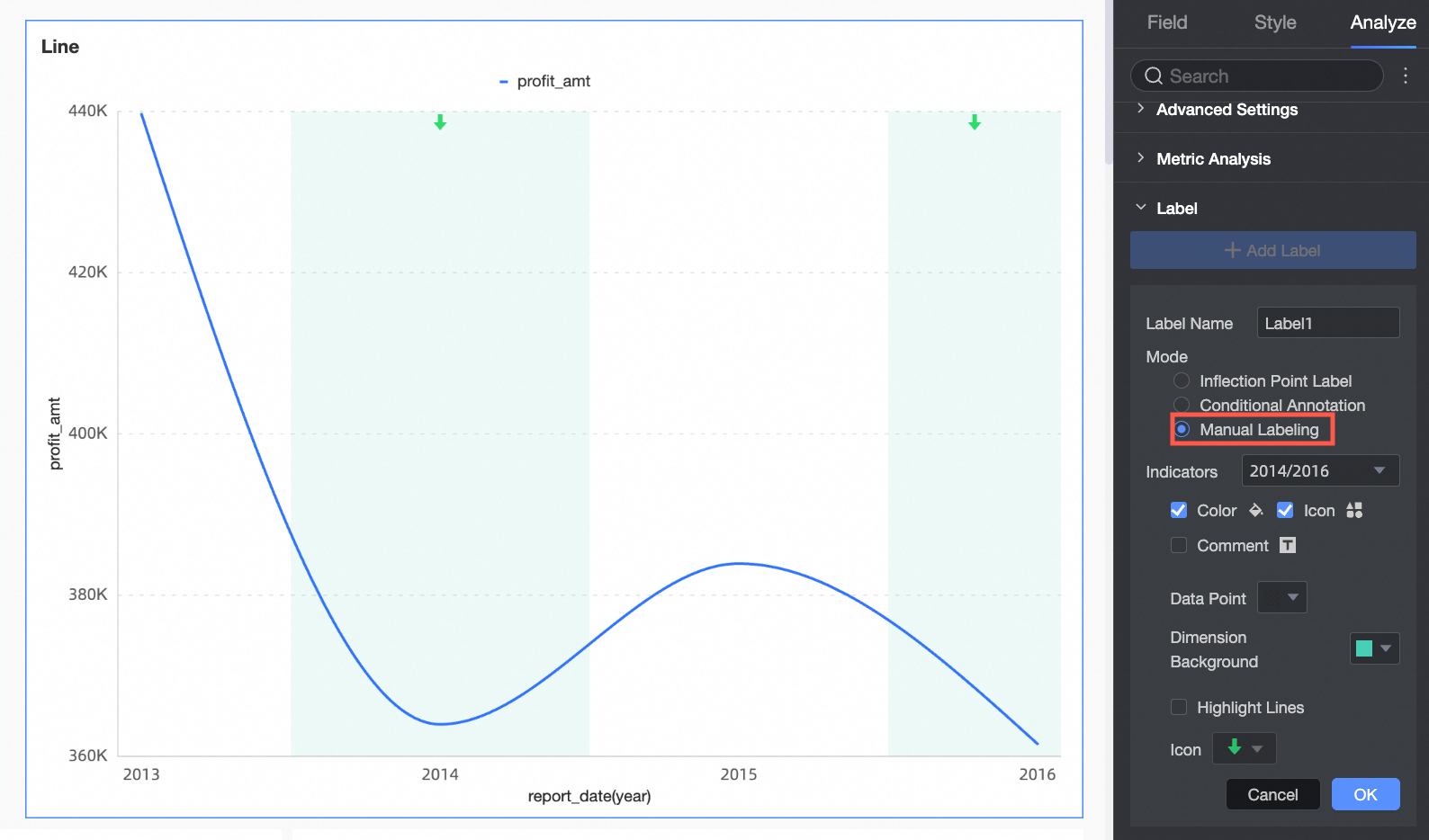
In the Label section, click Add Label and configure the following parameters:
Label Name
A unique name for the label.
Mode
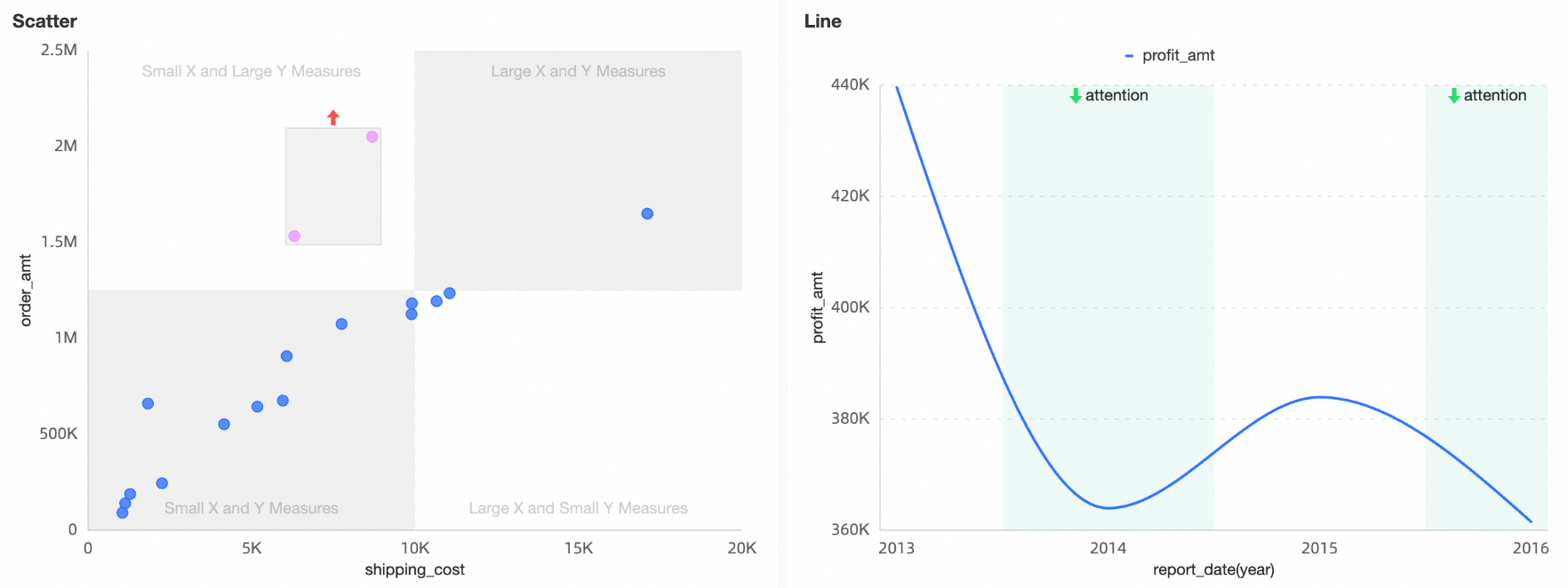
Supported modes are inflection point label, measure threshold, quadrant labeling, and manual labeling.
Mode
Description
inflection point label
The system automatically identifies points where a time trend's slope changes. This helps you spot trend changes and respond accordingly.
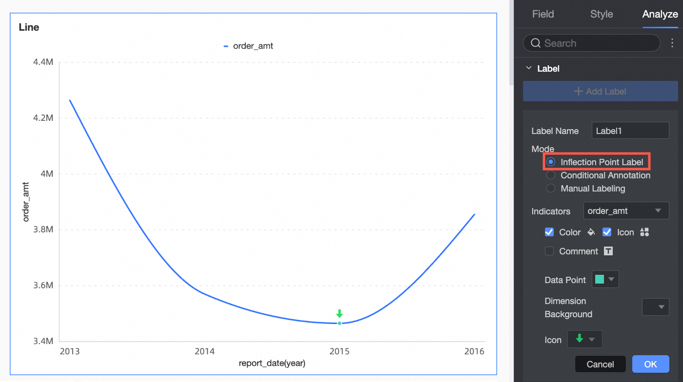 Note
NoteThis parameter can be configured only when a time dimension field is used on the horizontal axis.
measure threshold
Functions like a reference line and supports fixed and calculated values.
quadrant labeling
Highlights a quadrant and lets you configure the color and icon for its data points.
 Note
NoteQuadrant labeling is available only after you enable the four-quadrant display for a scatter chart or bubble chart.
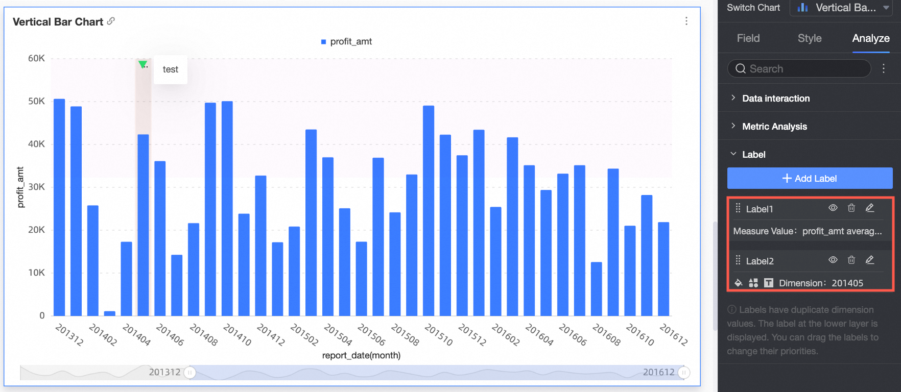
manual labeling
Lets you select a dimension and identify specific parts of the chart to display.

Click OK.
Add a label on a chart
You can add a manual label in one of the following ways:
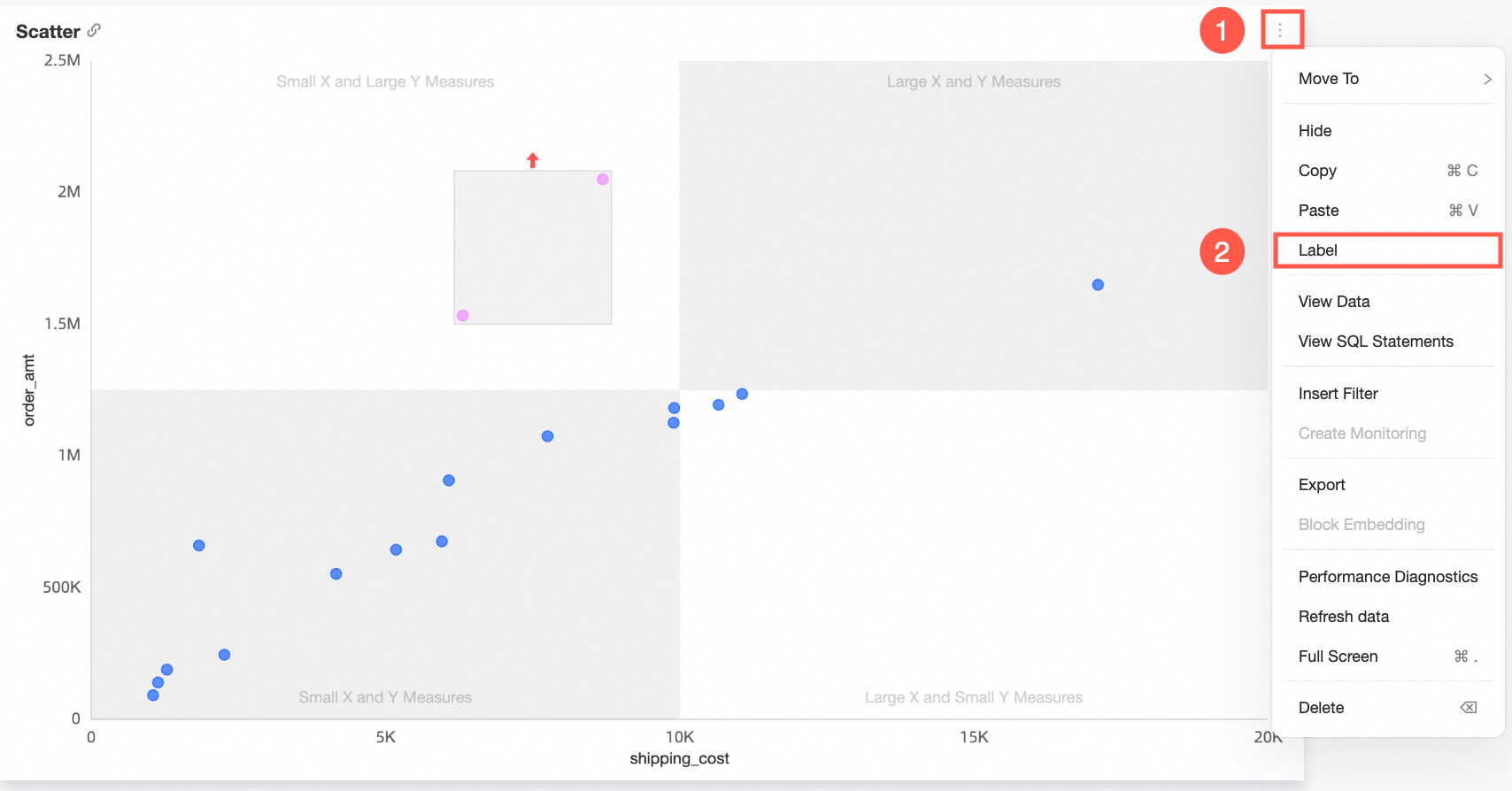
Use the More icon
On the dashboard edit page, click the More icon
in the upper-right corner of the chart and select Label.In the dialog box, set the color, icon, and description for the label, and then click Save.
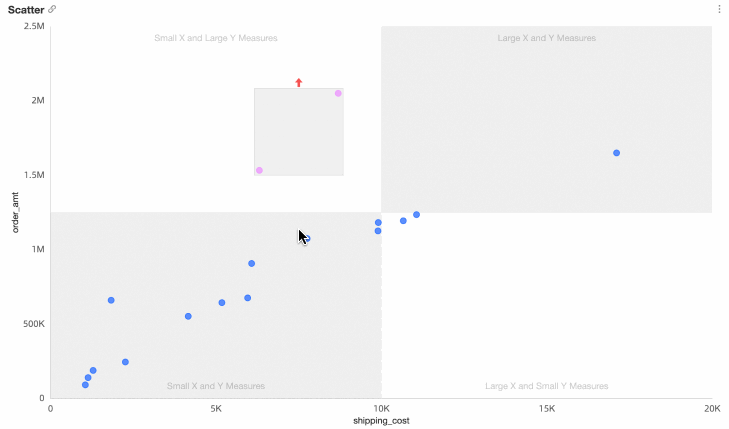
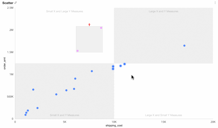
The following figure shows an example.
Add a label by selecting an area
On the dashboard edit page, select an area in the chart. In the dialog box, select Label.
Set the color, icon, and description for the label, and then click Save.
NoteArea selection is available only for the following chart types:
Trend charts: line chart, area chart, stacked area chart, 100% stacked area chart, and combination chart
Comparison charts: vertical bar chart, stacked vertical bar chart, 100% stacked vertical bar chart, horizontal bar chart, stacked horizontal bar chart, 100% stacked horizontal bar chart, and leaderboard
Relationship charts: scatter chart and bubble chart
Distribution charts: treemap and word cloud
Edit a label
On the dashboard edit page, click the chart.
In the Chart Design pane, click the Advanced tab.
In the Label section, click the edit icon
next to the label.
 next to the label.
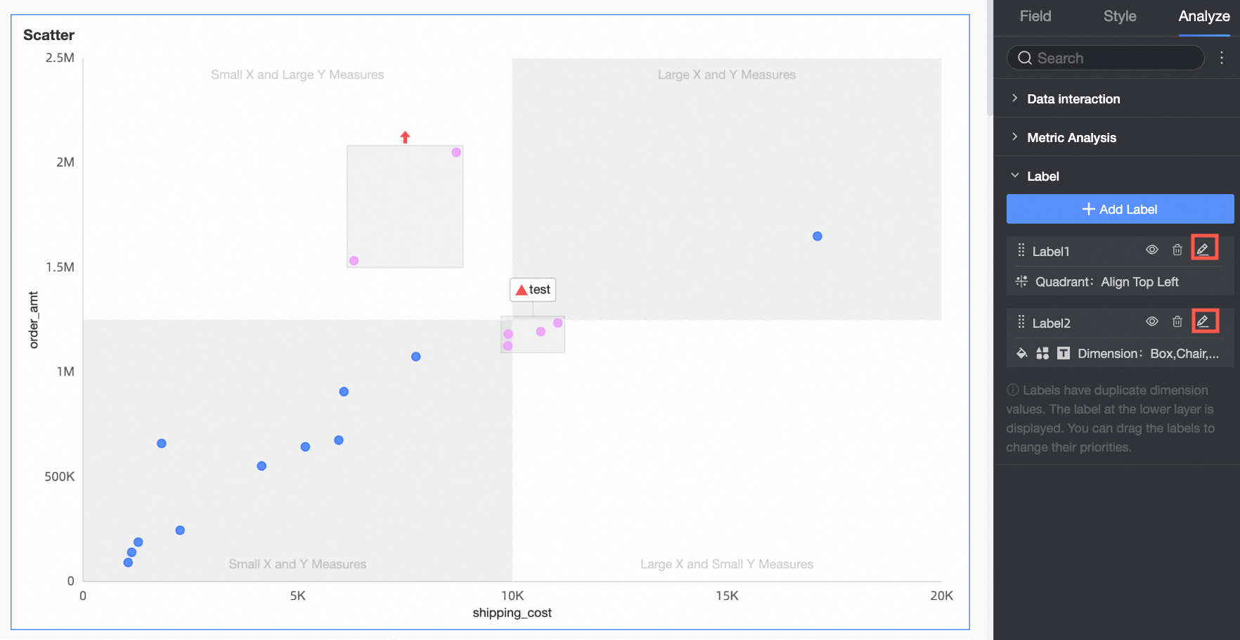
Hide a label
On the dashboard edit page, click the chart.
In the Chart Design pane, click the Advanced tab.
In the Label section, click the hide icon
next to the label.NoteTo show the label again, click the show icon
.
 next to the label.
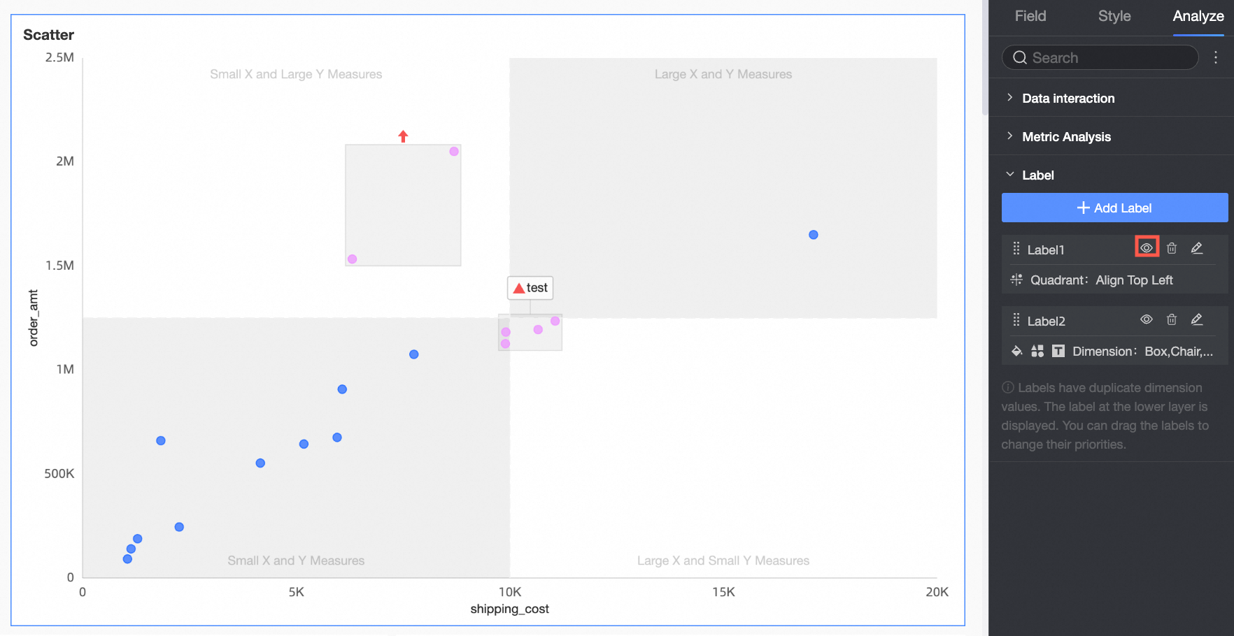
 .
.Delete a label
On the dashboard edit page, click the chart.
In the Chart Design pane, click the Advanced tab.
In the Label section, click the delete icon
next to the label.
 next to the label.
FAQ
How can I add both an icon and a description as labels for the same dimension?
You can add multiple labels, select the same dimension, and set different label types for that dimension.