Area charts display data trends over time and the relative share of each series. You can add data fields and configure chart styles to suit your analysis needs.
Prerequisites
You must have a dashboard. For details, see Create a dashboard.
Overview
Use cases
Area charts help you identify trends such as increases, decreases, cyclical patterns, or exponential growth in your data over time.
Key features
-
Calculation: One-click YoY/MoM and cumulative calculations, auxiliary lines, trend lines, trend forecasting, anomaly detection, and fluctuation analysis.
-
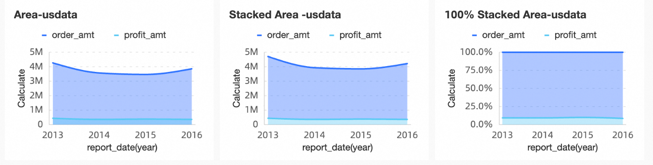
Visualization: Multiple chart styles including area, stacked area, and percentage stacked area charts, with display elements such as labels, a legend, and an overview axis.
-
Data comparison and annotation: Period-over-period comparison and value labels.
Example
Limitations
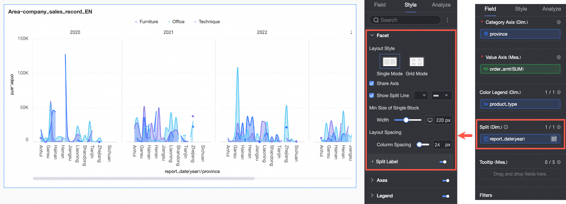
An area chart consists of a value axis, a category axis, and a color legend:
-
The category axis requires at least one dimension, such as date, province, or product type.
-
The value axis requires at least one measure, such as order count.
-
You can add only one dimension to the color legend, such as shipping method.
NoteIf you add multiple measures to the value axis and a custom dimension to the color legend, you must enable the in-chart metric filter to select which metric to display.
-
You can add only one dimension to the split field, such as product type.
Chart Data Configuration
-
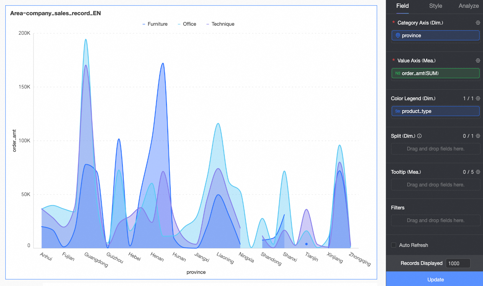
On the Data tab, select the required dimension and measure fields:
-
From the dimension list, double-click or drag province to the category axis area.
-
From the dimension list, double-click or drag product_type to the color legend area.
-
From the measure list, double-click or drag order_amount to the value axis area.
-
-
Click update.
-
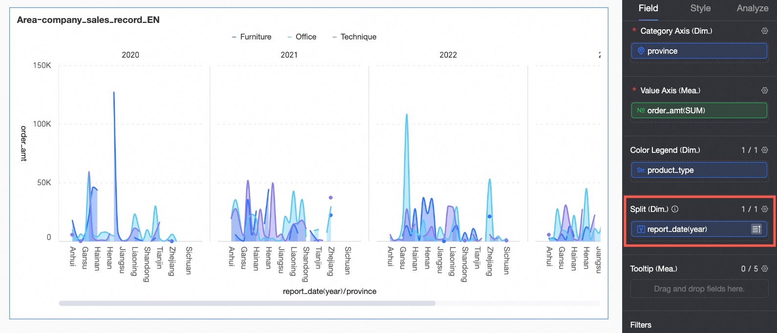
(Optional) You can add an additional dimension field to the split area to enable facet mode. This visualizes data trends more intuitively across different dimension values.
Note-
You can add only one split dimension field, and facet mode has the following limitations:
-
Fields: For the split dimension field, the advanced calculation feature supports only TopN and None.
-
Style: A dual Y-axis is not supported; a thumbnail axis is not supported for the auxiliary display.
-
Advanced: Only filter interaction is supported. advanced settings, analysis alerts, label, and smart insight are not supported.
-
-
Using a large number of facets may cause the page to lag. For optimal performance, we recommend using no more than 500 facets.
-
Chart Styles
Configure chart styles as described below. For general style settings, see Configure the chart title area.
Enter a keyword in the search box at the top of the configuration panel to quickly find a parameter. Click the  icon on the right to expand or collapse all categories.
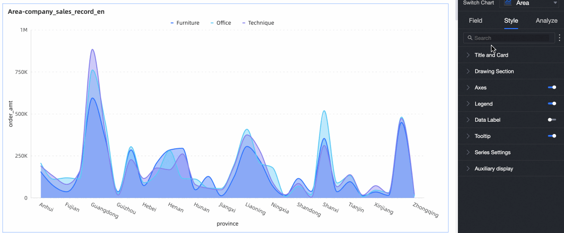
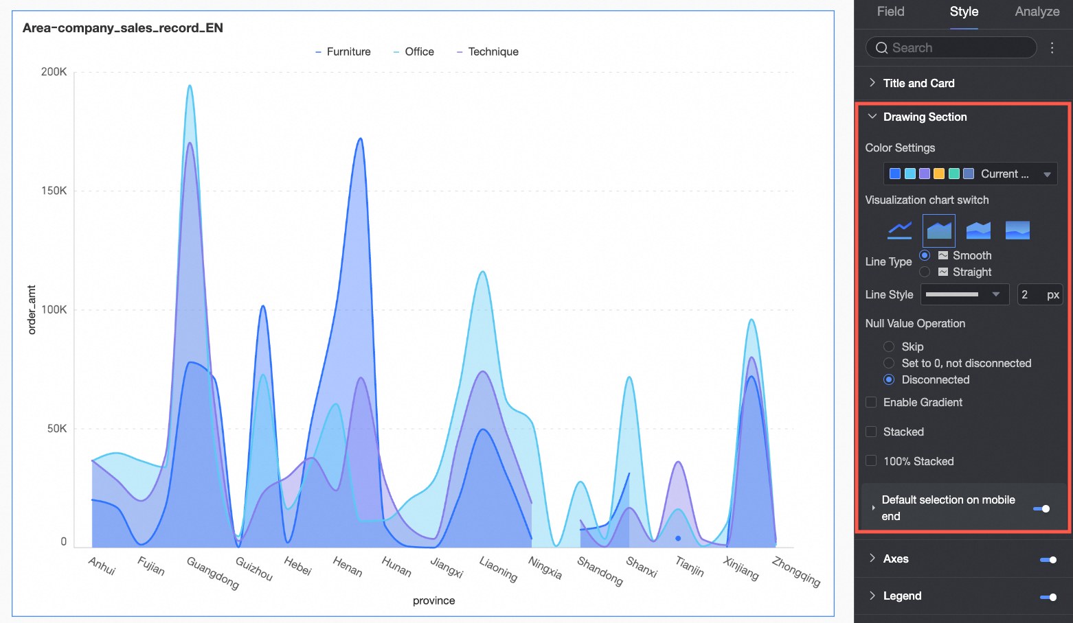
Chart Area
In the Chart area section, configure the chart style.
|
Parameter |
Description |
|
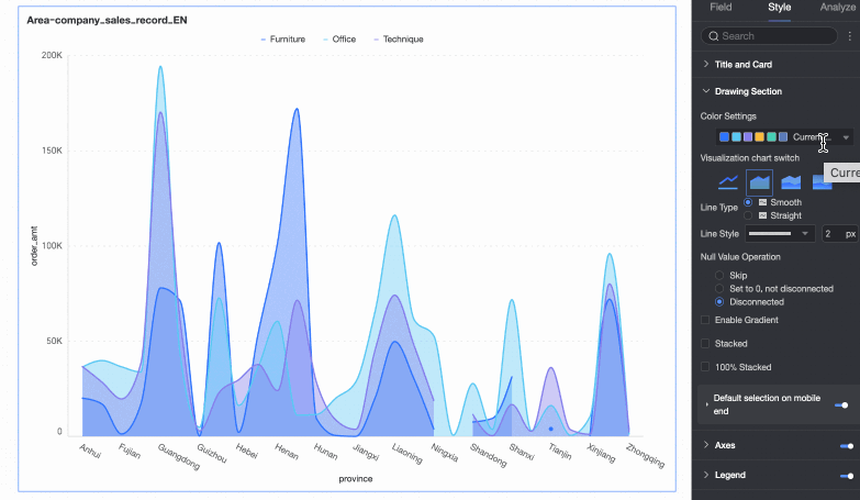
Color scheme |
The color scheme for the area fill. You can use a system color scheme or define a custom one. |
|
Chart type switch |
The chart type. Supported types include line chart, area chart, stacked area chart, and 100% stacked area chart. |
|
Line type |
The line type. Supported types are Curve and Straight. |
|
Line style |
The pattern and thickness of the chart lines. |
|
Null value handling |
How to handle null values. The following options are available: Skip, Set to 0 and connect, and Break line. |
|
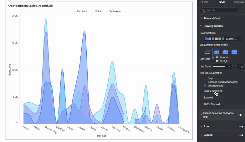
Enable gradient effect |
When enabled, the area fill displays a gradient. |
|
Stacked and 100% stacked |
Switches between area, stacked area, and 100% stacked area chart modes.
|
|
Default selection on mobile |
If enabled, you can set the Default selected item to either the Last global dimension value or the Last dimension value for a specified series. |

Facet
In facet mode, use the Facet section to configure the layout and styles.
Facet mode is active only when a field is configured in Split/Dimension.
|
Parameter |
Description |
|
|
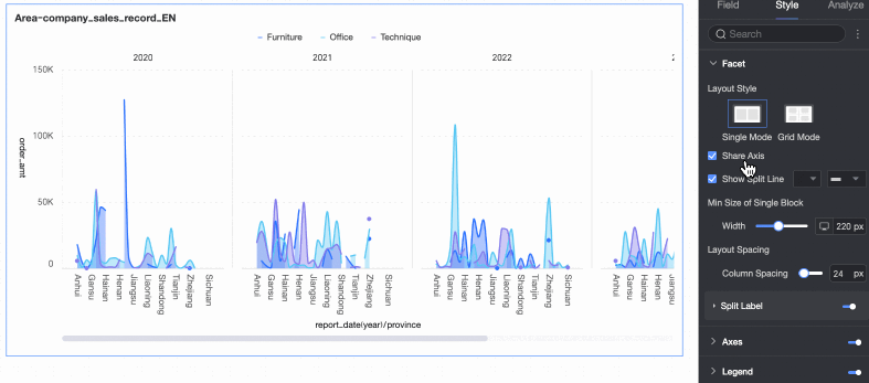
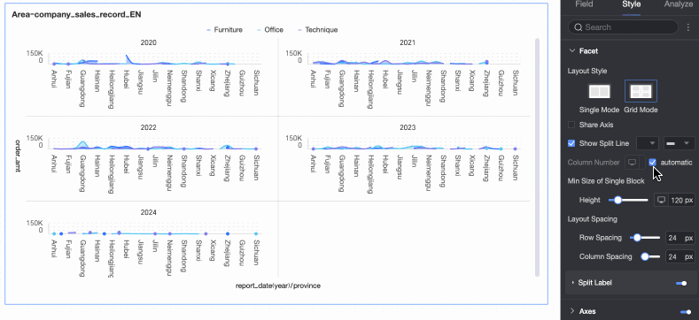
Layout style |
Sets the chart layout. The following modes are supported: Single-Column Comparison and Grid Layout. |
|
|
Shared axis |
Determines if the charts share an axis.
|
|
|
Show separator line |
Shows or hides a separator line between charts. If enabled, you can configure the color and style of the separator line. |
|
|
Number of columns |
When Layout style is set to Grid Layout, you can set the number of columns for the chart arrangement. By default, this is set to Auto. You can also customize the number of columns. Note
|
|
|
Minimum facet block size |
Sets the minimum width and height for each chart block. The available options vary based on the layout style.
|
|
|
Row and column spacing |
Sets the spacing between rows and columns of charts. The available options vary based on the layout style.
|
|
|
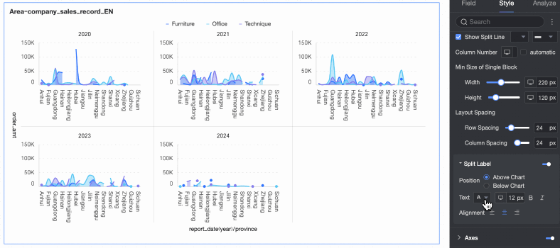
Split label |
Position |
Sets the display position of the dimension value label. You can place it Above chart or Below chart. |
|
Text |
Sets the font color and style for the dimension value label. |
|
|
Alignment |
Sets the alignment of the dimension value label. |
|

 icon at the top of the page.
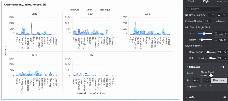
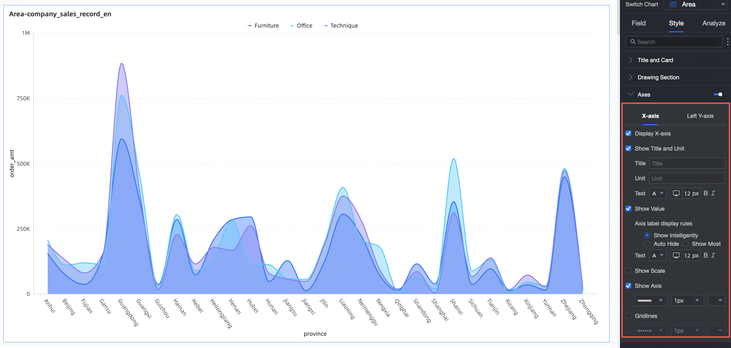
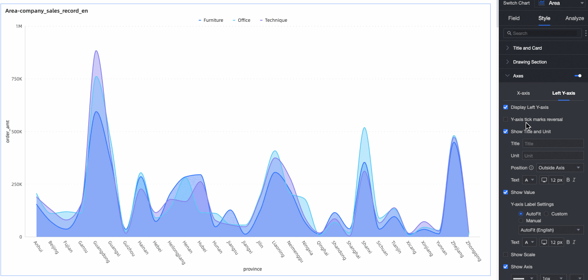
Axes
In the Axes section, configure axis styles. By default, axes are displayed.
Select Show Dual Y-axis to add a second axis. This takes effect only when two or more measures are added. When enabled, a Right Y-axis section appears in the Axes section.
|
Name |
Parameter |
Description |
|
X-axis |
Show X-axis |
Specifies whether to show the X-axis. |
|
Show title and unit |
Specifies whether to show the axis title and unit on the X-axis. |
|
|
Show axis label |
Specifies whether to show labels on the X-axis, and configures the axis label display rules and text style. |
|
|
Content to display |
Sets whether to display some or all dimension values.
|
|
|
Show tick marks |
Specifies whether to show tick marks on the X-axis. |
|
|
Show axis line |
Specifies whether to show the X-axis line, including its type, width, and color. |
|
|
Show axis label |
Specifies whether to show labels on the X-axis. |
|
|
Show gridlines |
Specifies whether to show gridlines on the X-axis, including their type, width, and color. |
|
|
Left Y-axis |
Invert Y-axis scale |
Reverses the Y-axis scale.
|
|
Show left Y-axis |
Specifies whether to show the left Y-axis. |
|
|
Show title and unit |
Specifies whether to show the axis title and unit. |
|
|
Show axis label |
Specifies whether to show labels on the Y-axis. If enabled, you can configure the axis label display format and text style. The axis label display format can be set to Auto or Custom.
|
|
|
Show tick marks |
Specifies whether to show tick marks on the left Y-axis. |
|
|
Show axis line |
Specifies whether to show the left Y-axis line, including its type, width, and color. |
|
|
Show gridlines |
Specifies whether to show gridlines on the left Y-axis, including their type, width, and color. |
|
|
Axis range and interval |
|
 icon to configure the data format in the Data display format settings dialog box based on your requirements. For more information about the parameters in the dialog box, see
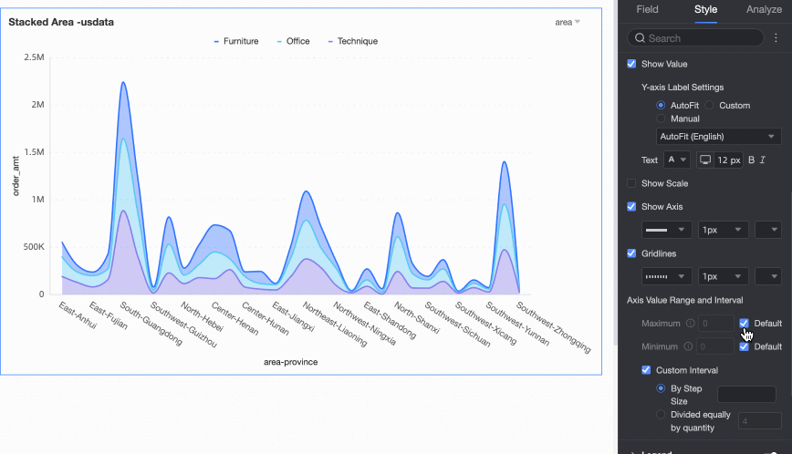
You need to configure the Right Y-axis only if you select Show Dual Y-axis. The parameters are the same as for the Left Y-axis.
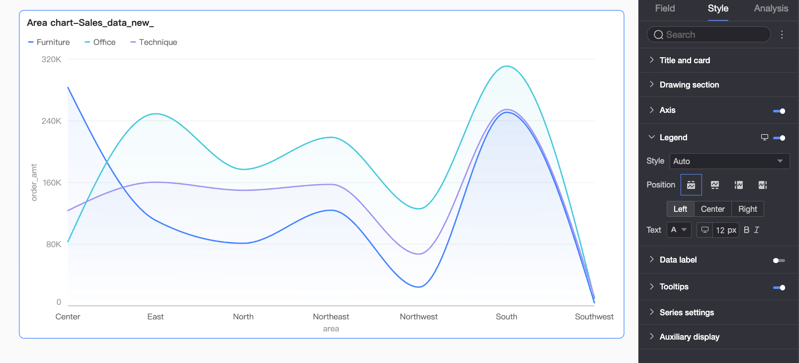
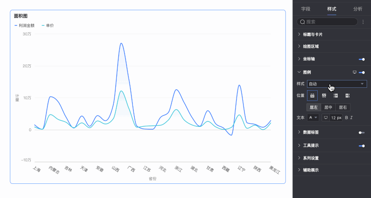
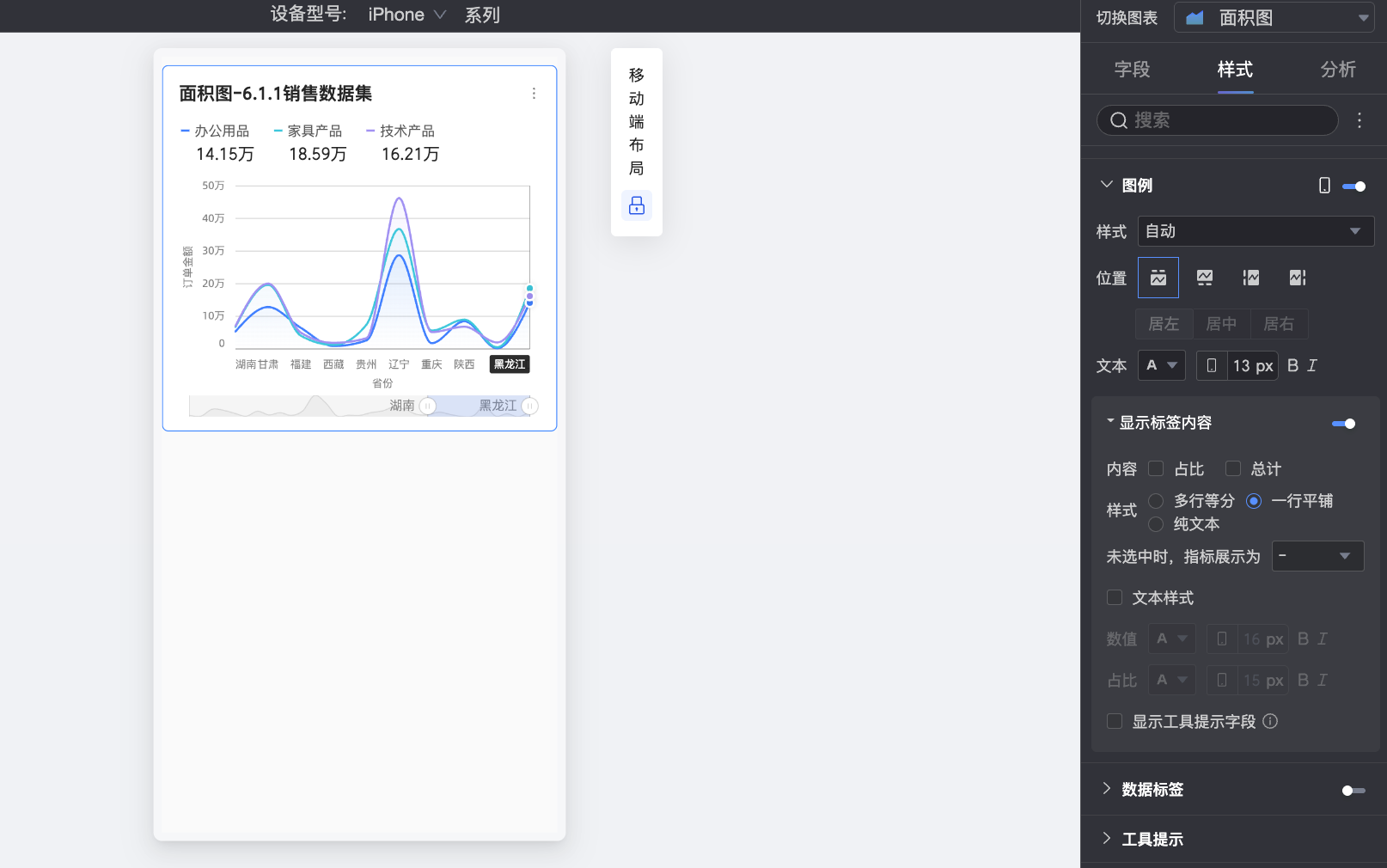
Legend
In the Legend section, click the  icon to enable the chart legend and configure its style.
-
PC configuration

Parameter
Description
Style
Sets the style of the legend icons. The following styles are supported: Automatic, Line Only, and Line and Marker.
Note-
When you select Line and Marker, the legend uses the marker style configured in the chart. If no marker style is configured, a solid circle is displayed by default.
-
When you select Scale legend symbol with text in Theme design > General content style, the size and thickness of the legend icons and lines are adjusted proportionally based on the chart line thickness and legend text size.
Position
Sets the display position and alignment of the legend on a PC.
-
When the position is set to Top or Bottom, you can select Left, Center, or Right alignment.
-
When the position is set to Left or Right, you can select Top, Center, or Bottom alignment. You can also set the distance between the legend and the chart.
Text
Sets the text style for the legend on a PC. You can configure the font color, size, weight, and whether it is italicized.
-
-
Mobile configuration
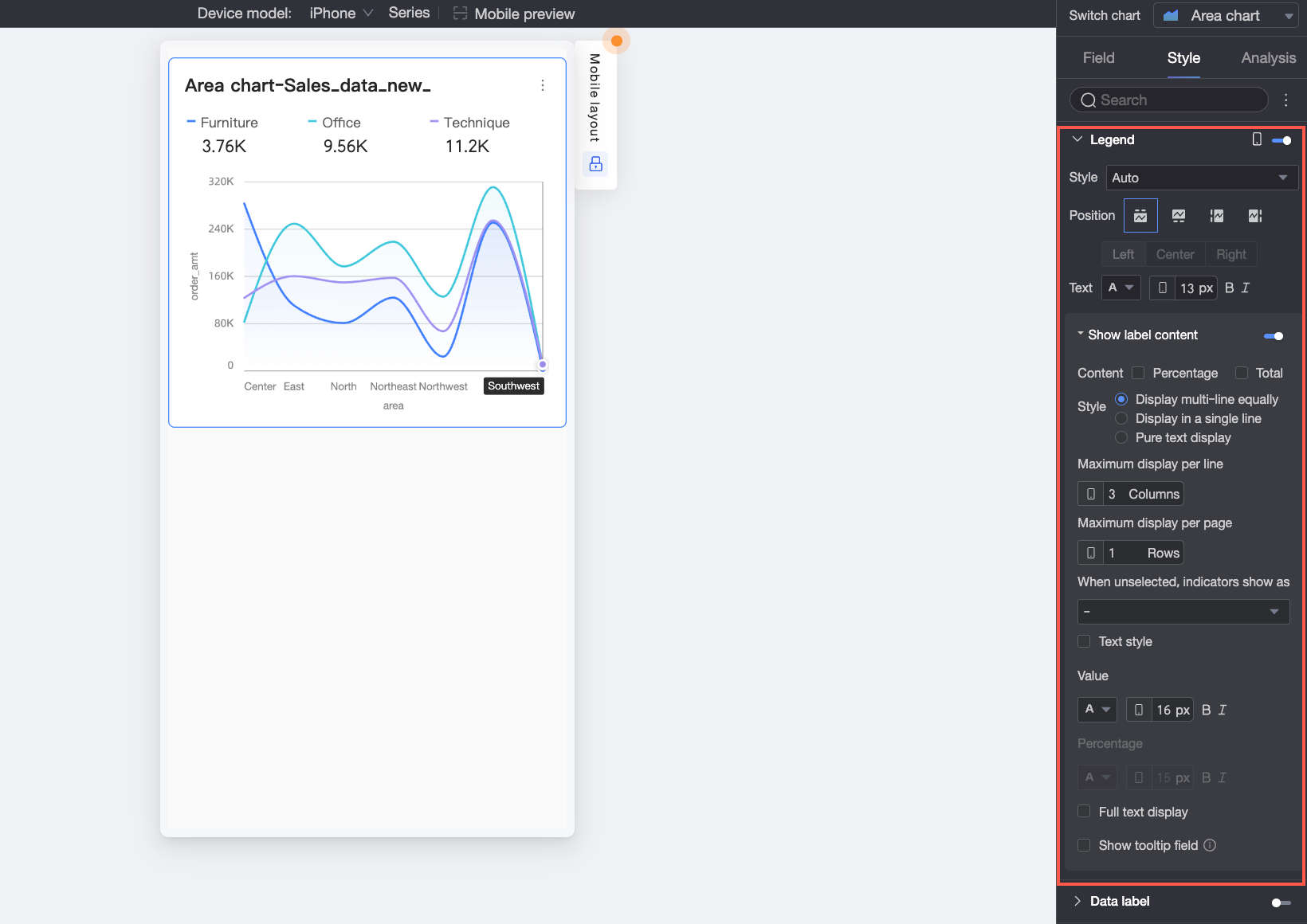
|
Parameter |
Description |
|
|
Style |
Sets the style of the legend icons on a mobile device. The following styles are supported: Automatic, Line Only, and Line and Marker. |
|
|
Position |
Sets the display position and alignment of the legend on a mobile device.
Note
When the position is set to Top, you can enable labels below the legend. |
|
|
Text |
Sets the text style for the measure names in the legend on a mobile device. You can configure the font color, size, weight, and whether it is italicized. |
|
|
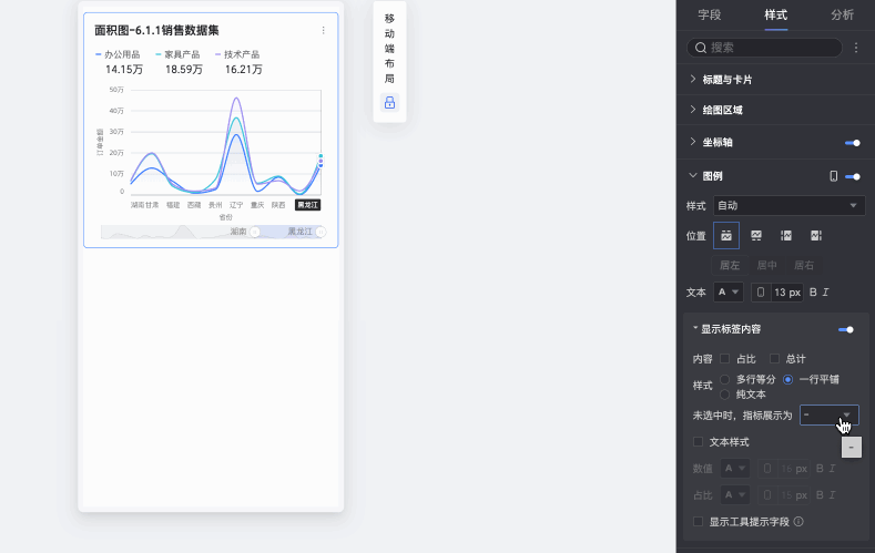
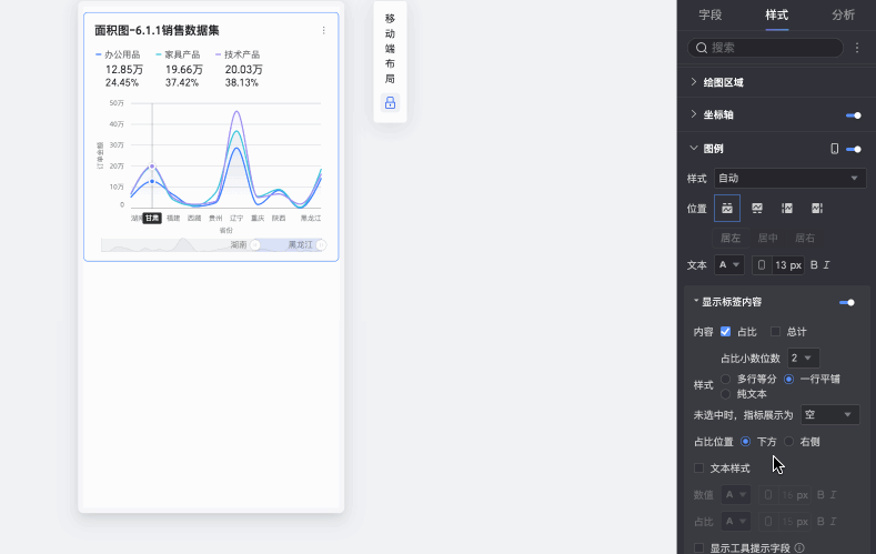
Show label content When Position is set to Top, click the |
Content |
Sets the data content to display in the labels below the legend. Supported options are Percentage and Total.
|
|
Style |
Sets the layout style for the labels below the legend. The following options are available:
|
|
|
Display for unselected items |
When Style is set to Multi-row equal-width or Single-row, you can configure how unselected legend items are displayed. Supported options are "-" and Blank. |
|
|
Percentage position |
When Percentage is selected in Content and Style is set to Multi-row equal-width or Single-row, you can specify the display position of the percentage data. You can place it Below or to the Right of the value label. |
|
|
Text style |
When Style is set to Multi-row equal-width or Single-row, you can configure the text style for the value. If you select to display percentage data, you can set a separate text format for the percentage to visually distinguish it from the value label. |
|
|
Show full text |
When Style is set to Multi-row equal-width, long measure names might be truncated. If you still need to display the full measure name, select Show Full Text. |
|
|
Show tooltip fields |
If selected, the fields you configure in the Tooltip/Measure field on the data panel are displayed in the legend area. Note
Displaying tooltip fields is not supported when the chart is split by dimension values (that is, when a dimension is used for the color legend). |
|
 icon to enable labels below the legend.
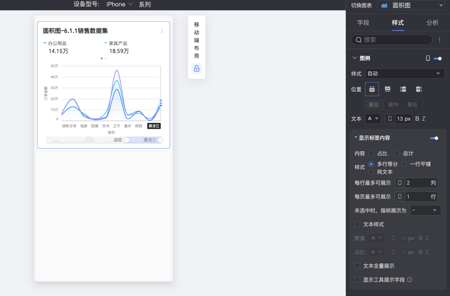
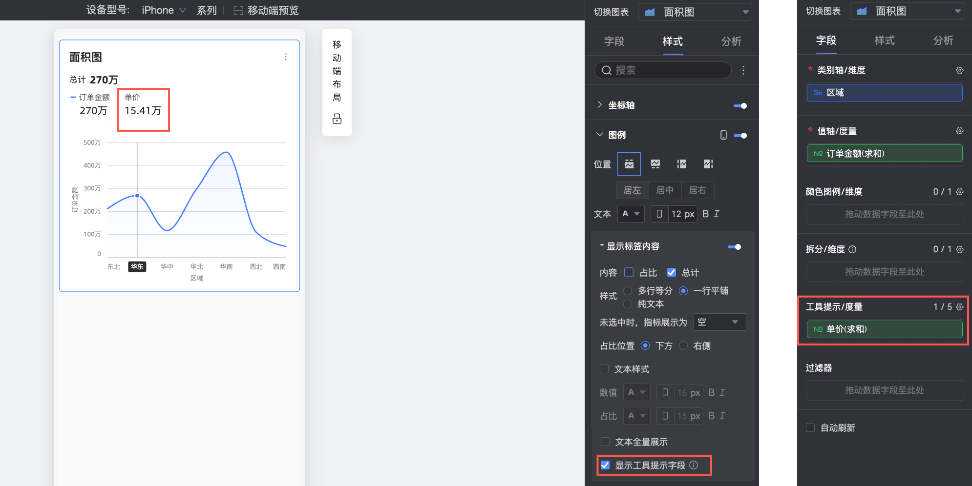
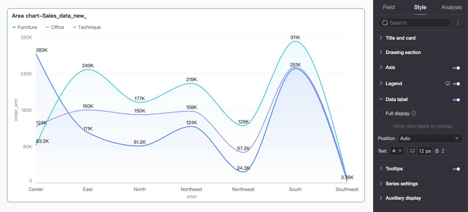
Data Labels
In the Data labels section, specify whether to show data labels and configure their styles.
|
Parameter |
Description |
|
Content |
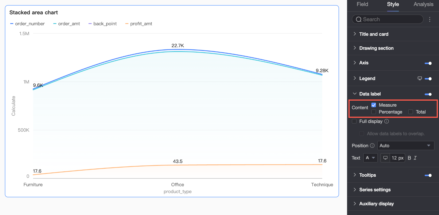
When the Chart type in the Chart area section is set to stacked area chart or 100% stacked area chart, you can select the data to display in the data labels. Supported options are Measure, Percentage, and Total. If you select Percentage, you can also set the number of decimal places to 0, 1, or 2 in Percentage decimal places. |
|
Full display |
This option automatically adjusts label positions to prevent overlaps. However, if labels still extend beyond the chart area, some may not be displayed. With full display enabled, you can also choose to Allow data labels to overlap. |
|
Position |
Sets the display position of the labels. |
|
Text |
Sets the text style for the labels. |
Tooltip
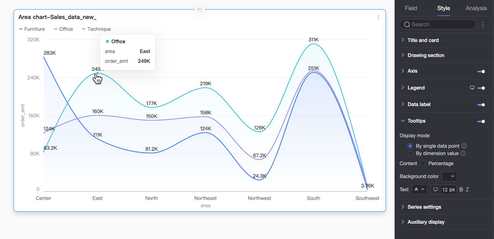
In the Tooltip section, click the icon to enable tooltips and configure their settings.
-
PC configuration
Parameter
Description
Display mode
Sets how tooltip information is displayed. The following modes are supported: By single data point and By dimension value.
Content
Selects the data content to display in the tooltip. The available options vary based on the configuration:
When the display mode is By single data point, Percentage is supported. When the display mode is By dimension value, Total and Percentage are supported.
-
Percentage: The percentage of a data point out of the total for the current dimension. For example, the percentage of profit out of total revenue for office supplies. If you select this, you can also set the number of decimal places to 0, 1, or 2 in Percentage decimal places.
-
Total: The sum of all measures for the current dimension. For example, the total sales amount for all regions in 2025.
Background color
Sets the background fill color for the tooltip box.
Text
Sets the text style in the tooltip box. You can configure the font color, size, weight, and whether it is italicized.
-
-
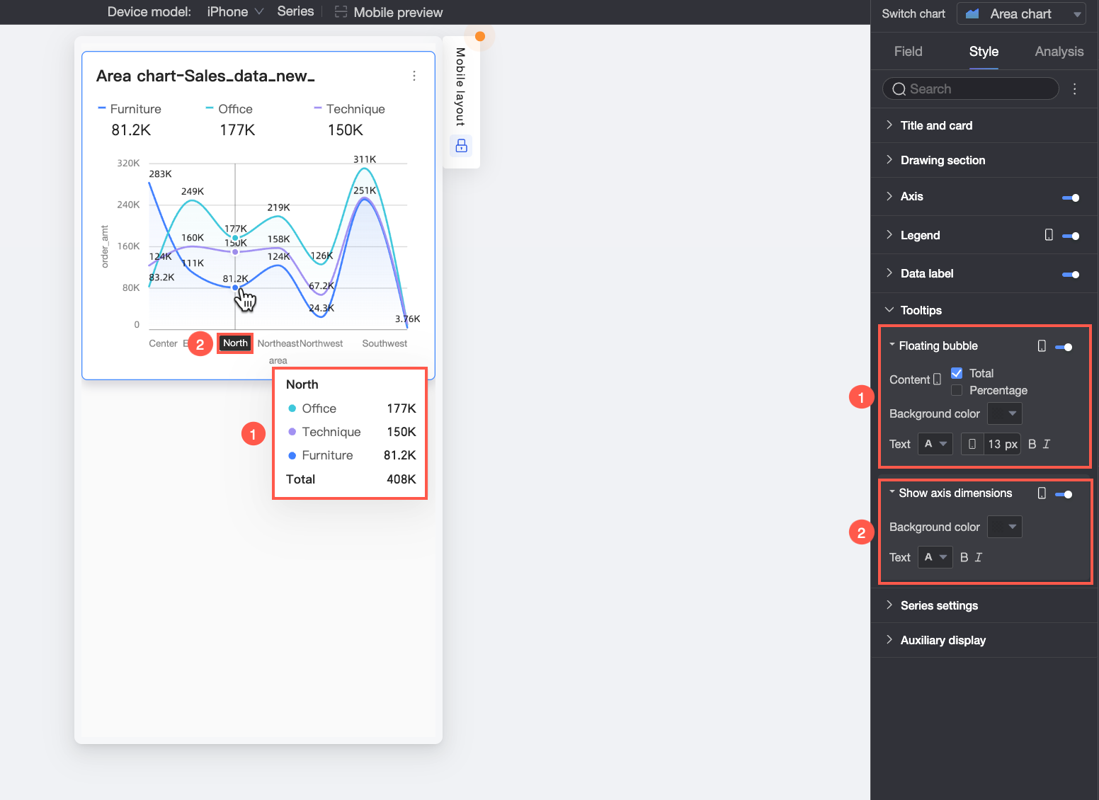
Mobile configuration
Parameter
Description
Floating bubble
Click the
icon to enable the floating bubble display (①).Content
Sets the data content to display in the floating bubble. You can select Percentage and Total.
-
Percentage: The percentage of a data point out of the total for the current dimension. For example, the percentage of profit out of total revenue for office supplies. If you select this, you can also set the number of decimal places to 0, 1, or 2 in Percentage decimal places.
-
Total: The sum of all measures for the current dimension. For example, the total sales amount for all regions in 2025.
Background color
Sets the background fill color for the floating bubble.
Text
Sets the text style in the floating bubble. You can configure the font color, size, weight, and whether it is italicized.
Show axis dimension
Click the
icon to enable the axis dimension display (②).Background color
Sets the background fill color for the axis dimension label.
Text
Sets the text style for the axis dimension label. You can configure the font color, weight, and whether it is italicized.
-
Series Settings
In the Series settings section, configure series styles.
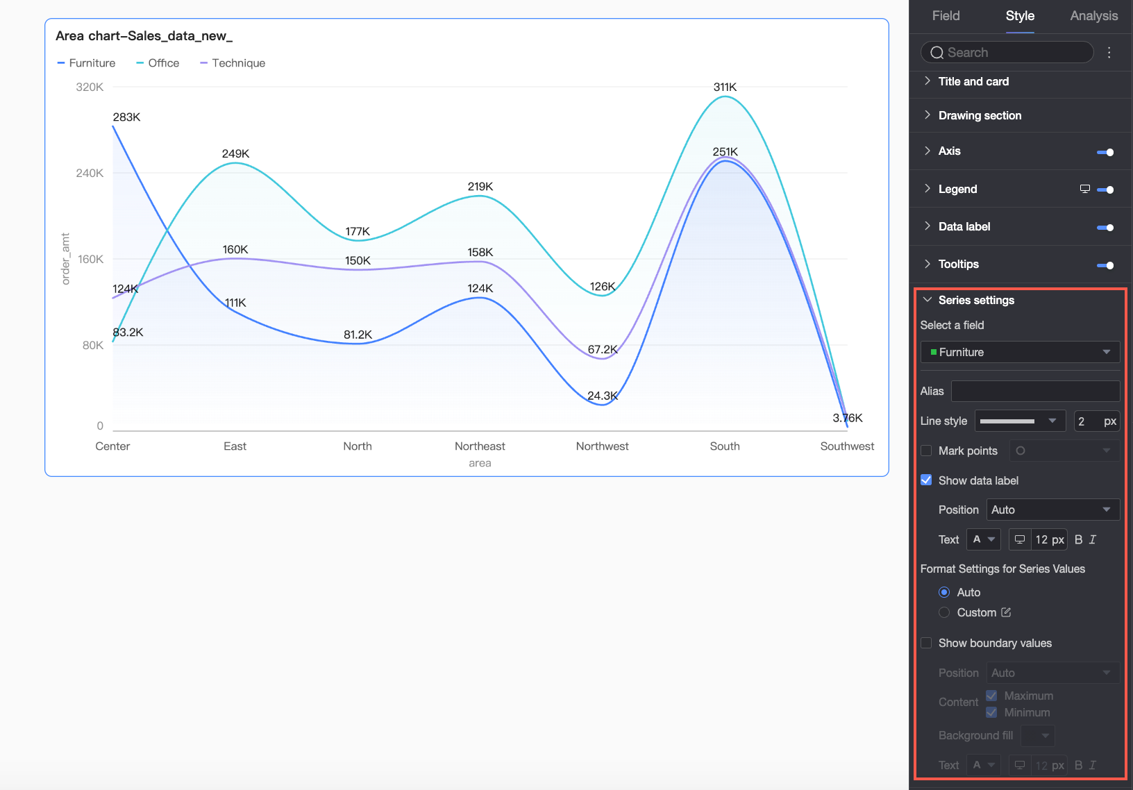
You can configure Alias and Series value display format in Series settings only when Color legend/dimension is enabled in the Fields pane.
|
Parameter |
Description |
|
Select field |
Select a dimension or measure. |
|
Alias |
Sets an alias for the field that matches your business scenario. This option is configurable only when Color legend/dimension is used. |
|
Line style |
Sets the type and thickness of the lines. Note
This feature is not supported for stacked and 100% stacked charts. |
|
Show markers |
Specifies whether to show markers. If selected, you can then select the marker style. Note
This feature is not supported for stacked and 100% stacked charts. |
|
Show data labels |
Specifies whether to show data labels and sets the label position and text format. |
|
Series value display format |
Configures the display format for series values. Supported options are Auto and Custom.
This option is configurable only when Color legend/dimension is used. |
|
Show boundary values |
Specifies whether to show boundary value labels in the chart. If selected, you can configure the label Position, Content to display (Maximum/Minimum), Background fill color, and Text style. Note
This feature is not supported for stacked and 100% stacked charts. |
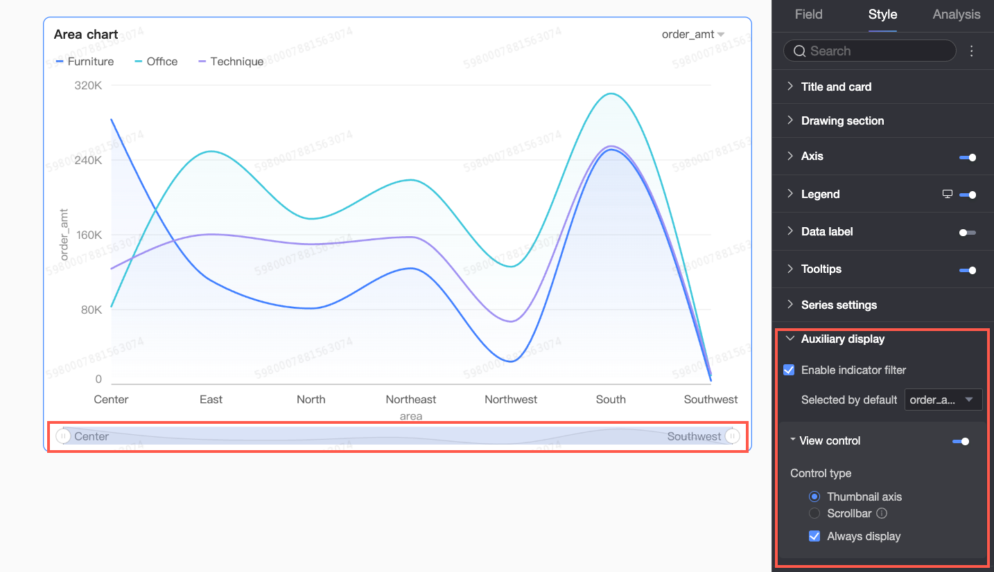
Controls
In the Auxiliary display section, configure the metric filter and view controls.
|
Parameter |
Description |
|
Enable in-chart metric filter |
Whether to enable the in-chart metric filter. If enabled, you can also set the default selected metric field. |
|
View control |
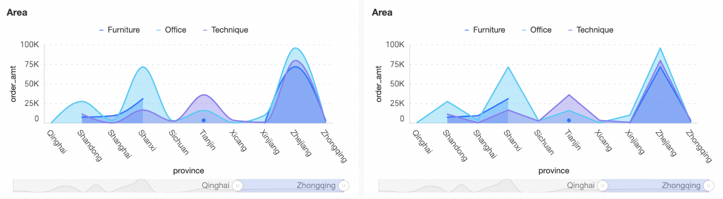
When chart data is too dense to fit in the container, click the Two control types are available for the visible range: Navigator and Scroll bar.
Note
If no view control is configured and the chart is too small, the system automatically enables the Navigator, which appears only when the data exceeds the chart container's width. |
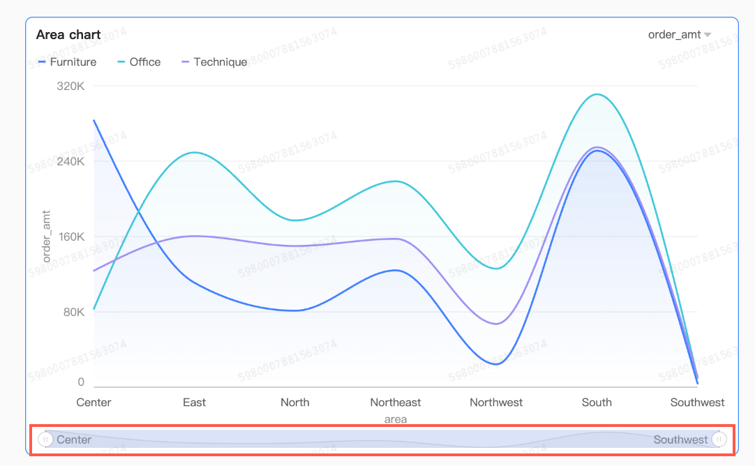 By default, the navigator is displayed only when the data exceeds the chart container's width. Select Always show to display the navigator even when the data does not fill the container.
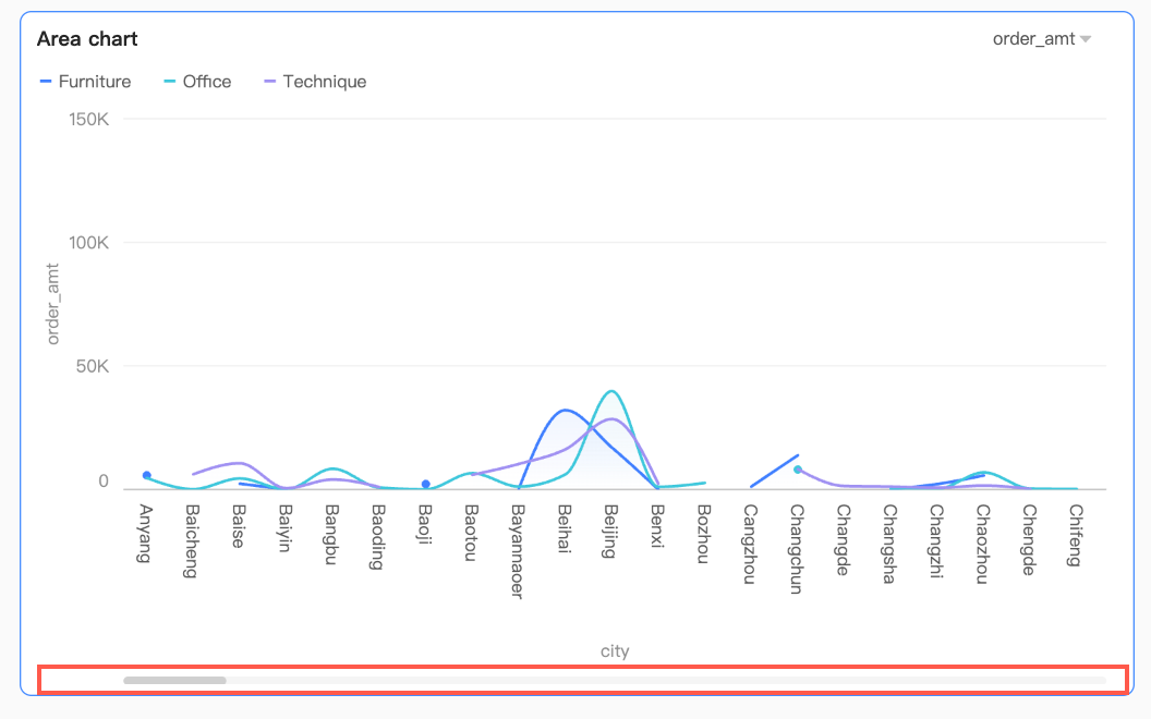 You can set the minimum category width to limit the amount of data in the current chart window, ensuring clear scaling and avoiding visual clutter from overlapping labels or dense data points. The default minimum category width is 32px, with a range of 16px to 100px.
Chart Analysis Configuration
|
Parameter |
Name |
Description |
|
Interaction analysis |
drill-down |
After you configure drill-down for a chart, you can configure how its levels are displayed. For more information, see drill-down. |
|
linkage |
When your data spans multiple charts, use linkage to connect them. For more information, see linkage. |
|
|
jump |
When your data spans multiple dashboards, use the jump feature to connect them. Jump includes two types: parameter jump and external link. For more information, see jump. |
|
|
Analysis and alerting |
reference line |
Use a reference line to compare the current measure with a reference value. Reference values can be fixed or calculated. Calculated values include average, maximum, minimum, and median. For more information, see reference line. |
|
trendline |
Use a trendline to show the overall trend in your data. Six types are available: smart recommendation, linear, logarithmic, exponential, polynomial, and power. For more information, see analysis and alerting. |
|
|
annotation |
- |
When chart data contains anomalies or requires special attention, you can add annotations such as color highlights, icons, notes, or data points. This helps you spot anomalies and respond accordingly. For more information, see annotation. |
What to do next
-
To let other users view the dashboard, share it. For more information, see Share a dashboard.
-
To create a complex navigation menu for thematic analysis, integrate the dashboard into a Data Portal. For more information, see Data Portal.