Configure an image decoration widget
Add and manage image decoration controls on a data visualization screen.
Prerequisites
A data visualization screen is created. For more information, see Create a Data Visualization Screen.
Effect display
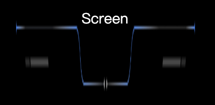
Add image decoration control
On the dashboard editing page, click Materials in the top navigation bar to add border decorations. You can select Head Decoration, Block Border, Vertical divider, and Background of ticket board.
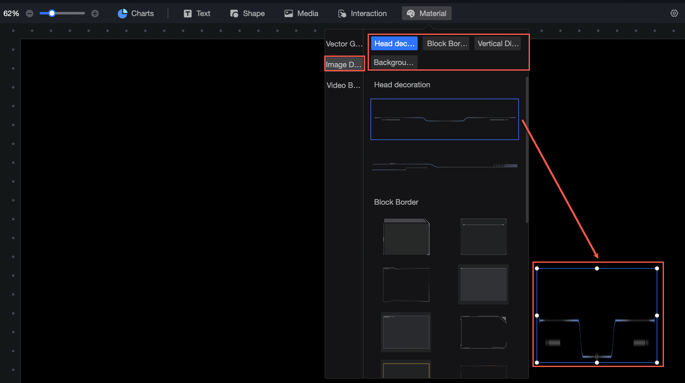
Image decoration style configuration
Location and size
Configure the following properties in the configuration section:
-
Adjust the alignment of components: left, center, and right alignment are supported.
-
Adjust the size of the widget: set the X and Y values relative to the upper-left corner.
-
Rotate the widget: set the rotation angle.
-
Resize the widget: set the W and H values to adjust the width and height.
-
Lock the widget: prevents changes to its size and position.
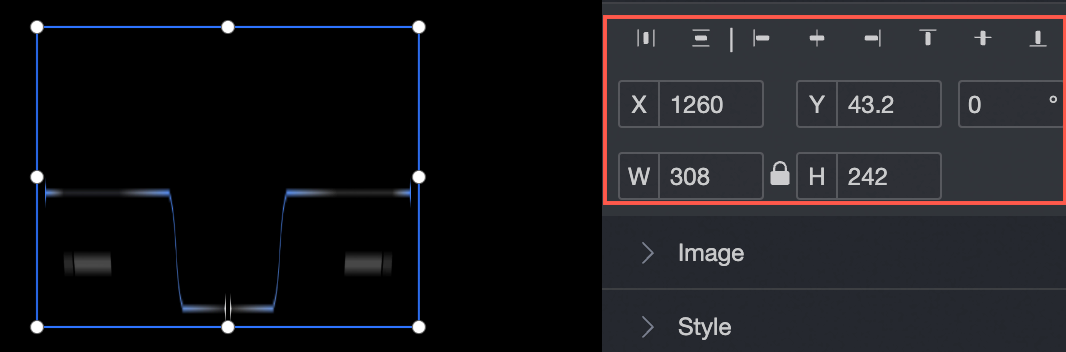
Image source
-
Materials: Select from materials including Head Decoration, Block Border, Vertical divider, and Background of ticket board.
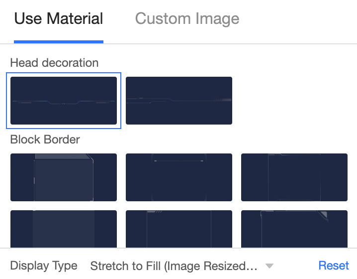
-
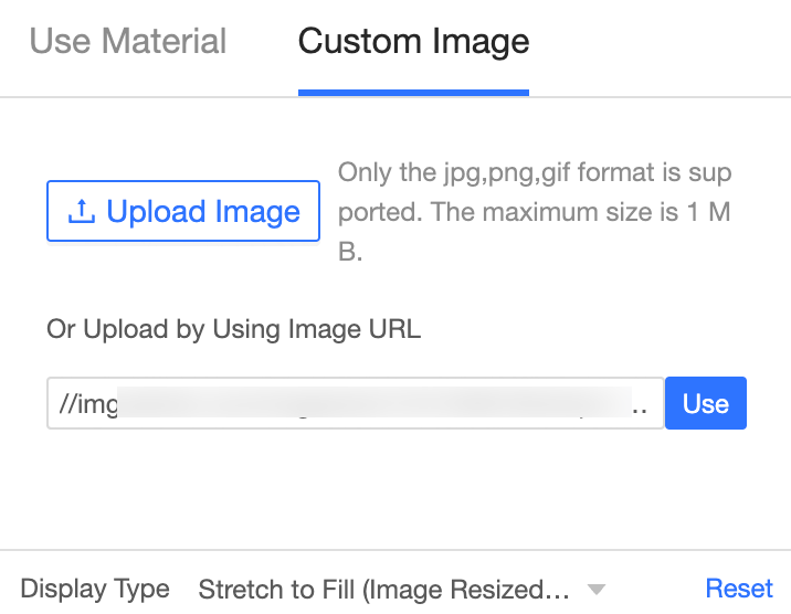
Custom Image: Click Upload Local Image to upload a local image.
 Important
Custom images can only be in the JPG, PNG, or GIF format. The maximum size is 1MB.
styles
Set the transparency, background padding, and background blur for border decorations.