Data entry offers 21 basic and advanced controls. Learn about their basic operations and general configurations.
Use cases
|
Type |
Name |
Use case |
|
Basic controls |
For entering a single line of text, such as a name, position, or billing entity. |
|
|
For entering complex, multi-line text, such as a detailed address or notes. |
||
|
For entering numeric data, such as a competition score or transaction amount. |
||
|
For entering date-related data, such as a date of birth or questionnaire submission date. |
||
|
For selecting a single option from a short, visible list, such as a gender. |
||
|
For selecting one or more options, such as in a satisfaction survey. |
||
|
For selecting a single option from a long list, such as a province or employee ID. |
||
|
For selecting multiple options from a long list, such as interests or service ratings. |
||
|
Advanced controls |
For cascading selections in a hierarchical structure, such as viewing the cities within a specific province. |
|
|
For entering formatted text, such as terms and instructions. |
||
|
For uploading images, such as proof of income or expense receipts. |
||
|
For rating items, such as products or services. |
||
|
For entering mobile numbers in the Chinese mainland format, such as for income verification. |
||
|
For entering email addresses, such as in a satisfaction survey. |
||
|
For entering an ID card number, such as in a new employee onboarding form. |
||
|
For entering the current time with a single click, such as in a product survey form. |
||
|
For visually representing a percentage, such as in a competitive analysis table. |
||
|
Automatically fills in the submitter's username, for example, in an event registration form. |
||
|
For selecting a single user within the organization, such as in a voting system form. |
||
|
For selecting multiple users within the organization, such as in a project participation form. |
||
|
Layout control |
For rearranging controls into a column-based layout. |
Basic operations
Add a control
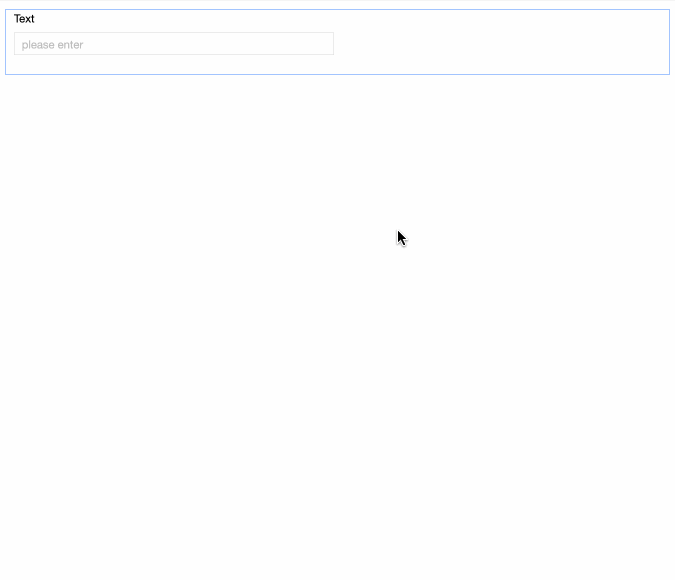
On the data entry page, add controls by dragging or clicking them from the left-side panel.
Copy a control
Click the  icon in the upper-right corner of a control to duplicate it below the original.
Delete a control
Click the  icon in the upper-right corner of a control to delete it.
General configurations
Basic configuration
|
Parameter |
Description |
|
|
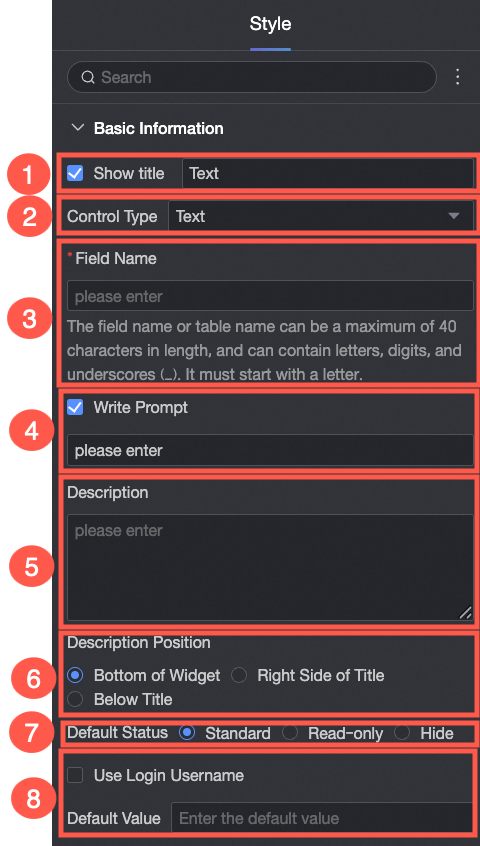
① Display title: Shows or hides the control's title. This name is also used as the column name for data entry. |
|
② Control type: Changes the type of the selected control. |
|
|
③ Table field name: The name of the corresponding field in the table created from this data entry form. Note
Field or table names must start with a letter and can contain letters, numbers, and underscores (_). The maximum length is 40 characters. |
|
|
④ Placeholder: Sets the hint text that appears in an empty input field, such as Please enter. |
|
|
⑤ Description: A custom description for the control. |
|
|
⑥ Description position: Sets the position of the description. Options include Bottom of Control, Right of Title, and Below Title. |
|
|
⑦ Default state: Sets the control's default state. Options include Normal, read-only, and hidden. |
|
|
⑧ Default value: Sets a default value for the control. If you select Use login username, the system automatically fills the field with the current user's name. |
Validation
Sets validation rules, such as making a control required or defining its value range.
Style
Adjusts the control's width. Options include the default width and a full-row width.