Create a PC BI Portal
A BI portal organizes data works — dashboards, workbooks, data dashboards, ad hoc analysis, data reporting, and downloads — along with external links into a menu-driven interface for thematic analysis.
Portal Configuration
To configure the PC portal, toggle the terminal slider at the top to the  icon.
icon.
Operation Entry
-
Click the Portal Settings icon at the top.
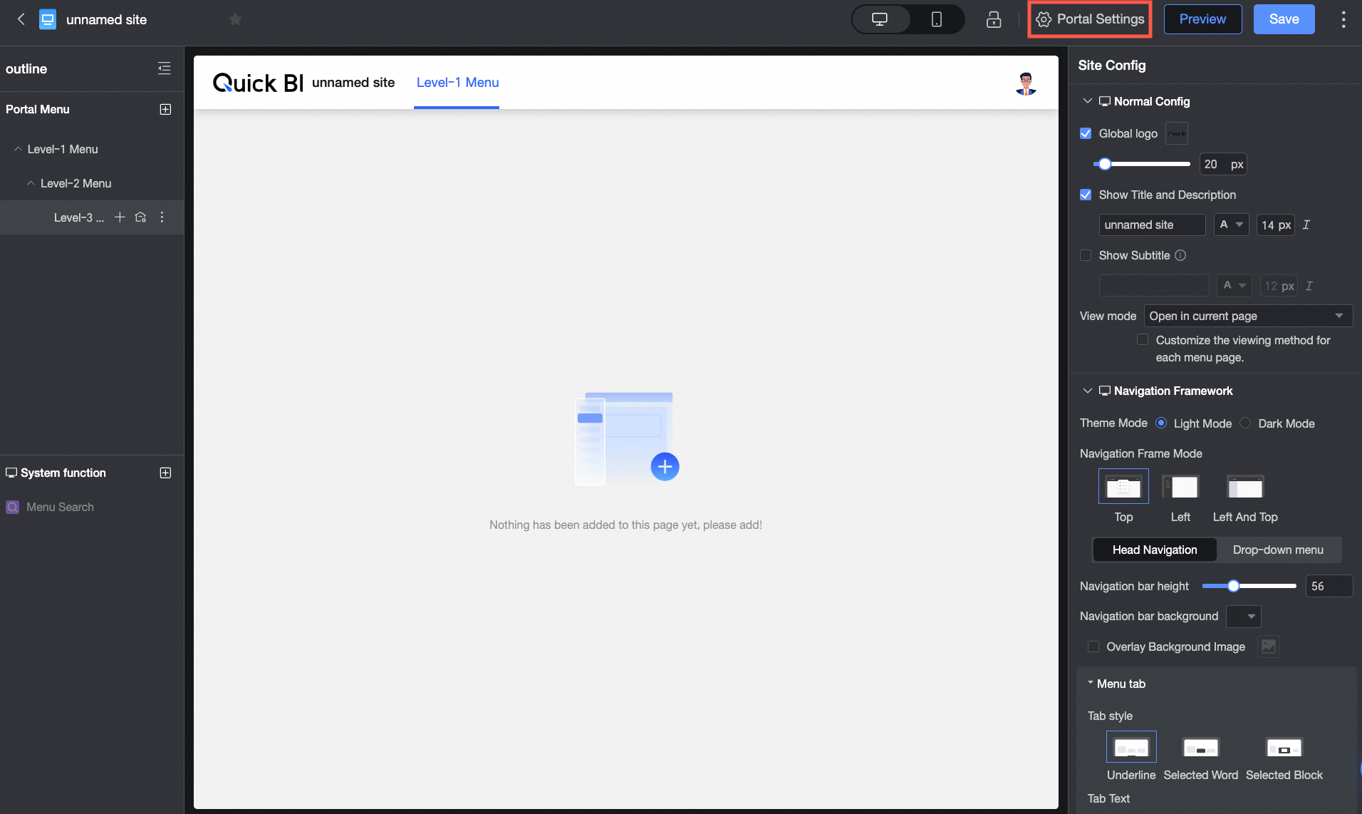
-
While configuring the menu, click Portal Configuration to open the portal configuration interface.
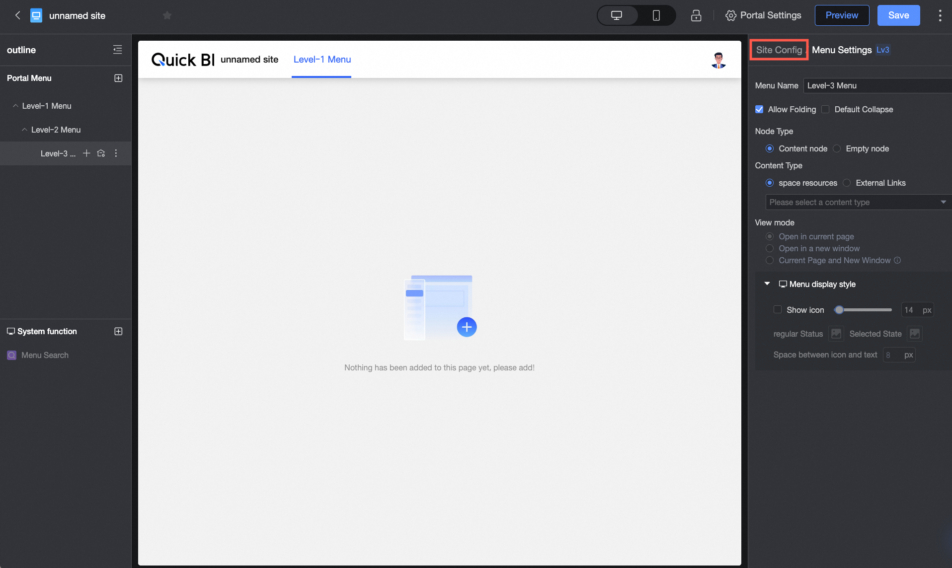
Basic Configuration
|
Configuration item |
Description |
|
Global LOGO |
|
|
Display main title |
Toggle the main title display and configure its name and text style. |
|
Display subtitle |
Toggle the subtitle display and configure its name and text style. |
|
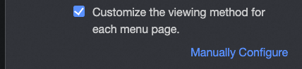
Viewing method |
|


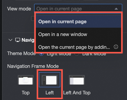

Navigation Frame
Customize the theme mode and navigation frame pattern and style.
-
Theme Mode
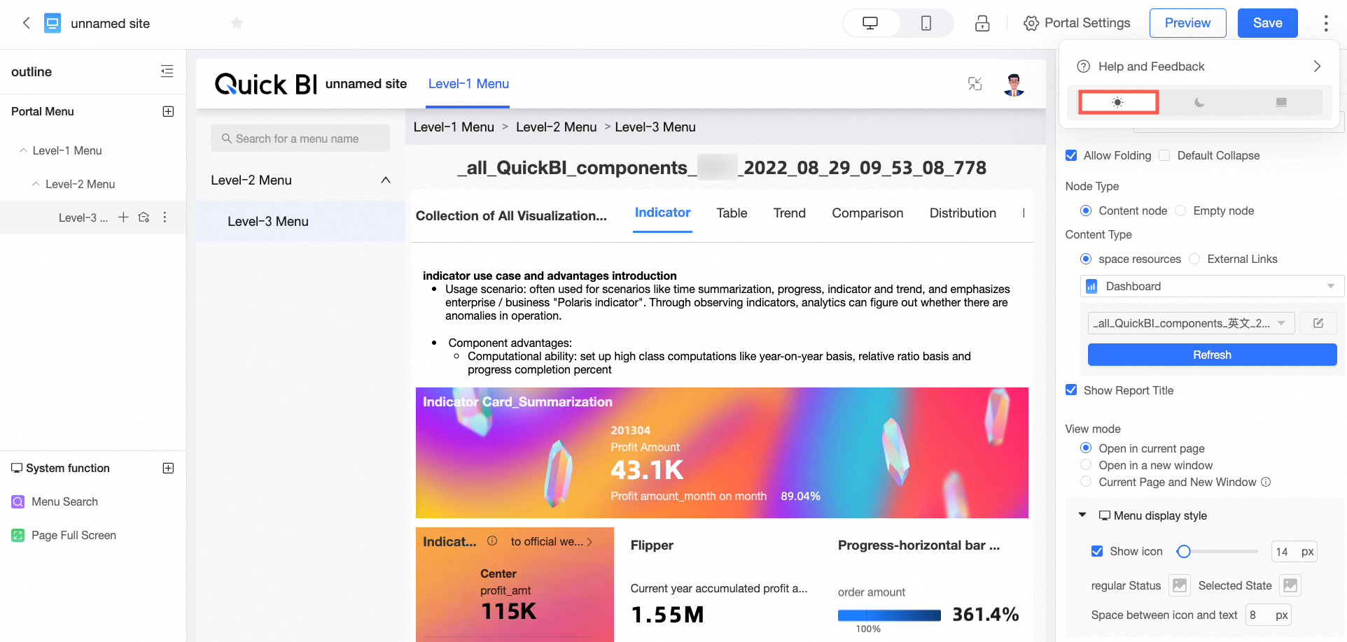
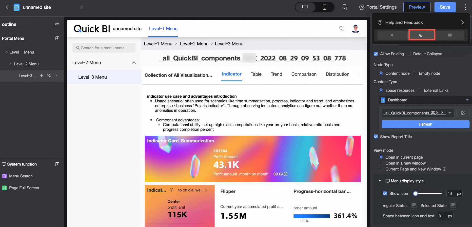
Options include light mode and dark mode.
-
Light Mode

-
Dark Mode
-
-
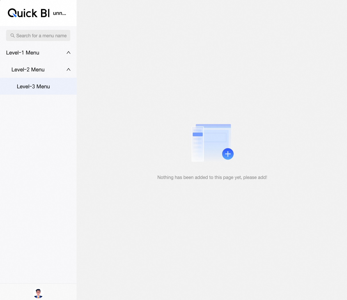
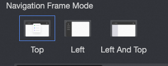
Navigation Frame Pattern
Choose from top navigation layout, left navigation layout, or dual navigation layout.
-
Top Navigation Layout
Configuration item
Description
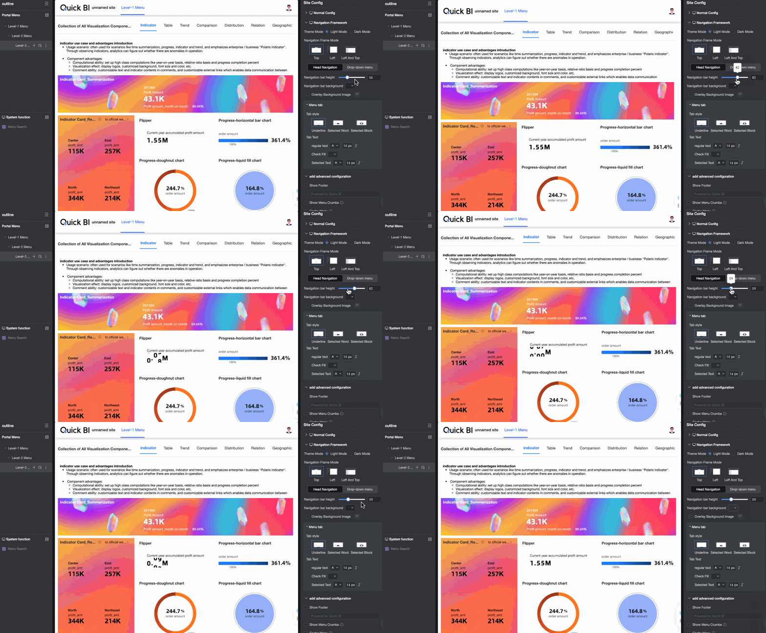
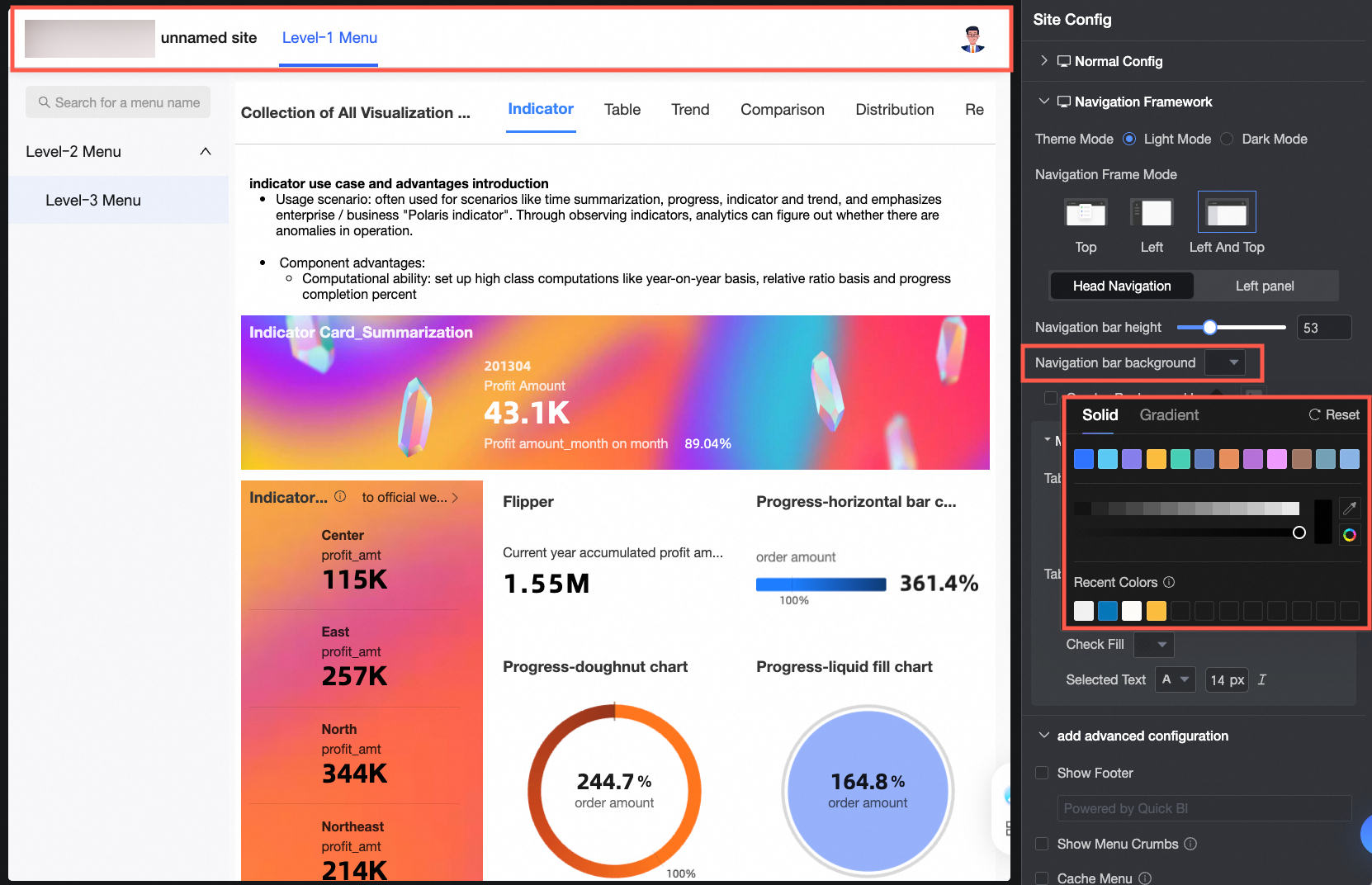
Header navigation
Available for top navigation layout and dual navigation layout. Configure the following header navigation settings:
-
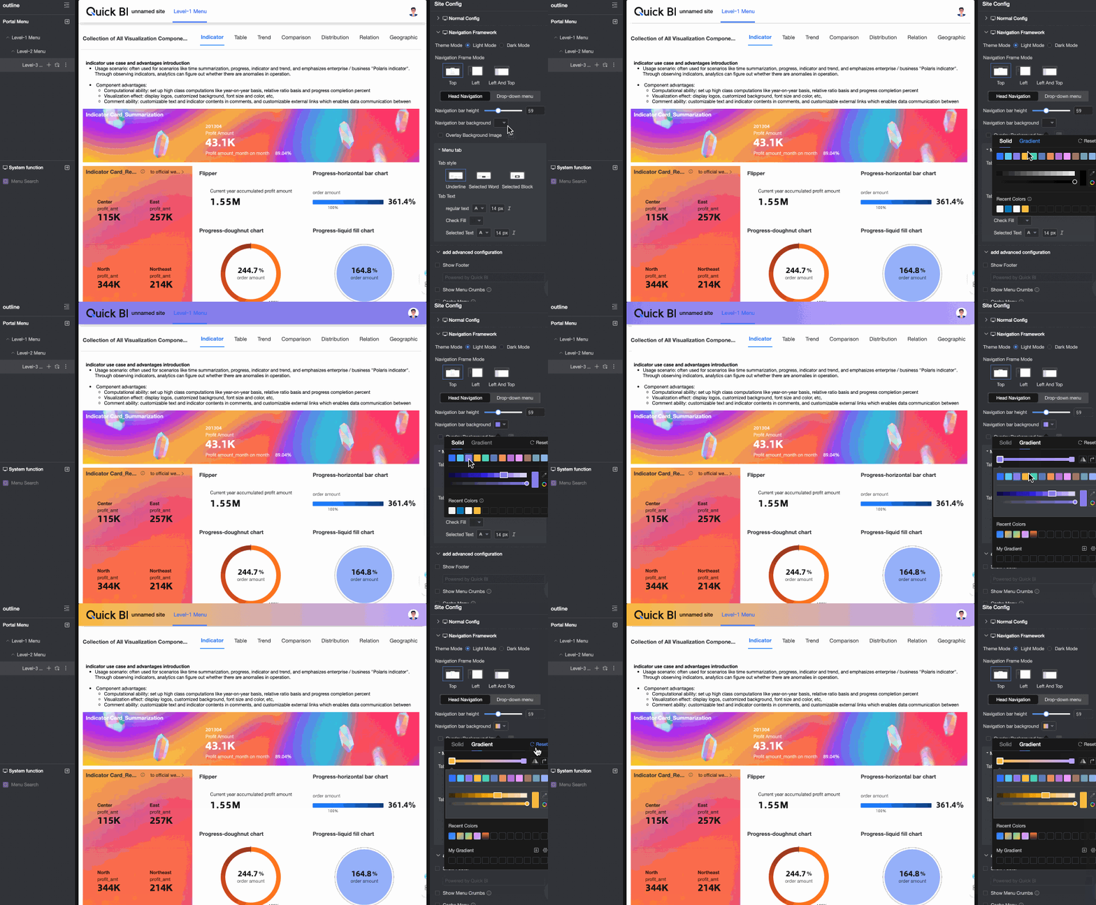
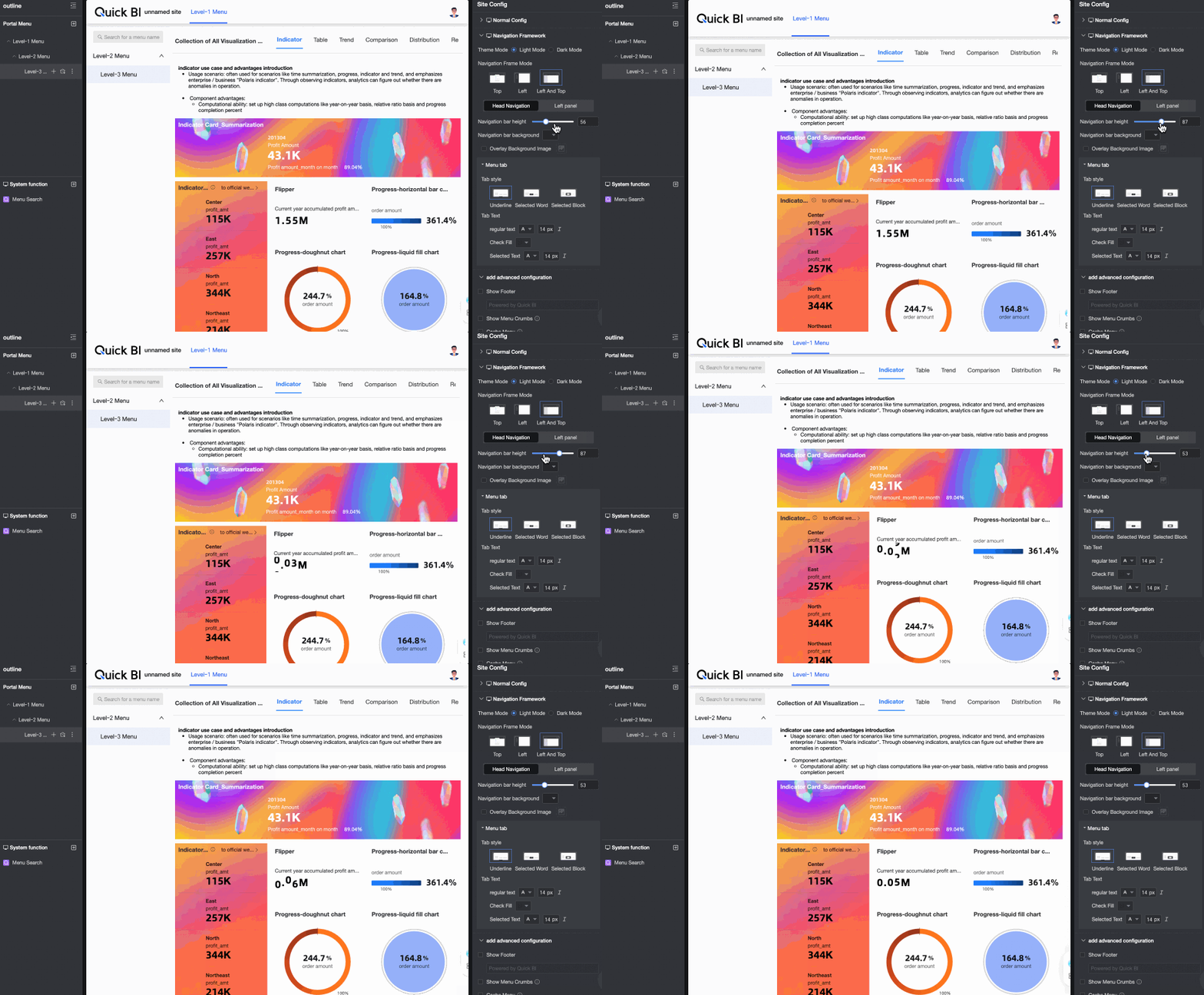
Navigation bar height
-
Navigation bar background
-
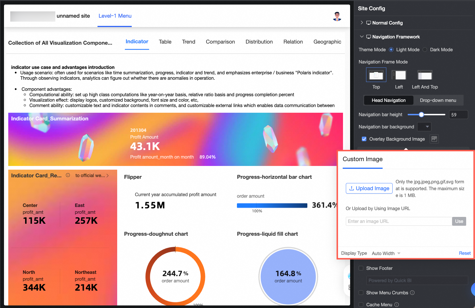
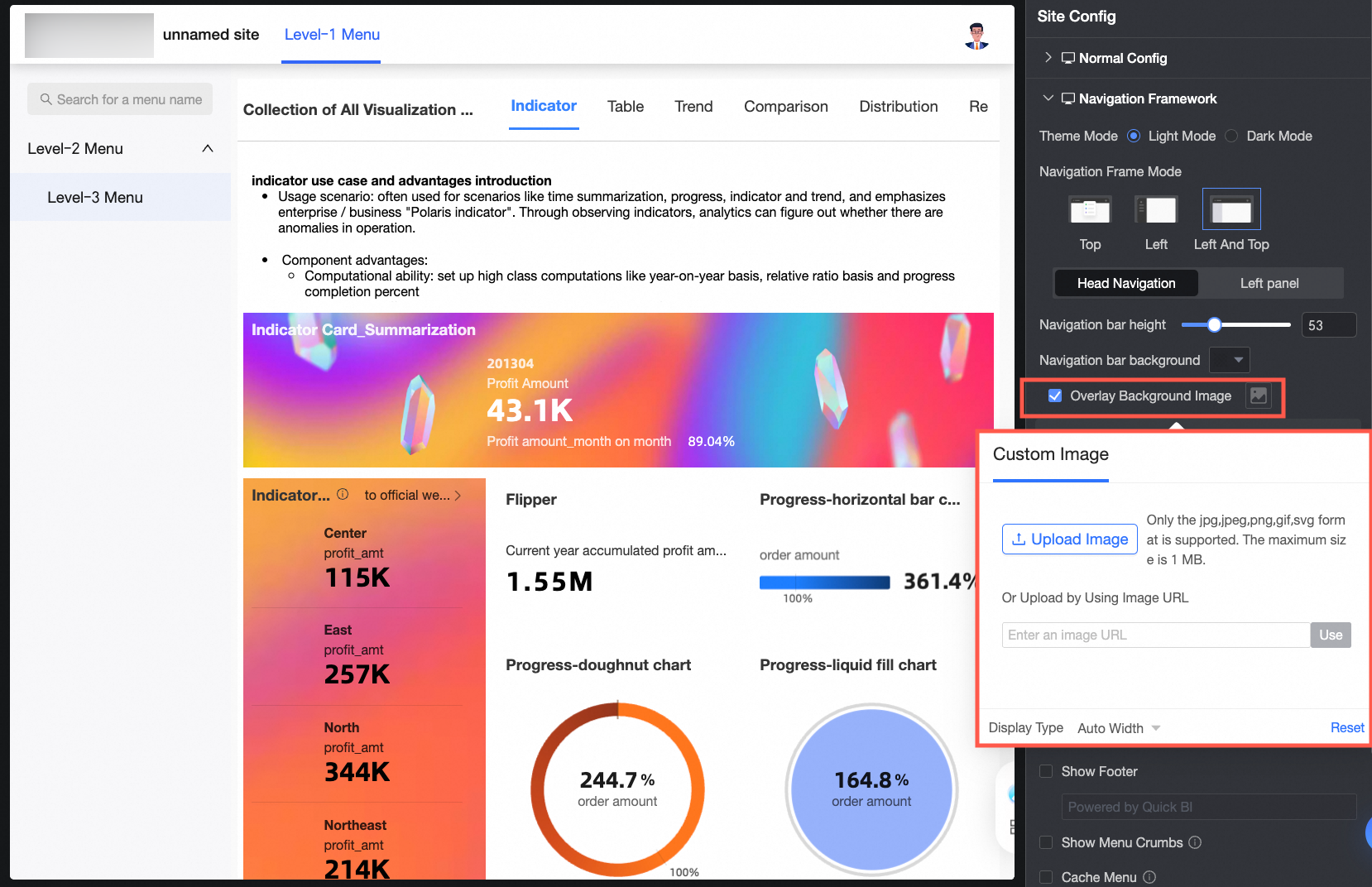
Overlay background image
When selected, upload a custom image. Supported formats: JPG, JPEG, PNG, GIF, SVG. Maximum size: 1 MB.
-
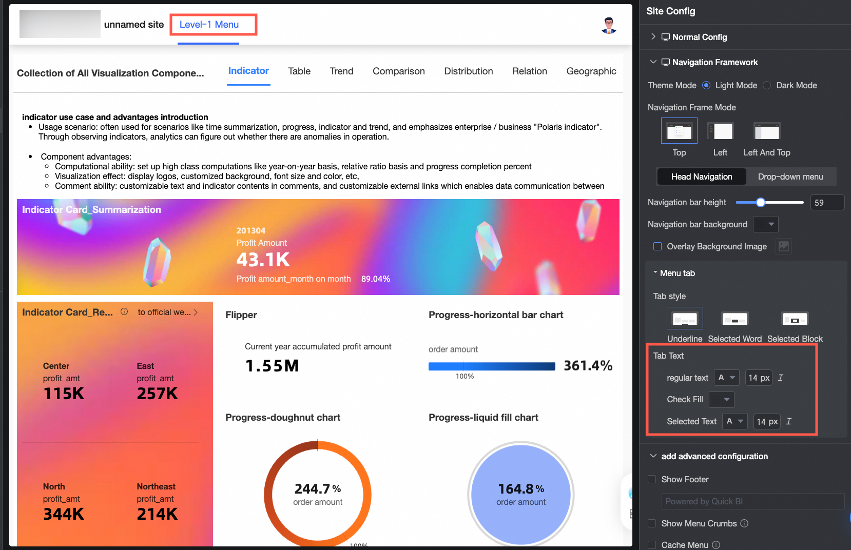
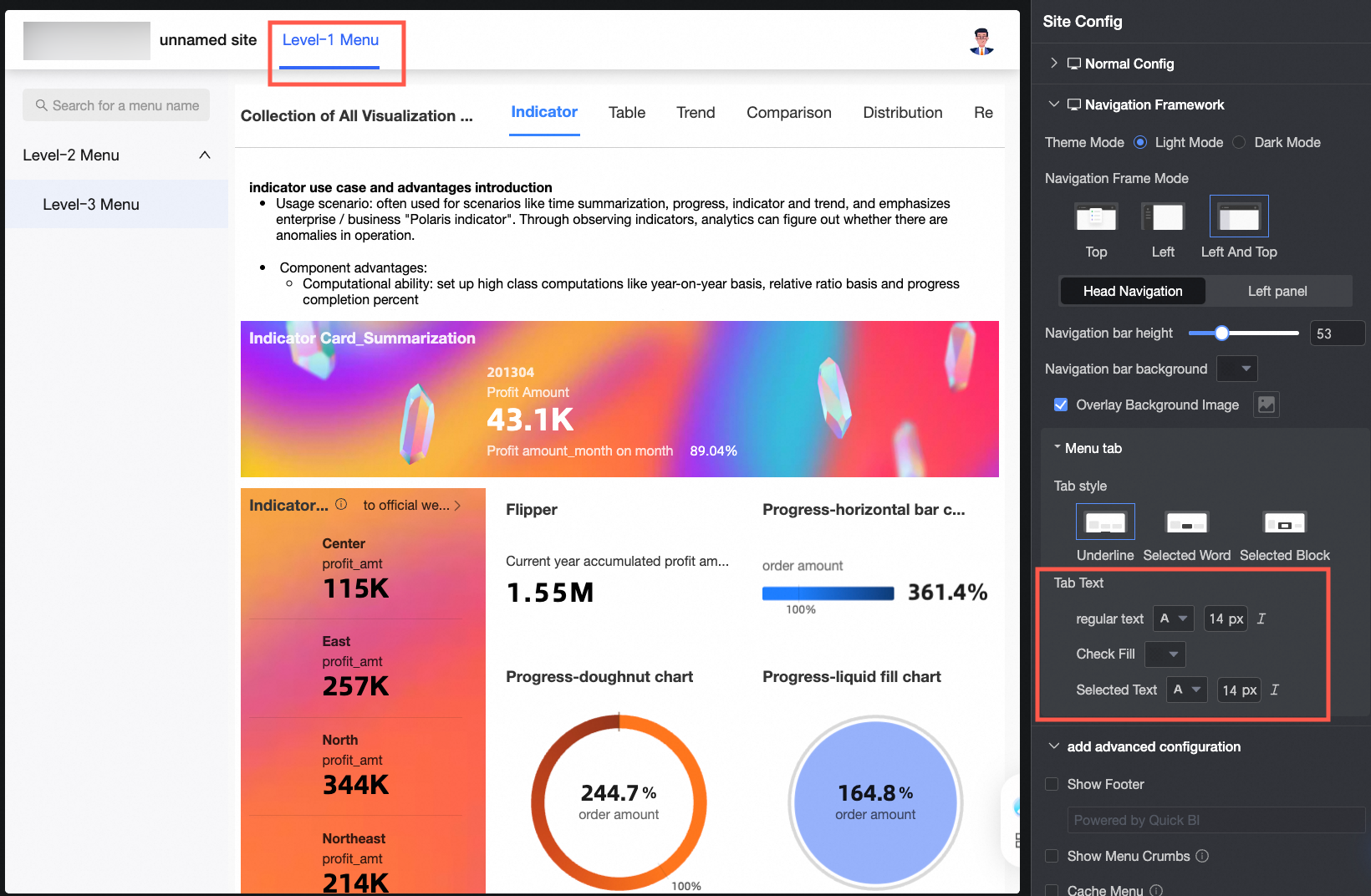
Tab style
Options: underline, selected word, and selected block.
-
Tab text
Set the regular text style, selected fill color, and selected text style. The selected fill color applies only to selected block mode.
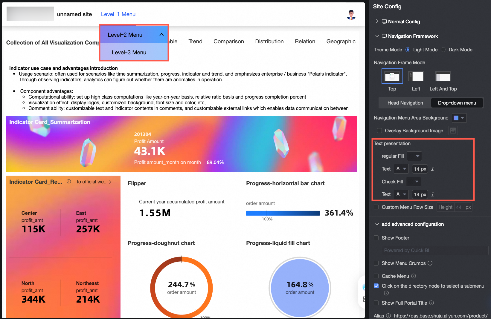
Drop-down menu
Available for top navigation layout. Configure the drop-down menu settings:
-
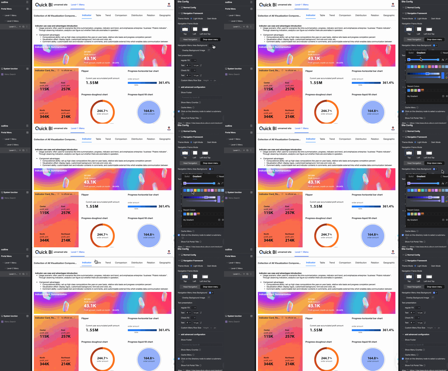
Navigation menu area background
-
Overlay background image
When selected, upload a custom image. Supported formats: JPG, JPEG, PNG, GIF, SVG. Maximum size: 1 MB.
-
Text display
Set the regular and selected fill color and text style.
-
Custom menu row size
Specify the menu row height.
-
-
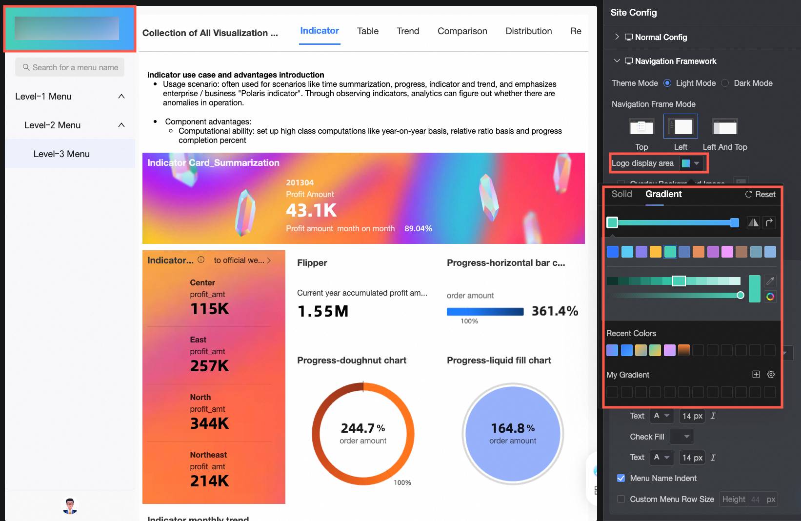
Left Navigation Layout
Configuration item
Description
Logo display area color
Set the Logo display area color to a solid color or gradient.
Overlay background image
When selected, upload a custom image. Supported formats: JPG, JPEG, PNG, GIF, SVG. Maximum size: 1 MB.
Panel configuration
-
Navigation bar background
-
Overlay background image
When selected, upload a custom image. Supported formats: JPG, JPEG, PNG, GIF, SVG. Maximum size: 1 MB.
Menu display configuration
-
Menu selected style
Options: fill and selected block.
-
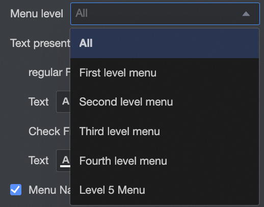
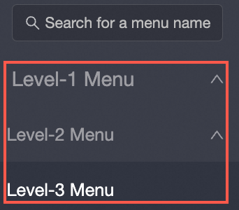
Menu level and text display
Set the text display style for all or specific menu levels.
-
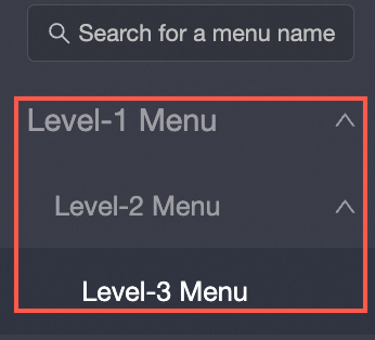
Menu name indent
-
When selected, sublevel menu names are indented.
-
When deselected, all menu names align in a single column.
-
-
Custom menu row size
Specify the menu row height.
-
-
Dual Navigation Layout
Configuration item
Description
Header navigation
Available for top navigation layout and dual navigation layout. Configure the following header navigation settings:
-
Navigation bar height
-
Navigation bar background
-
Overlay background image
When selected, upload a custom image. Supported formats: JPG, JPEG, PNG, GIF, SVG. Maximum size: 1 MB.
-
Tab style
Options: underline, selected word, and selected block.
-
Tab text
Set the regular text style, selected fill color, and selected text style. The selected fill color applies only to selected block mode.
Left panel menu area
Available for dual navigation layout. Configure the left panel menu area settings:
-
Menu area background
-
Overlay background image
When selected, upload a custom image. Supported formats: JPG, JPEG, PNG, GIF, SVG. Maximum size: 1 MB.
-
Menu selected style
Options: fill and selected block.
-
Menu level and text display
Set the text display style for all or specific menu levels.
-
Menu name indent
-
When selected, sublevel menu names are indented.
-
When deselected, all menu names align in a single column.
-
-
Custom menu row size
Specify the menu row height.
-
-



Add Common Controls
Adding common controls follows the same process on PC and mobile.
|
Configuration item |
Description |
|
Display footer |
When selected, specify the footer content. The footer appears at the bottom of the content page. |
|
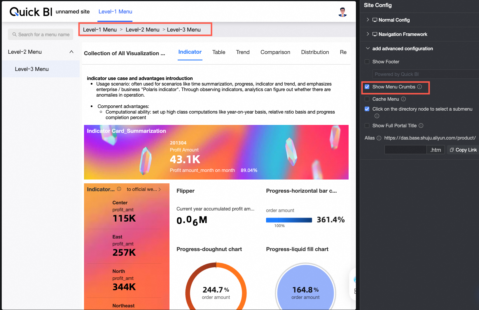
Menu level breadcrumb display |
When selected, menu level breadcrumbs appear at the top of the content page.
|
|
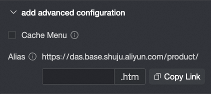
Menu cache |
When selected, previously opened menus are cached and do not reload when you switch between them. |
|
Click directory node to select submenu |
When selected, clicking a directory node automatically displays the next level submenu. When deselected, clicking a directory node only collapses or expands the menu list in top and left navigation layouts. In dual navigation layout, this setting applies only to the left menu. |
|
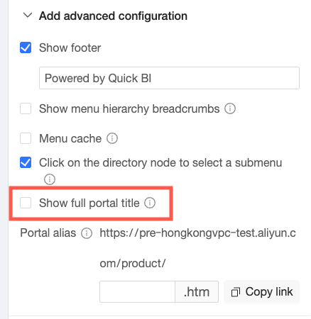
Display full portal title |
In dual or top navigation layouts, long titles are displayed in full by default. |
|
Portal alias |
Specify a custom URL parameter. For example, entering 1 sets the portal URL to
Note
Enter only content that complies with applicable laws and regulations. Do not enter any illegal, pornographic, reactionary, or unethical content. |
Menu Configuration
PC menu configuration differs from mobile only in menu display styles. All other settings are shared.
-
On the BI portal editing page, click a menu to open its Configure Menu page.
-
Configure the Portal Menu, System Features, and Menu Settings.
-
Portal Menu Configuration
① Add a main menu. This creates a level-1 menu.
② Add submenus for level-2 and below.
③ Designate a menu as the homepage, which will be displayed by default when the BI portal is accessed.
④ Delete a menu.
-
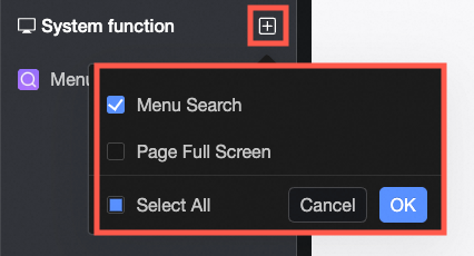
System Features Settings
Select the Menu Search and Page Full-Screen features.
-
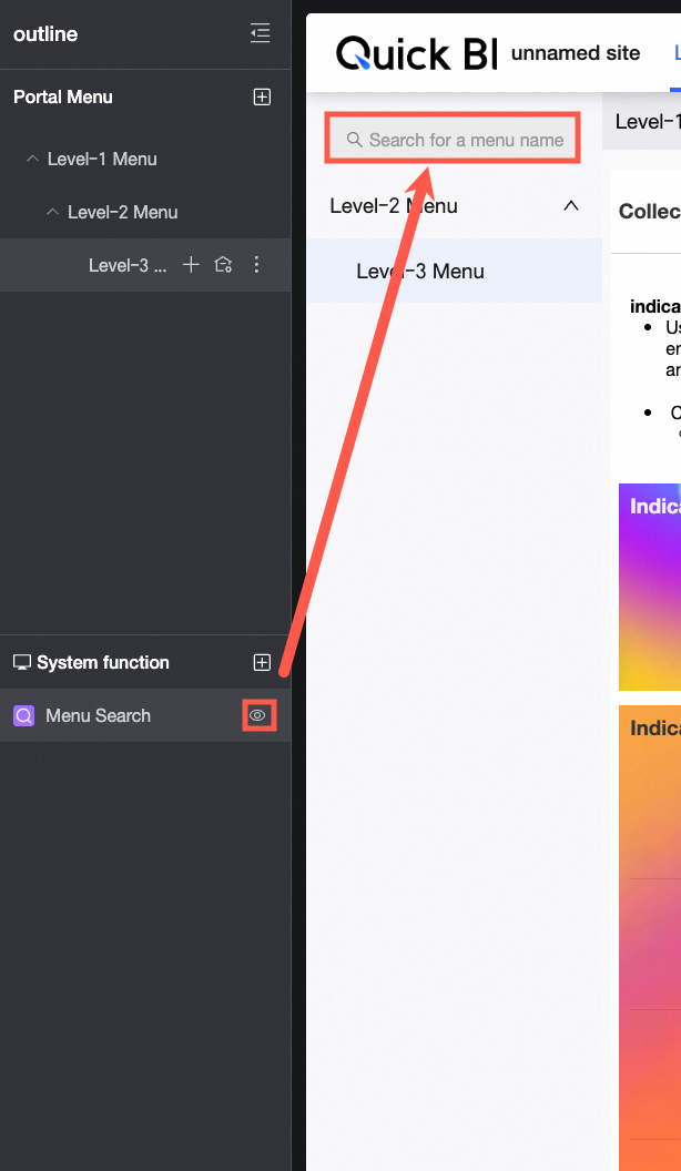
Menu Search
-
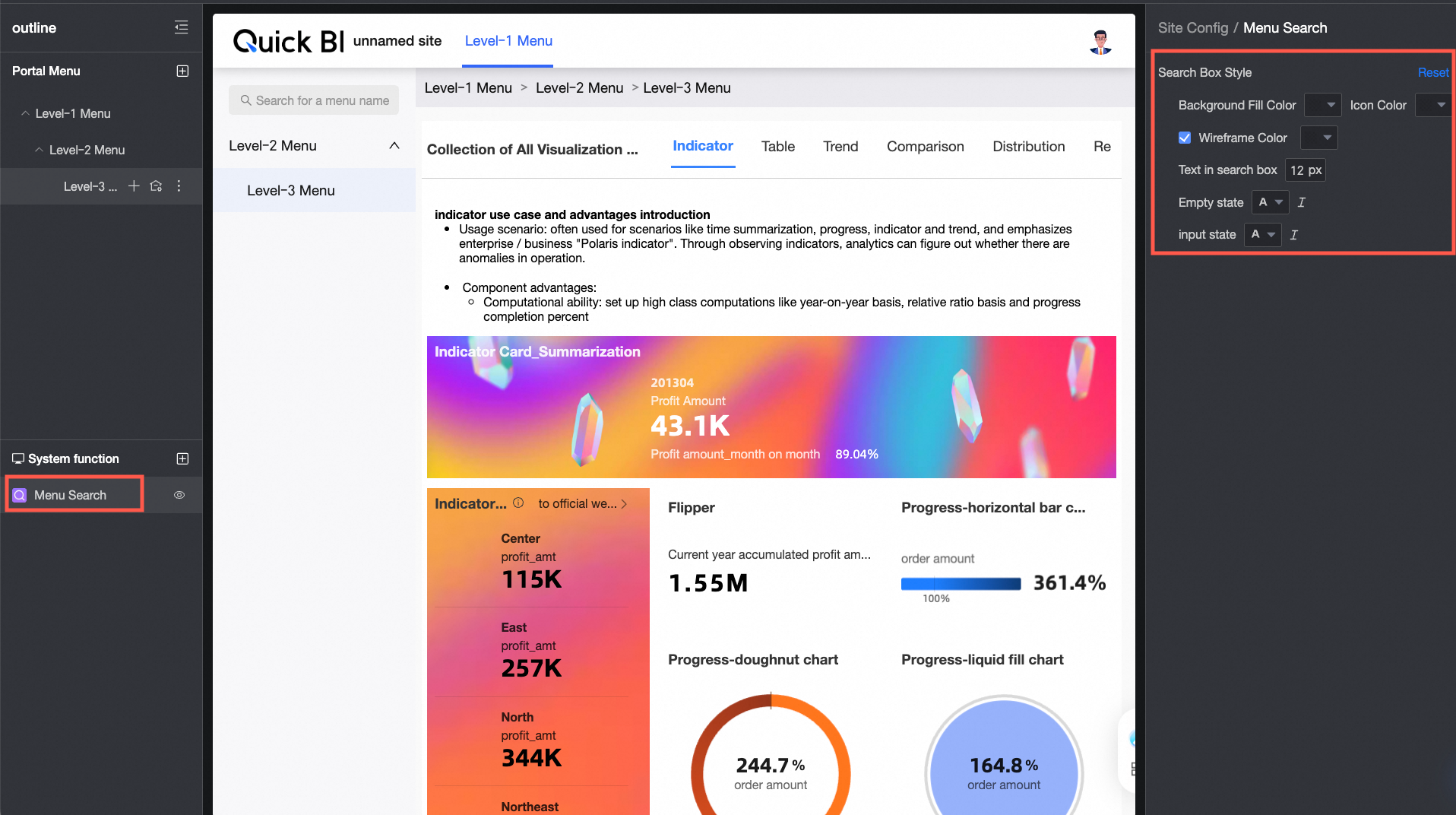
When Menu Search is selected and set to displayed, users can search for menu names.
-
Configure the background fill color, icon color, line frame color, and text style for the search box in empty state and input state.
-
-
Page Full-Screen
-
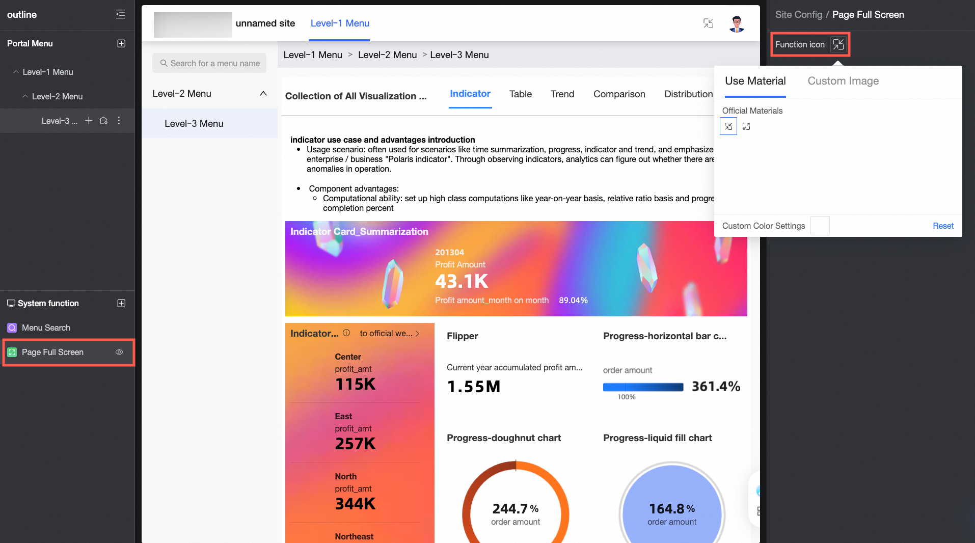
When Page Full-Screen is selected and set to displayed, a full-screen button appears on the page.
-
Set the function icon to materials or custom images.
Uploaded local images must be in JPG, JPEG, PNG, GIF, or SVG format, with a maximum size of 1 MB.
-
-
-
Menu Settings
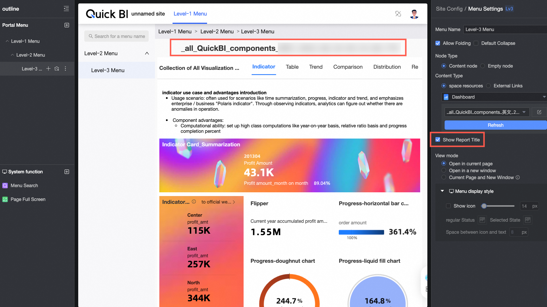
Configuration item
Description
Menu name
The menu display name.
Allow collapse
Controls whether the menu can be collapsed.
Default collapse
Sets the default collapsed or expanded state.
NoteAvailable only when Allow menu collapse is selected.
Node type
Set the node to a content node or an empty node.
-
A parent node can be set to an empty node.
-
Adding a child node automatically converts a content node to an empty node and clears its content.
Content type
Set to space resources or external links. Supported space resource types:
-
Dashboard
-
Data dashboard
-
Workbook
-
Ad hoc analysis
-
Data reporting
-
Downloads
For dashboard, workbook, ad hoc analysis, or downloads resources, you can toggle display the report title.
Viewing method
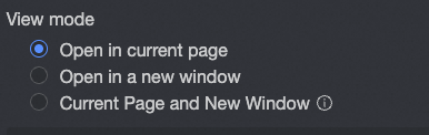
Options: open in current page, open in new window, and open in current page and new window.
Note-
Available only when the menu is not an empty node.
-
If a unified viewing method is set in the site configuration, individual menu pages cannot be customized. Change to custom viewing method for each menu page to enable per-menu configuration.
Menu display style
Show or hide the menu display. You can also select Display icon to configure icon size, menu icon for normal and selected states, and spacing between the icon and text.
-
Customize menu visibility for PC and mobile independently. Hiding a menu on PC also hides its submenus, without affecting mobile. Configure mobile menu visibility when you create a mobile BI portal.
-
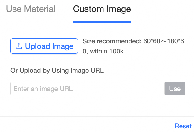
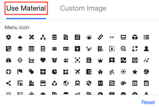
Set the menu icon to a material or custom image.
-
Use material
-
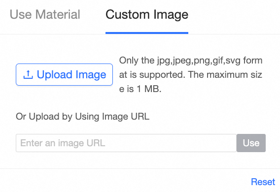
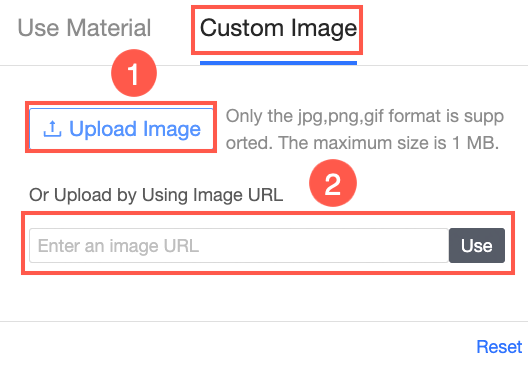
Custom image
Upload a local image (①) or provide an image URL (②).
-
-
-
-
Click Save.
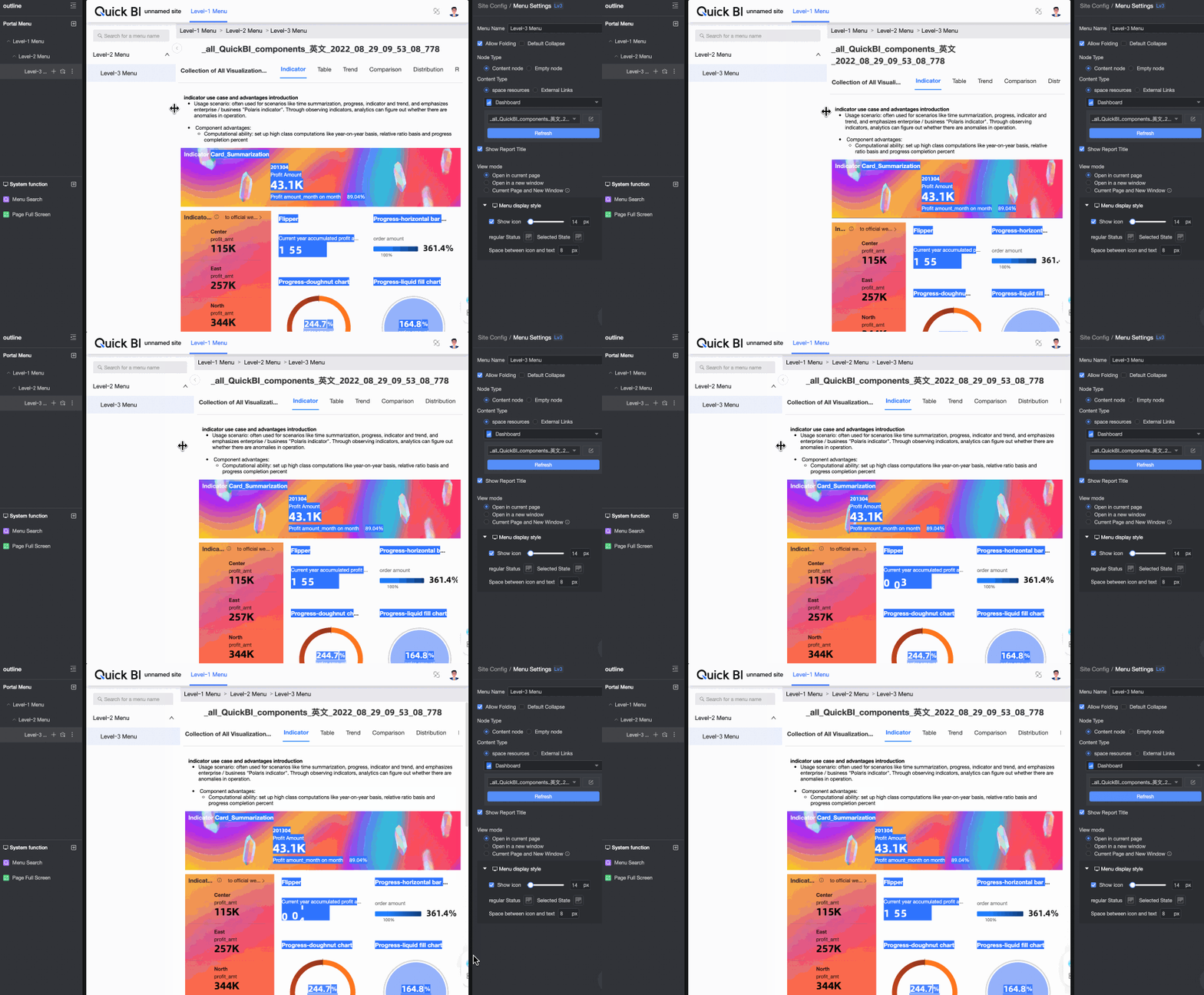
Drag the left navigation pane to adjust its width.






Theme configuration
-
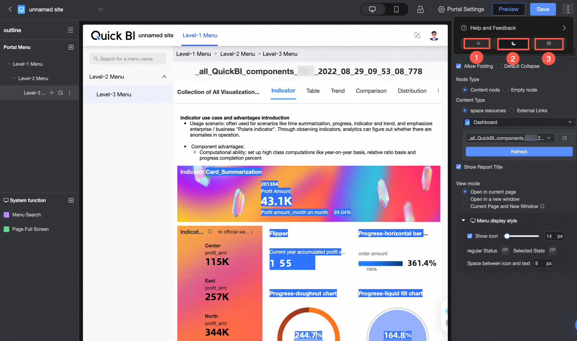
On the BI portal editing page, click the
icon in the upper-right corner, then locate the icon at the bottom to toggle between light and dark theme modes.NoteTheme mode switching applies at the account level, not per module. For example, setting the workbook to light mode also switches compatible modules (such as dashboards and data reporting) to light mode.
① Light Mode
② Dark Mode
③ Follow System
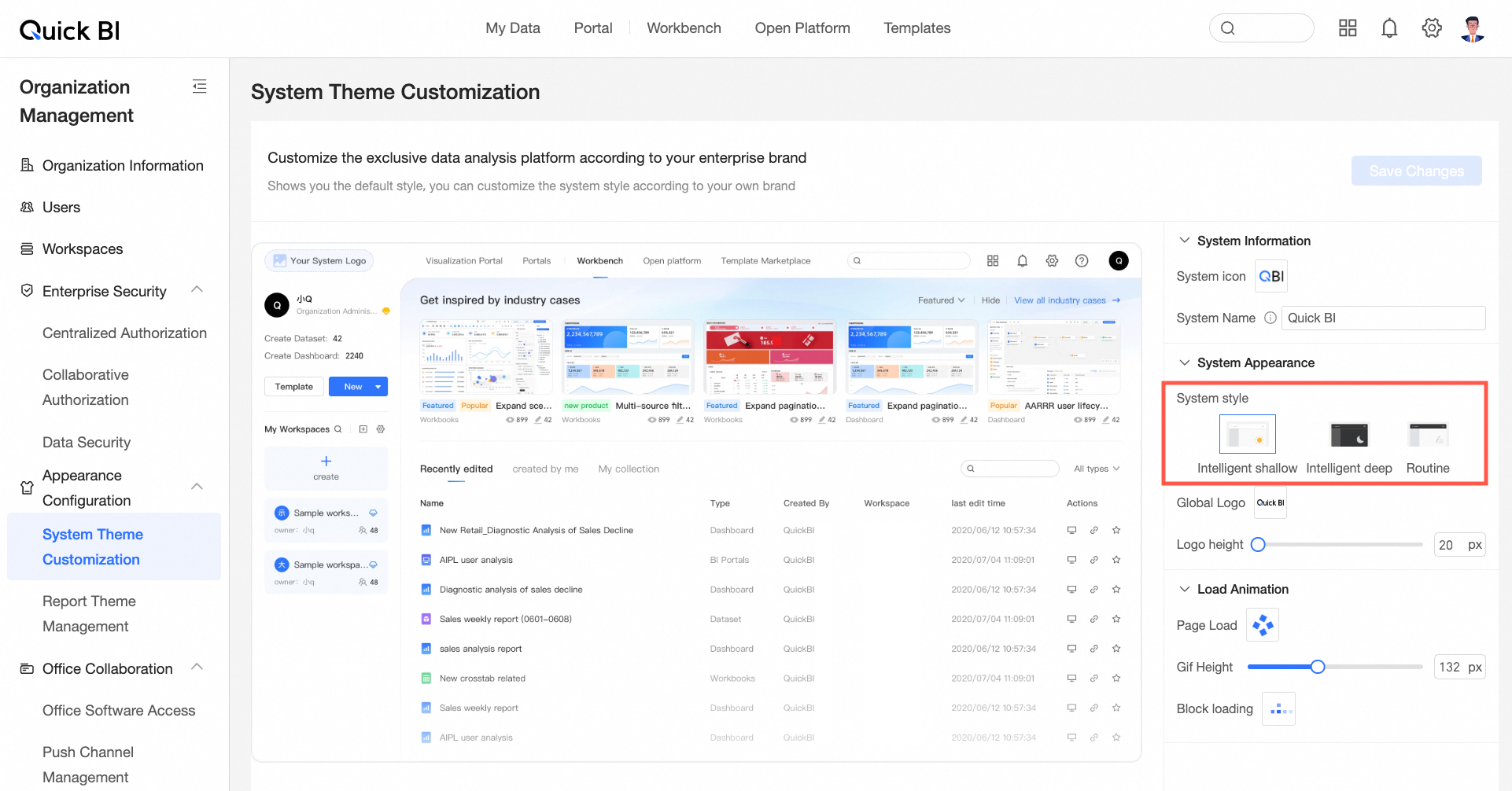
Apply the system theme style to custom configurations.
For more information, see Customize the system theme.
NoteSystem style settings in custom configurations are available only in Organization Management. Module-level settings take precedence over organization-level settings.
 icon in the upper-right corner, then locate the icon at the bottom to toggle between light and dark theme modes.