Button
A button is an interactive widget whose color, size, label, and link are customizable for each state. Combined with other components, buttons can display linked pages or prompt messages in visual charts.
Prerequisites
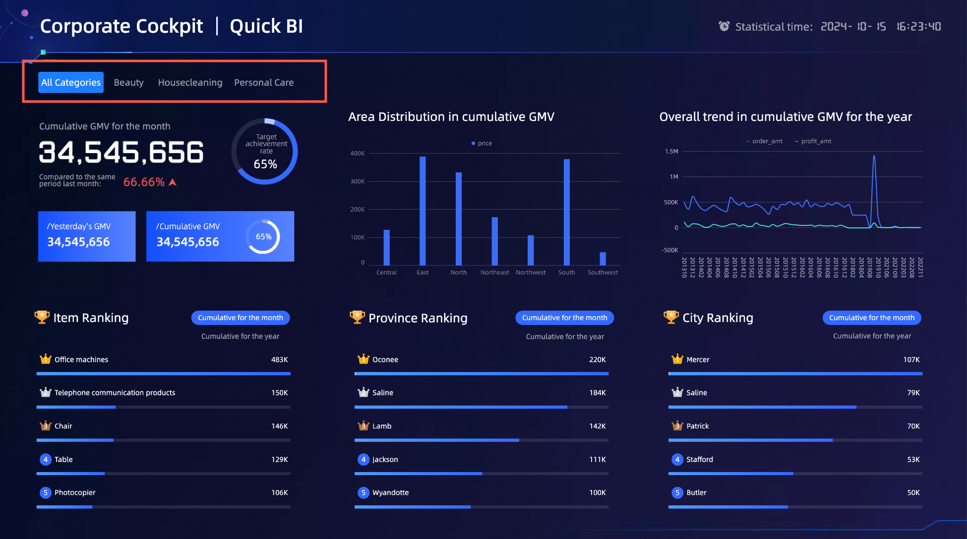
A visualization screen is created. For more information, see Create a Data Visualization Screen.
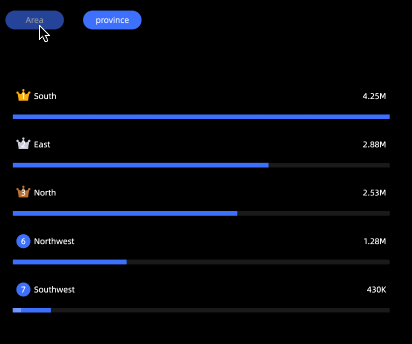
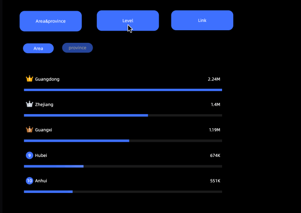
Effect
Add Button Control
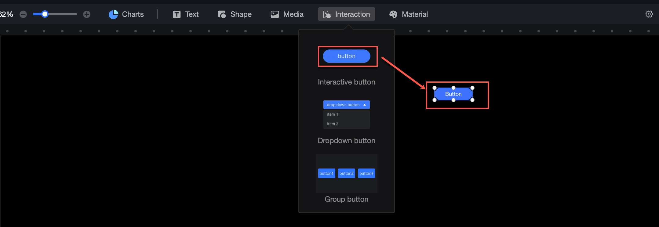
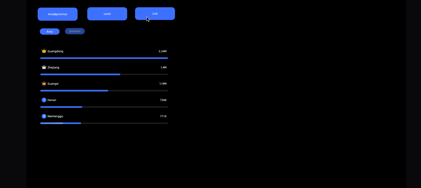
On the dashboard edit page, click Interaction in the top navigation bar to add a button.
Layer Events
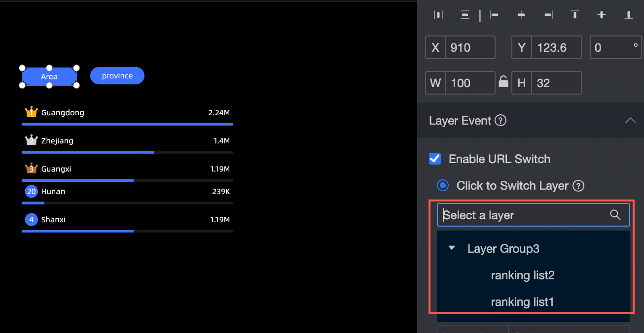
Configure layer events for the button in the configuration section:
-
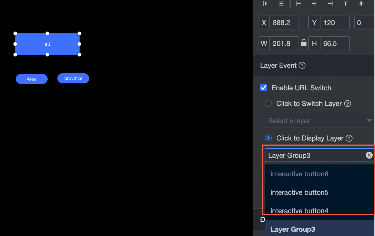
Set Click to Switch Layer: Place the button and the switchable object (a layer group with layer overlay enabled) at the same layer level, then associate the button with the target layer from the drop-down list.
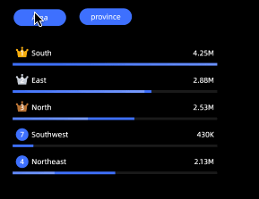
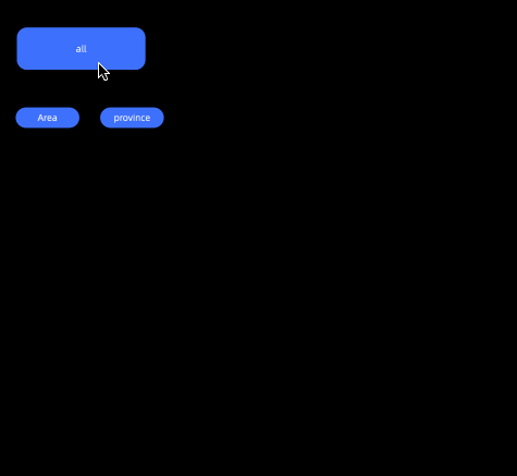
Effect:
-
Set Click Pop-up Layer: Select the layer or layer group that appears when the button is clicked. The pop-up object must be a layer or layer group on the layer root node.
Effect:
-
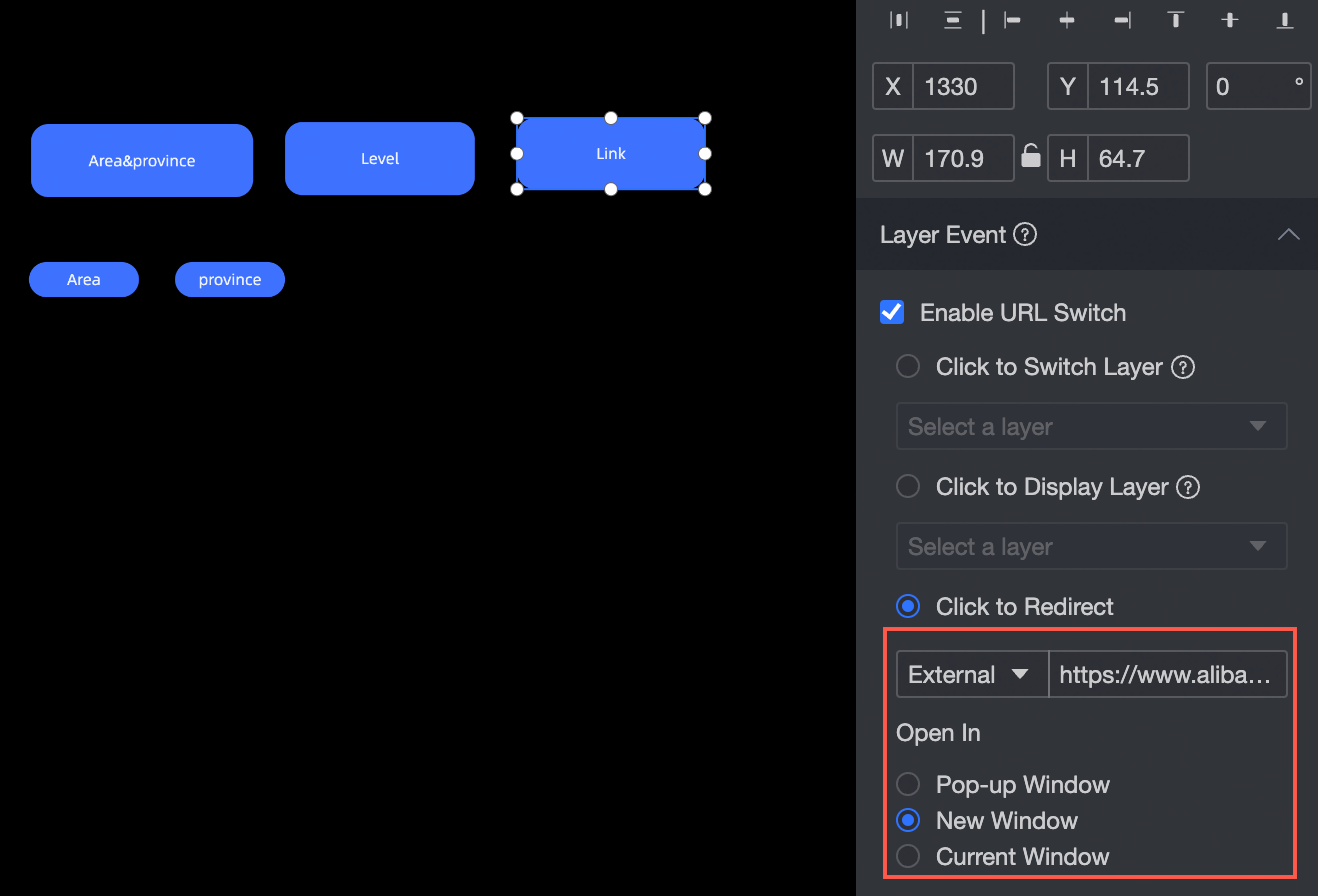
Set the click redirect page:
-
Internal: Redirects to an internal overlay page.
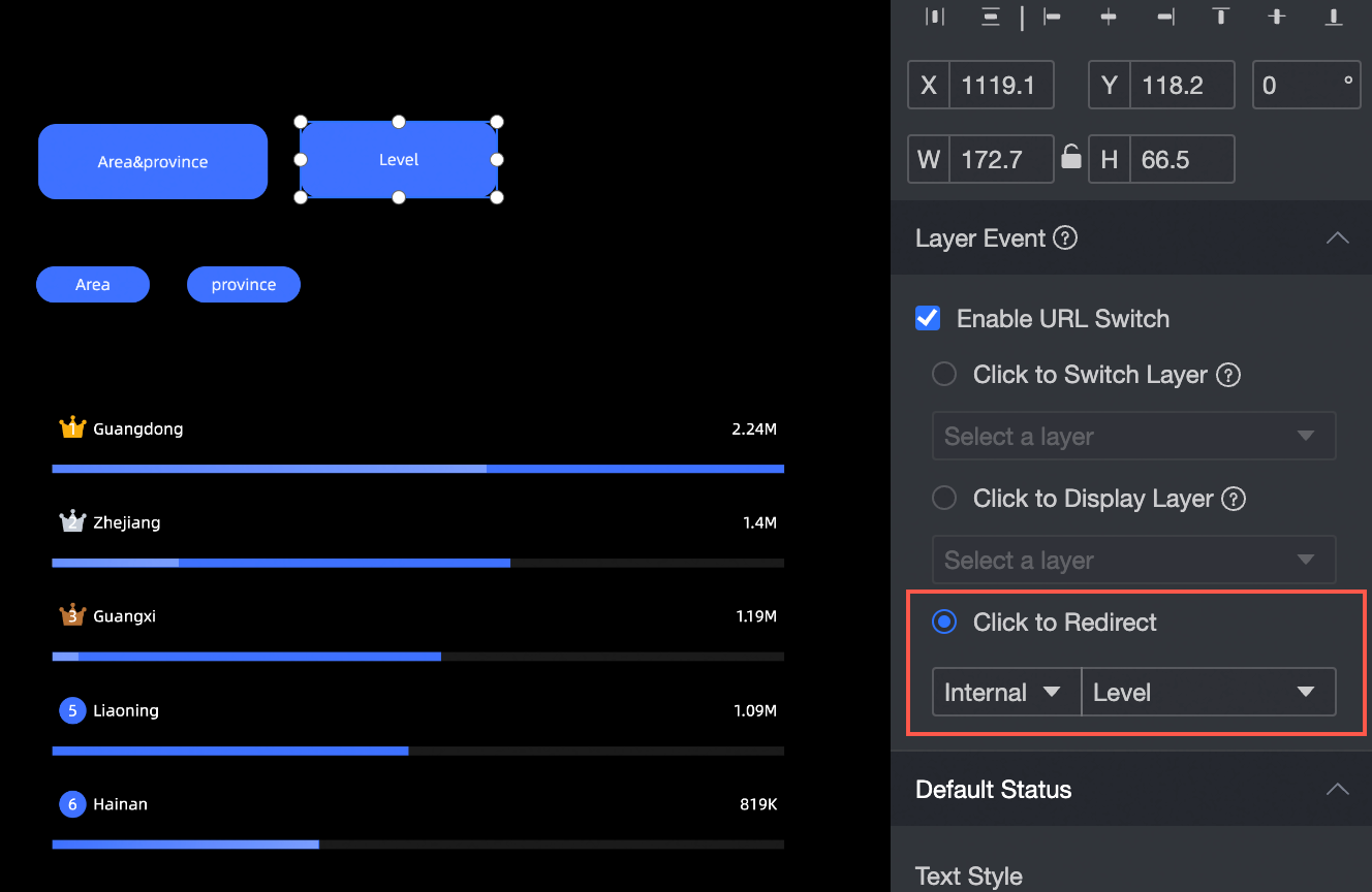
Effect:
-
External: Links to an external URL. The link opens in a pop-up window, a new window, or the current window.
-
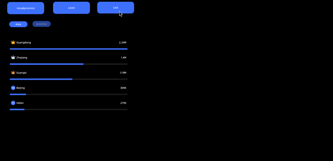
Pop-up window effect
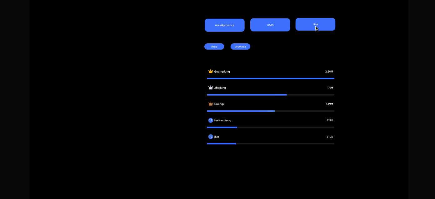
New window effect:
Current window effect:
-
-
Button Style Configuration
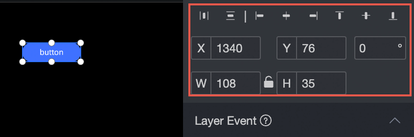
Location and size
Configure the widget position and dimensions in the configuration section:
-
Alignment: Supports left, center, and right alignment.
-
Position: Set the X and Y values relative to the upper-left corner to reposition the widget.
-
Rotation: Set the rotation angle.
-
Size: Set W and H to adjust the width and height.
-
Lock: Prevents further changes to the widget size and position.
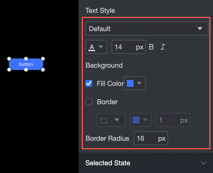
Text Style
Configure the widget text style in the configuration section:
-
Font: Set the font family, color, size, bold, and italic styles.
-
Background: Set the background fill color.
-
Border: Set the border style, color, and width.
-
Corner radius: Set the border corner radius.
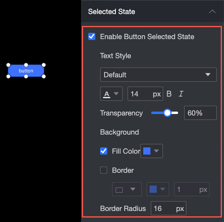
Selected Status
Configure the selected-state appearance in the configuration section:
-
Font: Set the font family, color, size, bold, and italic styles for the selected state.
-
Background: Set the background fill color for the selected state.
-
Border: Set the border style, color, and width for the selected state.
-
Corner radius: Set the border corner radius for the selected state.
Effect: