Quick BI provides six analysis methods—auxiliary line, trendline, forecast, anomaly detection, fluctuation cause analysis, and cluster analysis—to help you identify data trends and anomalies in dashboards.
Overview
-
Analysis and Alerting lets you analyze data from multiple perspectives to visualize trends and identify anomalies.
-
Six methods are available: auxiliary line, trendline, forecast, anomaly detection, fluctuation cause analysis, and cluster analysis.
ImportantTrendline, forecast, anomaly detection, fluctuation cause analysis, and cluster analysis require the Professional Edition.
Limitations
The following charts support Analysis and Alerting.
|
Chart |
Auxiliary line |
Trendline |
Forecast |
Anomaly detection |
Fluctuation analysis |
Cluster analysis |
|
line chart |
√ |
√ |
√ |
√ |
√ |
× |
|
area chart |
√ |
√ |
√ |
√ |
√ |
× |
|
stacked area chart |
√ |
× |
× |
√ |
× |
× |
|
100% stacked area chart |
√ |
× |
× |
√ |
× |
× |
|
vertical bar chart |
√ |
√ |
√ |
√ |
√ |
× |
|
stacked vertical bar chart |
√ |
× |
× |
√ |
× |
× |
|
100% stacked vertical bar chart |
√ |
× |
× |
√ |
× |
× |
|
horizontal bar chart |
√ |
√ |
√ |
√ |
× |
× |
|
stacked horizontal bar chart |
√ |
× |
× |
√ |
× |
× |
|
100% stacked horizontal bar chart |
√ |
× |
× |
√ |
× |
× |
|
combination chart |
√ |
√ |
√ |
√ |
√ |
× |
|
trend indicator |
× |
× |
× |
× |
√ |
× |
|
scatter chart |
√ |
√ |
× |
√ |
× |
√ |
|
bubble chart |
√ |
× |
× |
√ |
× |
√ |
|
leaderboard |
√ |
× |
× |
× |
× |
× |
|
bullet chart |
√ |
× |
× |
× |
× |
× |
|
box plot |
√ |
× |
× |
× |
× |
× |
|
histogram |
√ |
× |
× |
× |
× |
× |
Auxiliary line
Use an auxiliary line to compare a measure's current value with a set reference point. An auxiliary line can represent a fixed value, a calculated value, or a custom value.
-
Log on to the Quick BI console.
-
On the Dashboards page, find the dashboard that you want to edit and click the
 icon.
icon. -
On the dashboard edit page, click the target chart.
-
In the Data panel, on the Analysis tab, go to the Analysis and Alerting section and click the
 icon next to Auxiliary line.
 -
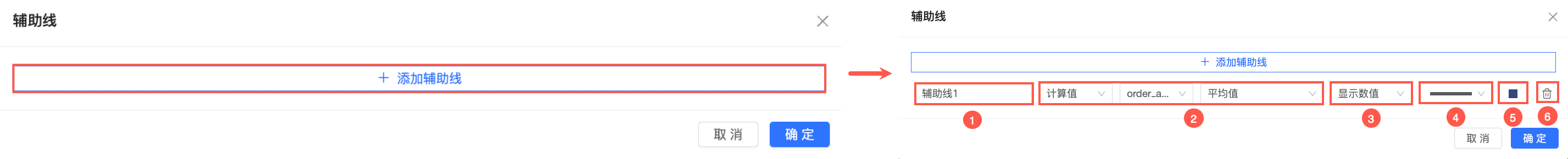
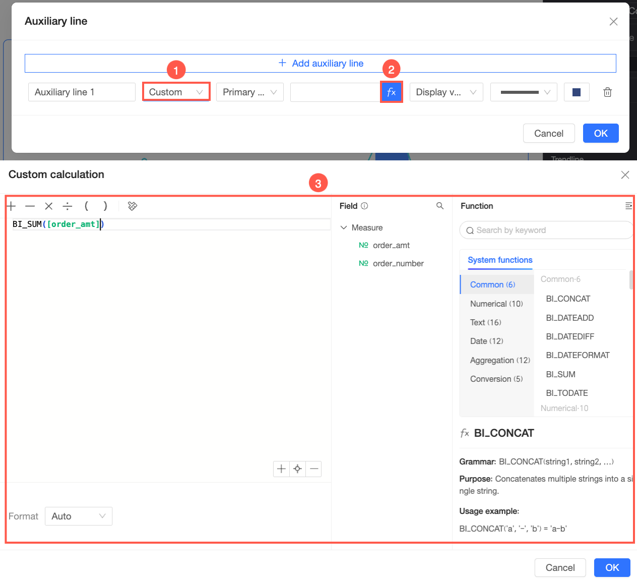
In the Auxiliary line dialog box, click Add auxiliary line and then configure its settings. The following example uses a line chart.
Setting
Description
① Name
Enter a name that reflects the line's business purpose.
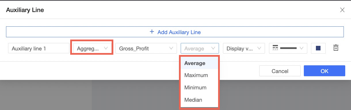
② Set value
Fixed value
Sets a specific constant numeric value.
If the chart has a primary and secondary axis, you can choose which axis the auxiliary line follows.
Calculated value
Uses a predefined calculation: Average, Maximum, Minimum, or Median.
Custom
Uses a custom expression that can reference fields and functions.
If the chart has a primary and secondary axis, you can choose which axis the auxiliary line follows.

③ Display content
Select what information the auxiliary line displays:
-
Show value: Displays only the value of the auxiliary line.
-
Show name: Displays only the name of the auxiliary line.
-
Show both: Displays both the name and the value.
④ Line style
Select a style for the auxiliary line.
⑤ Line color
Select a color for the auxiliary line.
⑥ Delete current auxiliary line
To delete an auxiliary line, click the
icon next to it. -
-
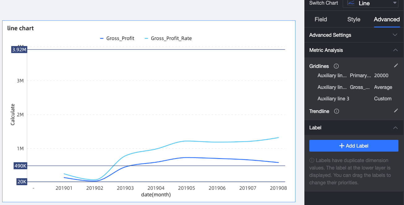
Click OK. The following figure shows an example of an auxiliary line.
Trendline
A trendline shows the overall direction of your data. The default type Auto evaluates five models (linear, logarithmic, exponential, polynomial, and power) and selects the best fit. You can also manually choose a type.
Procedure
-
On the Dashboards page, find the dashboard that you want to edit and click the
icon. -
On the dashboard edit page, click the target chart.
-
In the Data panel, on the Analysis tab, go to the Analysis and Alerting section and click the
icon next to Trendline. -
In the Trendline dialog box, select the measure to analyze, the calculation method, the trendline type, and the number of periods to forecast.
-
Click OK. The following figure shows an example of a trendline.
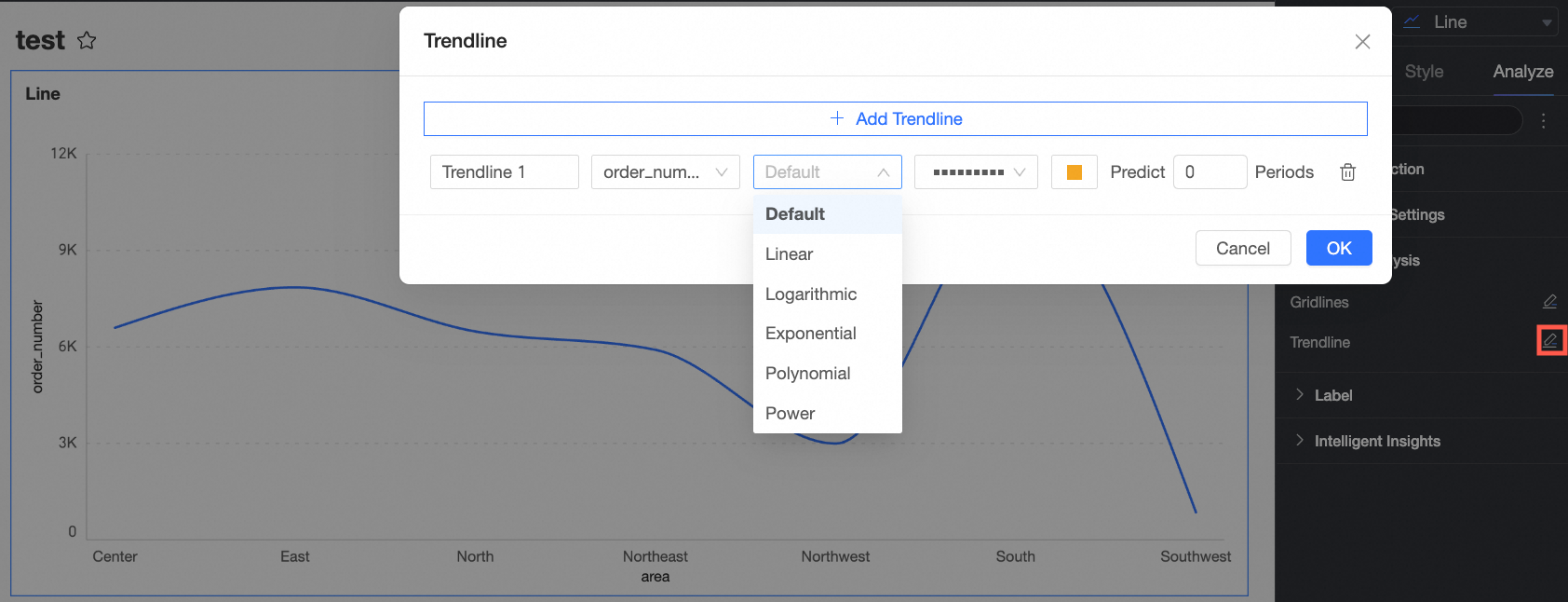
Trendline types
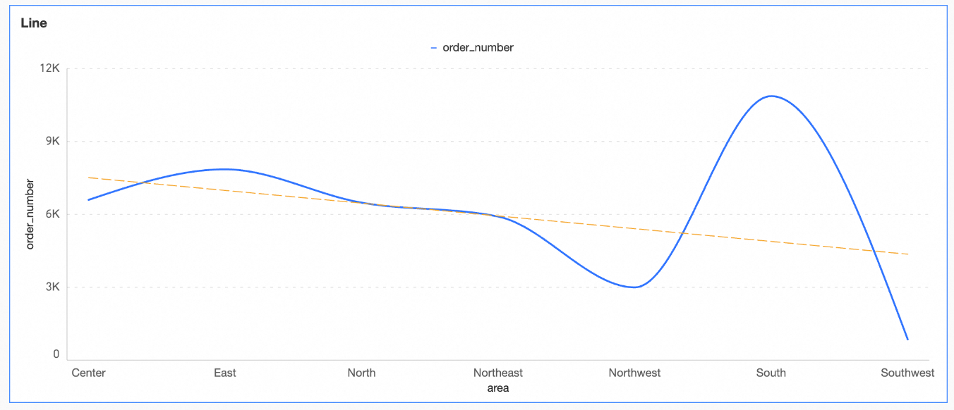
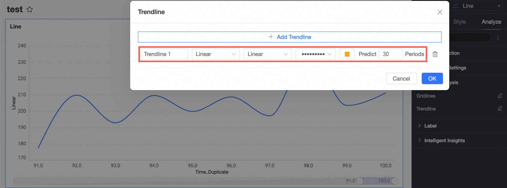
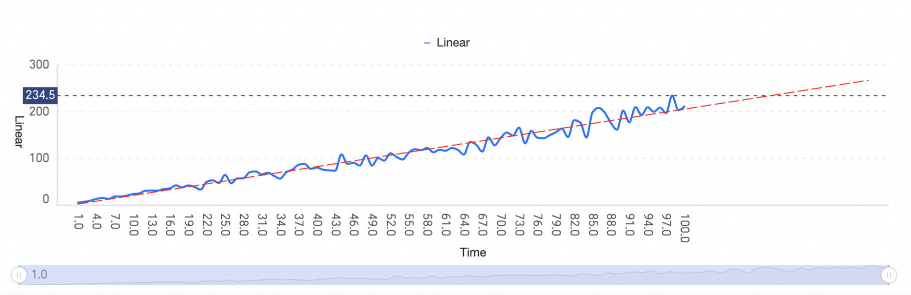
Linear
A linear trendline is a straight line best suited for data points that follow a linear pattern.
-
Configure the linear trendline as shown in the following figure.
To make a simple forecast, set the number of forward periods. In this example, the trend is projected forward by 30 periods.
-
Click OK to complete the configuration.
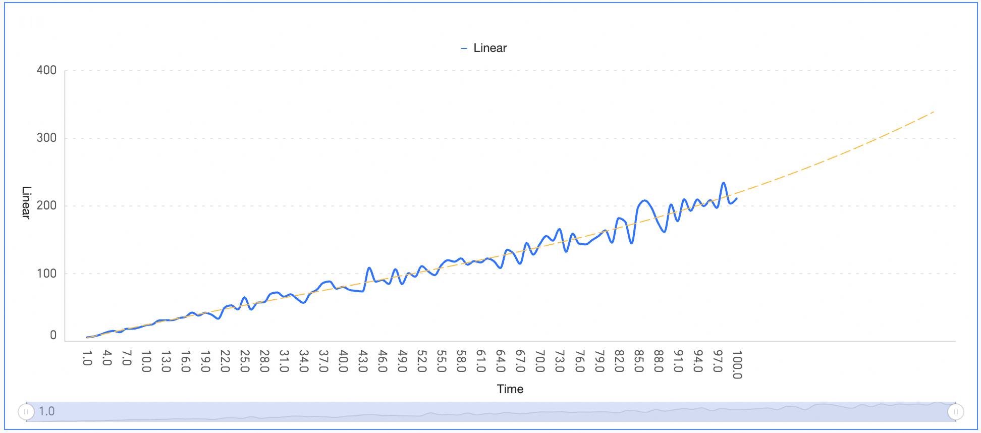
The result shows linear growth with minor random fluctuations. The linear model smooths these fluctuations to reveal the long-term trend.
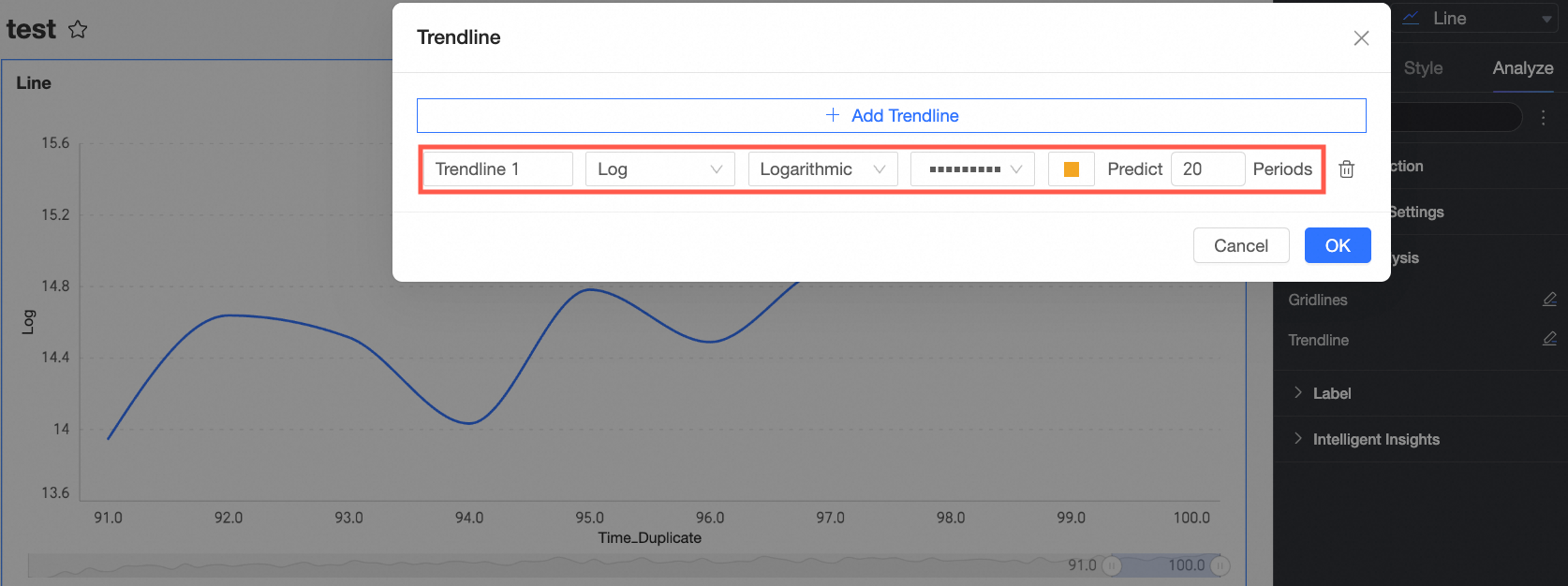
Logarithmic
A logarithmic trendline is best for data where the rate of change increases or decreases quickly and then levels off.
-
Configure the logarithmic trendline as shown in the following figure.
To make a simple forecast, set the number of forward periods. In this example, the trend is projected forward by 20 periods.
-
Click OK to complete the configuration.
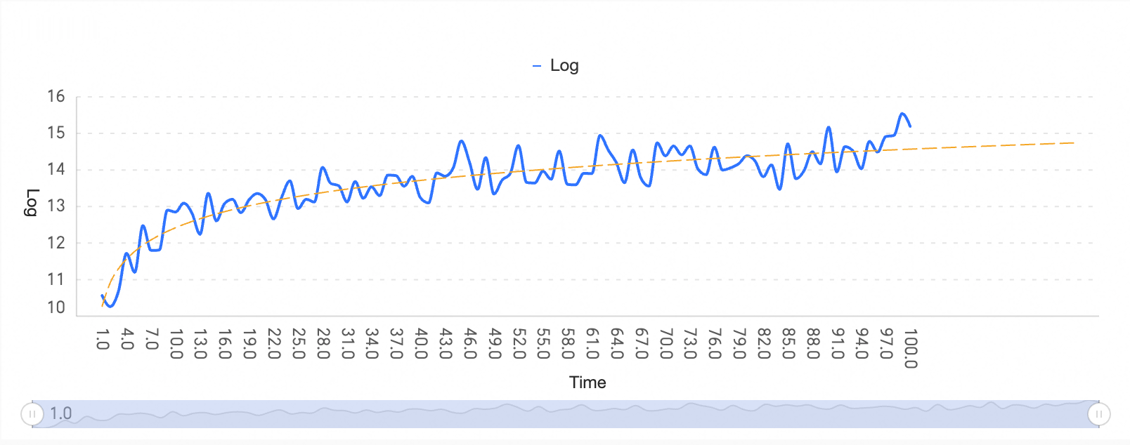
The result shows that the data changes rapidly at first and then levels off.
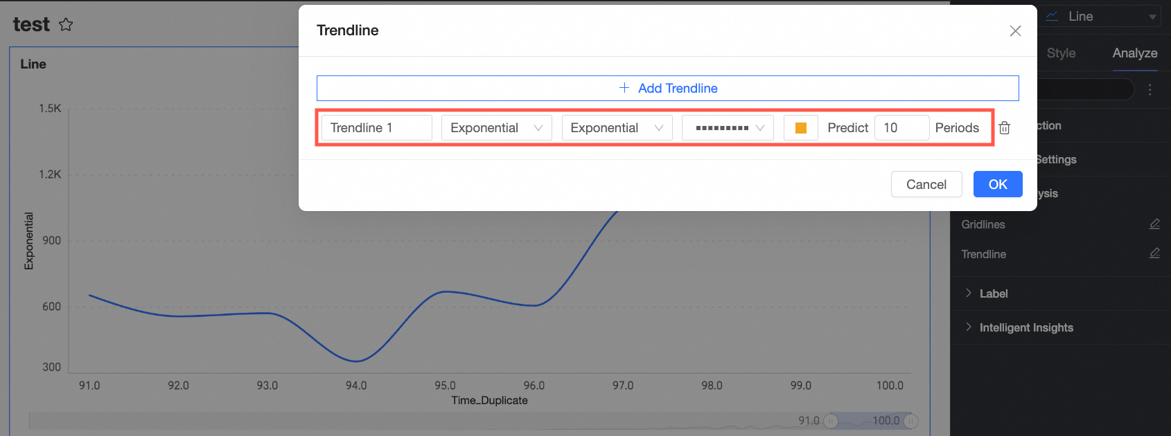
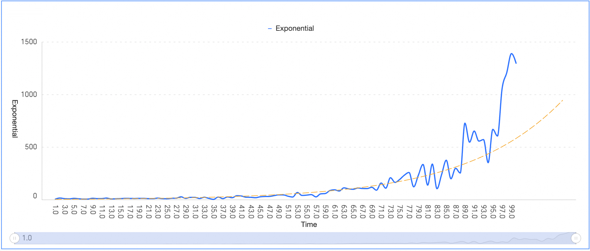
Exponential
An exponential trendline fits data that rises or falls at an increasing rate, showing faster growth or decline than a power trendline in later stages.
-
Configure the exponential trendline as shown in the following figure.
To make a simple forecast, set the number of forward periods. In this example, the trend is projected forward by 10 periods.
-
Click OK to complete the configuration.
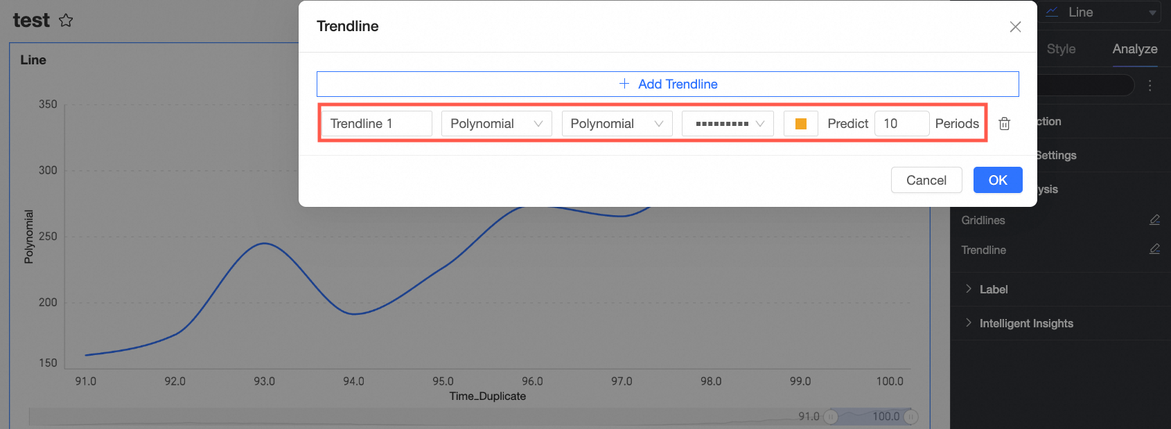
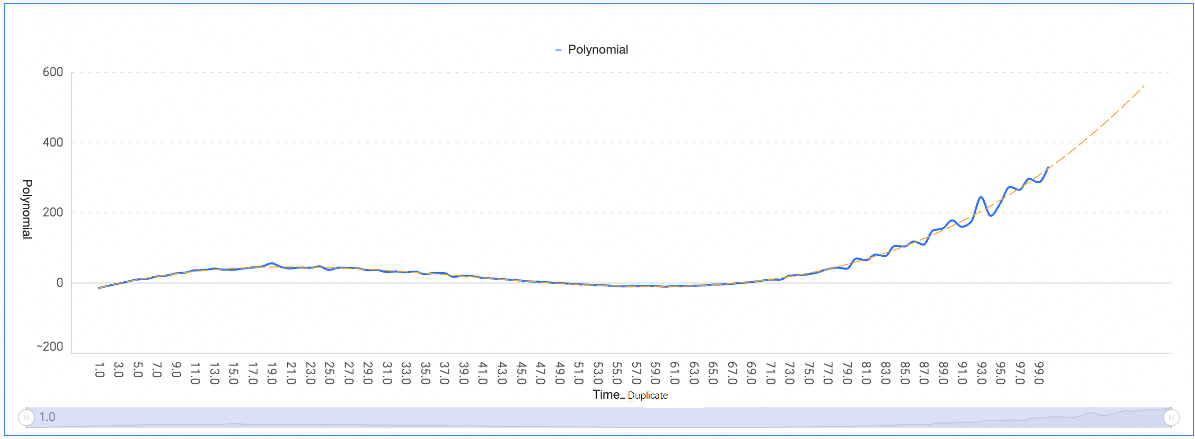
Polynomial
A polynomial trendline is a curved line used when data fluctuates.
-
Configure the polynomial trendline as shown in the following figure.
To make a simple forecast, set the number of forward periods. In this example, the trend is projected forward by 10 periods.
-
Click OK to complete the configuration.
The result shows a curved line that fits fluctuating data, useful for analyzing gains and losses over large datasets.
Power
A power trendline is best for datasets that show a consistent rate of acceleration or deceleration.
-
Configure the power trendline as shown in the following figure.
To make a simple forecast, set the number of forward periods. In this example, the trend is projected forward by 10 periods.
-
Click OK to complete the configuration.

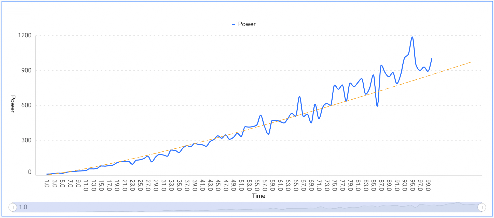
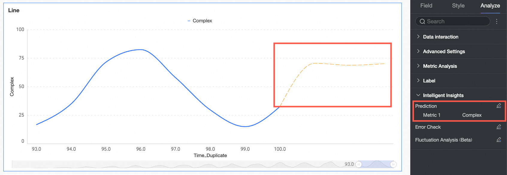
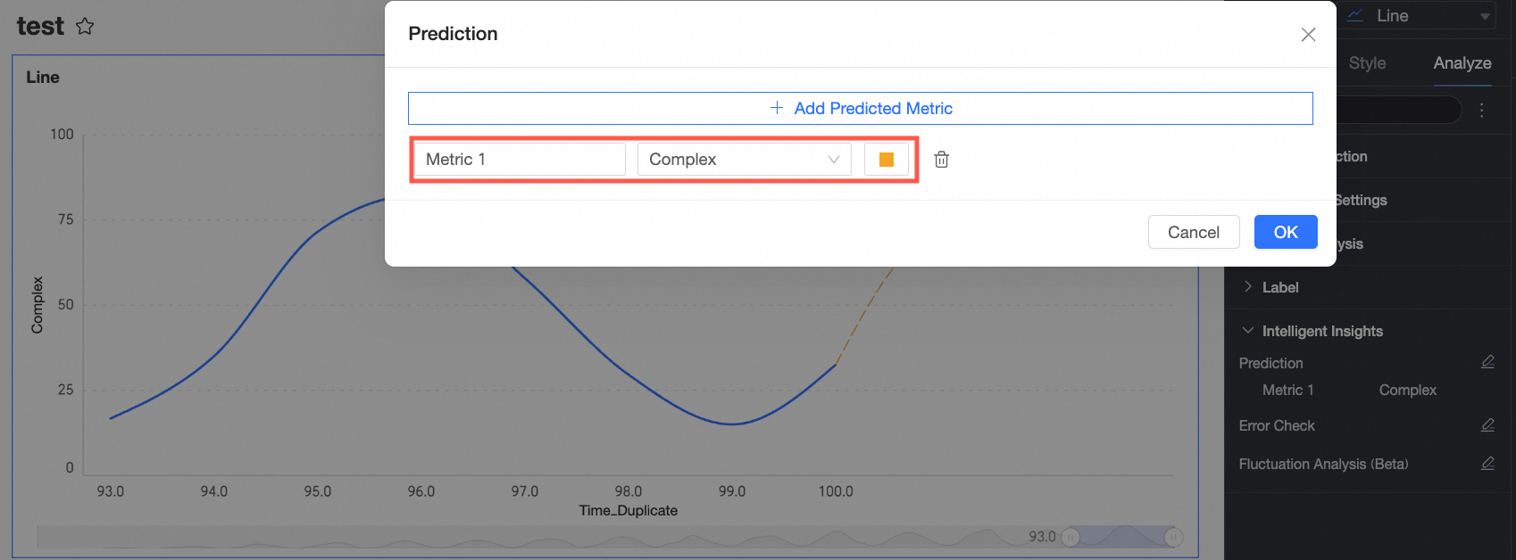
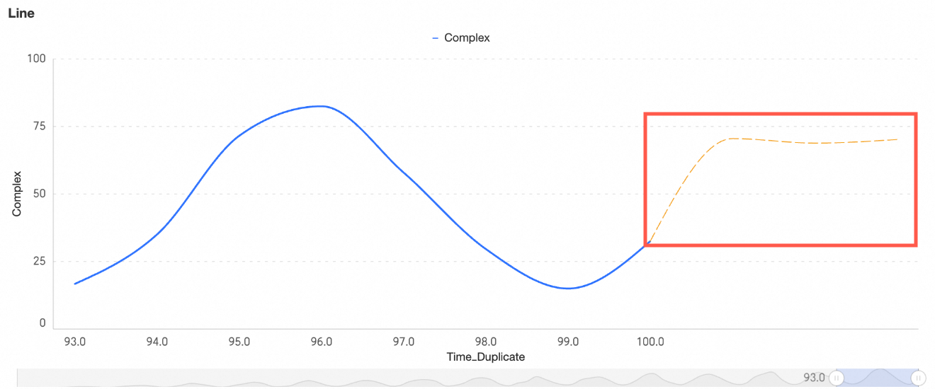
Forecast
The forecast feature helps you analyze data and predict future trends.
Use forecast when your data is too complex for the five standard trendline types.
For example, the following data shows a slight upward trend with increasing volatility. A standard trendline captures the general direction but cannot fit each data point. Add a forecast line to predict future values—the system automatically predicts the next three periods for the selected measure.
-
On the Dashboards page, find the dashboard that you want to edit and click the
icon. -
On the dashboard edit page, click the target chart.
-
In the Data panel, on the Analysis tab, go to the Intelligent Insights section and click the
icon next to Forecast. -
In the Forecast dialog box, select the measure to analyze and a line color.
-
Click OK. The following figure shows an example of a forecast.
Quick BI uses a proprietary forecasting algorithm that captures more complex time-series patterns than standard trendline functions. For accurate predictions, use at least 50 data points.
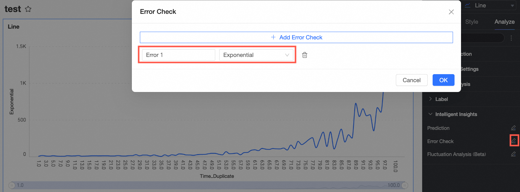
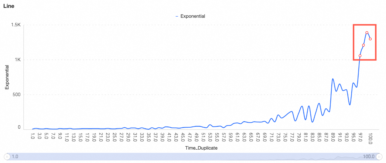
Anomaly detection
Anomaly detection identifies and highlights time-series points where fluctuations exceed the expected normal range.
-
On the Dashboards page, find the dashboard that you want to edit and click the
icon. -
On the dashboard edit page, click the target chart.
-
In the Data panel, on the Analysis tab, go to the Intelligent Insights section and click the
icon next to Anomaly detection. -
In the Anomaly detection dialog box, select the measure to analyze.
-
Click OK. The following figure shows an example of anomaly detection.
Note-
Anomaly detection measures deviation from the normal range, not just maximum or minimum values.
-
In a line chart, anomalies are marked with red dots. In a vertical bar chart, anomalous bars are colored red.
If all fluctuations are within the normal range, no anomalies are detected, as shown in the following figure.
-
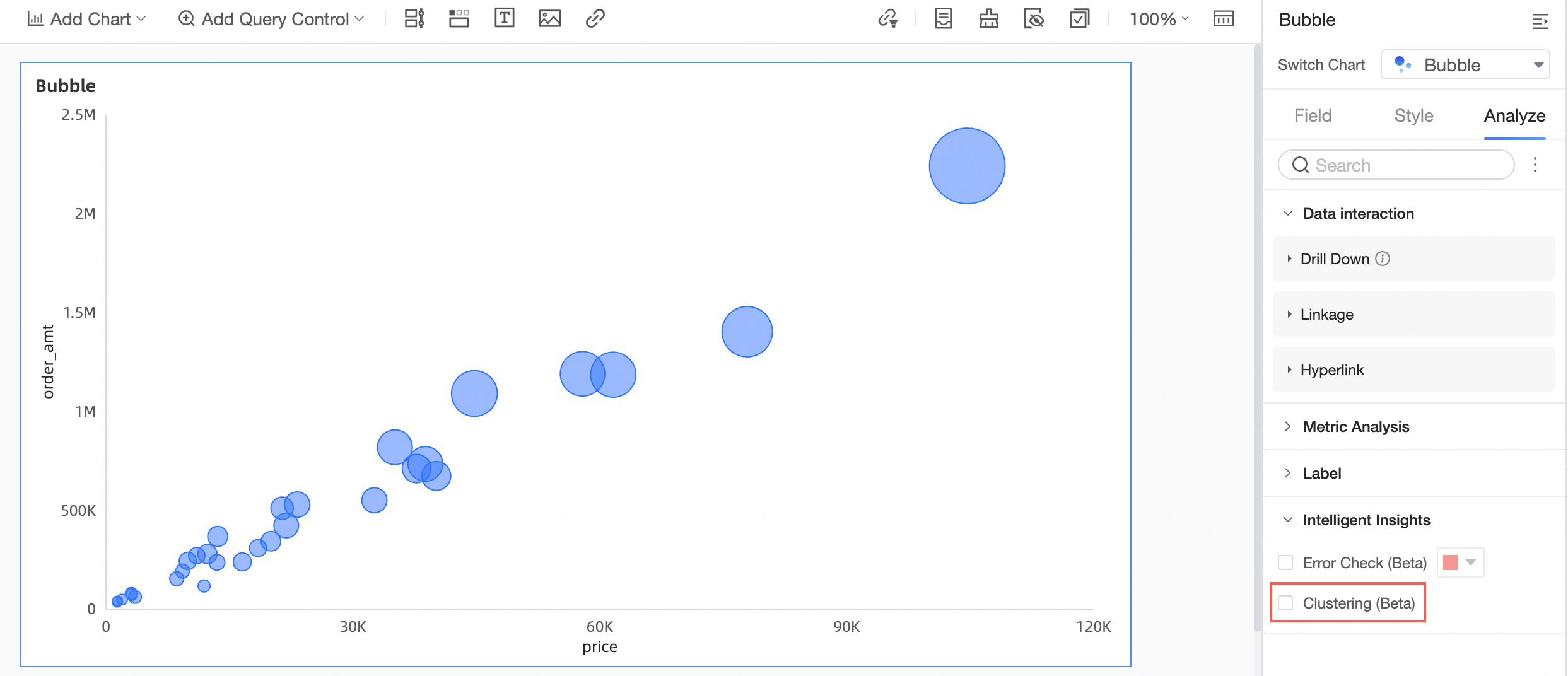
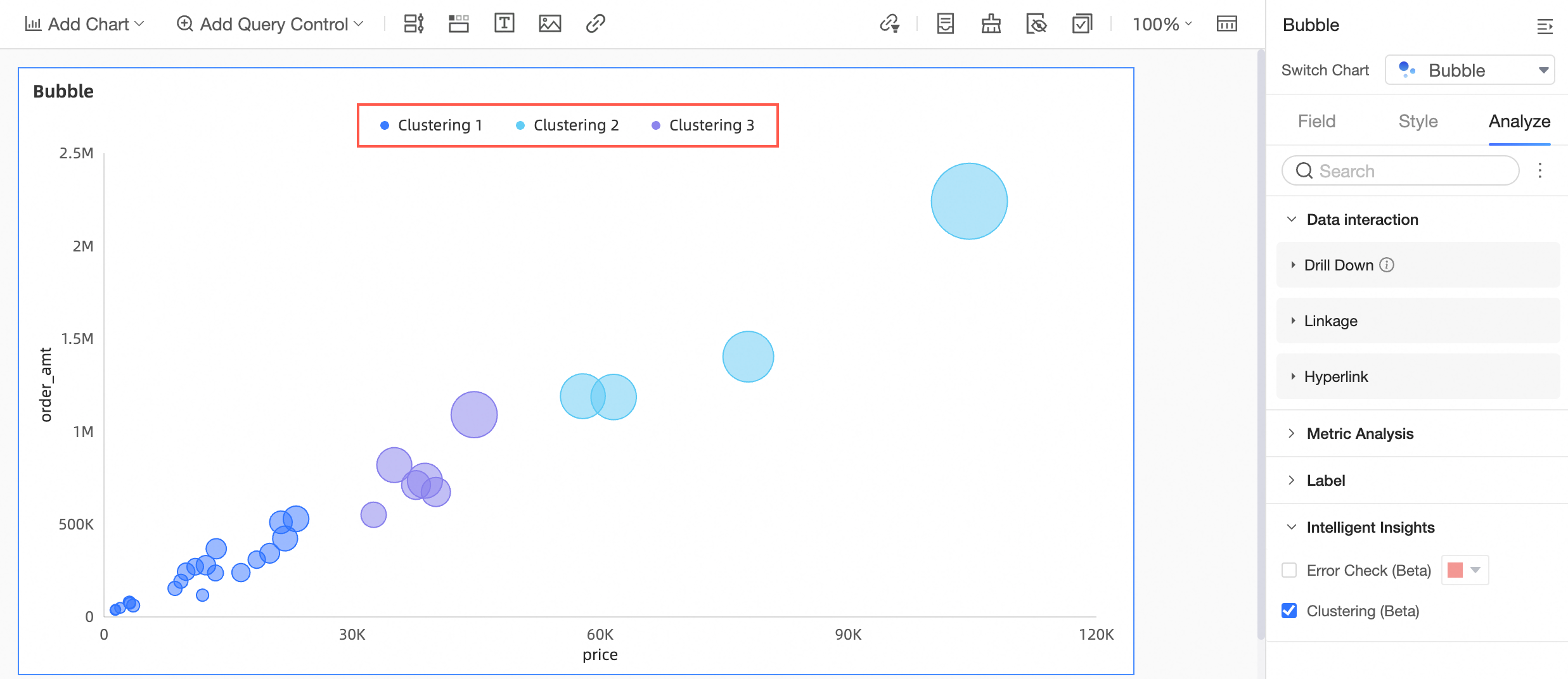
Cluster analysis
Scatter charts and bubble charts support cluster analysis. When enabled, data points are colored by cluster, overriding the color field.
-
On the Dashboards page, find the dashboard that you want to edit and click the
icon. -
On the dashboard edit page, click the target chart.
-
In the Data panel, on the Analysis tab, go to the Intelligent Insights section and select the Cluster analysis checkbox.
-
The following figure shows an example of cluster analysis.
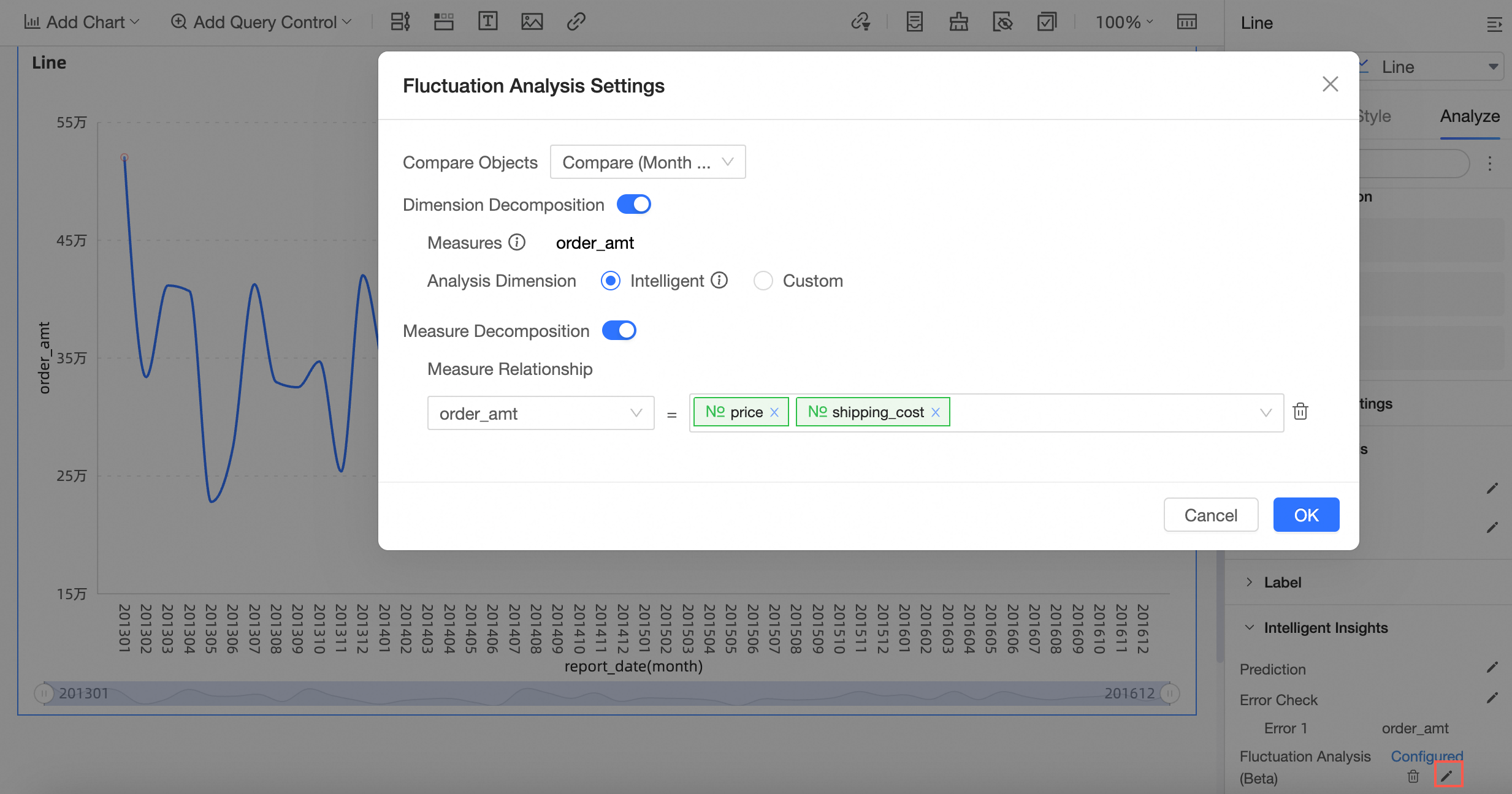
Fluctuation cause analysis
Fluctuation cause analysis uses machine learning to identify why key metrics fluctuate. You can decompose causes by dimension or measure.
-
On the Dashboards page, find the dashboard that you want to edit and click the
icon. -
On the dashboard edit page, click the target chart.
-
In the Data panel, on the Analysis tab, go to the Intelligent Insights section and click the
icon next to Fluctuation cause analysis. NoteThe chart must meet both of the following conditions:
-
The category axis or dimension is a time field (not hour, minute, or second).
-
At least one measure uses the SUM or COUNT aggregate function.
-
-
In the Fluctuation Cause Analysis Settings dialog box, configure the following parameters.
-
Select the Comparison Object.
-
Enable Dimension Decomposition and select an Analysis Dimension to analyze the Analyzable Measures.
-
Enable Measure Decomposition and configure the measure relationships.
-
Click OK.
-
-
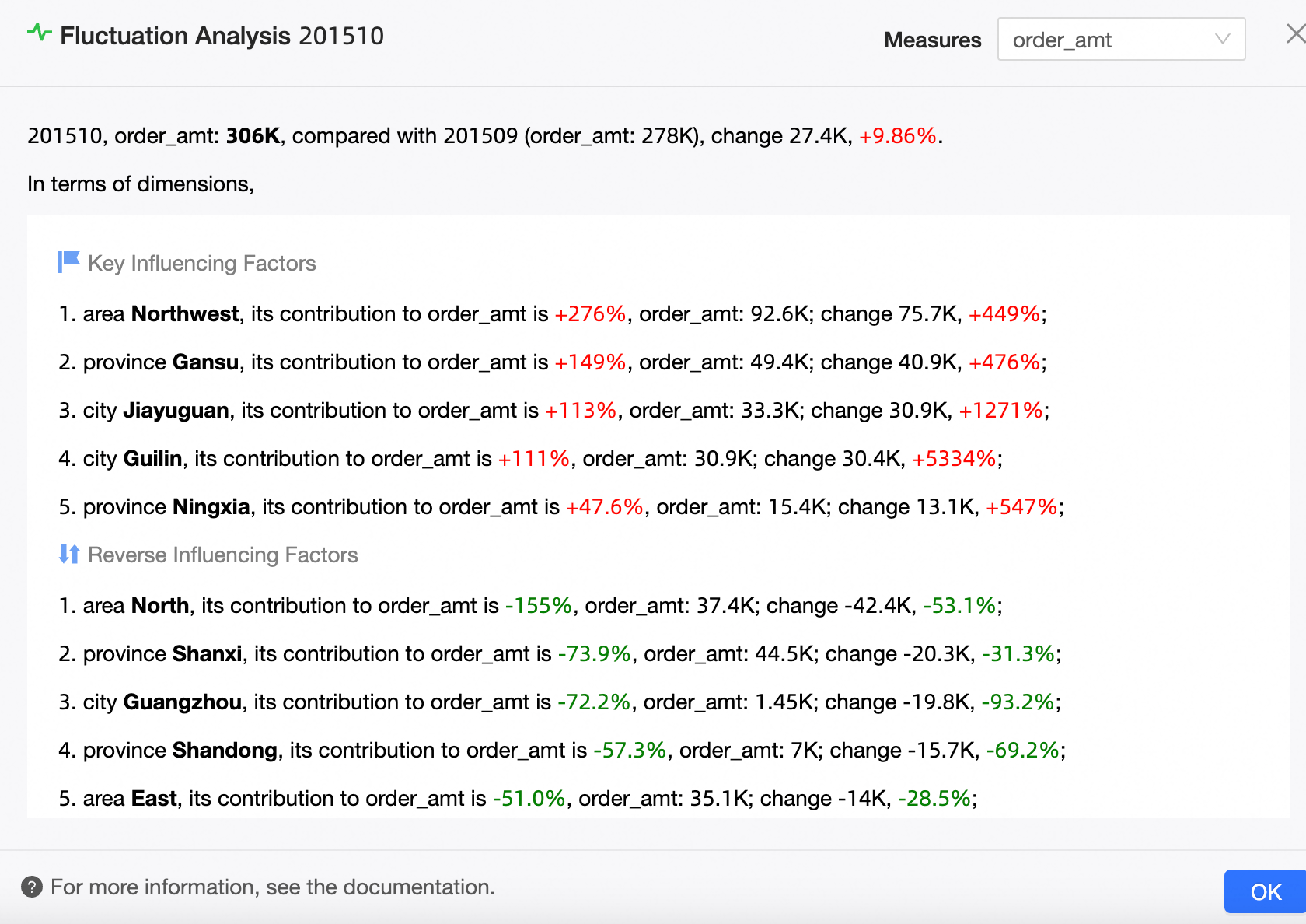
In the chart, click a time point to open the Fluctuation Cause Analysis panel and view the detailed analysis.
-
In the Fluctuation Cause Analysis panel, you can select an Analyzable Measure to view its Key Drivers and Countervailing Factors.
Note-
The change contribution rate of a dimension value equals its change amount divided by the total measure change.
-
The change contribution rate of a measure indicates its influence on the analyzed measure's change.
-
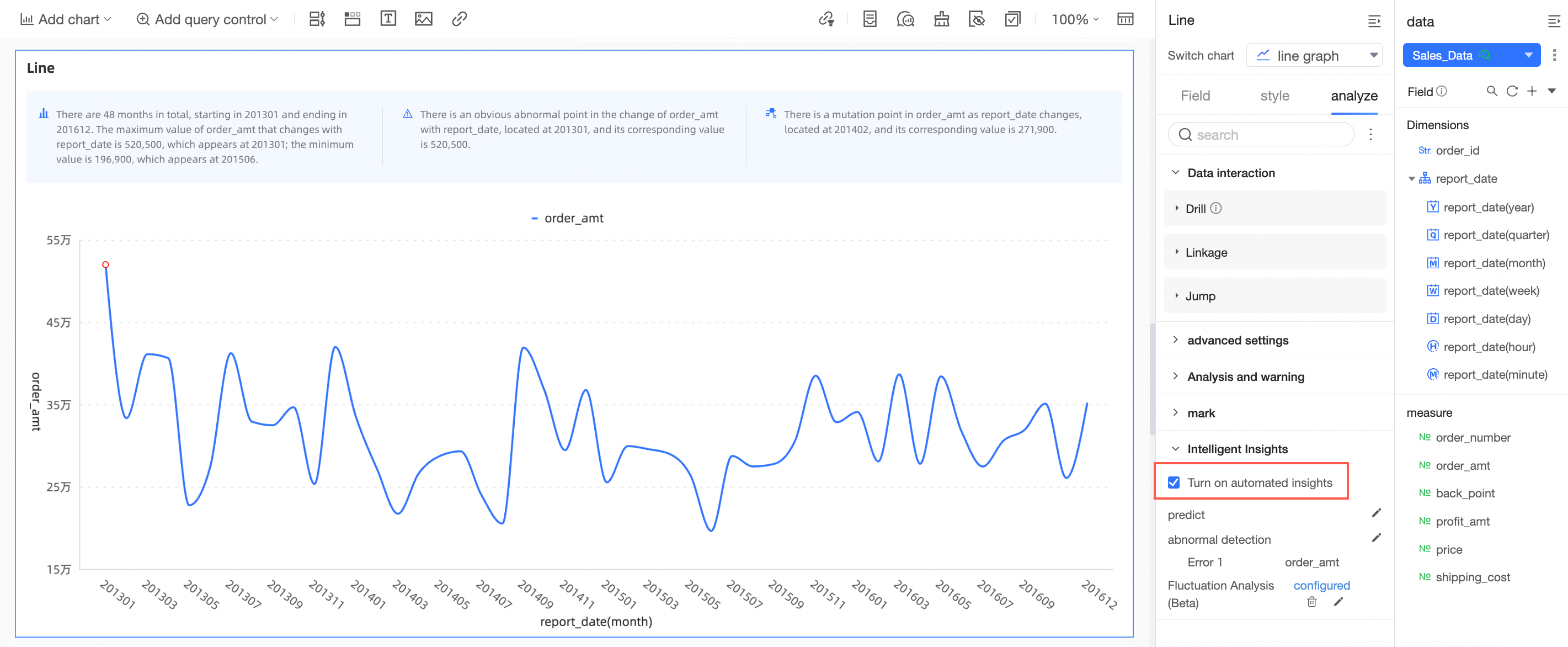
Automated insights
Automated Insights generates a natural language summary of a chart's analysis results.
-
On the Dashboards page, find the dashboard that you want to edit and click the
icon. -
On the dashboard edit page, click the target chart.
-
In the Data panel, on the Analysis tab, go to the Intelligent Insights section and select the Enable Automated Insights checkbox.
NoteAutomated Insights supports the following chart types:
line chart, area chart, vertical bar chart, horizontal bar chart, pie chart, rose chart, stacked area chart, stacked vertical bar chart, stacked horizontal bar chart, 100% stacked area chart, 100% stacked vertical bar chart, and 100% stacked horizontal bar chart.