The text filter bar lets report viewers filter data by entering or selecting text values. This helps them focus on key information in charts.
Main advantages of the text filter bar:
-
High flexibility: Supports three display types, including drop-down list, text input box, and tree drop, with flexible configuration options for various scenarios.
-
High precision: Provides multiple matching conditions, such as contains, does not contain, starts with, and ends with, for precise data filtering.
Quick BI supports three types of text filter bars: drop-down list, text input box, and tree drop. The following sections cover the use cases and configuration for each type.
Prerequisites
-
You have created a dashboard, and the charts on the dashboard contain text fields.
-
You have added an empty filter bar to the dashboard. For more information, see Create a filter bar.
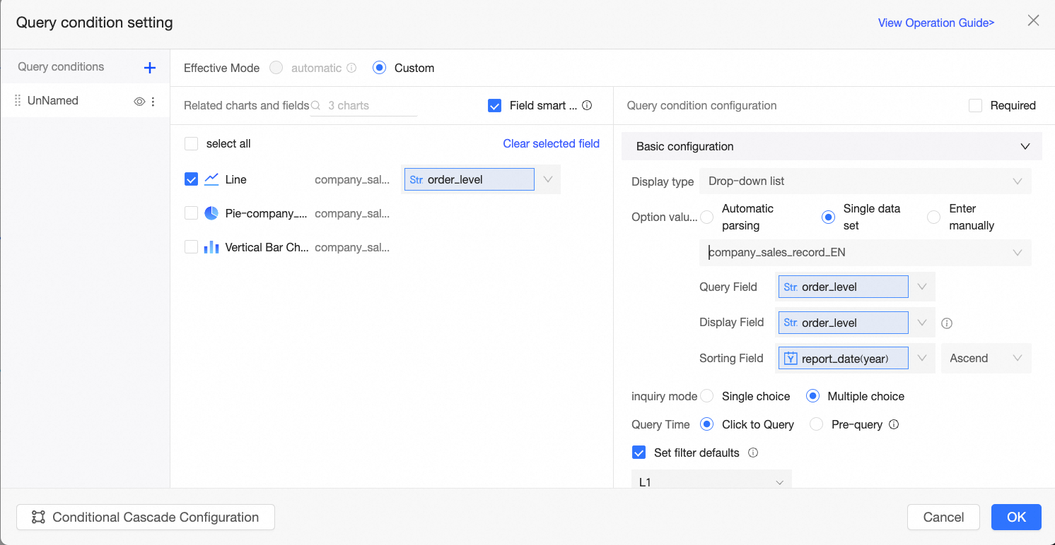
Configure filter conditions
-
Go to the dashboard edit page. For more information, see Create a dashboard.
-
In the dashboard list, find and click the target dashboard.
The charts on the dashboard must contain text fields to configure a text filter bar. This topic uses a line chart as an example. For more information, see line chart.
-
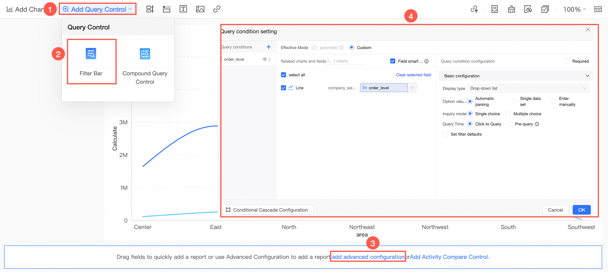
Follow the steps in the figure to add a filter bar.
-
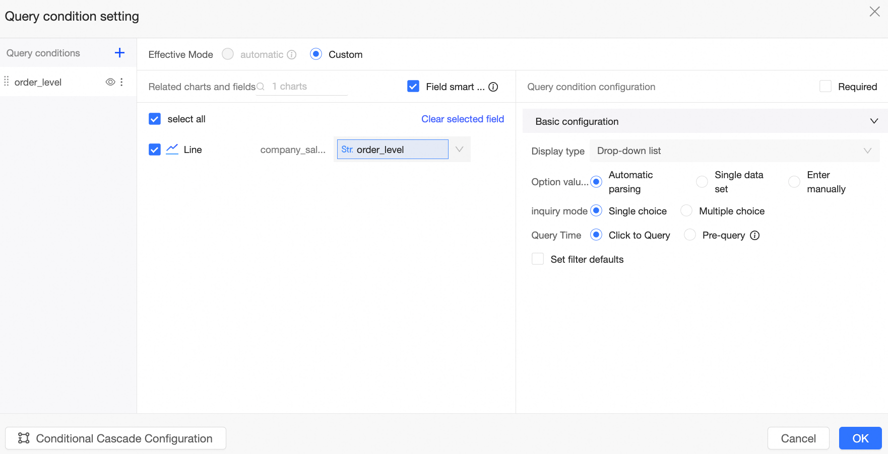
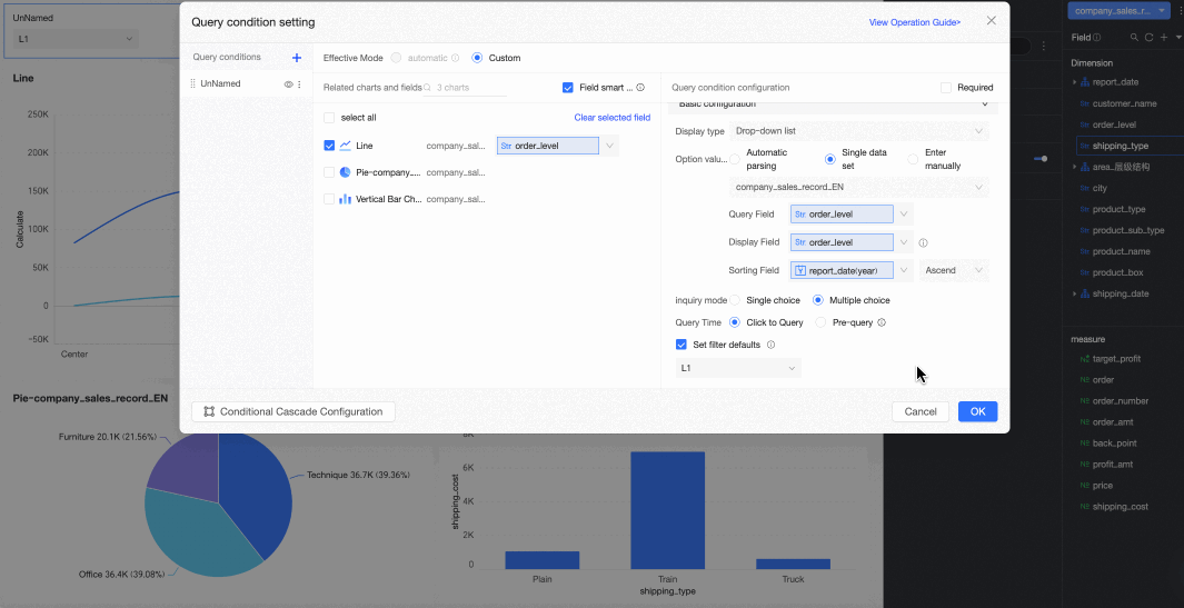
Configure the filter bar.
-
Set the filter condition name to Level Query.
-
Select the associated chart line chart and the associated field order_level.
-
Set the display type and complete the configuration of the filter conditions.
-
When you select drop-down list as the display type, see drop-down list for an example.
-
When you select text input box as the display type, see text input box for an example.
-
When you select tree drop as the display type, see tree drop for an example.
-
-
-
Click OK.
Drop-down list
The drop-down list presents predefined options for report viewers to select. When the display type is drop-down list, the option value source supports automatic parsing, single dataset, and manual input.

Automatic parsing
When you select automatic parsing as the option value source, Quick BI automatically identifies the values of all associated fields and populates the filter bar with the union of these values.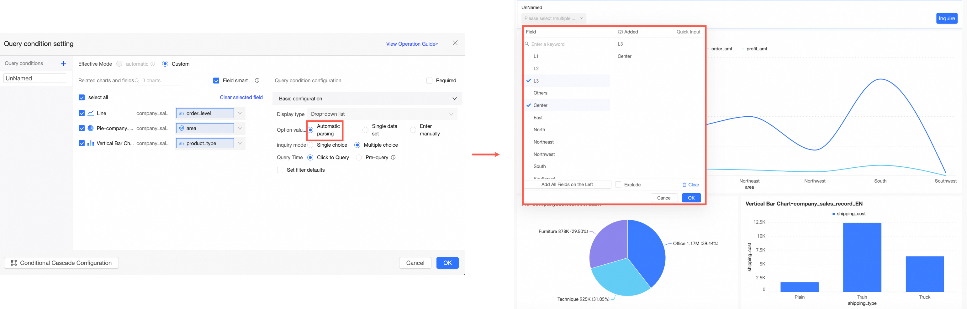
-
If the charts selected in the Related Charts and Fields section use the same dataset, automatic parsing retrieves values from that dataset.
-
If the charts selected in the Related Charts and Fields section use multiple datasets, the options in the drop-down list are the union of values from all associated datasets.
|
Parameter |
Description |
Example |
|
Selection mode |
Supports single-select and multi-select. |
|
|
Query time |
Supports on-click query and pre-query.
|
|
|
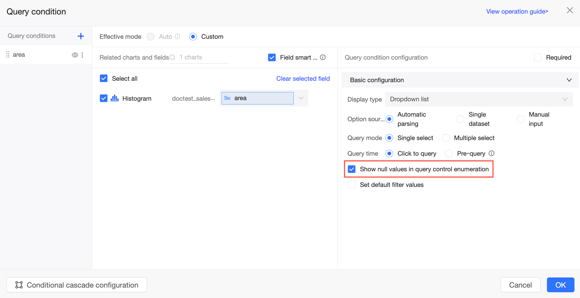
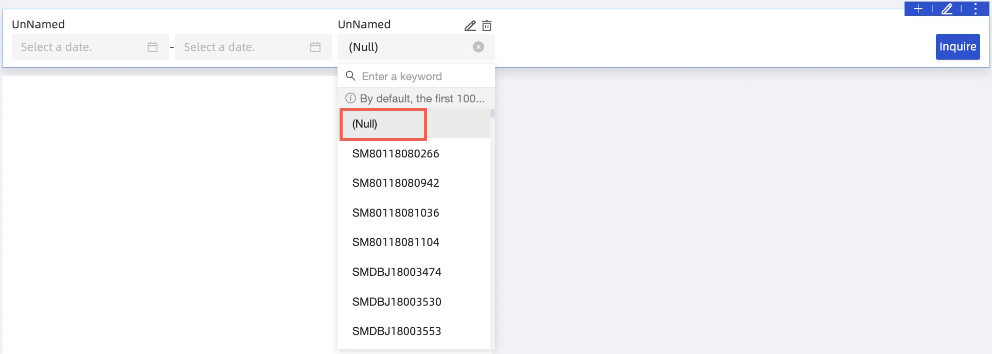
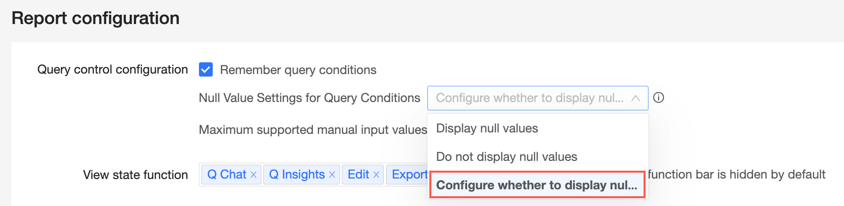
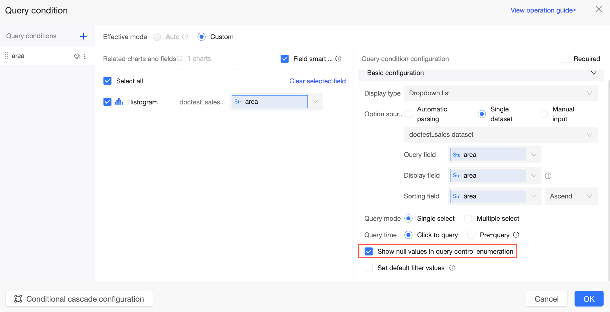
Show null values for filter options |
If you select Show null values for filter options, null values in the drop-down list are displayed as (Null) to report viewers.
If this option is not selected, null values are filtered out of the list.
Note
This parameter is available only when Configure whether to display null values in each filter condition is selected in the organization-level Report Configurations.
|
|
|
Set filter defaults |
If you select this option, the filter box displays Please select. Click the box to open the Field dialog box and configure default values. In this dialog box, you can perform the following operations:
Note
If there are more than 1,000 filter options, only the first 1,000 are displayed by default. You can search for options beyond this limit. |
To summarize this example:
-
The Related Charts and Fields section includes fields from multiple datasets. The filter's drop-down list will display a union of all associated field values.
-
Selection mode is set to multi-select, allowing users to select multiple options at once.
-
Query time is set to on-click query, meaning the report viewer must click the query button to apply the filter.
-
Set filter defaults is configured with Advanced, Guangdong Province, and Furniture. When a report viewer opens the report, it defaults to showing results for these selections.
The result is shown in the following figure: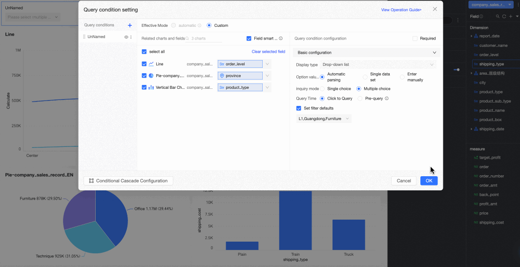
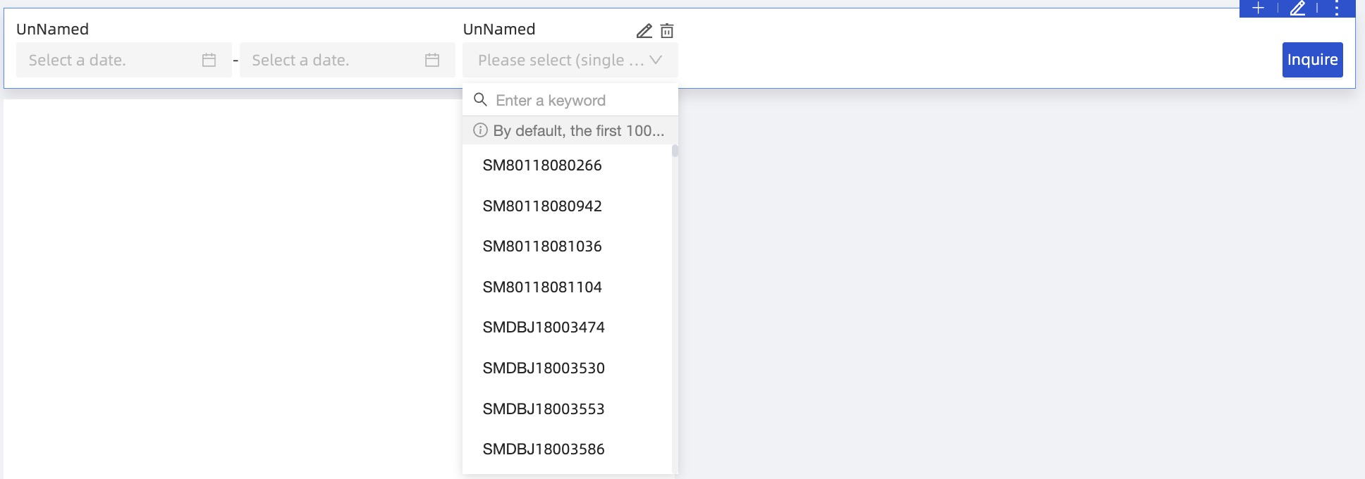
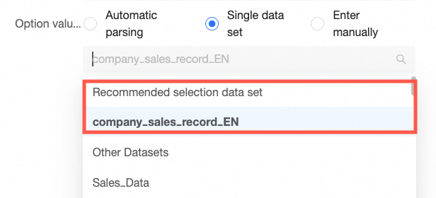
Single dataset
When you select single dataset as the option value source, the filter bar options are derived from a specific field within that dataset.
|
Parameter |
Description |
Example |
|
Select a dataset |
You can select any dataset within the current dashboard's workspace. We recommend selecting the dataset that is the source for the chart. |
|
|
Query value field |
This field from the selected dataset is matched against the associated field. Its values are used for the actual query, allowing report viewers to select one or more of them to filter data. |
|
|
Display name field |
The field whose values are displayed as options in the filter bar. This field is typically used to improve the user experience by helping report viewers better understand the meaning of the options.
|
|
|
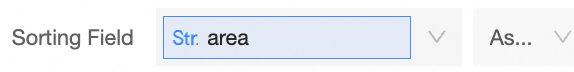
Sort field |
Allows sorting by a selected field. This is an optional parameter. If left blank, the options are sorted according to the order in the dataset. If you need to sort by a specific field, such as a measure or a date, select it from the drop-down list. Sorting options include Ascending, Descending, and Custom. If you choose Custom, you can drag and drop field values in the Custom Sort dialog box to arrange their order. This setting affects only the order of options in the filter's drop-down list. It does not change the sort order of dimension values within charts, which is still controlled by the dataset or the data panel of each chart. |
|
|
Selection mode |
Supports single-select and multi-select. |
|
|
Query time |
Supports on-click query and pre-query.
|
|
|
Show null values for filter options |
If this option is not selected, null values are filtered out of the list.
Note
This parameter is available only when Configure whether to display null values in each filter condition is selected in the organization-level Report Configurations.
|
|
|
Set filter defaults |
If you select this option, the filter displays preset values. Note
If there are more than 1,000 filter options, only the first 1,000 are displayed by default. You can search for options beyond this limit.
|
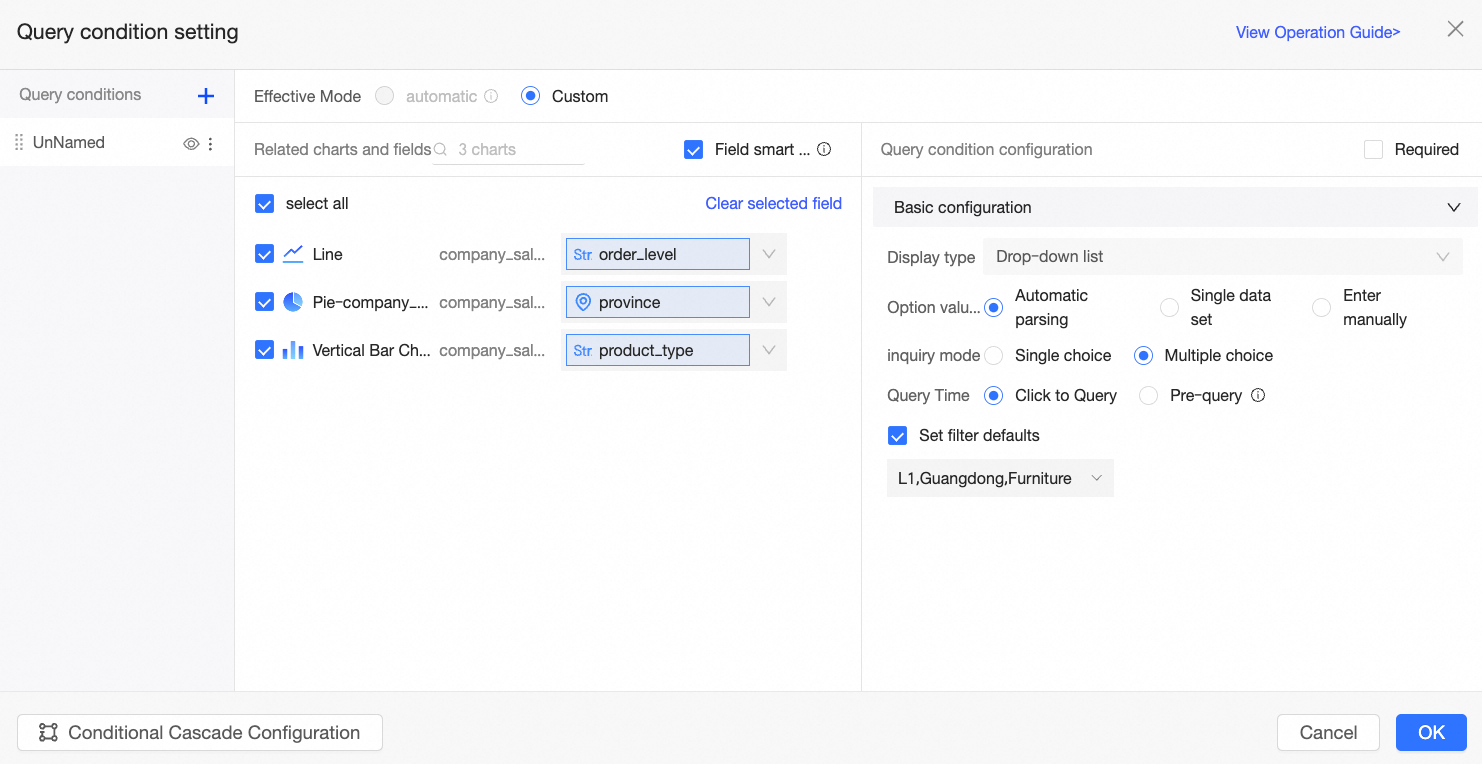
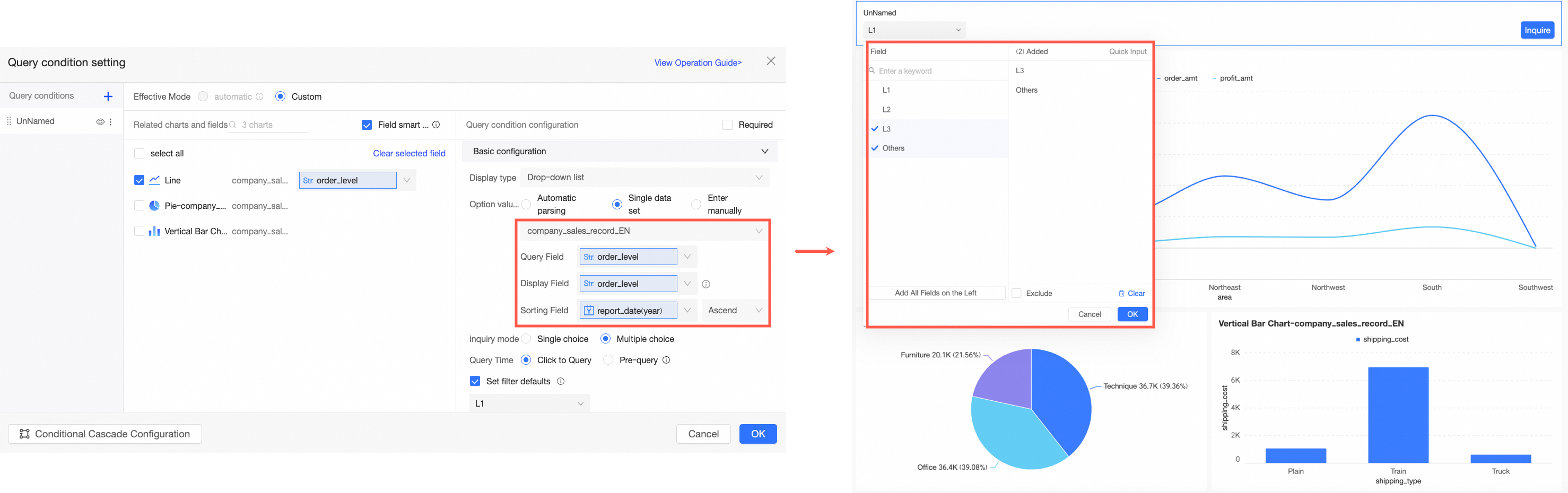
To summarize this example:
-
The dataset is the recommended dataset company_sales_record, which is the source for the current chart.
-
The query value field is the same as the associated field, so order_level is used for the actual query.
-
The display name field is the same as the query value field, both are order_level.
-
The sort field is set to Order Date to determine the sort order of the filter options.
-
Selection mode is set to multi-select, allowing report viewers to choose multiple options.
-
Query time is set to on-click query, meaning the report viewer must click the query button to apply the filter.
-
Set filter defaults is configured to Advanced, so the report defaults to showing results for the Advanced order level when opened.
The result is shown in the following figure:
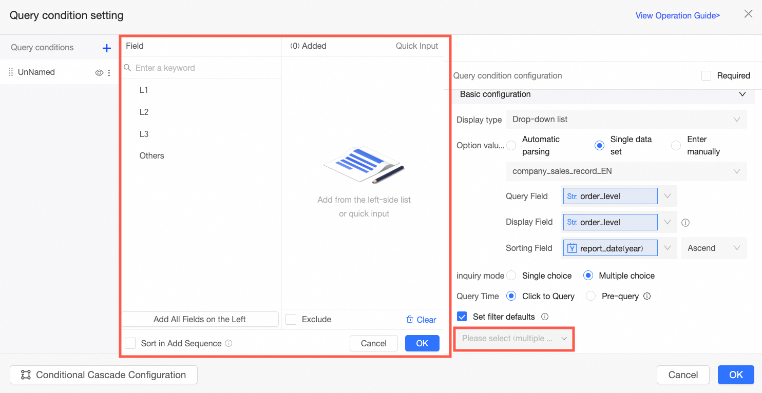
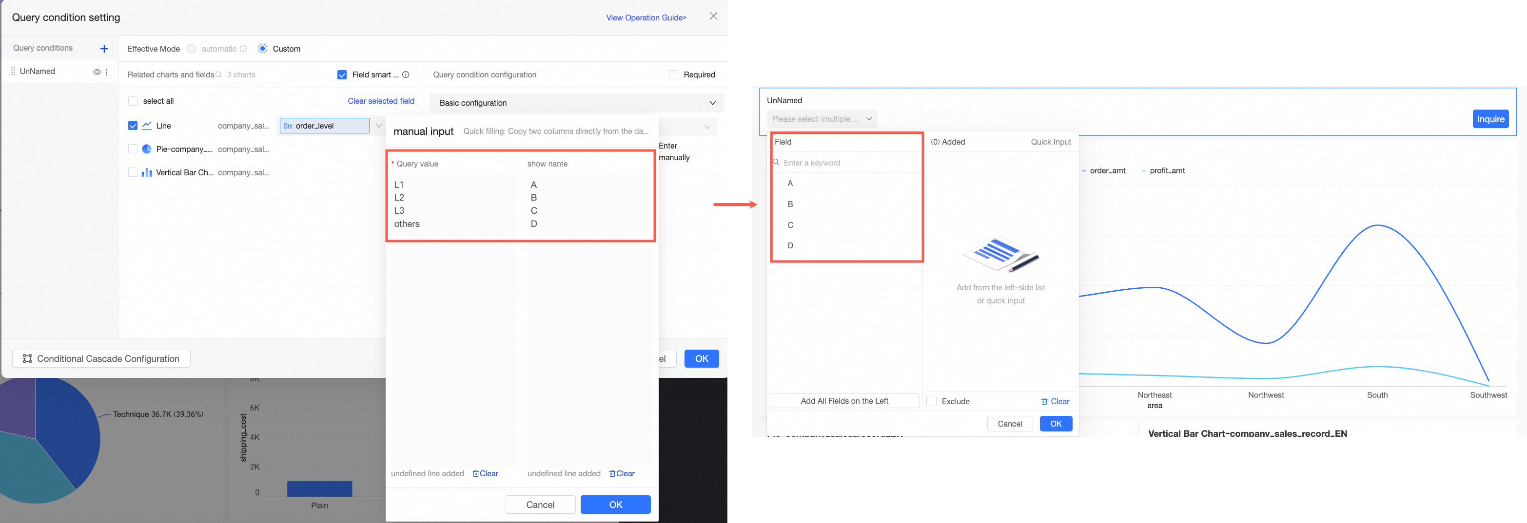
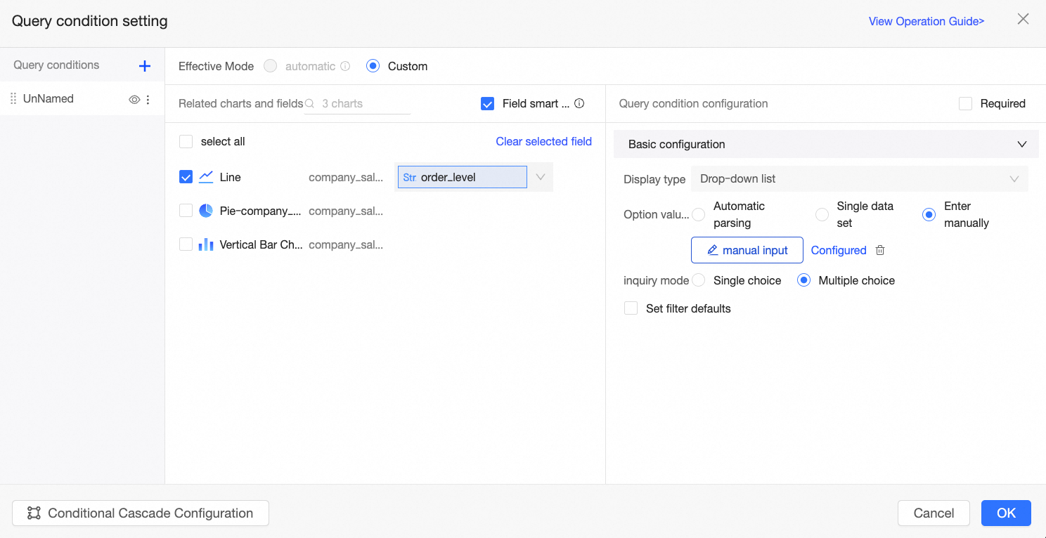
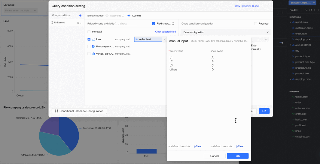
Manual input
When you select manual input as the option value source, the report author explicitly defines the filter bar's options.
|
Parameter |
Description |
Example |
|
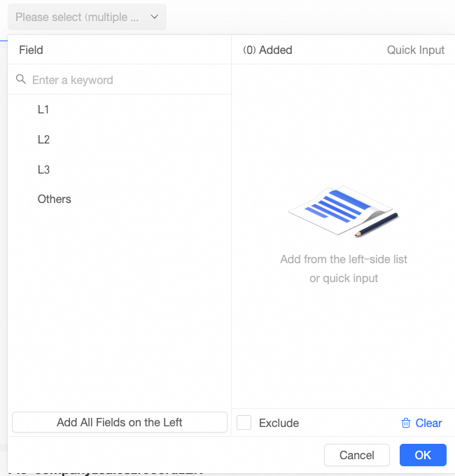
Manual input |
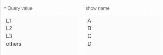
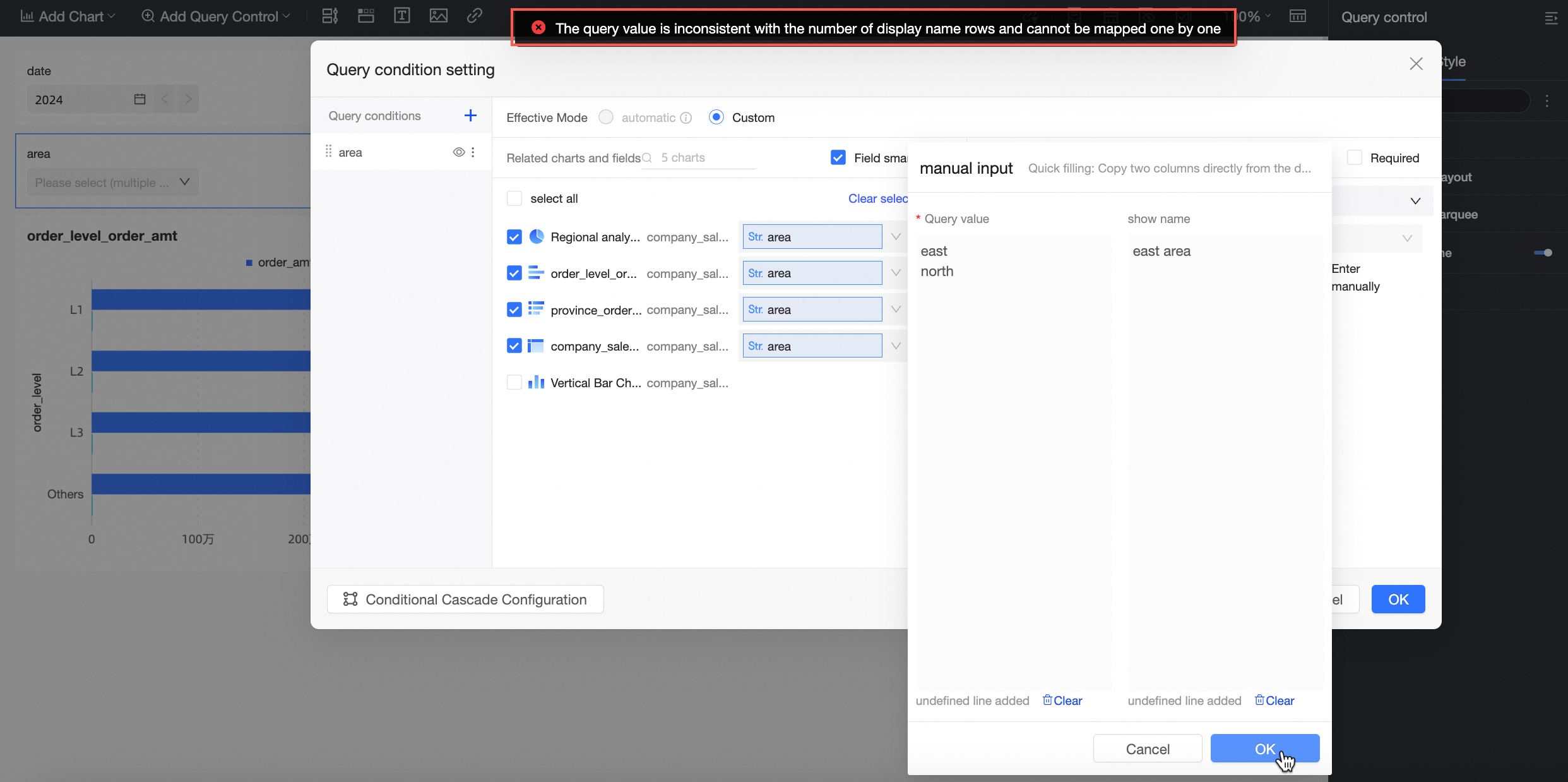
Click Manual Input and enter the Query Value and Display Name in the Manual Input dialog box.
Note
|
|
|
Selection mode |
Supports single-select and multi-select. |
|
|
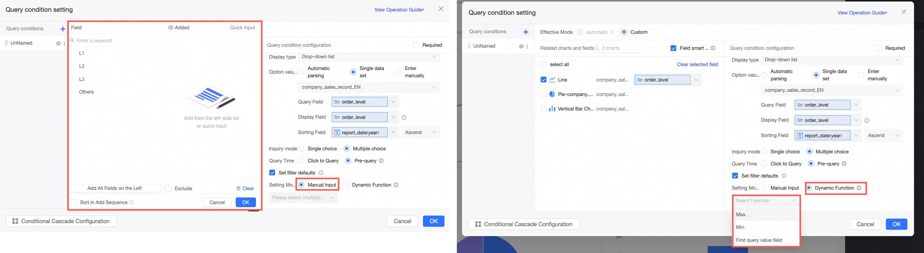
Set filter defaults |
If you select this option, the filter displays preset values. |
To summarize this example:
-
Manual input is used to map order level field values to display values: Advanced to Grade A, Intermediate to Grade B, Basic to Grade C, and Other to Grade D.
-
Selection mode is set to multi-select, meaning report viewers must click the query button to apply the filter.
-
Set filter defaults is set to Advanced, so the report defaults to showing results for Grade A when opened.
The result is shown in the following figure:
Search
Use the search bar to quickly locate specific options when filtering.
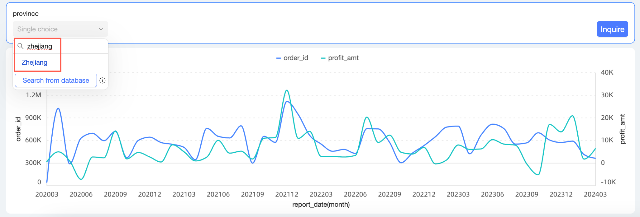
-
If your desired option is not found, you can try Search from Database.

-
When there are more than 1,000 filter options, only the first 1,000 are displayed by default. You can search directly for options beyond this limit. If your desired option is still not found, you can try Search from Database.
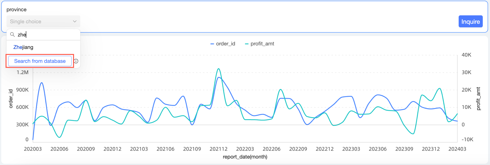
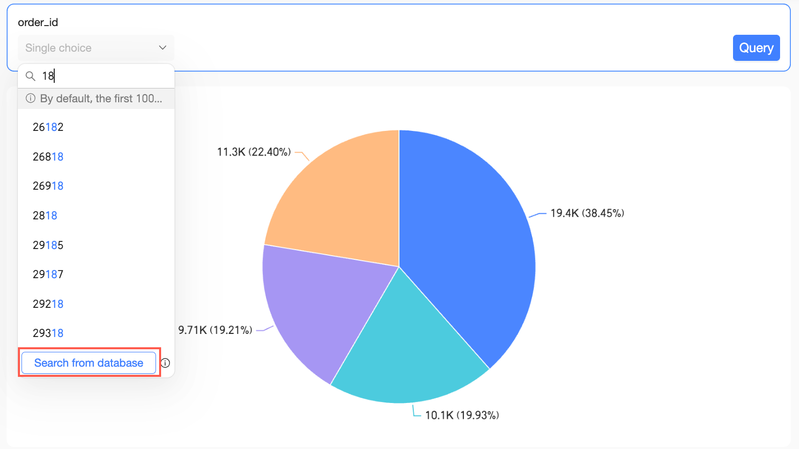
The Search from Database option is available only when the display type is drop-down list and the option value source is set to automatic parsing or single dataset.
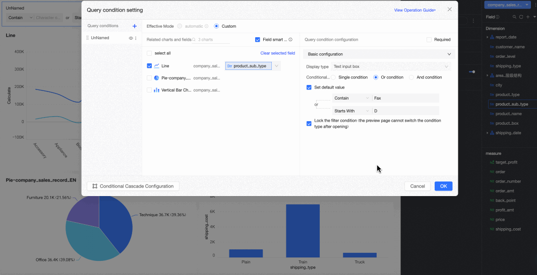
Text input box
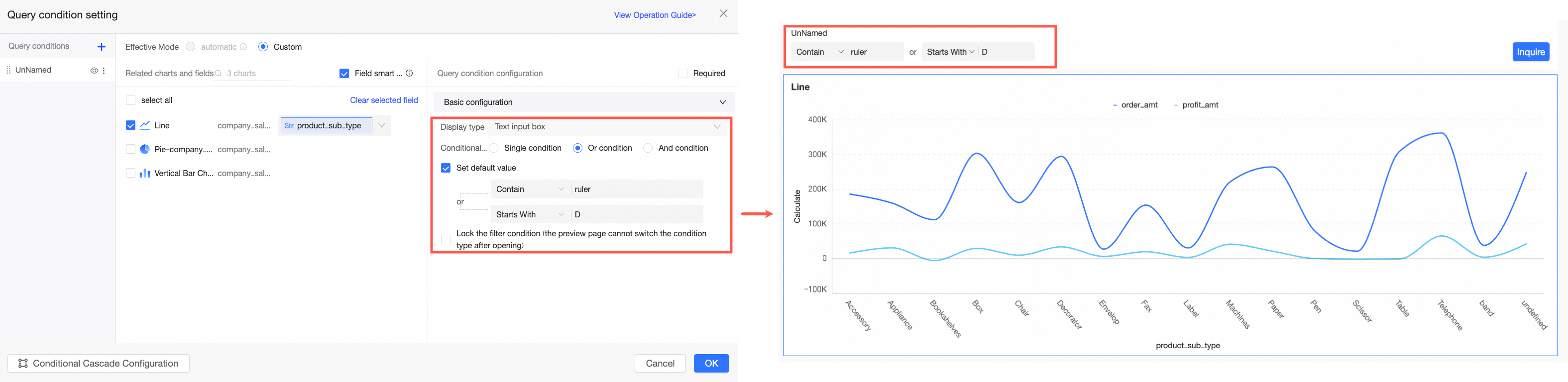
The text input box allows report viewers to quickly retrieve data by entering keywords, making data queries more precise and flexible. When the display type is text input box, you can set the condition type to Single condition, OR condition, or AND condition. This section uses an OR condition as an example.
|
Parameter |
Description |
Example |
|
Condition type |
Supports Single condition, OR condition, and AND condition.
|
|
|
Set default value |
The available rules depend on the selected condition type. The following list shows the available rules and their corresponding SQL syntax when setting a default value for the product_sub_type field:
|
|
|
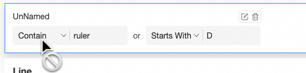
Lock filter condition |
If you enable this option, report viewers cannot change the condition type on the preview page. Note
This option is available only when Set default value is selected. |
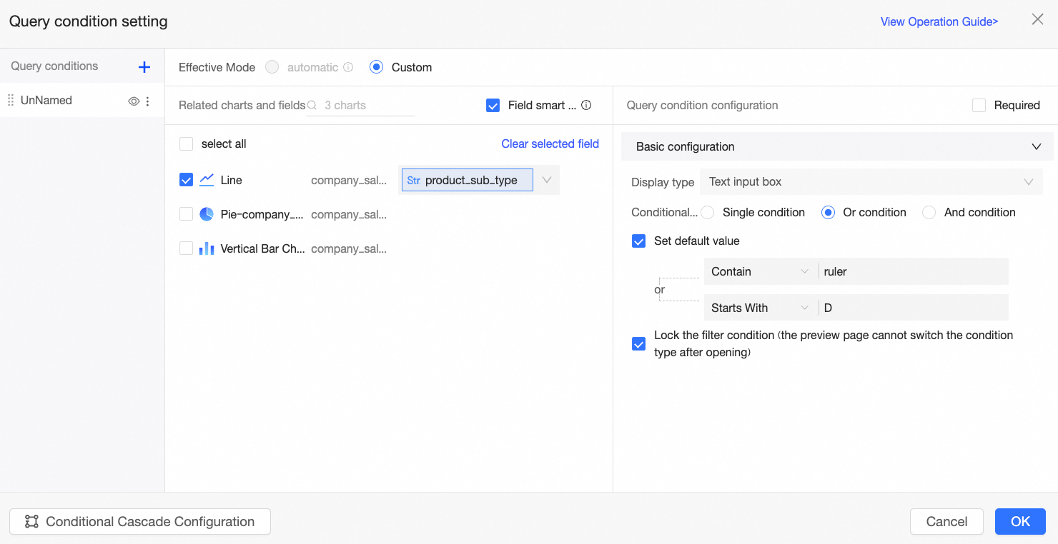
To summarize this example:
-
Condition type is set to OR condition, meaning data will be displayed if it meets any of the specified filter criteria.
-
Set default value is configured to contains the text ruler or starts with the text table. When a viewer opens the report, it defaults to showing results where the product type contains "ruler" or starts with "table".
-
Lock filter condition is enabled, preventing report viewers from changing the condition type on the report page.
The result is shown in the following figure:
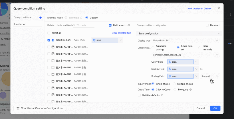
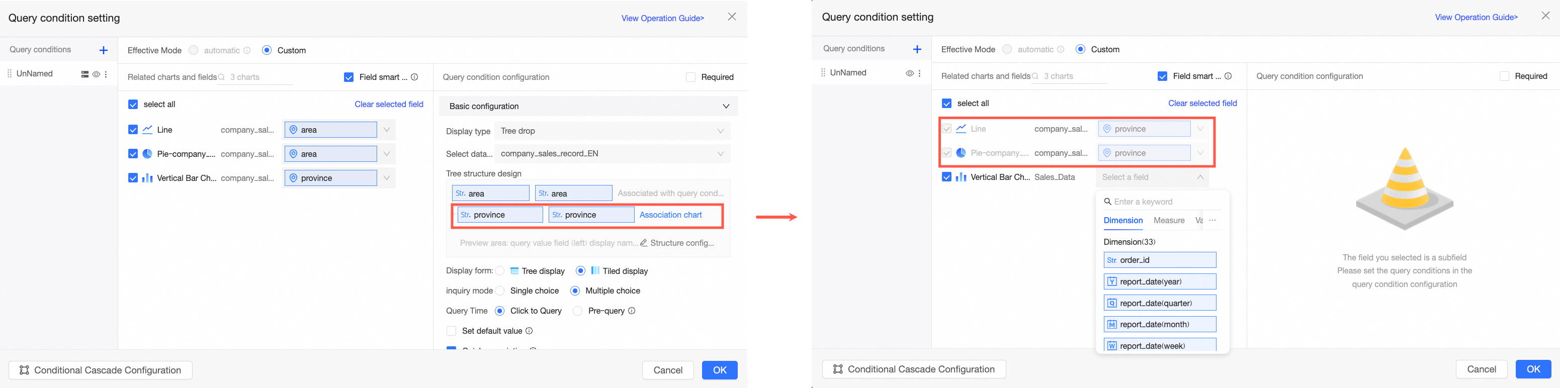
Tree drop
The tree drop lets report viewers filter hierarchical data, such as organizational structures, geographical regions (Country-Province-City), or product categories (Category-Subcategory), by expanding and selecting options at each level.
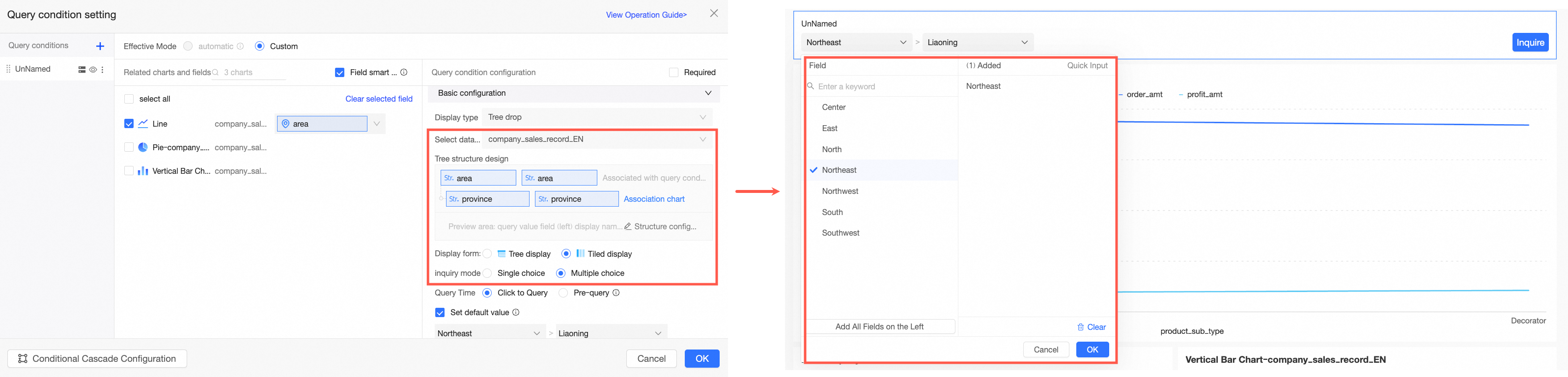
When an associated chart uses a dataset combination and multiple associated fields are selected, the tree drop is not available.
|
Parameter |
Description |
Example |
|
|
Select a dataset |
You can select any dataset within the current dashboard's workspace. We recommend selecting the dataset that is the source for the chart. |
|
|
|
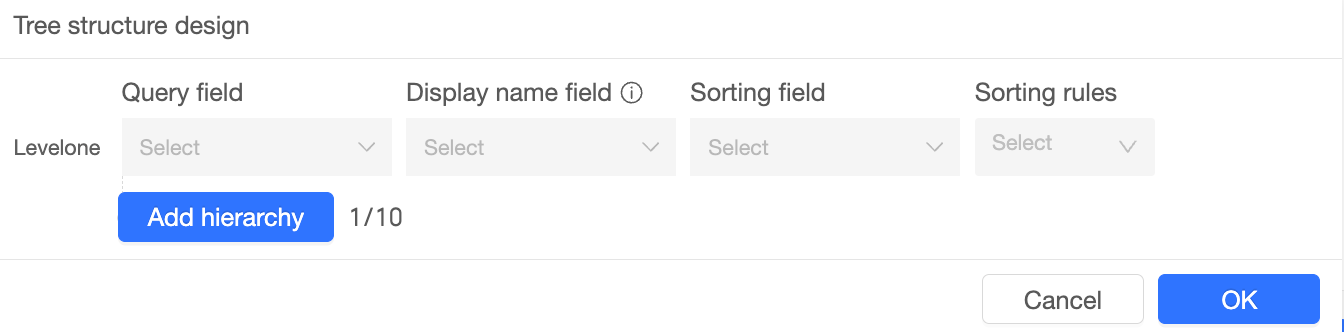
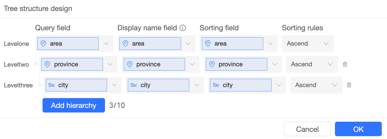
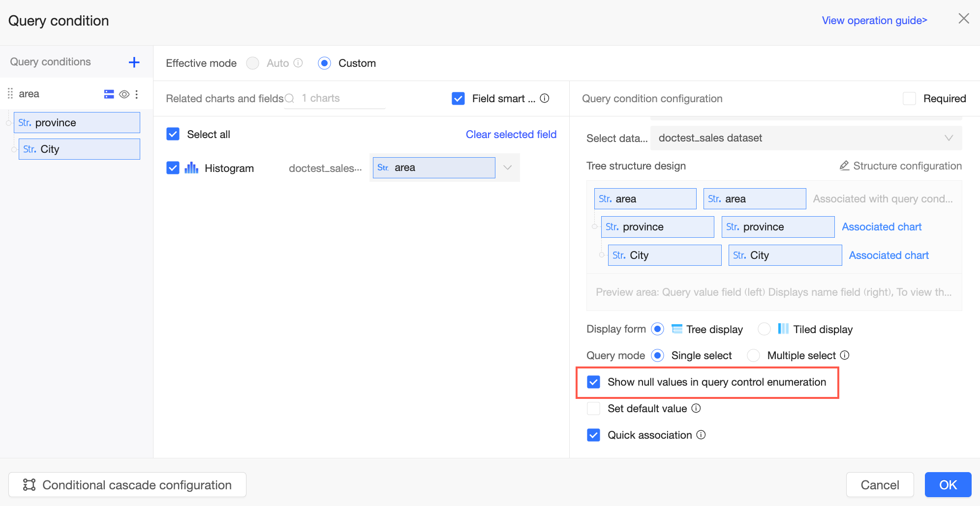
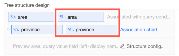
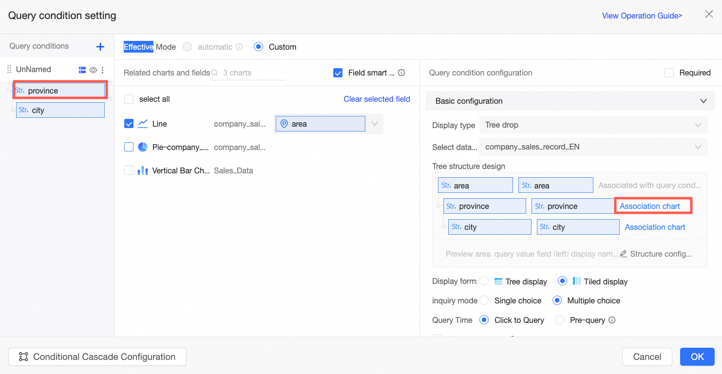
Tree structure design |
Click Start Configuration. In the Tree Structure Design dialog box, configure the query field, display name field, sort field, and sort rule for each level of the filter.
Example: For example, if you create a tree filter with a "Region-Province-City" hierarchy and set an ascending sort rule for each query field:
The filter options will be sorted in ascending order for each level (Region, Province, and City):
Note
|
||
|
Display format |
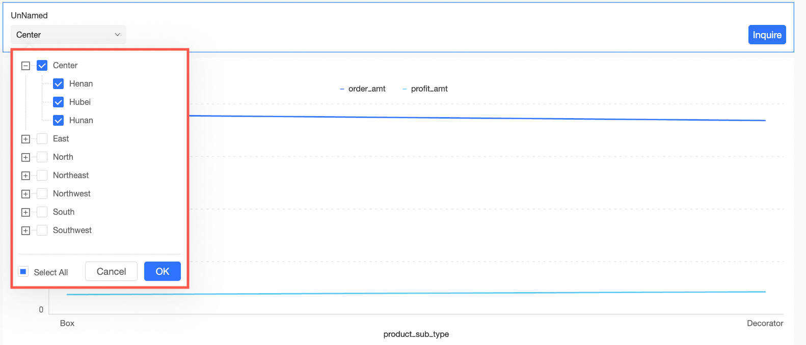
You can choose between tree display and tile display. Note
If you have more than 1,000 data entries, we recommend using the tile display format. |
|
|
|
Selection mode |
You can choose between single-select and multi-select. |
||
|
Query time |
Supports on-click query and pre-query.
|
||
|
Show null values for filter options |
If you select Show null values for filter options, null values in the drop-down list are displayed as (Null) to report viewers.
If this option is not selected, null values are filtered out. Note
If an intermediate node in the tree has a null value, the entire branch (including the null node and all its children) is not displayed, even if the child nodes have non-null values.
Note
This parameter is available only when Configure whether to display null values in each filter condition is selected in the organization-level Report Configurations.
|
||
|
Set default value |
If you select this option and set a value, the filter bar displays the preset value when the report page loads. Note
The default value here corresponds to the display name field in the tree structure design. |
||
|
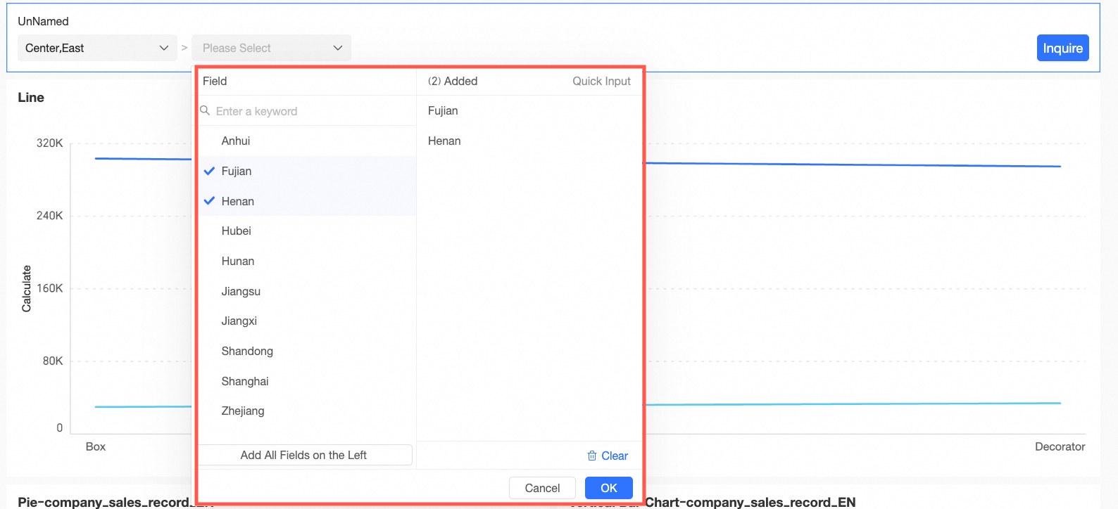
Quick association |
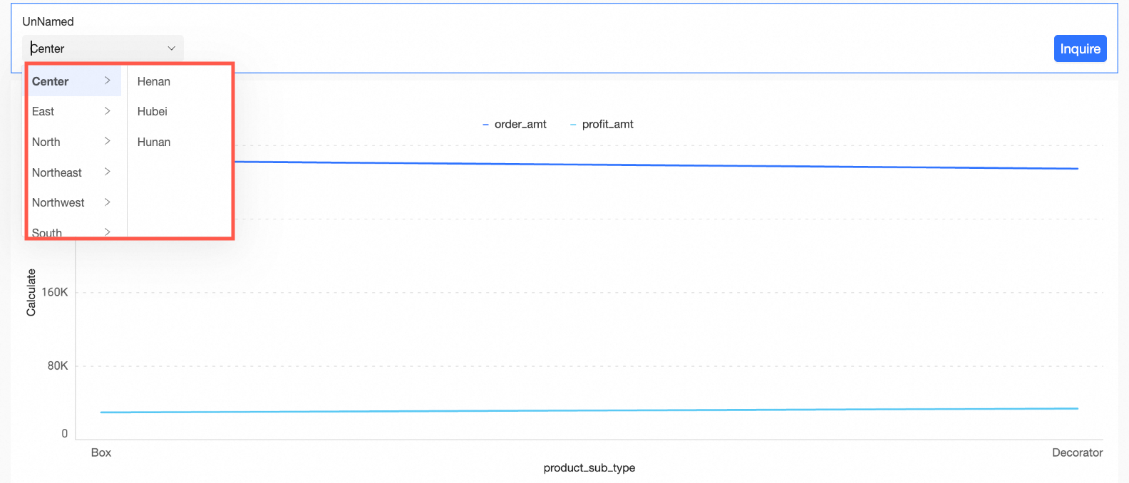
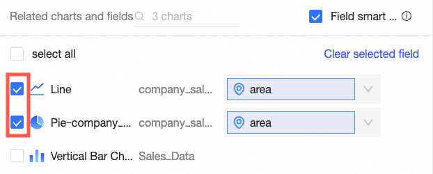
If you select Quick association, the sub-level fields in the tree structure are automatically added to the Related Charts and Fields section for charts from the same dataset. This streamlines the filter bar configuration. For example, when you configure the related charts and fields for the second-level province field, the system automatically fills in the province field for the line chart and column chart from the same dataset. However, the associated field for the pie chart, which is from a different dataset, must be entered manually, as shown in the figure below.
Note
Only charts selected in the Related Charts and Fields section of the main level support automatic synchronization of sub-level fields. You can click Associate Chart in the tree structure or click a sub-level name in the filter list on the left to associate sub-levels with charts and fields from other datasets. |
||

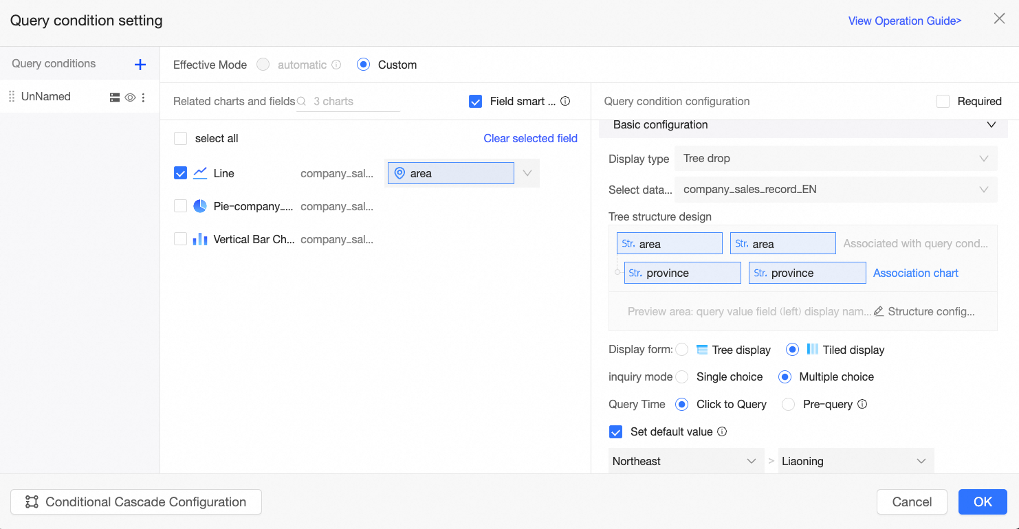
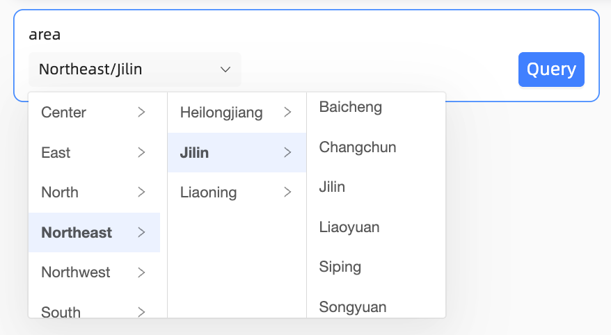
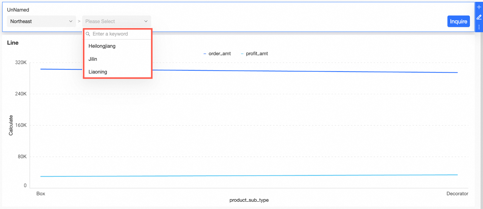
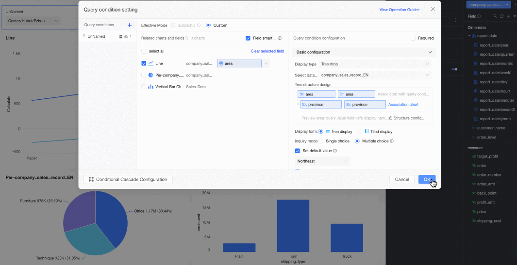
To summarize this example:
-
Select a dataset is set to
company_sales_record, the source dataset for the current chart. -
The tree structure design is configured with the region field at Level 1 and the province field at Level 2. Because the query field values are self-explanatory, the query and display name fields are the same.
-
Display format is set to tile display.
-
Selection mode is set to multi-select, allowing report viewers to choose multiple options.
-
Query time is set to on-click query, meaning the report viewer must click the query button to apply the filter.
-
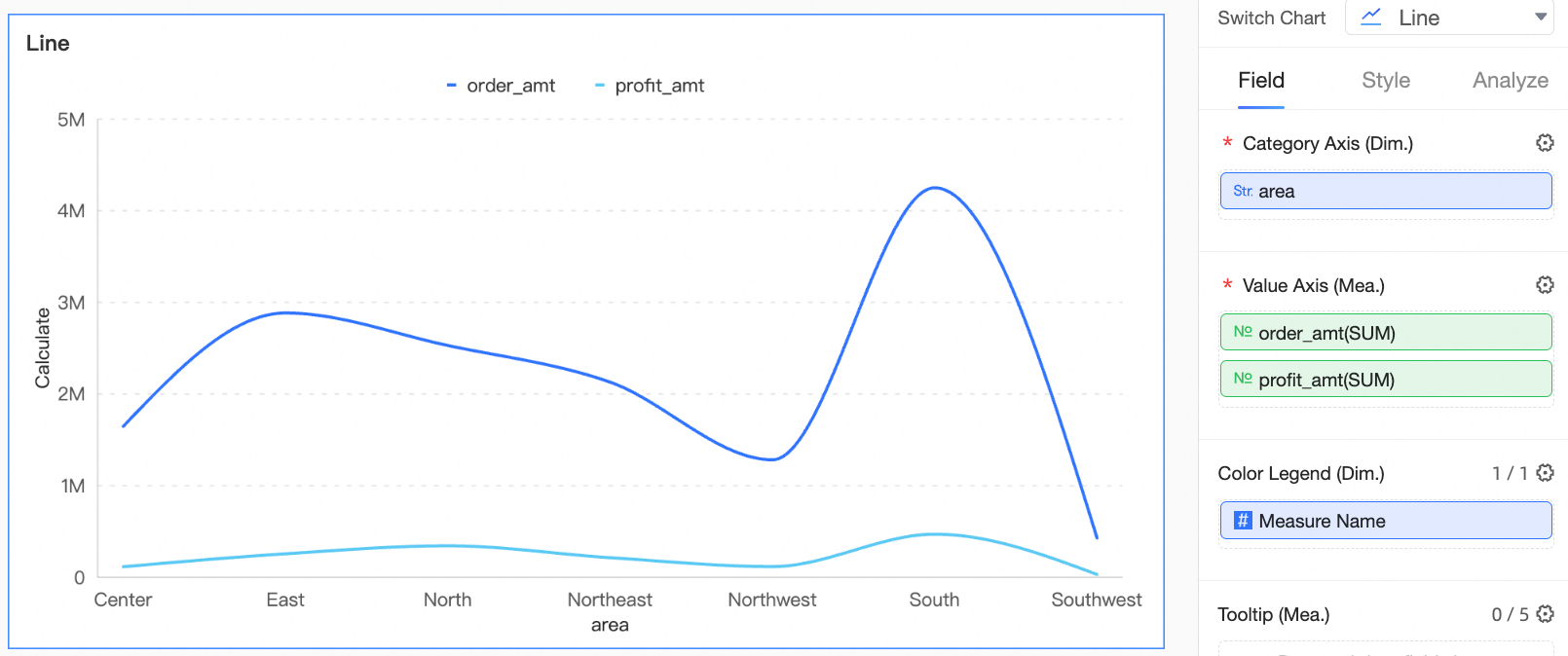
Set default value is configured to Northeast > Liaoning, so the report defaults to showing results for this region and province when opened.
-
Quick association is enabled.
The result is shown in the following figure: